Software
Houzz Logo Print
dani_shugart

Expensive Color Mistake

6 years ago
last modified: 5 years ago
EDIT: I've added new photos to the very bottom of this thread.


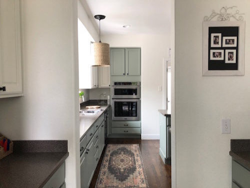
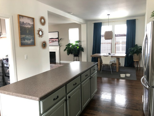
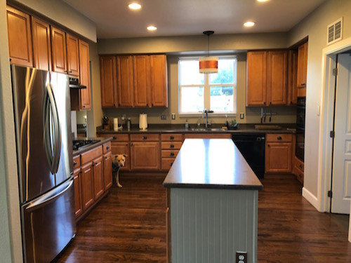
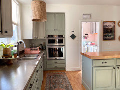
I had my cabinets professionally painted with the same colors that are in my office. The office looks GORGEOUS with those colors (pale green trim, creamy white walls). But the kitchen looks stark and cold. Somehow the pale green looks pale aqua in the kitchen even though both rooms are south-facing.


I'm only mentioning my office because I know this color combo can be amazing in the right context. Maybe the dark gray countertops in the kitchen are what's making it look cold and unwelcoming?


This kitchen was really dark before with the orangey cabinets (pic below). But I didn't want to paint the cabinets ALL white because that's too stark for me. So I needed a color or a darker neutral on at least the bottom cabinets and went with this pale green from Sherwin Williams called Evergreen Fog. Top cabinets and walls are both Alabaster.


What would you do in this situation?


I don't really want to have the cabinets repainted because that money could go toward a new countertop and backsplash, and maybe those two changes would be enough to warm it up.

Or could I repaint the wall a warm neutral color. Sherwin Williams has a color called Shitake (like the mushroom) that actually complements both of my current cabinet colors.

Here's the "before"...


And here are the not-so-after pictures. Not sure why but this just feels too cold/stark to me...


My whole house has an earthy, boho vibe going on and this kitchen doesn't really do it justice. Would love your opinion on what to do.

Comments (98)

  • 6 years ago

    IdaClaire your suggestion about finding some new artwork to tie in warmer colors was a great idea.


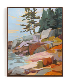
    So I found this painting from an artist I love on Minted.


    https://www.minted.com/product/art/MIN-WZY-DNA/step-up-step-out-i?color=A&shape=


    (I also think a framed canvas would be better since the plexiglass on the current picture seems to reflect a lot of glare from the window.)


  • 6 years ago

    I love the advice about the brass or gold hardware, and I fully agree with it.


    The only problem is, the current hardware is just one year old. It was kind of a splurge from Rejuvination last year and I was using it on my orange cabinets. So it pains me to get rid of those so soon!! LOL


  • 6 years ago

    how pretty! it reminds me of Candada's art collective "Group of Seven".

    Dani Shugart thanked User
  • 6 years ago

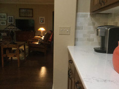
    Dani, we just had new countertops & backsplash put in. This pillar & cut out was our challenge or where to end - wrap around or not? We didn’t wrap & think looks good. For the other two counters ending at a wall, we lined up stop point with base cabinets to make a continuous line & think that looks good too.


    Dani Shugart thanked KW PNW Z8
  • 6 years ago

    I think your kitchen is so nice. You don’t need new cabinet hardware. Just some color to liven it up.

    Dani Shugart thanked flopsycat1
  • 6 years ago

    Regarding the kitchen hardware - you can definitely spray paint or use one of those rub on compounds to change the look. But since they’re new I wouldn’t get rid of them either.

    Dani Shugart thanked Trem Wills
  • 6 years ago

    don't paint metal that you're going to be touching multiple times a day. it will wear off no matter how careful you are with the application. plus it's so much work. and I especially wouldn't do it if what you have now is expensive and relatively new.

    Dani Shugart thanked User
  • 6 years ago

    Lovely colors @Dani Shugart. Totally understandable that going from the honey wood cabinets to white feels stark. But your new painted cabinets are beautiful.

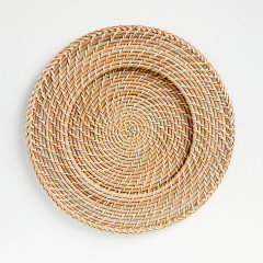
    What about adding in some warm wood feeling with decor, like a large rectangular wood serving dish on the island, wood cutting board under cabinets on sink wall. And maybe even a simple switch of changing the clay pots to baskets for your plants would soften things - and perhaps match boho?


    Dani Shugart thanked Rachel M. Frazier
  • 6 years ago

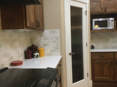
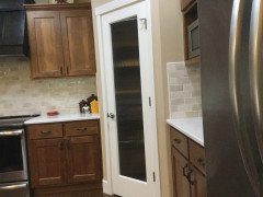
    One more pic of wood cutting boards as decor


    Dani Shugart thanked Rachel M. Frazier
  • 6 years ago

    Inexpensive, fun solution. ..and Practical. Get ready for it.... ACCESSORIES!


    boho inspired... think, wood, bamboo, organic.

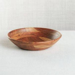
    A nice large bamboo fruit bowl on the island,

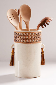
    wood utensils,

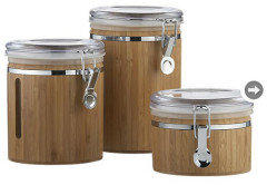
    wood canisters,

    cutting Board,

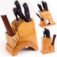
    knife holder.


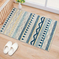
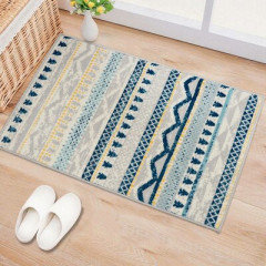
    how about a boho inspired area rug?


    )?


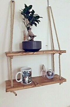
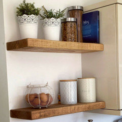
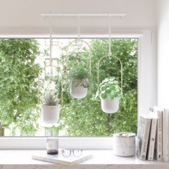
    perhaps 2 wood shelves some succulents on them? (where the painting and wall decor are.. although I do like them).


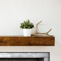
    Wood mantel?


    Dani Shugart thanked Me AGirl
  • 6 years ago

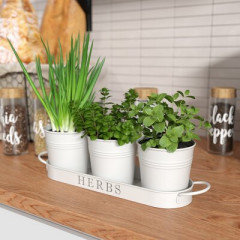
    Herb pots on window sil?


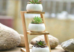
    Or below the painting, some wood stand with herbs? Succulents?


    Dani Shugart thanked Me AGirl
  • 6 years ago

    Me AGirl yes!! I've already started accessorizing with some warm wood tones, and I love your ideas here. I'm going to do a google search for some of your photos! Great tip!

  • 6 years ago

    Oh I will post links if you like

  • 6 years ago

    Keywords:

    boho kitchen accessories,

    wood kitchen accessories,

    bamboo fruit bowls,

    Dani Shugart thanked Me AGirl
  • 6 years ago

    I'm late to the party, so this territory has probably been covered to death already, but:

    The cabinets are beautiful - don't change those. That blue/green is gorgeous.

    I see two big problems right off the bat - the counter is of a shade that is fighting with the cabinets now - you say that it is dark gray, which should look great with the blue/green (I am thinking of steel gray granite, for example) but it seems to have a pinkish or mauveish undertone to it in some of the photos. It could just be my computer's rendering of the color, but if not, change the counters. Otherwise everything else you do will just be trying to disguise them.

    Maybe changing your lighting's color temp would help, so try that first (I favor 3000-3500k usually)

    Then, you've gone from kind of blah walls to white-white-white. Too much white. Yes, accessories will help, but really I would look for either a pale backsplash tile, or a pale paint, in a color that complements the lower cabs. Doesn't have to exactly match the blue/green, although that would be pretty. but either close or in the same tonal family. If you use a bit of color on the walls, then a textured white tile like some of the examples about would be even more fab.

    Most paint manufacturers have tools on their websites to help you find a good color to go with what you already have. I like Valspar's, even though I don't always use their paint - I did use Valspar colors mixed in a different brand in my kitchen.

    Dani Shugart thanked raee_gw zone 5b-6a Ohio
  • 6 years ago

    Update: I've been adding wood elements here and there with cutting boards, fruit bowls, and other accessories and it feels WAY more inviting now. You all had excellent advice and I'm not done yet implementing it!


    Also totally agree with those who made suggestions on light bulbs. Cool color temperature light bulbs have always made me sick. So the color temperature of the bulbs in my kitchen are as warm as it gets with LEDs. And they're actually dimmable too. The pictures I posted of the painted cabinets were taken when the kitchen lights were off because it was the middle of the day.


    As soon as I have a free weekend, I will be able to shop around for butcher block for the island. Definitely wanting to do this soon, but schedule is overwhelmingly busy lately.


    Funny... the green I wasn't in love with at first has grown on me! And I love it so much that I'm thinking about putting it on the upper cabinets as JudyG Designs had originally suggested.


    However, I think I can do a better job than the professional painters that did this job. It'll just require a lot of time, and I'll have to try to do it when my podcast takes a season break in a couple months.


    Thank you all so much for the great advice, the kind words, the inspiration, and the encouragement. It really means a lot!!


  • 6 years ago

    Will we get to see an update? Would love to!


    what type of bulbs did you use?

  • 6 years ago

    is There a way to see how the painted uppers would look? Before you make a commitment to it? Wouldn’t want to make the kitchen too dark

  • 5 years ago

    I saw this exact color combination in a kitchen and love it , from rebeccagibbs.design

    SW Alabaster and SW Evergreen Fog


  • 5 years ago

    Wow, I think this kitchen is off to a great start. I say go for it, add the backsplash and butcher block. If budget is an issue then wallpaper backsplash and hardware.
    I really like Me AGirl accessory suggestions.

  • 5 years ago

    Brushed stainless pulls and white quartz with grey veining on the island.

  • 5 years ago

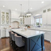
    In the picture I posted above I think its the tile backsplash that really pulls it together. Its Fireclay Salton Sea.

  • 5 years ago

    Awesome suggestions here! I'm actually not sure why my question from last year is gaining a bit of traction, but the kitchen looks different now.


    In February our dishwasher broke and caused water damage on the hardwood floors, so we ended up getting them refinished in a lighter oak color, and we ended up getting a big slab of butcher block on the island. I'll take some more pics when work slows down a bit!


    I'm still wanting a backsplash, but the kitchen has definitely warmed up since I made this post. Thanks so much for the amazing suggestions! I love that backsplash, Caroline Kelly Kryger it's the perfect warm neutral I'd want. So thank you for sharing it here... that'll be my first choice when I start looking again. :-)

  • 5 years ago

    This thread probably popped up on the sidebar, where old threads often appear - and people don't notice that it is old. Or someone was searching for a post about your colors, perhaps.

    Anyway, I'll look forward to your pictures - I agree about the backsplash that Caroline Kelly Kryger posted!

  • 5 years ago

    @Caroline Kelly Kryger That kitche is gorgeous, can you post a link? And yes, the backsplash makes all the difference. Thank you and Dani thanks for checking in!

  • 5 years ago

    I love the combination and find it absolutely gorgeous! Love the evergreen fog colour. I believe as others had said and provided, just accessorize.

    Dani Shugart thanked Johanne Pasion
  • 5 years ago

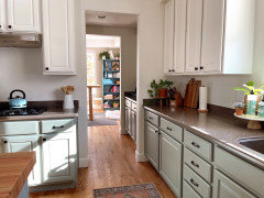
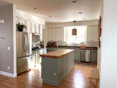
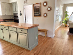
    Quick update on this kitchen!


  • 5 years ago


  • 5 years ago


  • 5 years ago


  • 5 years ago

    If the kitchen looks super different it's because we changed the stain on our hardwoods. The old dishwasher broke and caused water damage so we refinished the floors with a brighter stain and now the kitchen looks a lot warmer. I think that in dark rooms, "Evergreen Fog" will feel really cool but with enough light and warmth around it, it'll feel cozier.


    If I had it to do over again though, I probably would have had the top cabinets painted the same color as the bottom.

  • 5 years ago

    I like the two tone dani, and the floors were a happy accident! they look great.

  • 5 years ago

    Gorgeous @Dani Shugart!!!!

  • 5 years ago

    Beautiful! did you repaint the green cabinets, or simply decorate around the color? Either way, it turned out fantastic. I'm really loving the pink dish rack, what a great detail!

  • 5 years ago

    I still love Evergreen Fog (glad you've come to like it too) and the new floor stain, and the butcher block, are perfect with it! Great choice for your pendant too!

  • PRO
    5 years ago

    This kitchen would look like a completely different kitchen without the dark splash

  • 4 years ago
    last modified: 4 years ago
    VERY late to the party, but...I love the choice of Evergreen Fog! The lighter cabinets above are perfect. The wood on the island countertop is fabulous. What I would ABSOLUTELY change: the regular countertops for a light color (white like upper cabinets), eliminate the 4" backsplash or replace it with a more subtle 2" version, again in the light color. Change out panels in a few upper cabinets and replace with glass. Voila! Oh! And hardware. A warm, antigued brass would flatter beautifully!

    Dani Shugart thanked My Gmail
  • 4 years ago
    My Gmail, I agree 100% and would make those changes in a heartbeat! I even have some gorgeous quartz picked out. But my husband would have to be on board with 8k worth of cosmetic updates. In our area, it might not even pay off when we try to sell. Also our foundation has settled, so we may be looking at some serious expenses that are a bit more pressing. Love your suggestions!

  • 4 years ago

    Totally get the cost issue. I am dying to know what quartz you picked! I just selected Spectrum Simplicity quartz (which I had in mind for your kitchen too). I know it would flatter the Evergreen Fog. I don't know your upper cabinet color, so can't say if it works well with it or not. I do know it was quite a bit less expensive than another choice I had in miind from LG Viatera. Yay. Not sure it if that helps for not. Was also thinking once you get them (I am an optimist!!!) a few accents of rich ocher and matte black would be awesome too -- like for a pot of a plant or a on counter utensil holder.

    Dani Shugart thanked My Gmail
  • 4 years ago
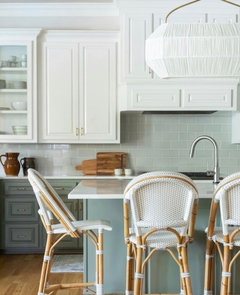
    That sounds divine! Im already drawn to that ochre color; its so happy. And I’ll make a note of that quartz — thank you so much for the great suggestion!

  • 4 years ago
    last modified: 4 years ago
    Dani Shugart Spending money on foundations rather than cosmetic updates -- I've been there. I've lived in my house for nearly 5 years and still haven't updated the kitchen like we were so sure we would. And at this point, we might move in a few years so it might not be worth it. Funny thing, that kitchen has really grown on me as-is.

    If you think you might not get a good ROI with 8K countertops, then honestly, it looks fantastic right now. You did a terrific job, enjoy it!

    Dani Shugart thanked User
  • 4 years ago
    Thank you so much and im sorry to hear about the trouble you’ve gone through with your foundation. I’m so glad that you’re enjoying your kitchen as it is!

  • 4 years ago
    Your kitchen looks amazing! Agree that I would change the perimeter counters (if and when funds are permitting). I was just reading about another kitchen today that had white Caesarstone from ikea installed and it looks great. It apparently goes on sale 2x/year (12% off).

  • 4 years ago
    Dani Shugart for us it wasn't actually the foundation, it was a badly installed metal roof that caused rot and a $40K reno. home ownership is fraught, why does anybody do this LOL?

    best of luck to you though! there are different outcomes for foundation problems, fingers crossed yours will wind up being one of the easier solutions.

  • 4 years ago

    Your kitchen is stunning ! The flooring and small decor additions pulled it all together wonderfully .

  • 4 years ago

    Your kitchen looks stunning!

  • 4 years ago

    It is a year later, curious about what you did. I say you were on the right track to change the countertops. The dark floor and the dark counters are the issues. One should be lighter and I would think brighter countertops and a backsplash would be marvelous.

  • 4 years ago

    If you scroll up in the comments you can see the updated photos. I actually don’t see the gray countertops as being an issue.

    And sure, a backsplash would be marvelous, but it’s not a priority. I feel great being in my kitchen now even though it’s not super high end.

  • 4 years ago

    Love love thd nee floor color rxcellent chouce mskes s witld if difference