

White paint to coordinate with walnut in efficiency
5 years ago
Sort by:Oldest
Comments (5)

Related Stories
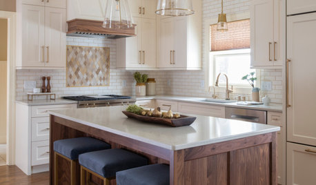
BEFORE AND AFTERSKitchen of the Week: Creamy White, Warm Walnut and a New Layout
Years after realizing their custom kitchen wasn’t functional, a Minnesota couple decide to get it right the second time
Full Story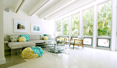
DECORATING GUIDESDesign Debate: Should You Ever Paint a Wood Ceiling White?
In week 2 of our debate series, designers go head to head over how classic wood ceilings should be handled in modern times
Full Story
DECORATING GUIDESDesigner Secrets: 10 Pros Share Their Favorite White Paints
Decorating experts look to these hues when they want a go-to white they can count on
Full Story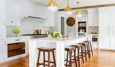
KITCHEN OF THE WEEKKitchen of the Week: White, Walnut and Brass in an 1840 Farmhouse
An addition to a Massachusetts home creates a bright, spacious chef’s kitchen with white cabinetry and warm woods
Full Story
WHITEHow to Pick the Right White Paint
White is white, right? Not quite. See 8 white paint picks for 8 very different effects
Full Story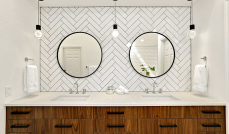
BATHROOM MAKEOVERSBathroom of the Week: A Master Bath in Black, White and Walnut
A Seattle couple finds a designer on Houzz to transform a heavily brown space into a light, bright and stylish dream
Full Story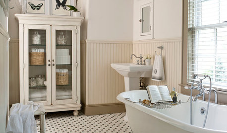
MOST POPULARMust-Try Color Combo: White With Warm Off-White
Avoid going too traditional and too clean by introducing an off-white palette that brings a touch of warmth and elegance
Full Story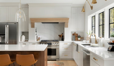
KITCHEN DESIGNKitchen of the Week: Creamy White, Wood and Brass in an Open Plan
A design-build firm helps a Minnesota couple create a roomy L-shaped kitchen with off-white cabinets and a walnut island
Full Story
MOST POPULARCrowd-Pleasing Paint Colors for Staging Your Home
Ignore the instinct to go with white. These colors can show your house in the best possible light
Full Story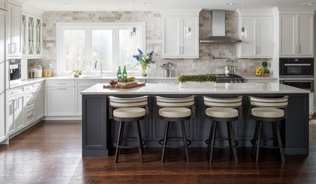
WHITE KITCHENSWhite Cabinets Remain at the Top of Kitchen Wish Lists
Find out the most popular countertop, flooring, cabinet, backsplash and paint picks among homeowners who are renovating
Full Story
sealavender
Andrea WOriginal Author
Related Professionals
Memphis Bathroom Remodelers · Branson Kitchen & Bathroom Designers · Coos Bay Kitchen & Bathroom Designers · Lufkin Interior Designers & Decorators · Las Cruces Interior Designers & Decorators · Alexandria Architects & Building Designers · Asheville Architects & Building Designers · Spartanburg Architects & Building Designers · Little Rock Kitchen & Bathroom Designers · Lawrenceburg Kitchen & Bathroom Designers · Mount Vernon Kitchen Remodelers · Charlottesville Kitchen Remodelers · Reno Kitchen Remodelers · Brattleboro Custom Countertops · Provo Custom CountertopsAndrea WOriginal Author
cawaps
Andrea WOriginal Author