Software
Houzz Logo Print
eirlim

Has anyone tried lightening SW Alabaster?

5 years ago

I'm in the process of painting the inside of my house and I chose Alabaster for the soft and warm look of the color. The color looks so pretty and perfect on the walls of the first floor - a giant open plan that has tons of north facing windows and some west facing windows which gives the space a glow of yellow afternoon sun but generally a subdued air due to the cool non-direct light from the north side.


Hoping to achieve the same, I painted a swatch of it in the master bathroom which also faces north, but because it's covered in tan colored tiles, the reflected light really warms up the color; it reads too yellow, almost lemony. I tried a swatch of Pure White next to it, and was disappointed to see that it reads way too white in the warm colored space. I think Alabaster lightened just a tad would be perfect for the bathroom, but when I asked the clerk at the local Sherwin Williams store, they told me that it's already such a light color that it can't be lightened. I understand that it's not always an easy matter of adding white or cutting the formula, but I didn't think it was impossible to try...


Has anyone tried lightening Alabaster at their local store or done it themselves by adding white? Unless I can find a different Sherwin Williams employee to do it for me, I think I might try and lighten it myself as I can't seem to find a color that's just slightly less saturated than Alabaster...Please share your thoughts!


Comments (21)

  • 5 years ago

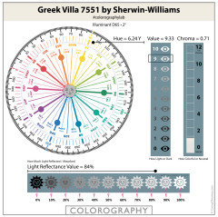
    Try SW Greek Villa. It is similar to Alabaster but less yellow. It’s actually so close that the sample of both colors is the same.

    eirlim thanked eevere1
  • 5 years ago

    @eevere1 I actually grabbed a color chip for Greek Villa while I was there and observed it side by side with Alabaster and in certain lights, it looked just as saturated as Alabaster and actually toned down (which is an issue because I do like the lightness of Alabaster) - would you say that it's just a less yellow version of Alabaster and that's why it's registering as being "toned down" or darker?

  • 5 years ago


    eirlim thanked Marylee H
  • 5 years ago

    @Marylee H oh wow both colors look like solid candidates!!! Thank you so much!!

  • 5 years ago


  • 5 years ago

    Alabaster reads very yellow in our north facing room as well. I painted one wall se Greek villa (it had been a contender and I had a full gallon of it) and it’s equally yellow in the room. I decided to live with it for now but will go back and repaint later on.

    eirlim thanked Jennifer Svensson
  • 5 years ago

    @Jennifer Svensson That's exactly my concern with Greek Villa, that it'll read just as yellow since it looks just as saturated to my eyes! Such minor difference, but huge effect on the space...

  • 5 years ago
    last modified: 5 years ago

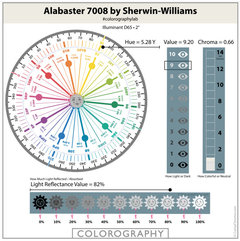
    The saturation you mention is reflected in the quantities of Chroma. See Greek Villa in comparison.

    As you say, a little difference can have quite an impact..


  • 5 years ago

    @Marylee H I was just comparing the specs on the colors after reading your super educational comments on other similar posts! I did find that Cold Foam is closest to Alabaster, just lighter and more neutral...which is exactly what I wanted! I happened to have the catalogue with the two colors included so I've been studying them, and Cheviot looks pretty yellow so I'm surprised to see that it's more neutral according to the chroma. Anyway, thank you so much for pointing out those colors (that I've unknowingly overlooked even though they were right here in my room all this time, ugh) and explaining the meaning behind the numbers! Paint colors are SO hard!

  • 5 years ago

    Hi again - Cheviot is lighter than Cold Foam but almost bang-on the same quantity of Chroma.


    That extra feeling of colour may possibly come from it sitting closer to the Yellow-Red Hue family than the other colours. It’s proximity might add a sense of peachiness to its warmth.


    Good Luck! Choosing near neutrals colours are not for the faint-hearted!

    eirlim thanked Marylee H
  • 5 years ago

    I have the same issue in my north facing living room. It’s such a pain but what’s worse is I can’t find any other colors that look like cold foam. I tried pure white on my walls and it looks Blue! One shade higher is alabaster and it looks too yellow for me. Cold foam is part of their emerald line and would be so expensive because I need about 3 to 4 gallons :( I’m tired of thinking about paint. I must’ve tried at least 20 samples.

  • 5 years ago


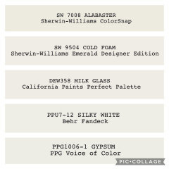
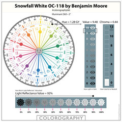
    Have you considered any of these?


    All these sit between SW Alabaster and SW Pure White in terms of Hue Family location.


    So they are likely to be perceived as not quite so warm as Alabaster, nor quite as cool as Pure White.


    They are all more neutral than Alabaster. They are all a little darker than Pure White.


    🌈


  • 5 years ago

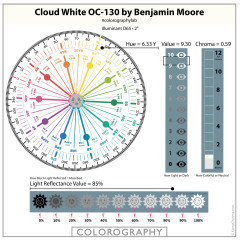
    Marylee H - I’m writing this a while after the last thread, so I’m hoping you will see it. I’m painting my kitchen cabinets and was considering Greek Villa and Alabaster. My walls are Killum Beige and the floor is a light marble with hints of beige. The countertops and backsplash are a black marble with small flecks of beige/ gold. I’m just learning about Cloud White and wondering if would is a good choice. I don’t mind a hint of yellow but not too much - I prefer a minimal undertone. If anyone else has used it on cabinets I’d appreciate the input.

  • 5 years ago

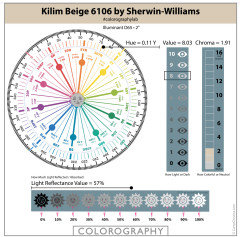
    Hi - You can compare & contrast the key attributes of all the colours you are considering, using their Colorographies from The Land of Color.


    Higher Value = lighter colour.

    Higher Chroma = more colourful colour.

    Lower Chroma = more neutral


    🌈

  • 5 years ago

    Marylee H - Thank you so very much for your quick response!! This is helpful.

  • 3 years ago

    I went to Sherwin Willams, and asked to have Alabaster lightened 75%. it was perfect for me. There is no other colour that matches it. Trust me, I have tried many whites.

  • 3 years ago

    I am considering doing the same but at 75% is it the same formula as Greek Villa?

  • 2 years ago

    @deirdrebetteridge do you have any photos? did it make it more of a white than an off white?

  • 2 years ago

    @deirdrebetteridge piggybacking off Emily! im wondering the same, and any pics?

  • 2 years ago

    I was looking for something in between Alabaster and Pure White that’s not yellow and Cold Foam seems a strong contender. I noticed that alabaster And pure white are mixed in the Extra White base while Cold Foam is in the Ultra White base. I wonder why the difference. SW calls both alabaster and cold foam warm whites and pure white is a cool white. Wonder what the base brings to the color on the wall.