

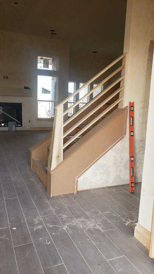
Color scheme help
6 years ago
Sort by:Oldest
Comments (8)
Related Stories
WINTER GARDENINGHow to Help Your Trees Weather a Storm
Seeing trees safely through winter storms means choosing the right species, siting them carefully and paying attention during the tempests
Full Story
EXTERIORSHelp! What Color Should I Paint My House Exterior?
Real homeowners get real help in choosing paint palettes. Bonus: 3 tips for everyone on picking exterior colors
Full Story
COLORPick-a-Paint Help: 11 Ways to Mine Your World for Colors
Color, color everywhere. Discover the paint palettes that are there for the taking in nature, shops and anywhere else you roam
Full Story
LIFEDecluttering — How to Get the Help You Need
Don't worry if you can't shed stuff and organize alone; help is at your disposal
Full Story
COLORPick-a-Paint Help: How to Create a Whole-House Color Palette
Don't be daunted. With these strategies, building a cohesive palette for your entire home is less difficult than it seems
Full Story
REMODELING GUIDESKey Measurements for a Dream Bedroom
Learn the dimensions that will help your bed, nightstands and other furnishings fit neatly and comfortably in the space
Full Story
SELLING YOUR HOUSE5 Savvy Fixes to Help Your Home Sell
Get the maximum return on your spruce-up dollars by putting your money in the areas buyers care most about
Full Story
SELLING YOUR HOUSEHelp for Selling Your Home Faster — and Maybe for More
Prep your home properly before you put it on the market. Learn what tasks are worth the money and the best pros for the jobs
Full Story
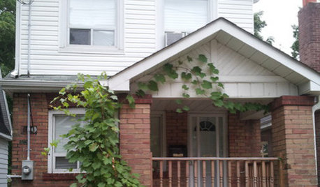
ENTRYWAYSHelp! What Color Should I Paint My Front Door?
We come to the rescue of three Houzzers, offering color palette options for the front door, trim and siding
Full Story
Christina
Christina
Related Professionals
Cedar Rapids Interior Designers & Decorators · Newburyport Interior Designers & Decorators · Newport Interior Designers & Decorators · San Bernardino Interior Designers & Decorators · Cheyenne Interior Designers & Decorators · North Adams Kitchen & Bathroom Designers · Bismarck Kitchen & Bathroom Designers · Branson Interior Designers & Decorators · Fergus Falls Kitchen & Bathroom Designers · Akron Kitchen & Bathroom Designers · Rolla Furniture & Accessories · Providence Architects & Building Designers · Martinsburg Design-Build Firms · Flint Design-Build Firms · Edison Design-Build FirmsUserOriginal Author
Marylee H
Marylee H
Christina
Marylee H
UserOriginal Author