Software
Houzz Logo Print
donnaesnard

Ceiling Color Paint Trends

6 years ago

Wall color is a very light neutral, i.e. Antique White, Wool Skein or something similar. Trim Color is slightly lighter, i.e. Cotton Balls, White Dove or similar. Is it more harmonious and cleaner to paint the ceiling the same color as the wall color or the trim. I typically do Flat on the ceiling, Satin on the Crown/Trim, and Eggshell on walls. Suggestions?

Comments (10)

  • PRO
    6 years ago

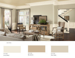
    These are not neutral colors. They are gold in tone and unless your rooms are flooded with natural light might be too dark for the ceilings.


    Donna Esnard thanked BeverlyFLADeziner
  • 6 years ago

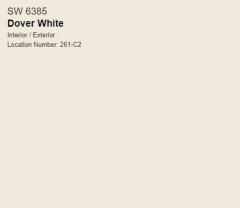
    Dover White is on my short list for trim. I agree with the point about the ceiling color. Nice photo. Thanks!

  • 6 years ago

    I'm not finalizing the wall color until I've painted very large sections on multiple walls and lived with it. These are great points to consider. Thank you!

  • 6 years ago

    If you don't like plain 'ceiling white', try using a diluted version of the lightest paint colour in your room. For Dover White I might do a 1/2 tint. For Wool Skein, maybe a 1/4 tint.

    Donna Esnard thanked Jennifer K
  • 6 years ago

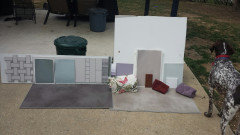
    Use large poster or foam boards to paint your color choices. You can them move them around and see them in different areas. It's a better way of testing color.

    Donna Esnard thanked simplechoices
  • 6 years ago
    last modified: 6 years ago

    I also wanted to add that it depends on your ceilings as well. If the room is enclosed with defined boundaries, it's easier to add a color to the ceiling in a few rooms. What is the ceiling height, how often do you like to change your paint color? Are you doing the work yourself, or hiring a painter? If I can manage the ceiling height, I paint my own spaces. I have done a few ceilings and loved them, but it also became a pain to repaint when I wanted to change the color of the walls. So I would consider all these things before I chose the ceiling color. Same consideration for the trim color. The more white and neutral, the less likely you will have to repaint if you change the wall color. Dover White will limit your choices in the future.

    Donna Esnard thanked simplechoices
  • 6 years ago

    @simplechoices Ceilings are 9 ft. Kitchen ceiling is beadboard, Adjacent Living and Dining ceilings are sheetrock. I'm painting the kitchen walls and trim, painter doing the rest. Is Dover White limiting it's too strong of a color?


  • 6 years ago
    last modified: 6 years ago

    Dover White DNA is 5.06Y 9.27/0.97

    It can be a beautiful wall color, but I would not choose it for trim. Another risk with SW Dover White is that when you pair it with other colors, it starts to draw out the creaminess (yellow) of it.

    Take a look at SW Alabaster or BM White dove. They have similar DNA in Value (lightness) but are less colorful (less Chroma) and will give you a lot more flexibility in the long run.


  • 6 years ago

    Personally in a home with light walls and crown molding I think the crown sings when the walls and ceiling are the same color.


    When I am choosing colors I always start with what is already in the home and cannot/will not change - flooring, counters, cabinet color, furnishings, art.


    Know what 'colors' you will want to introduce into the space (If your favorite color is fire engine red the neutral that will work may be very different than if you love cornflower blue.)


    Once you know those things you can pick a neutral that works with the colors you have identified. I like to take samples outside on a clear day and look at everything together.


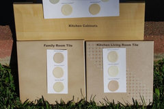
    The second picture below really was a challenging space - in the home, with indoor lighting the family room and kitchen tiles looked like the same color, but when you took them outside in the sunlight you could immediately see the pink tones in the kitchen tiles.


    We see the undertones better in sunlight than we do with indoor lighting. Seeing the color in bright, full spectrum daylight can help you discern the subtle undertones in whites and light neutrals.


    colors · More Info


    Once we know what works together we have to see what it looks like with the lighting inside the home, but if it didn't work outside it will never work inside.


    We can tweak the color selection - go lighter or darker, more or less saturated, but stay in the same hue family. If your indoor lighting is more yellow it will cast the same yellow on all the color selections so the hue is shifted for all of the colors, not just the paint color, so it still works.


    I also highly recommend using large samples when looking at whites and neutrals. The undertones are subtle and much easier to detect with a large sample.


    I like using 140 lb watercolor paper for painting samples. It doesn't warp and has a bit of texture that emulates wall texture well. I usually get the 18x24 for whites and neutrals.


    https://www.amazon.com/Canson-Watercolor-Textured-Charcoal-Acrylic/dp/B00NQ49PLM?ref_=ast_sto_dp&th=1


    Look at one sample at a time in your space. If you already have color on your wall you need to have a good amount of white space between the new color and the old so your mind doesn't auto compare the two colors.


    Before making a final decision I will paint a large sample on drywall - I have some 1/2 sheets of drywall that I use over and over again for paint samples. You do have to prime new drywall. Unprimed drywall absorbs the liquid in the paint and the dry color is not the same as it will be on a primed surface.


    Then I live with the color for several days - moving it from room to room or wall to wall and looking at it at different times of the day with different lighting,


    There is nothing innately wrong with Dover White - many people have used this color and absolutely love the finished look. Others think it is yellow or for some reason don't like it in their space. But this is like picking an outfit. With some outfits a crisp white shirt looks best and with some a cream or an ecru or a taupe works better.


    What a white or light neutral looks like in anyone else's space has nothing to do with what it will look like in your space with your flooring and your lighting and your furniture and belongings.


    Donna Esnard thanked Jennifer Hogan