Software
Houzz Logo Print
max_pressler

Something a shade darker than BM Cotton Balls?

5 years ago

I tried White Dove, Cloud White, Cotton Balls, Oxford White, SW Pure White and SW Alabaster paint samples on my walls. I thought Simply and Cloud were too warm/creamy/peachy. Further right into Green/Yellow territory was Oxford white which I found to have too much of an olive green undertone. SW Pure White looked a little too grey/blue and Alabaster still a bit greige.


What I'm looking for is a very pale yellow off white that doesn't turn pink or creamy in warm natural lighting (southern facing windows). Cotton Balls so far has been the closest match but it is so bright. What would be something a tad darker? The next up on the swatch was Minced Onion and that was far too dark (I also used the next color up from Snowfall White which was Cloud Nine...also too dark and too olive)


I am considering Moonlight White but I'm afraid that will be too dark also.

It's possible also that the SW Pure White is looking blue because it is surrounded by other paint samples which are yellower in comparison.


Please help lol.

Comments (19)

  • 5 years ago


  • 5 years ago
    last modified: 5 years ago

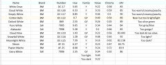
    This is to help you collate what you have sampled already. I think in your quest you may have become highly sensitised to the slightest nuances of white!


    Try and remember that when installed, they play off the available light and other surfaces. They become only part of the whole impression and atmosphere in your space.


    Some here do fit the bill of being darker than Cottonballs or lighter than Cloud Nine.(Value)


    Most neutral = Extra White. Most colourful = Alabaster. (Chroma)


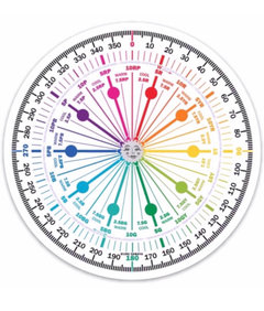
    You can use their Hue notation to plot them on the Color Wheel. e.g. 5.65Y


    So you might decide if you care to move further anti-clockwise into the Yellow Hue Family or more clock-wise into the Green-Yellow Hue Family.


  • 5 years ago


  • 5 years ago

    Thanks. How are you finding the hue numbers? Most of these colors are on the campchroma website but some are not. I would like to see where Paper Mache and Steam sit on the color wheel but cannot find them.

  • 5 years ago


    Hi - have included those too. For the colours not already at The Land of Color, I convert their data into the notations above.


    🌈

    Max Pressler thanked Marylee H
  • 5 years ago

    Thanks. Lori I’ve noticed how often you advocate for PpG Delicate White. Gonna go grab a sample today. I promise it will be my last. I’ve narrowed everything down to Pure White, Alabaster and Cotton Balls, which are respectfully too cool, too grey, and too warm. I understand that they look extreme because they are all in juxtaposition to one another and as Marylee says, I have become hypersensitive to the nuances. If Delicate White isn’t the long lost beacon of truth I will likely just pick the Pure White to get it over with. My eyes hurt.

  • PRO
    5 years ago

    I just think Delicate White is pretty. Nothing to do with the numbers, really. 🙂

  • 5 years ago

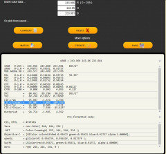
    There is also a website called Easy RGB that shows the LCH color for most paint brands.


    Easyrgb.com


    Simply look up a color and once the color is identified you can click on the color and select convert. It shows all mathematical equivalents for the color. It will also identify close matches to the color in specific brands of paint.


  • 5 years ago

    For many whites and near neutrals you have to really understand how we perceive near neutrals vs the color of reflected wavelengths of light coming off the color.


    Often using our eyes is just as efficient as trying to understand how a small drop in chroma can change a yellow to pink, purple, green or blue.


    You really should evaluate each color separately. Painting several samples on a wall with other samples will cause you to compare the two colors.


    Always look at whites, pastels and near neutrals with the colors that it will be next to when you paint the walls. (Cabinets, flooring, trim, wall color, furnishings . . . )


    Here is a great review on SW Pure White


    https://www.kylieminteriors.ca/paint-colour-review-sherwin-williams-pure-white-sw-7005/


    She has reviewed what she considers the best BM and SW Whites. It may help you narrow your choice.


    https://www.kylieminteriors.ca/the-8-best-benjamin-moore-white-paint-colours-undertones-and-more/


    I use watercolor paper to create my samples.

    It has a similar texture to drywall and doesn't warp like poster board.

    https://www.amazon.com/gp/product/B00NQ49PLM/ref=ppx_yo_dt_b_asin_title_o03_s00?ie=UTF8&psc=1


  • 5 years ago

    You will find lots of videos at the land of color on Youtube, which walk you through different aspects of colour measurement, plus examples of different ways in which it can be used. See ‘how to find the Hue Family for any color’ and others.

    🌈

  • 5 years ago

    Can I ask how you are sampling these colors?


    You want to be looking at them in your space with the colors that are going to be next to them and looking at them without interference from other colors that will no longer be in the space and with the lighting that you will have in the space, both natural daylight and evening artificial light.


    You need to look at them in various areas of the room - some walls may get more sunlight than others, some may have gray shadows.


    You need to be looking at large samples. I look at colors every day and still like to view whites as 18x24 samples. Without experience I often recommend painting a 1/2 or full sheet of drywall to test your top contenders.


    Not too long ago we had a woman post her dilemma on Houzz. Everyone was trying to help her. Between us we explained LCH and lighting and our own experiences with whites. She had color matches done by different brands, bought dozens of samples, mixed her own samples and then after about 150 comments she posted a picture of her samples. She was looking at small samples next to each other instead of large samples tested independently.


    This was her response after trying my suggestion of painting 2 pieces of drywall and never viewing more than 2 colors at a time.


    @Jennifer Hogan your suggestion was brilliant. I wish I would have done the big pieces of drywall testers in the very beginning! in doing this, I found that I actually liked a few different shades that I believe I’d be happy with. Not comparing the colors I was considering to multiple other whites next to it or other testers on the wall to distract was a game changer....in addition, seeing it in a larger scale and bringing it into multiple different rooms w my samples also helped me appreciate the color even more, or throw it out until I ended up with 2 I liked. it’s a bit of a rainy day here today- so just to be sure, I’m going to go check them out again tomorrow w better sunlight & make the choice :). Thank you so much for this recommendation.


  • 5 years ago

    I think I’ve decided on the cotton balls. I really love the color. It’s just so bright. What would happen if I added a drop of black paint to a gallon?

  • 5 years ago

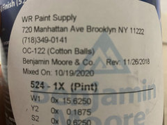
    Can you tell me the formula for Cotton Balls. I don't have a can handy. If I remember correctly it has White added to the #1 base. I think you may be able to reduce the white and get a better result than adding black.


  • 5 years ago

    It also may not feel as bright when the whole room is painted one color.

  • 5 years ago


  • 5 years ago

    I’d like to read that!

  • 5 years ago

    I painted an entire wall Pure White and its just entirely too blue looking. I just can’t do it.

  • 10 months ago

    I was just wondering if you used cotton balls. i planned on using it but still not sure. if you didn’t use cotton balls could you tell me what color you did use.