

gray that won't read blue
6 years ago
last modified: 5 years ago
Featured Answer
Sort by:Oldest
Comments (12)
 5 years ago
Related Professionals
Springfield Interior Designers & Decorators · North Platte Interior Designers & Decorators · Virginia Beach Bathroom Remodelers · Gulfport Interior Designers & Decorators · Austin Kitchen & Bathroom Designers · Norfolk Kitchen & Bathroom Designers · Enfield Kitchen & Bathroom Designers · Burlington Kitchen & Bathroom Designers · Cheyenne Kitchen & Bathroom Designers · Toledo Furniture & Accessories · Monroe Interior Designers & Decorators · Cincinnati Interior Designers & Decorators · Georgetown Architects & Building Designers · Mansfield Architects & Building Designers · Elgin Kitchen & Bathroom Designers- 5 years ago
- 5 years agolast modified: 5 years ago
- 5 years ago
- 5 years ago
- 5 years ago
- 5 years ago
- 5 years ago
- 5 years agolast modified: 5 years ago







Related Stories
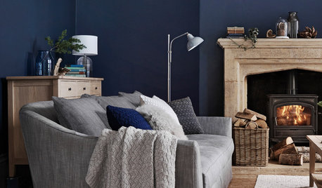
DECORATING GUIDESHow to Combine Blue and Gray in Your Living Room
Let these 10 versions of the versatile color combination inspire you
Full Story
KITCHEN DESIGNThoughtful Style and Storage in a Gray-and-Blue Kitchen
This North Carolina kitchen features a marble-and-brass backsplash and carefully planned cabinet organization
Full Story
GRAYColor Guide: How to Work With Light Gray
The hottest new neutral can be cool or warm, formal or casual, and feminine or masculine. Talk about versatile
Full Story
DECORATING GUIDESColor Guide: How to Work With Charcoal Gray
The most modern neutral, charcoal gray looks great in dining rooms, living rooms and even nurseries. Here's how to use it best
Full Story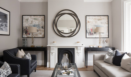
MOST POPULARWhat’s Your Neutral: Beige or Gray?
A designer shares 10 tips for using the neutral shade that works best for you
Full Story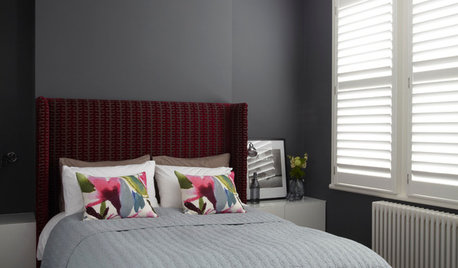
COLORDreaming in Color: 8 Gorgeous Gray Bedrooms
With this versatile hue, you can go dark and bold or slip into something more soothing
Full Story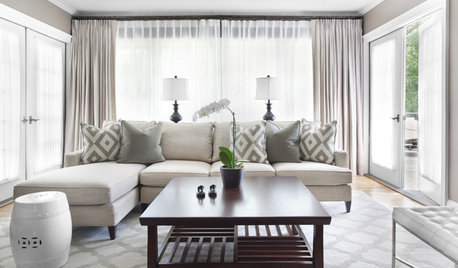
GRAYChoosing Paint: How To Pick the Right Gray
Which Version of Today's 'It' Neutral Is For You?
Full Story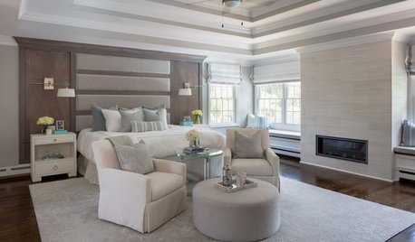
BEDROOMSSoothing Gray and Creamy White Bedroom With Coastal Style
A designer transforms a Long Island, New York, master bedroom into a light and airy space made for relaxation
Full Story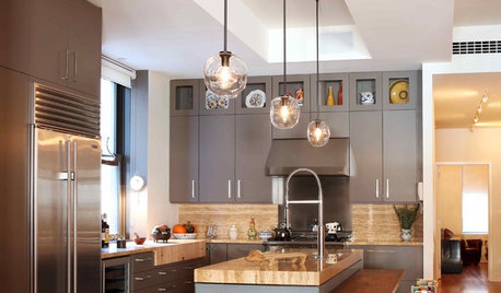
KITCHEN DESIGNObsessed With Gray in the Kitchen
See How to Use This Sexy Neutral to Heat Up Your Cookspace
Full Story
MOST POPULARRethinking Beige in a World Gone Gray
Gray, the ‘it’ neutral of recent years, has left beige in the shade. But is it time to revisit this easy-on-the-eyes wall color?
Full Story


allie2020