Software
Houzz Logo Print
mjconti

Color Advice - Determining Undertones

5 years ago
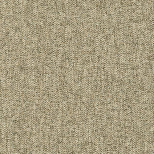
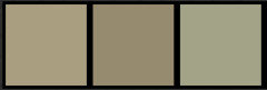
Many of you are color experts so I would appreciate and welcome advice. How can it be determined what the undertone of beige/tan is: red, yellow, or green? What are the best accent colors to use with it (especially if it's red) and is it important to know what the undertone is before choosing other furniture & accent pieces ? Since all computer monitors are different, I apologize that it will be hard for you to tell about this fabric, but any guesses you have will be appreciated. The fabric isn't light or dark - kind of medium. It doesn't appear warm or cool & it's kind of bla so what the heck is it?

Comments (29)

  • 5 years ago

    Does it matter what the undertone is - red, yellow, or green - when choosing coordinating colors in a room ? It seems a lot of people advise that it does, when it comes to gray.

  • 5 years ago

    What is this? Is it a piece of fabric? or a sample of something you pulled off of your computer?

  • 5 years ago

    Thank you for asking for clarification. It is the fabric on my sofa. Determining the undertone might help (or be necessary) before I purchase new items - throw pillows, drapes, or a new chair or chairs. If the undertone is red, what color or colors would compliment it or what colors should be avoided?

  • 5 years ago

    Undertones are somebody’s best guess at describing any noticeable colour, within the surface of a material or paint. They are our personal, subjective experience of a colour.


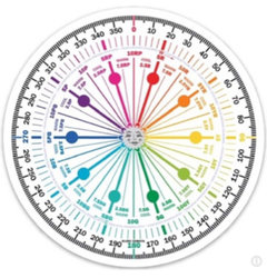
    But detailed attributes within colours of carpet, tile, wood, paint etc can actually be objectively measured and placed within identifiable Hue Families.


    This method has been used for the manufacture of all coloured products for a long time. Now it’s possible for the home owner to access too. (With a little time)


    Gathering colour information from a photograph is a poor substitute for being able to measure the actual colour of the material. That being said, it would appear your fabric is made of different tones of green fibres which sit within the mid to end of the Yellow Hue Family on this colour wheel.


    Even keeping it simple, there’s a huge array of paint colours and other products for the home from this Hue Family neighbourhood alone to form interesting companions.


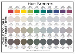
    See the Colorographies at the Land of Color. Com for details of lots of popular paint colours. Note in particular their Hue Families.


    mjconti thanked Marylee H
  • 5 years ago


    mjconti thanked Marylee H
  • 5 years ago

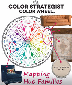
    It’s powerful stuff - knowing to which Hue Family key elements in your space belong!


    It helps you create palettes with reason to harmonise or contrast with those fixed elements and furnishings.


    A monochrome palette? (same Hue Family). A complementary palette? (opposite sides of the wheel), like this one.


    mjconti thanked Marylee H
  • 5 years ago

    Since it's hard to tell a specific hue family on a computer I would take a piece of the fabric to a window and place a piece of white paper next to it and see if that helps. You could also try putting some other fabrics next to it and see if something shows up. Try scarves, pieces of clothing, whatever you have to put next to it. I would use a west window if the sun isn't on it.

    On my computer, it looks grey/brown.

    mjconti thanked ashtonchic
  • 5 years ago

    Thanks very much to both of you for your expertise. I know it's important before proceeding to add more 'color'. I see so many people on this web site having problems choosing paint, etc. with the right undertones. Especially when it's ivory, beige or gray. The fabric on the sofa is confusing to me - it doesn't appear warm and yet it's not cool either. I'll try the 'white paper' and other fabric items to see if that helps. I'm also wondering, is it best to choose lighter or darker shades - instead of mid-range shades like the sofa, so there will be contrast?

  • 5 years ago

    Even if sticking to a monochrome palette, a range of lights and darks, both more saturated and near neutrals, different textures and surfaces all add to more visual interest in a space. 🌈

    mjconti thanked Marylee H
  • 5 years ago

    thanks Marylee. That sounds calming instead of high contrast. Do you think dark blue (almost navy) could work as an accent, along with monochrome light and dark of the sofa fabric? And maybe warm coral or warm green as a 3rd color for accent.

  • 5 years ago

    Or maybe the monochrome palette along with various shades of light & dark blue and nothing else. Now I'm sounding confused (typical !!)

  • 5 years ago

    The colors you use for a contrast should coordinate with other things you have in the room such as a rug, other furniture and your flooring. You can look on Houzz for Living rooms with gray couches and see if there is anything you like.

    mjconti thanked ashtonchic
  • 5 years ago

    These colours form an analogous palette from the Yellow and Yellow-Red Hue Families.


    mjconti thanked Marylee H
  • 5 years ago

    I have a dark blue (almost navy) chair I might use in the room. Plan to replace everything else. Thanks for your suggestion; will search for living rooms with tan or maybe taupe couches. I don't know what else to call the color. This one isn't gray.

  • 5 years ago

    Marylee, you definitely understand color. Looks like you had a lot of art classes, color theory.

  • 5 years ago

    My money is that sofa is from towards the end of the Yellow Hue Family!


    With an ‘almost navy’ chair in the mix, You could work on a complementary palette depending upon your floor.


    🌈

  • 5 years ago

    There is currently light beige carpet - it's old, but I like it. If it's replaced, I still prefer carpet in this living room.

  • 5 years ago

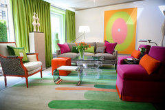
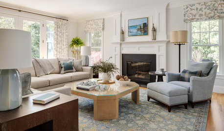
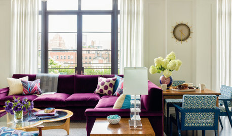
    Here are some rooms with grey couches to get you started.


    Delaware Place · More Info


    Coal Harbour Residence · More Info


    Fringe Design · More Info


    Kips Bay Showhouse · More Info


    mjconti thanked ashtonchic
  • 5 years ago

    Would a dusty coral work for accessories if I include the nearly navy chair? I hesitate to use shades of red - it might be dark and look nautical.

  • 5 years ago

    Just to show how unreliable monitors can be in displaying color - I don't see a bit of yellow tone in your swatch, and would call it fairly neutral but leaning cool. I think that I see black, gray, brown and either greenish or blueish threads in the weave along with the base taupe beige. Say, do you have a magnifying glass to look at it more closely?

    Placing the color that I have undertone questions about on a plain piece of typing paper, in indirect natural light, and away from other colors, has usually worked for me.

    Based on how it looks to me, the navy should look great with it, but probably not coral.

    mjconti thanked raee_gw zone 5b-6a Ohio
  • 5 years ago

    Using a magnifying glass is a wonderful idea! Thank you. I just unzipped one of the seat cushions to see what the underside of the fabric looks like - that didn't help. The underside is exactly the same as the front. The threads are all the same color. The weave makes it look like there's more than one color. I wish I'd have chosen a lighter, warmer colored fabric. What colors do you suggest for a 3rd color if using the navy chair or chairs- traditional interior. Like the style of these 2 rooms.

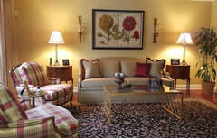
    Traditional Living Room · More Info


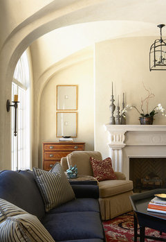
    Merilane Avenue Residence 2 Living Room 2 · More Info

  • 5 years ago

    I always described the color of the couch as 'cardboard'. Did the magnifying exam suggested by raee and also pulled one thread from the fabric on the inside of a cushion. The fabric and the single thread DO have golden undertones and also appears to be on the yellow-red spectrum as Marylee suggested. So both of you are on the right track for sure. I am so surprised because it always appeared to have red undertones. If any of you have time, I'd appreciate what 3rd color might look nice to add to the room & ... warm red, burgundy red, any greens so that the room isn't alll tan, beige, & blues.

  • 5 years ago

    There are lot's of discussions here on Houzz and other websites that talk about choosing colors. Check Emily Henderson's site. Or experiment and see what appeals to you!

    mjconti thanked ashtonchic
  • 5 years ago

    Thanks for your helpful suggestions. I need a 3rd color (at least for accent), so the overall room isn't just beiges and navy and look like a man's den. I've had this couch for THREE years, and still in this limbo state of color. There's a formal dining room next to the living room - and guess what, the dining room is entirely beige - floor, walls, even the upholstered chair seats.. So you can see I'm afraid of color, yet desperately need some.

  • 5 years ago
    last modified: 5 years ago

    I think that I would just avoid jewel tones. If the fabric truly is a golden tan/beige, you can try the coral, or at least a soft pink. Pale green should look nice and fresh; soft red looks good with an amazing number of colors; you can also bring in a small variety of blues and/or blue greens or turquoise blues. Even plum or eggplant. How about a floral pillow with several of those colors, and artwork as well?

    Do you have a fabric store nearby? go and get some swatches. Even setting paint chips from the paint store on it can help you know if a color you like works with the sofa.


    Just go to the paint store and start pulling colors that simply appeal to you, without thinking about if they would work, or would they be a mistake (your color fear) or what someone else might think of it.

    mjconti thanked raee_gw zone 5b-6a Ohio
  • PRO
    5 years ago
    last modified: 5 years ago

    Here are some extra colors for you.

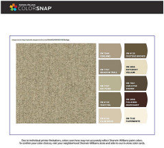
    There are colors snap from your fabric. It is more gold i would say, it is a medium light shade of yellow.


    Compliment color is blue. As Meadow Phlox by Behr or Blue Viola BM


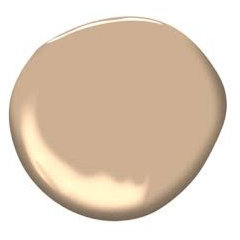
    Analogous colors are Raleigh Tan BM


    and Easy Green SW


    mjconti thanked Celery. Visualization, Rendering images
  • 5 years ago

    Here are some more ideas


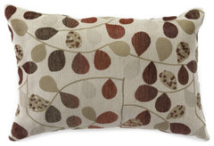
    Bayberry Rouge Jacquard Lumbar Throw Pillow | Big Lots · More Info


    Colors That Go With Beige · More Info


    mjconti thanked ashtonchic
  • 5 years ago

    Appreciate everyone's input. glad to have an OHIO person responding too (yep, that's where I am too). Thanks for jumping in, Celery & for the colorsnap (very cool). I often follow along & enjoy your comments when you advise other people. I have a lot of paint charts and have already looked at many of those to see what looks good with the couch! I miss going to the fabric store because of the virus. I sew valances, pillow covers, table runners (yep, and masks). I've been looking at fabric on line to possibly make throw pillow covers - seen some nice ones from P. Kaufmann, maybe Waverly - but hesitate to order. It can't be returned! Light, warm blue seems to look good with the couch, and I think the green Celery posted would too. I've always loved green. And shades of red (but not true red). Any gold shades might clash with the couch.

Sponsored
Michael & Son Remodeling
Average rating: 5 out of 5 stars3 Reviews
Industry Leading General Contractors in the DMV area!