Software
Houzz Logo Print
weedyacres

Kitchen design...color coordination

5 years ago

Floors are existing, new cabinets are installed, counters are ordered, and I'm down to selection of backsplash and bar stools.


Here's what I've got:


The backsplash tile actually has some variation between tiles as to where the horizontal band is. And here's the bar stool I'm looking at (both are snips from the website listings):


I was going for neutral cabinets/counters, with the BS and chairs being the pops of color.


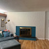
To add one more thing: This kitchen is in a 29'x32' great room, so it needs to coordinate with the LR furniture. I'm torn between "blue goes with blue" and "enough blue already; pick a different color to pop." Here's the LR. I purposely didn't include much of the kitchen because it's in a stage of remodeling disarray, LOL, but you can see where it is relative to the LR. Wide stinking open.


Comments (41)

  • 5 years ago

    Enough blue already, and blue is my favorite color. Looks like your furniture is blue and beige, pick a pop color that you like and will go with your existing furniture and use that on the stools. I would look at shades of red or coral. Once you have picked a color use pillows and other accessories to pull the color into other areas of the room.

  • 5 years ago

    You can use it for the backsplash, but do something else for the chairs.

  • 5 years ago

    I'd go with texture/pattern/design over color in the backsplash.

  • 5 years ago
    last modified: 5 years ago

    wait until everything is installed. (or did you already purchase the splash tiles? )

    I'd do something neutral w/texture for the stools. you have enough blue


  • PRO
    5 years ago

    I think I would add some white or cream to add interest along with textures.

  • 5 years ago

    Agree. The tile is sooo pretty. But the stools aren’t necessary. Go with something more natural. Not leather.

  • 5 years ago

    OK, sounds like I need to listen to my "enough blue already" voice.


    Here are some options in red. Do any of them work?


  • 5 years ago

    I was also considering a green tile, with green bar stools. Too close to blue?


    Hmm, cream/neutral/texture. Will neutral be enough to break up the blue?


    They do need to be comfortable, as Mr. Weedy and I will eat most of our meals at the island. So I like upholstered, with a back.


    Beth, your options look a little too casual, so I'm not sure they match the style we've got going.


    No tile purchased yet, just that sample. And the couches are gray, not cream. Morning light color distortion....

  • 5 years ago

    The green tile will definitely break up the “too blue” theme. Buy the stools after the kitchen is done. Then you’ll be better able to see what will look best. That’s not a decision that needs to be made now.

  • PRO
    5 years ago

    I understand waiting on the other hand, shipping times have gotten really long. I love swivel bar stools since you can get in and out so much easier and you don’t have to slide legs on flooring possibly messing floors up. This one is from Ballards and is good quality. Would blend nicely with all your finished. I wouldn’t add reds because it defeats your main color pallet.

  • 5 years ago

    Try to vary your fabric choices a little more...as well as color...no more velvet...no more blue...try for more textures as suggested in the stool ideas...maybe a fuller picture of the kitchen area would help...perhaps the next challenge will be window treatments...as you appear to have lots of natural light and great windows...

  • 5 years ago

    Another thing you have plenty of ...is seating with curved ..rounded backs...contrast is a very important feature of design...makes everything look more interesting

  • 5 years ago

    Love the backsplash. Since your couch is gray, I would look at doing gray barstools.

  • 5 years ago

    LOVE FLOS STOOL IDEA! beautiful!!

  • 5 years ago

    the four blue swivel chairs you have /w round coffee table is a nice conversation/social hour set up. i'd push that over to window area under the ceiling fan. people can take snacks and feel comfortable there. the two smaller cream couches and chairs in pattern would be nicer out in the middle floor space w beautiful are rug under. you can form an L w couches and then the one chair...........bring in a touch of green in a rug and then soft green backsplash if you don't want neutral backsplash. . the lighter feel of those pieces will be better if positioned differently...they are shoved off and can't appreciate them. Maybe one of those patterned chairs is enough if you have a bedroom to place the second. How many stools will there be?

  • 5 years ago

    Here's a better pic of the LR furniture. I plan to refinish the coffee table to a darker stain.


    And here's our under-construction-temporary-setup kitchen (wince).


  • 5 years ago

    I'm not sure that white or light wood barstools would work with all this, would they? I don't particularly care for rattan or wicker.


    Here are some comfy-looking swivel stools in cream or gray...do any have enough "texture" or contrast to mesh well with the rest of the room?


  • PRO
    5 years ago

    You have enough dark items. Flooring, cabinets so you need some lighter contrast. Creams or off whites. I know you are in state of disarray but I too would switch barrel chairs arrangement with sofas. In addition, it feels like too much large furniture for the space?

  • 5 years ago
    last modified: 5 years ago

    if you leave the rectangular coffee table by the window and place blue swivel chairs there..two on a side....facing across the table at each other..... the wood tone being a bit lighter will pop and make the blue seem a little prettier esp w light from window. i wouldn't stain anything darker. put a dark brown runner on it if you want to see the difference.....blues can look really nice w lighter wood tones ....but of course/ with Norse I'm biased.

  • 5 years ago

    I think with your darker toned cabinets and floors a lighter toned backsplash tile that is color matched with your countertop would be ideal. See if the blue tile you like comes in a color that coordinates with your countertop. Even a simple subway tile in a modern longer version could work as well to keep it simple and classic, plus allow you to paint walls or keep the paint color you have w/o clashing. I think I would scale back your furniture to one sofa under the window (by ceiling fan) with flower chairs on either side and tables/lamps on side tables and leave only 4 chairs round table where they are if that serves your entertaining needs. A bar height table and four stools in that area could serve as casual dining as well and may be more functional than 2 sitting areas in one room. Depends on your needs, but too much furniture as it is right now.

  • 5 years ago

    I’ve been following your progress! Can you remind me what type of cabinetry you ordered? It’s coming along nicely!

  • 5 years ago
    last modified: 5 years ago

    Cabinets are Medallion with Eagle Rock finish. They are more of a medium brown, but our kitchen lighting isn't in yet, and I'm not a great photographer, so it looks darker in the pics.

    I always find it interesting that Houzz threads often turn to advice unrelated to the original question. I welcome the input on the furniture layout, in fact I posted a while back asking for help with the great room layout and got very little response. LOL, go figure. I'll take it now!

    The LR space is huge: 32' long including the entry (need some help figuring out how to define that too), and takes up about half of the 29' width. Before I bought the blue chairs the extra empty space looked weird, so it definitely needs to be filled up. And on Sundays we tend to have large groups over for lunch after church (5-12 people), so all that seating is needed. (On hold currently due to COVID, but will resume.)

    I agree that the flowered chairs are now a bit awkward to get around with the blue chairs added. I'll play with that a bit. Also, the couches are squished together a bit more than they will be after the kitchen is done, just to keep room to move in the under-construction space.

    The couch area footprint is larger than the blue chair footprint, which is why I put the couches in the area by the window that has the alcove. If I swap it with the blue chairs, it will stick too far into the rest of the space.

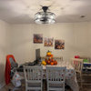
    I should probably post a photo of the whole space, showing the DR as well.

  • 5 years ago

    OK, here's the view of the entire space, from the front door. Again, forgive the mess.


    I took out both flower chairs but there was too much bare space, so I put just one back, on either end of the couches. It definitely takes care of the congestion issue. How does it look to your eyes?


  • 5 years ago

    The kitchen looks great!! Love how it’s turning out. I would try to add a rug under the DR table and in the living room space. Great rooms need the devision. It’s very hard to fully picture a space when there’s so much going on. ( a Reno and all the furniture lol ) I would wait for the kitchen to be complete. And then I’d remove everything and start over. I don’t necessarily think it’s too much I just don’t feel like it’s laid out properly.

    weedyacres thanked HU-187528210
  • 5 years ago

    Do you plan to leave the walls blue? IMO that is the main contributor to the "too much blue" feel (and I have a similar color blue on my bedroom walls, so I don't think it's prejudice against blue walls!). I think if you change the wall color to a warm cream color or even a pale taupe/greige, you would be able to have a lot more fun with colorful accents. I love vicki's suggestion of corals/reds - we have oranges/salmon paired with navy in our LR (against greige walls) and deep red paired with light blue in our bedroom and I love both.

    weedyacres thanked biondanonima (Zone 7a Hudson Valley)
  • 5 years ago

    Thank you for pointing out your entertaining needs, that helps a lot. This is a great room indeed. I think having your couches face each other creates a linear look that just makes this long room look even longer, and typically this style arrangement is centered on a fireplace. Right now our eyes are following the lines of your furniture to a single chair, it's not balanced. Your furniture is placed sideways in other words. Try a U shape with a sofa under your window, sofa on the wall where it is but moved a few feet down, and chairs opposite (on kitchen side). Flank the sofa under the window with your side tables (creates symmetry) and now this area is your focal point when you walk into the room facing the front of furniture, not the sides. Add lamps, curtains with maybe a natural fiber shade above (add just shades to other windows), and definitely area rugs to soften the seating areas. Almost everyone can see each other even if they are at the dining table, and the kitchen is not as blocked off as it is with the back of a sofa. A console table or small chest (not tall) by your entry and maybe a place for your one blue chair to the side so people have a place to sit to put on shoes, and ready to pull in if you need one more chair.

  • PRO
    5 years ago

    Can you post a drawing with measurements of the whole space. Then I could develop a good space plan for you. I am confident this space can look a lot better! Use black ink so numbers can be when posted. I can give you a good scale drawing.

  • PRO
    5 years ago

    Can be “seen”. Thanks.

  • 5 years ago

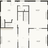
    Here's a drawing of the whole space that I made a while back. Sorry it's in pencil. If I need to find it and re-trace in black, let me know.


    I'd prefer not to re-paint the walls. That color (intention had been a bluish gray, but it ended up looking more grayish blue on the walls/in the light) is in the great room, hall, and den, and a lighter shade on the card in the mudroom. I'd like to work with it if I can.

  • 5 years ago

    I took HU's suggestion and wow, it really opens it up! I had thought that the couch with its back towards the kitchen created a visual room division, but I really like this feel.


  • 5 years ago

    Thanks for trying this! It looks great! Has a much better feel as well. Just a few tweaks, like trying to get as much of the couch under the window as centered as you can, hanging drapes behind it should help hide that, looks like you may have 5-6" to get closer to the other sofa. The arms of the sofa and chairs should not overlap so moving the chairs as well closer to the kitchen as well. I think you may have room to bring the sofa on the blank wall a little closer towards the entry and think of that wall that juts out as the end of that seating area. The side table's should be about 3" away from your sofa and just a tad to high to put where it is. It will match and be the same height on the left side of the sofa and fill in that wall space as well. I think a larger square coffee table will look better for this arrangement. Table should be a little more than 1/2 the length of the sofa and leave 18" between sofa and table for leg room or more. You could do a square ottoman with a tray on top for beverages as well, should function for how you'll use it the most though.

    weedyacres thanked HU-786049761
  • PRO
    5 years ago

    Here is my suggestion for layout of your spaces. I followed your drawing as best I could but measurements were off a little bit but this should be pretty close. This arrangement creates more open seating areas and better utilized the spaces. If you do counter stools at 24” wide 3 would be best. I can’t tell if you will have countertop overlapping for chairs to fit under? I created a “entry” area with long narrow entry table. You could butt two shorter ones together too as an option. I added a floor lamp at end of sofa (I guessed sofas were about 84-86” long and 40” deep) but this layout could handle longer sofas. I added round glass top square coffee table to ease the heavy furnishings. And a glass top 32” round end table. I added small table or buffet in niche along with a pair of lamps and green plant. I put a pair of lamps on the entry table as well. I also added small bench in front of big window for extra seating and to be able to view outside or turn for conversation.

    weedyacres thanked Flo Mangan
  • PRO
    5 years ago

    I allowed for good “transportation” (walking space) into and around the seating. That is key too.

  • 5 years ago
    last modified: 5 years ago

    Thanks, Flo! But it seems like your proposed arrangement creates a barrier in the entryway, making it feel closed in. Guests would have to walk all the way around to the kitchen side in order to enter the living room area.

    I do like the larger square coffee table with the couches in that L shape.


    P.S. The island is 4x10 with one 24" cabinet on the seating side on the far right. I planned for seating along the 8' remaining plus one "around the corner."

  • PRO
    5 years ago

    In open spaces, we “create” areas by furniture placement. Generally speaking, guests gravitate to kitchen islands. Then to seating areas so this arrangement allows for that progression. All your furnishings so far are about the same height so it will feel very open. If you wanted guests to get to seating right away, eliminate round table and push second sofa away for entry between sofas. You might want to test out once you get things more complete. Everyone is different so obviously you have options. Enjoy!

  • 5 years ago

    Haven’t read thru all comments again ....but it looks like area rugs would add a lot to the definition of each area...and another plus may be to place the couch at an angle somewhere...to eliminate the “ all in a row “ feel of all the square groupings

  • 5 years ago

    The island lining up with the dining table adds to the square and “all in a row” feel as well...would it fit in couch corner vertical to island?

  • 5 years ago

    LOL, the PO had the dining room there, which left 2 small truncated living spaces, one to the right of the entry and one where the DR is now. It looked very awkward, so we swapped them.


    If the front door was in the center of the long wall, then it would have worked ok, but not the entry on the far left.


    These are the "before" views, from hallway and front door.


  • 5 years ago
    last modified: 5 years ago

    I wanted to update on this. We got the counters in, and the backsplash tile promptly went out of stock. It was just for a week, then a month, and now it's bumped out to June. Sigh....

    In the meantime, I was browsing for what contrasting colors would go well with blue for the bar stools. I came across something that resonated with me: mustard yellow. I started shopping, and found some on Overstock that were so dirt cheap, if bought that day, that it wouldn't matter if I hated them. So I made an impulse buy.

    Here's a shot where you can see the kitchen with the blue in the adjoining room. What think you?


    So we've got contrast in color, shape (triangles), and materials. I'm not a huge fan of fake leather, but with our Sunday kids climbing all over them, it's practical. And they love the height adjustability. :-)

  • 5 years ago

    they’re cute! I’m sure the kids are loving them.