Software
Houzz Logo Print
lwfromny

Yup, another paint color question!

5 years ago
Sorry got being another person asking about paint! I tried to find answer by searching old discussions with no luck. So here goes.

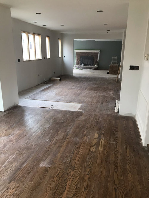
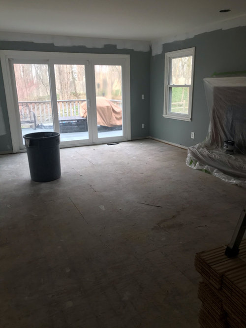
I am remodeling a family room/dining room/kitchen area. Imagine a ā€œZā€ with the long part straight up and down. The tip of the Z if the family room. The middle of the Z is the kitchen and dining room/eating area. The bottom of the Z is the living room. All areas are open t the adjoins areas, so they all need the same paint, except possibly the living room, but I’m inclined to make it the same color as the rest.

The kitchen is in the middle and will have almost no wall color. The backsplash is a blue/green subway tile. The cabinetry and all of the trim in the house is BM White Dove. Most of the light comes from the north, with some from the west and one window to the east, and the house is surrounded by woods, so the light isn’t usually bright. The floors are a medium tone oak, with no red,
pink or orange-y color. The countertop is Mont Rhapsody, which is a warm marble looking quartz with grays and browns in it.

I need help with a wall color. I don’t want it to look pure gray, but I’m open to a hint of gray. I’ve looked at enough colors to know I want an LRV of about 70-75, and I need something that makes the White Dove look white, not yellow-y. I know White Dove is never going to be the most crisp white, but I want to get as close as I can. The problem seems to be that I want a very light color, but as I go lighter the White Dove looks more yellow. The colors that have looked good in my house with White Dove (Old Navy, Winterwood, Seattle Gray, Revere Pewter, Comfort Gray, Greyhound, and Dark Teal) all have lower LRV. I do have Gray Owl in the upstairs, which looks awesome on the north side of the house but I really dislike it on the South - it turns green and muddy there.

I’m debating just using White Dove on the walls, but I’m concerned that the lack of good, bright natural light will make it look dull if I use it as pretty much a whole house color.

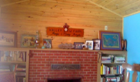
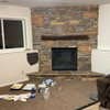
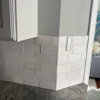
In the photos below, the area with the fireplace is the fam room, the middle section with the windows is the kitchen (there will be no upper cabinets on this wall, and the opposite side of the kitchen will have cabinetry from the floor to the ceiling), and the room with the wainscoting is the dining area. The living room is off the dining room but I don’t have pictures of that.

Comments (12)

  • 5 years ago

    Sorry for the the giant post all in one paragraph - I hate that the app does that if you use the phone to post something. Also, I neglected to mention that the fireplace brick will be painted White Dove also, so the red brick is not a factor in the wall color choice.

  • PRO
    5 years ago
    last modified: 5 years ago

    Don’t use White Dove on the walls with North light. I will look dirty, as there is so much cold blue/gray coming in the windows.

    Consider Linen White. It is one of my all time favorites. I love it for trim and walls. It will present well with all your white cabinets and trim. Throw in Palladian Blue somewhere.


  • 5 years ago
    last modified: 5 years ago

    I actually used white dove and ended up painting over it w/Simply White. the whtie dove looked so dingy.

    seems like White Dove is the issue. why not bite the bullet and do a diff white? not the cabs, just the trim. I know it's a pain, but you're asking for something specific so as not to make white dove appear yellow.

    Although, Maybe Pale Oak would work. have you tried it?


    they're paired together in this pic


    try this one. it's more of a neutral gray, but very light.


    maybe Lacey Pearl?


  • 5 years ago


    These 2 colours have more Chroma than White Dove, meaning they are more colourful.

    So White Dove will be more neutral by comparison.

  • 5 years ago

    @JudyG thank you. That’s exactly what I was afraid of if I painted the walls white. Will the Linen White look good against all the Whitr Dove?

    I do love Palladian Blue - I have a mud room and powder room nearby that will need to be painted and the mudroom has White Dove board and batten about 2/3 of the way up the walls. I was thinking of Gray Cashmere for those areas, but I’ll look at Palladian Blue also!

  • 5 years ago

    @Beth that first picture is exactly the amount of contrast I want. I’ve seen several photos of Pale Oak that look like that, but they all have better light than I do. Pale Oak is something I’m considering but I think it’s leaning pink in my rooms. I haven’t given up yet - I just put the chips up today and I need to watch it for a while longer to see if there really is pink showing up.

    Was the White Dove you painted over on your walls or trim? I’m in the ā€œscared I made the wrong decisionā€ stage of the remodel and am worried about the White Dove cabinets. It’s a LOT of White Dove so if it’s bad I’m sunk. But it was what seemed to look best against the counter sample. The trouble is that I had to pick it when the light was different from what it will be in the end. White Dress be has always been my go-to white in this house and has been beautiful but the light has changed a lot during the remodel so now I’m less sure. You are correct that I could easily change all the trim if I wanted to - I just don’t want it to look different from all the White Dove in the front of the house. Is Simply White what you would recommend I consider, or something else?

    I have about 30 chips of various colors up on the wainscoting now so I can see them all against White Dove. You can see them in the distance of the picture up top. I actually have three chips of every color taped together to make a bigger sample. I know this is WAY too many, but I’m having a lot of trouble figuring out which ones to rule out and which ones I like best so I don’t know how to start eliminating colors. I do have chips of Calm that are not up there but I will put them up. I don’t have Lacey pearl but I have a fan deck so I’ll check it tomorrow when it’s light. I do like that one - I don’t know how I missed it.

  • 5 years ago
    last modified: 5 years ago

    well, it seems like you've tried just about everything! You're probably on overload. pick a few favorites, remove all the others, and start fresh w/just those. then pick one.

    when I did White dove I did my walls. my room has south/west light, but not a lot of it. it was horrible. I painted Simply white on the walls and also did the trim w/it. Some say it pulls yellow, but not in my room! it's the perfect white.


  • 5 years ago

    @Marylee H it’s interesting that you chose those two. My process has been to find colors in the fan deck that look most promising, then go to the store and get three strips with each color. Then I cut them out, taped the three of each color together, and hung them on the White Dove wainscoting to start to narrow the field. Nature’s Essential was the color I most wanted to see from the fan deck stage, and somehow I didn’t get those chips! I was so bummed when I got home yesterday and didn’t have them! So I went back to the store and just got home from picking them up and found your post lol. I don’t have Fog Mist on the wall but I do have a color from that same strip so I know I must have it in the pile of cut strips. I’ll hang them both tomorrow. There’s no lighting at all in that part of the house yet, so I can’t see any of the colors in artificial light. Which makes this even harder šŸ¤¦šŸ»ā€ā™€ļø. Thank you for the input!

  • 5 years ago

    @Beth H I think you’re right. I’m not really seeing any favorites but I think I just need to take a bunch down and look at fewer at a time. The problem is I have to move out on Monday for three weeks while the floors are all re-done, and won’t be able to come back in the house for most of that time. They will need my paint colors pretty soon after the floors are finished, so I had hoped to get it down to three or four (tops) colors by tomorrow night.

    Generally speaking, what colors or undertones will help the white be whiter? I suspect one of the problems is that I have a lot of chips that ar leaning green/yellow, and that’s making the white look more yellow. Am I correct that that’s the effect the green/yellow will have? I don’t want a pink or purple undertone.

  • 5 years ago
    last modified: 5 years ago

    I think by using something in the green/yellow, you'll just accentuate the yellow that's there. I don't know if anything is going to make it look 'whiter'.

    what if you paint the walls with it?

    to me white dove and those other two lean taupe. which is fine, but taupe has pinker undertones and can lean yellow as well.

    You want it to look brighter? paint the walls a deep dark color! navy, black. then it will look brighter!

    what's wrong w/this blue? it looks white in these picks. go for a lighter shade of blue

    Paint the ceiling a bright white. like, out-of the can white

  • 5 years ago

    The white on the ceiling in that picture is primer. But the white on the window trim is White Dove. It really does look white currently - you can tell best in the picture below. Both the pantry closet and the wainscoting are White Dove and they look white compared to the colors there now. The gray bordering the pantry is Seattle Mist and the gray above the wainscoting is Revere Pewter (these used to be separate rooms). But when I put those samples on the wainscoting a lot of them made the white look yellow.

    I really want to switch to a lighter wall color to make the rooms feel lighter and brighter. I do love a dark color but it’s just not what I want for this space. It helps to know the green/yellow shades are a poor choice - there are several of those in the mix, so I’ll eliminate those first. I do really like the Calm - I went and looked at the fan deck and it’s a really nice color. Tomorrow morning in the light I’ll take down all the green/yellows, put up the new suggested colors, and narrow down more and let you know how it goes. I still have hope for the Pale Oak. Thank you for the advice - it helps a lot 😊.

  • 5 years ago

    I’ve narrowed things down quite a bit. Still have too many in the running (about 8) but I’m getting there. One that I keep feeling drawn to is White Drifts OC-138. When I see pictures of it online it seems to have a hint of green but so far I don’t see that in my house. But it’s hard to know for sure bc I only have the natural light, which is dim. In reality, I will never use these rooms without light fixtures on, but I have to pick paint before all the fixtures are in. Do any of you have any experience with White Drifts? I worry there are undertones I’m not seeing.