Software
Houzz Logo Print
cdnmiss

BM Boothbay Gray for kitchen walls? Is this a thing?

5 years ago

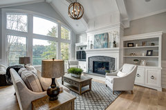
I have seen this color used a lot in doors and cabinetry but not a lot on kitchen walls. I recently installed black slate tile and white cabinetry and saw a pic of a mudroom with this color and the slate. Looks lovely!

Wondering if this may not be a great choice for kitchen walls though. Its a lot stronger color on the sample than the current Stonington Gray I have now.

Is it more bedroomy than kitcheny?


Help!

Melissa

Comments (32)

  • 5 years ago

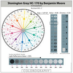
    Does Stonington Gray look blue in your space? It actually belongs to the Green-Yellow Hue Family, but in certain imbalanced lighting it can appear blue.


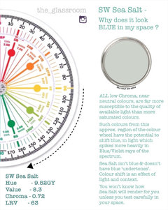
    It isn’t blue and doesn’t have blue ‘undertones‘ it’s an effect if lighting & context if it shifts colour in a room


    Boothbay Gray by comparison, belongs to the Blue-Green Hue Family.


    They have almost the same quantity of Chroma (colourfulness) but Boothbay Gray is a few points darker in Value.


    I wouldn’t be put-off Boothbay Gray if it works with your other finishes e.g., flooring, worktops etc and your lighting can support it.


    🌈

    cdnmiss thanked Marylee H
  • 5 years ago

    Marylee Stonington looks pure gray in the space. I used Coventry Gray in the laundry room and wished I had continued it into kitchen.

    I am hoping to change it up a bit in this remodel. The floors went from that orangey oak to black slate tile.


  • 5 years ago

    What do you prefer about Coventry Gray to to Stonington?


    (Just note that Boothbay could show more of its inherent blue-greenness depending upon the light.)


    But if Stonington doesn’t show blue for you, it must be pretty well balanced, lighting wise.

    cdnmiss thanked Marylee H
  • 5 years ago

    I think it was just a bit more color to contrast all the white. Stonington with all the windows and light looked a bit pale and cold in comparison. But now with different white cabinets and slate floors I wanted a change.

  • 5 years ago


  • 5 years ago

    Marylee would you have any other suggestions? I have black MSI slate floor, Weybourne Cambria counters, white cabinets (looks closest to BM White). Next room is Revere Pewter so looking for something that goes nicely with it,

    Funny how gray Boothbay gray looks above!

  • 5 years ago

    I don’t want to put you off your choice! I think it’s a lovely colour.

    No matter how good the device, screen colours aren’t the same as real life colours.

    (Are you surprised it appears so blueish on screen?)


    It’s just that if you know to which Hue Family a colour (especially a near neutral) belongs, it can make you more aware of possible attributes which may show-up.

  • 5 years ago

    All the colors above seem more blueish in my house. But maybe it was the orangey wood floor that made them look that way.

  • 5 years ago
    last modified: 5 years ago

    The orange may exacerbate it but it’s their low Chroma and Hue Family locations which make them shift. See below.

    Stonington as mentioned above (colour shift)

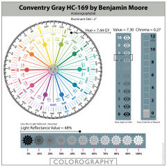
    Coventry Gray - same reason. (Colour shift)

    Boothbay Gray - Hue Family includes blue. It’s part of its inherent DNA


  • 5 years ago

    Hi Marylee..still working on the color. The Boothbay Gray looks like A LOT of color on my walls. I may try to cut by 50% and see if that works better.

    I found a sample of SW Passive and like that too. Some pictures it seems cool blue and others more warm and greenish. Confusing!

    Thoughts?

  • 5 years ago
    last modified: 5 years ago

    You are drawn to chameleon colours!


    Passive is lovely - but uber variable! (low Chroma issue again)


    Ideally try it on board against each wall the room.


    Your descriptions are both accurate.


    In certain light situations it will look warm and greenish. (Green-Yellow Hue Family)


    In other light it can appear positively blue!


    You aren’t going to know how it will appear for you unless you test in your space with your available light.


    Contemporary Coastal New Home · More Info


    This beautiful room has Passive on BOTH walls! Isn’t it FAB!

    (But you kind of need to know if that’s going to happen.)

  • 5 years ago
    last modified: 5 years ago

    Boothbay Gray by 50%? Is a big gamble that you will get what you hope for.


    Can you identify what you are trying to achieve?


    Lighter but same Chroma?

    Lighter and more neutral?


    Or are you you trying to lessen blueness?


    🌈

  • 5 years ago

    I wish I could figure out what I am trying to achieve LOL!

    The Stonington I have now always seemed a little cold in the space with tons of light and white trim and now with new black slate tile I believe will feel really chilly. However I am hesitant to go too warm a gray with all the white and black I have going on. I am using Cambria Weybourne counters so staying in that white and cool gray family.

    I want to stay away from anything too blue that screams baby's room but want it to feel not so cold. The adjoining room is Revere Pewter.

    Maybe I am looking for a paint unicorn haha...


  • 5 years ago

    What about moving a little further back into the Yellow-Hue Family,,,


  • 5 years ago


  • 5 years ago


    cdnmiss thanked Marylee H
  • 5 years ago

    Too me they seem very warm for my black slate floor. The suggestion from Cambria is BM Graytint which I've used in another house and loved it. Might try that? I kind of like Passive too.


    Ugh! Wish I didn't care so much about the right shade.

  • 5 years ago

    I think you need to pull at least one of those, to make a meaningful comparison to the colours which shift to blue for you.


    I like Passive too but defo needs testing.


    Graytint is in the Green Hue Family and may shift blue in imbalanced lighting.


    🌈

  • 5 years ago

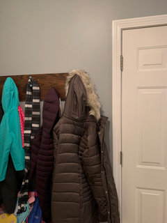
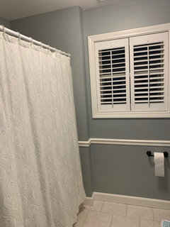
    I’ve had Boothbay Gray in a mudroom, office, bedroom, and bathroom for 10 years now. I still love it. Definitely is blue, but not baby blue. I have it paired with green, pink, or brown in the various rooms, with black doorknobs, etc. The mudroom is adjacent to the kitchen and I would have had it in my kitchen, but I wanted it to match my island and didn’t want to pay for a custom island color, so I went darker blue. I encourage you to get a sample. I think it would be great with slate.

    cdnmiss thanked emilyam819
  • 5 years ago

    Hi Emily,


    Is there any chance you would have a picture of your mudroom? I have the sample on my wall but it looks really dark and much different than the photos online. I think that's where I get confused by this color.


    Thanks!

  • 5 years ago

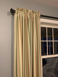
    Dark out now. But here it is in office...

  • 5 years ago

    Mudroom (messy)

  • 5 years ago

    Bathroom

    cdnmiss thanked emilyam819
  • 5 years ago

    Definitely blue. I remember thinking it looked dark next to white as I painted it. But so nice.

    cdnmiss thanked emilyam819
  • 5 years ago

    Wow it looks gorgeous in your house. Funny how it reads different in each room!

  • 5 years ago

    Thanks!

  • 5 years ago


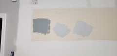
    This is how its going in my kitchen LOL Far left is Stonington Gray (current color) next is Boothbay Gray..then Gray Owl..then SW Passive. See how much color it seems?

  • 5 years ago

    An update..I chose Benjamin Moore Paper White and love it! Thanks for all your help :)

  • 4 years ago

    Hi! cdnmiss. Could you post a picture of paper white in your house? also, what exposure does your house get?

  • 4 years ago

    Hi, I am out of town currently and can post when I return. It's really stunning, with just the right amount of gray. The back of our house that the kitchen area faces is west.

  • 4 years ago

    I would love to see a picture of tbe white paper as well! i am really struggling to find a paint that works! i have a very open floor plan so the color I chooae will go in all the rooms. The lighting varies SO much, that everywhere I paint a swatch on the wall, it looks a different color! i have Stone Harbor as an accent wall and wouks like to keep it or something similar as I really like it. My biggest challenge

    is not just our lighting, but working with honey oak cabinets and trim as well! Any suggestions would be appreciated!!! The paper white may be just what I need! Thank you!!

Sponsored
Schlabach Woodworks
Average rating: 5 out of 5 stars21 Reviews
Franklin County's Reclaimed Wood Professionals