

Dining Room Wallpaper
5 years ago
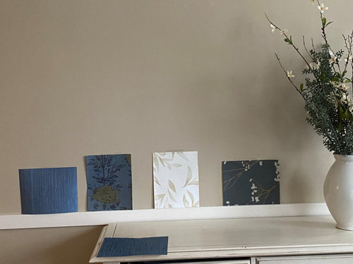
Featured Answer
Sort by:Oldest
Comments (24)
 5 years ago
 5 years ago
Related Professionals
Elizabeth City Bathroom Remodelers · La Crosse Bathroom Remodelers · Washington Kitchen & Bathroom Designers · Indianapolis Kitchen & Bathroom Designers · Cambridge Kitchen & Bathroom Designers · Wilmington Kitchen & Bathroom Designers · Frederick Interior Designers & Decorators · Ogden Interior Designers & Decorators · McComb Kitchen & Bathroom Designers · Webster Kitchen & Bathroom Designers · Rome Furniture & Accessories · Grand Junction Furniture & Accessories · Kennewick Furniture & Accessories · Guymon Interior Designers & Decorators · Shreveport Kitchen & Bathroom Designers 5 years ago
- 5 years ago
- 5 years ago
- 5 years ago
 5 years ago
 5 years agolast modified: 5 years ago
- 5 years ago
- 5 years ago
- 5 years ago
- 5 years ago
- 5 years ago
- 5 years ago
- PRO5 years ago
- 5 years ago
- 5 years ago
 PRO5 years ago
- 5 years ago
- 5 years ago
 PRO5 years ago
- 5 years ago
 5 years ago



Related Stories
DINING ROOMSExpert Talk: Treat the Eyes to Dining Room Wallpaper
For a visual feast and plentiful servings of style in the dining room, pro designers show how wallpaper fits the bill
Full Story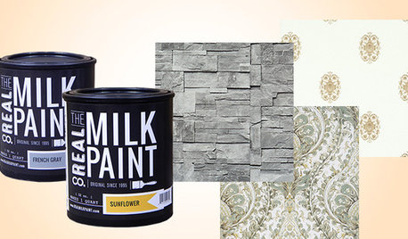
SHOP HOUZZShop Houzz: Save on Chic Wallpaper and Paint
Up to 30% off wallpaper and paint that will give your dining room or kitchen a fresh start
Full Story0
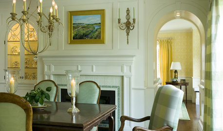
DINING ROOMSGraceful Decorations for Traditional Dining Room Walls
Let the elegant artistry of oil paintings, classic prints and wallpaper enhance your dining room — and your entire dining experience
Full Story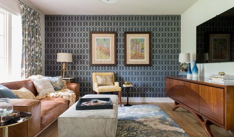
ROOM OF THE DAYRoom of the Day: Geometric Wallpaper Pulls Together Midcentury Style
Slate blues and lots of pattern balance the warm midcentury wood tones in this Austin, Texas, home
Full Story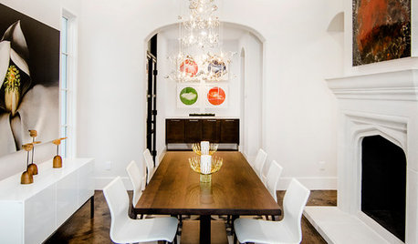
DINING ROOMSNew This Week: Proof the Formal Dining Room Isn’t Dead
Could graphic wallpaper, herringbone-patterned floors, wine cellars and fire features save formal dining rooms from extinction?
Full Story
DECORATING GUIDESHow to Create a Great Dining Room Wall
Shelves, candles, stonework, wallpaper and chalkboard paint make dramatic backdrops for feasts
Full Story
WALL TREATMENTSSource List: 20 Wallpapers That Make the Room
Find out where to get the wallpaper that makes the difference in these popular interiors
Full Story
ROOM OF THE DAYRoom of the Day: New Life for Historic Wallpaper Landscapes
In a Rhode Island mansion, painstaking restoration saves lavish woodblock-printed paper scenes commissioned in the early 1800s
Full Story
MORE ROOMSGuest Picks: 20 Beautiful Wallpapers to Elevate Your Room
Whatever your style, one of these pretty wallcoverings should work for you
Full Story
DECORATING GUIDESTop It Off: Wallpapered Ceilings Take the Eye High
Check out these rooms to see the difference a wallpapered ceiling makes
Full Story
Lisa Phillips