Software
Houzz Logo Print
lindsay_vandriel58

Help with finding palette

5 years ago
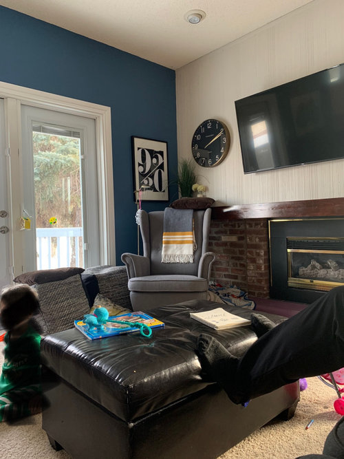
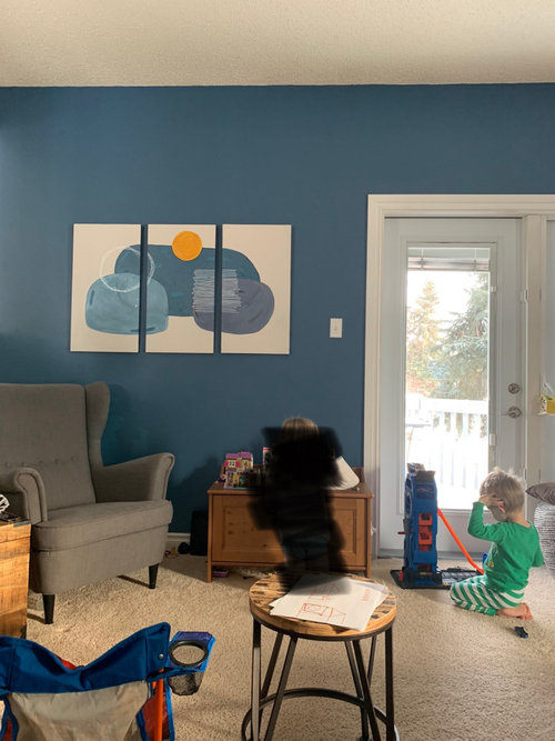
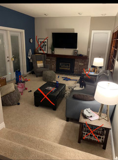
My house was built in the 50s and there are some MCM elements that I love but I wouldn’t say the whole house is MCM (keep that in mind). Also try to ignore the kid mess.

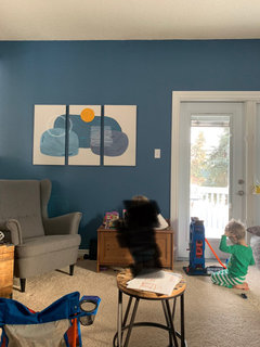
I’m having such a hard time trying to find a palette. The majority of the house is beige so I wanted to add some impact and painted a wall blue. And I hate the color. So I did a painting with the blue in it. And I just don’t think it’s coming together or is looking cohesive. I don’t know what color or pattern I’m missing or if I should paint the wall back and start from scratch. I don’t want this house to look like a stock house but I feel like I’m failing. Any tips whatsoever on decor or palette would be GREATLY appreciated.

Comments (45)

  • 5 years ago

    The blue isn't working because so many elements in the room are dark shades--big TV screen, firebox, leather sofa/ottoman. You could either paint it back and add some pops of orange on throws over the wing chairs, or paint the wall the orange from your art work! If you don't like it, paint it back to the original color.

  • 5 years ago

    Yes that’s probably what’s bothering me!

  • 5 years ago

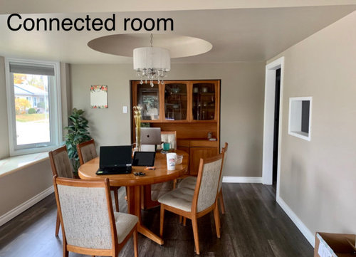
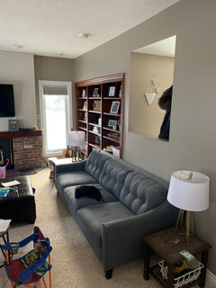
    Here’s another angle from within the room

  • 5 years ago
    last modified: 5 years ago
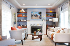
    Contrast makes a room dynamic. Otherwise, all the elements blend together. Here's a room with a blue wall, which contrasts with the light furnishings with multiple pops of orange added to the ix. That's why the bit of blue works.

    Marietta · More Info


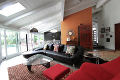
    MCM with orange wall for contrast against that large couch:

    m.a.p. interiors · More Info


    Also consider painting your built-in bookcase white with wallpaper backing in white and orange. It'll look great! Your house is very nice, by the way, even if it doesn't quite yet have some zing you want. It'll get there.

  • PRO
    5 years ago

    I think you picked a beautiful blue! the problem, as I see it, is that the color is "fresh" and it doesn't have anything else in the room that it relates too. I would consider painting the fireplace brick white, that will bring more "lightness" into the room. Next, I would look to see where you can repeat the blue. Look for blue pillows, throws, accessories OR consider painting a furniture piece! Also, try layering the blue/pattern rug over your carpet in front of the fireplace. Carry the blue into the dining room by adding window panels and/or art! Good luck

    Dawn Vee thanked The Best Dressed House
  • 5 years ago

    No advice to share; just wanted to say I like your art. :)

  • 5 years ago

    I love your blue wall and suggest that you need some more of one of the blues in your painting to distribute around the room--pillow, throw, vase, another painting. You might consider also carrying the blue into the dining room with paintings (or fabric wall hangings) on the wall next to the china cabinet.

  • 5 years ago

    I love your artwork.... continue on making some more pieces using the same paints. Add one in the dining room and one in the living room.

  • 5 years ago

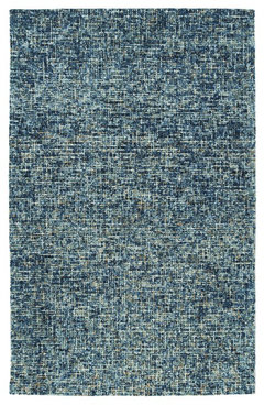
    space-dyed yarns over-tufted on a flat-weave construction, in the most simplistic pattern of checks. Its neutral hue and checkered design, will make any room feel light and lively. High low effect gives depth. Hand-tufted in India, 100% wool. Detailed colors in this rug are Denim, Blue, Copper, Pewter, and Linen.


    Kaleen Lucero Collection Rug, Denim 8'x10' · More Info


  • 5 years ago

    It might feel off because an accent color is usually on a wall that has a focal point like a fireplace or a bed. Its a pretty color. if you decide to keep it, balance needs to be achieved as has been suggested.

    I like the blue and orange palette housegal posted.

  • 5 years ago

    No comment other than I like the blue you painted that wall, I’d repeat it elsewhere.

  • 5 years ago

    If I go with a blue orange palette.. would I have to do that throughout the dining room? Thanks everyone for your wonderful suggestions

  • 5 years ago

    If I changed the blue wall, do you have any paint suggestions?

  • 5 years ago

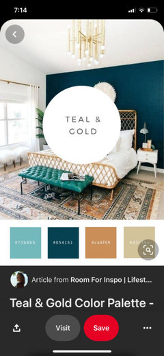
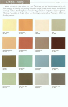
    I’m not a huge orange fan but I found this palette with toned down orange. Do you think this could be an appropriate palette for the house? And I could leave the blue wall? Potentially change the painting somehow. I also have some teal elements from my previous house we moved from within the last year.

  • 5 years ago

    Is it possible to get a photo of the whole room facing the fireplace?

  • 5 years ago

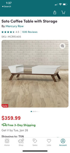
    Here it is before we bought the clock. We are also waiting for delivery of a coffee table. I would like to change out the end tables as well. At some point I think I would need to buy curtains but probably keep them lighter to not close in the room? I find this so incredibly hard. Thanks everyone for your help.

  • 5 years ago

    Pics

  • 5 years ago

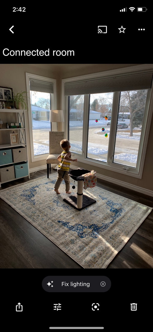
    And then this is the corner you can’t see to the left.

  • 5 years ago

    You’re doing great. I was actually wondering if you’d be interested in replacing the ottoman with something not so dark. I like your palette, but if you don’t love orange, we can find something else.

  • 5 years ago

    You could use gold metallics in place of orange even. I like the golden yellow color in your painting.

  • 5 years ago

    Yes the ottoman will be replaced with the white coffee table. And thanks for the kind words :)

  • 5 years ago

    I actually don’t mind orange as more of the accent color and not a primary color. I think it could work!

  • 5 years ago

    Housegal mentioned painting or wallpapering the backs of the bookcase. You could use the blue wall color and add some large white items on the shelves.

  • 5 years ago

    I’m a bit nervous to do anything with the wood but I did love and appreciate how that could look.. but try and incorporate in a different way. Great idea about the white. Now you say that there are a lot of dark items. I planned on putting more bright and lightbooks on the shelves and less Knick knacks.

  • 5 years ago
    last modified: 5 years ago
    i think youre going in the right direction. I agree that the blue is too dark for the room. In case you don't know, Sherwin williams colors have LRV light reflective value. you might want to go for a higher LRV one to brighten up the room.

    As far as a nod to mid century modern, i think your furniture choices are good. I'd pick a more MCM color, i think orange would really brighten it up but it can be polarizing. Also maybe a lighter avocado green or some kinda peachy color or ligher blue that leans more aqua. Maybe consider doing a pop of color in each of these 3 rooms and hints of the other 2 colors in each room. .

    https://i.pinimg.com/originals/3f/a1/74/3fa174b3ee174bf6f63c5b746c77a3a4.jpg

    I think this is a cute pallet.

    I love your hutch BTW

  • 5 years ago

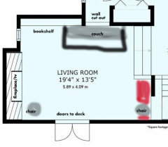
    The floor plan of that room has me a little confused.... do you have enough room to turn the sofa to face the tv? It would seem to be a lot more comfortable.

  • 5 years ago
    last modified: 5 years ago
    I think orange would work better as the accent wall color. I think it would blend better with the adjoining walls. The blue wall shade is quite dark. I think blue is a great accent shade here, but lighter, closer to the couch color.

  • 5 years ago
    last modified: 5 years ago
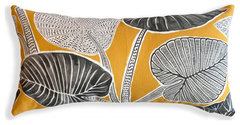
    It's 'off' how blue has white door frame / adjoining wall has soft paint with brick...

    any thought to painting entire room the blue? would be youthful, cheerful - with grey furniture good, but could use a brightening color, more brightening than white...

  • 5 years ago
    last modified: 5 years ago
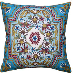
    Not yet a deal with DR. When you find a bench pillow add it, and art for the wall --


    Lumbar Blue Floral Cotton Decorative Pillow Cover Silk Embroidery 18x18" · More Info


  • 5 years ago

    I hadn’t zoomed in on your bookshelves before. They are gorgeous!

  • 5 years ago

    @everdebz I'm not sure what you mean by DR. That pillow is beautiful!

  • 5 years ago
    last modified: 5 years ago

    @Amanda Smith the floorplan is verrry tricky. We want to move the chair and eventually put a piano where the red area is and if we wanted to turn the sofa it would be basically right in front of the piano (so the sofa doesn't cover the doors to the deck). I know that's probably hard to visualize. But I agree with you. There is only one chair that faces that tv head-on. It is not ideal at all.


  • 5 years ago
    last modified: 5 years ago
    DR is for dining room.

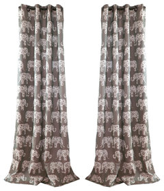
    Just small-scale elephants idea for LR [living room].


    Elephant Parade Gray 84 x 52-Inch Curtain Panel Pair · More Info


  • 5 years ago

    @roy25a I had no idea Sherwin Williams has a LRV, considering I bought my blue paint from a SW store and was never educated on that! I love the palette you posted. Thank you. I LOVE my hutch too. It's a little bit beat up, but I love it. I wish I knew more info about it.

  • 5 years ago
    last modified: 5 years ago
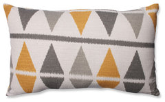
    I'm thinking that all blue walls is too much with 'interruptions' of door/window/shelving/cut-out, etc... and one blue wall is not you? I'd repaint, and bring your colors in accessories...


    Palma Lumbar Pillow Cover · More Info


    Ikat Argyle Birch Rectangular Throw Pillow · More Info


  • 5 years ago
    last modified: 5 years ago
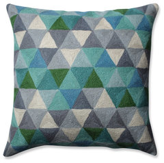
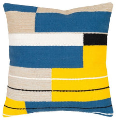
    Let's say you have 1 blue wall - this palette is modern I think, has greys, blue-greys? white as table will be -

    comes in other colors, etc.

    Pillow Perfect Triangle Grid Throw Pillow, Blue Gray, 16.5" · More Info


    Surya Harley HRE-003 Modern Hand Woven Pillow, Square 20"x20" Cover Only · More Info


  • 5 years ago

    Everdebz..... thank you for your 2d pillow suggestion, perfect for our media room! ( house is MCM furnished)

  • PRO
    5 years ago

    I'm feeling a push & pull between 2 worlds- MCM & safe traditional. You need more MCM (doesn't have to be a super dramatic interpretation) consistency. A on-site designer could help you immensely. GL :)

  • 5 years ago

    Dining room has a dressier feel, and chandelier. Your art and pillow could be 'dressing down' casual or dressing up a bit. Idea:


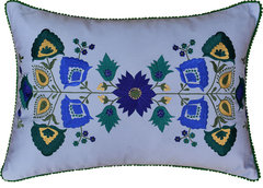
    Floral Garden Pillow Cover Bright Turquoise Blue Hand Embroidered Wool 18x18" · More Info


  • 5 years ago
    last modified: 5 years ago
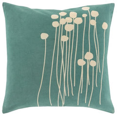
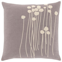
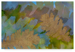
    Dresssing down -

    "Cerulean waters" Canvas Art, 48"x32" · More Info


    Surya Abo 18x18x4 Blue Pillow Kit · More Info


    Surya Abo 18x18x4 Gray Pillow Kit · More Info


    "Fallen Leaves Green Golden" by Cora Niele, Canvas Art, 30"x47" · More Info


  • 5 years ago
    last modified: 5 years ago
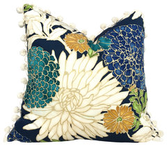
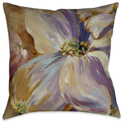
    I wouldn't say DR has to echo an accent color from LR, but a variation of it could be nice, maybe muted some.

    Laural Home Flower Song II 18" X 18" Indoor Decorative Pillow · More Info


    Asian Floral Pillow Cover With Cream PomPom Trim, 24"x24" · More Info


  • 5 years ago


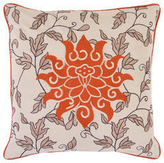
    Starburst Pillow 18x18x4, Polyester Fill · More Info


  • 5 years ago
    last modified: 5 years ago
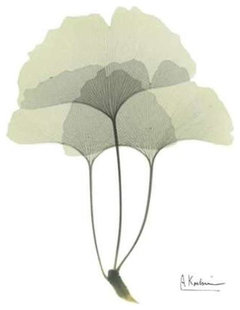
    Have you seen Koetsier's?


    "Desert Bloom 1" Poster Print by Albert Koetsier, 18"x24" · More Info


    "Midnight Magnolia 1" Print, 18"x24" · More Info


    Gingko in Pale Green 3 by Albert Koetsier Canvas Print · More Info


Sponsored
Hope Restoration & General Contracting
Average rating: 4.7 out of 5 stars35 Reviews
Columbus Design-Build, Kitchen & Bath Remodeling, Historic Renovations