

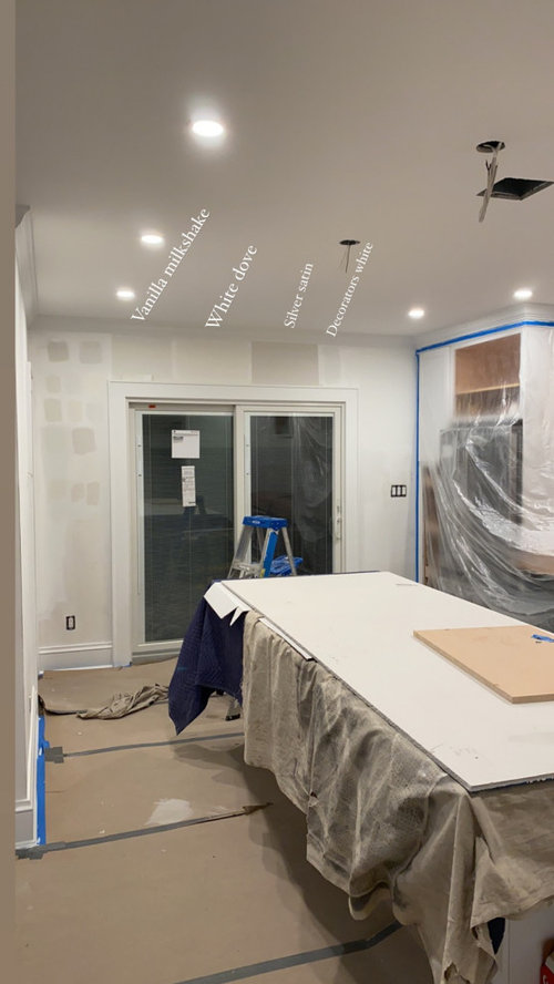
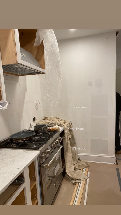
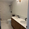
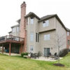
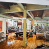
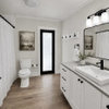
paint colors appearing much darker open concept
5 years ago
Sort by:Oldest
Comments (11)

Related Stories

COLORFront and Center Color: When to Paint Your Door Purple
From grapelicious to lavender, a front door cloaked in the color of royalty might just reign supreme in the neighborhood
Full Story
FRONT DOOR COLORSFront and Center Color: When to Paint Your Door Orange
Bring high energy and spirit to your home's entryway with a vibrant shade of orange on the front door
Full Story
COLOR12 Tried-and-True Paint Colors for Your Walls
Discover one pro designer's time-tested favorite paint colors for kitchens, baths, bedrooms and more
Full Story
KITCHEN CABINETSKitchen Cabinet Color: Should You Paint or Stain?
Learn about durability, looks, cost and more for wooden cabinet finishes to make the right choice for your kitchen
Full Story
COLORPick-a-Paint Help: How to Quit Procrastinating on Color Choice
If you're up to your ears in paint chips but no further to pinning down a hue, our new 3-part series is for you
Full Story
MOST POPULARCrowd-Pleasing Paint Colors for Staging Your Home
Ignore the instinct to go with white. These colors can show your house in the best possible light
Full Story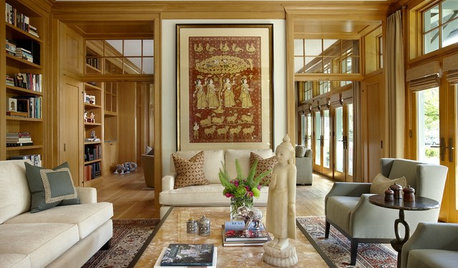
COLOR11 Terrific Paint Color Matches for Wood Details
Pair your wood trim and cabinets with the right shade of wall paint to bring out the beauty in both
Full Story
COLORPick-a-Paint Help: How to Create a Whole-House Color Palette
Don't be daunted. With these strategies, building a cohesive palette for your entire home is less difficult than it seems
Full Story
MOST POPULARThe Right Way to Test Paint Colors
Here are 5 key steps to take to ensure you're happy with your wall paint color
Full Story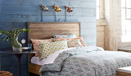
BEDROOMSHouzz Quiz: What Color Should You Paint Your Bedroom Walls?
Cool and soothing, or warm and spicy? Answer these questions and learn what hue is right for you
Full Story
rebunky
Stephanie ScimOriginal Author
Related Professionals
Miami Interior Designers & Decorators · Ashland Kitchen & Bathroom Designers · Martinsburg Kitchen & Bathroom Designers · Jacksonville Kitchen & Bathroom Designers · Bangor Kitchen & Bathroom Designers · Oxford Kitchen Remodelers · Texarkana Kitchen Remodelers · Cookeville Custom Countertops · Grand Forks Interior Designers & Decorators · Harrisburg Interior Designers & Decorators · Idaho Falls Interior Designers & Decorators · Dover Architects & Building Designers · Sioux Falls Architects & Building Designers · Seattle Architects & Building Designers · Elizabethtown Kitchen & Bathroom Designerscrcollins1_gw
crcollins1_gw
hemina
lynartist
Beth H. :
adalisa frazzini
Stephanie ScimOriginal Author
itsourcasa
imhofan