Software
Houzz Logo Print
kaupert

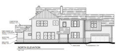
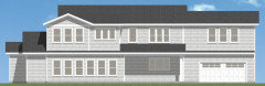
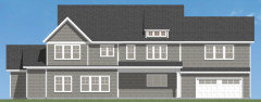
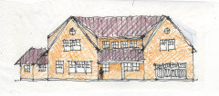
Traditional - modern elevations

5 years ago
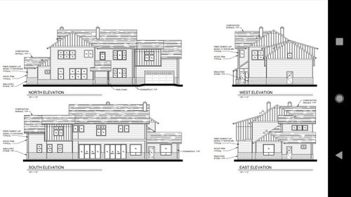
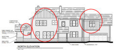
Please help me plan this exterior (siding, horizontal, vertical, etc.). The house will be on a rural property characterized by oak trees, 2 minutes to town, central coast CA. I'm thinking somewhat traditional with a touch of modern but am open to all suggestions. Thank you for any help!

Comments (35)

  • PRO
    5 years ago
    last modified: 5 years ago

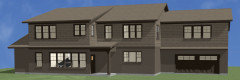
    Not sure what you want from the house. What do you consider modern on an exterior and what is traditional to you. I will say way too many roog angles for any house IMO It would be nice to see a color elevation showing all choices for the exterior. What is the interior like IMO that design is what drives the exterior as to windows door placement and sizes of both .Your house styles in your idea books are all over the map so I think you need to narrow those choices for sure.

  • 5 years ago

    Interesting house. I agree that there are too many different roof changes. This can be a problem down the road.

  • 5 years ago

    It looks like a house of windows and not all placed in the right position or being the right size.

  • 5 years ago

    I agree there are two many roof lines and ‘additions’ to make the house look cohesive. Can you simplify?


    id also eliminate the vertical siding, it seems off on that house.

  • PRO
    5 years ago

    Bigger


  • PRO
    5 years ago
    last modified: 5 years ago

    Are you happy with the overall exterior of the house? Does it look pleasing to you?

    How has this plan changed from: https://www.houzz.com/discussions/6044676/final-house-plans-please-review


    Is your brother still the designer?

  • 5 years ago

    First off, I don't like the hidden front door and the prominent garage door. Lots of windows and roof angles as mentioned. It doesn't appear to fit any particular style of home. Did you have anything in mind?

  • PRO
    5 years ago

    It looks like the plan was developed void of any consideration for the exterior appearance. Applying exterior finishes to the derived concoction to be aesthetically pleasing is a major task. Simplification of the massing and form may help, but that may most likely involve the re-working of the floor plan. An investment in a local talented designer (architect) would be worthwhile.

  • 5 years ago

    There is ZERO rhyme or reason to the rooflines, windows, siding depictions, etc to the entire house.


    It's like architectural mad libs.


    What did you WANT it to look like?

  • 5 years ago
    last modified: 5 years ago

    This may sound harsh but my very first thought on the exterior was, "What the _____?" There's way too much going on for my brain to handle and process.


    This exterior plan needs some major editing. Then edit some more.

  • PRO
    5 years ago

    I tried to be gentle.

  • 5 years ago

    The house looks like it is sinking into whatever is around the bottom(stone? Brick?)

  • 5 years ago

    I was looking for some parts of the elevations to provide some constructive criticism, so I perused your other thread of the floor plans. What I see is that this project is lacking in inspiration, not just in the plans and elevations, but in the way of living. This may be a harsh assessment of your brother, but the plans remind me of a high school drafting class where the assignment is to design a house to learn how to draft, not design spaces. These issues with the plans are simply emanating into the elevations, which is causing you problems in determining how to delineate the "frosting on this cake."

  • PRO
    5 years ago

    I think if the OP is not answering we are at aloss .

  • PRO
    5 years ago

    I assume the OP is digesting the information provided so far, and that could take a lot of time. They have tough decisions ahead of them.

  • 5 years ago

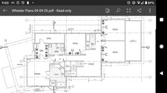
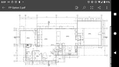
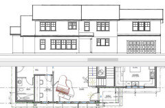
    Thank you for the comments. Sorry for not responding sooner; I've been thinking about the comments. We definitely planned the floorplan first and then the exterior. I'm including the updated floorplan that we are planning to use. We made several changes based on an earlier floorplan post. I actually really like the floor plan at this point. I wanted lots of light and am glad for the many windows. I wanted the back patio to face south. I wanted the living, dinning, and media rooms to be off of the back patio. I wanted the beautiful views of the hills to the north to be seen from the master bedroom and sitting room upstairs. I don't prefer the front door on the side, but we are working with a protected habitat that requires us to build within a certain shaped, small area and an existing driveway that can't be changed. I think that the positioning of the front door may be the best that we can do, and I think that I'm ok with it at this point.

    I honestly had not developed a strong opinion about the way that I wanted the exterior to look. I asked my brother who is an architect (who does commercial work) to just come up with something. These plans are the first elevations that I've seen. In thinking about your comments, I think what I want is to have a somewhat traditionally shaped house with some slightly modern finishes. Is it possible to have a cohesive look that accomplishes these two things? I also don't think that the house should look like it's meant to be in the suburbs when it's out on a really natural piece of land. So, I'm trying to put all of those factors together to figure out what it is that I really want. I definitely plan on simplifying the siding/stone, etc, and I appreciate the comments about simplifying the lines. I think that I will suggest that we simplify the roof lines and maybe try to get rid of the two pop-out looking squares. Does it seem like that would make a big difference? Also, some of you commented on the windows. Do you have any suggestions for how we could make those look better from the exterior? I think that simple, peaceful lines are what I want to move towards.

    Thanks so much!

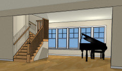
    • The stairs on the first floor won't curve. They will be straight. The second floor is from a previous plan, so the extending first floor roof lines are not accurate, but the room layout is accurate. I'm not married to the idea of having a grand piano, so the piano's placement is not a big consideration for me.

  • 5 years ago

    Some thoughts - the shape of this house is relatively simple at the foundation (good!) and I think the first floor is actually pretty decent (good!). My first reaction is "how could this fairly straightforward design yield THIS set of elevations?


    And then all hell breaks loose upstairs.

    • the 2 bedrooms over the garage driving the unappealing bump outs for no good reason. The shed dormer won't ever be centered in this configuration. Generally bedrooms over a garage are not desirable - most fires start in the garage. You have people sleeping over unconditioned space that has all sorts of noxious fumes / odors / gases. Who draws a space over a garage as "open to below"?
    • Why is the storage taking up the space in a corner that could be used for windows for ventilation and light in the master?
    • Why are there double doors into the master bath? who's making a grand entrance? Or moving large furniture in there?
    • Why is there a vanity shaped like that - that will require most custom cabinets and counters, and reduce storage, then driving a weird linen closet?
    • What's the door to the left of the master that leads to the... roof?
    • There's no redeeming quality to the second floor. Logic says it should be relatively easy to put 4 bedrooms in what is essentially a rectangle, and then any ancillary spaces (the reading room) over the garage. Right now - the reading room looks like the best room in the house and yet an afterthought at the same time.

    I realize this is blunt - but you are NOT getting a good product here and you are about to spend a ton of cash. I think the first floor is redeemable but the second floor needs to be simplified and put together logically.


    And it can be done in a way that gives you an "updated traditional" house. (I'd advise looking at houses in Houzz that speak to you and creating an idea book to refer back to) But I am not sure this can be accomplished with the current designer unless you get WAY more specific and rigorous in your direction and examples.

  • 5 years ago

    I'm not really going to comment on the whole house look, but instead focus on the windows. The one thing that I noticed was that you really love the light the windows bring in... But the windows don't really have a theme going on. You have a couple groups of three windows together. Some groups appear to be double hung, then full height glass, then double hung. Some are just three double hungs in a row. There is one window over the entryway that has small grids up high. There are windows that appear to be a casement (or fixed glass) below with an awning above. Some just look like fixed glass or casements.

    I think that you need to come up with a central theme regarding the windows. It is very distracting to me to see some many windows and have them be so varied. I think you can do tons of windows and make it look much better.

  • 5 years ago

    In addition to other comments, why not give bedrooms #2 and #3 walk in closets and a jack/Jill bathroom in the extra space behind them, over the garage? That would also simplify the roofline and walls, and would not be a big expense utilizing the basic house shape you already have.

  • 5 years ago

    The stairs remind me of an Escher drawing.

  • 5 years ago

    caledisgn, I was actually just thinking about that exact thing. Thank you!

  • PRO
    5 years ago

    The stairs remind me of a trip to the hospital.


    (play on words intentional)

  • 5 years ago

    I'm sorry but your brother may be an excellent commercial architect, but this is not a good design and shows a total lack of understanding of how people live in houses. You need a RESIDENTIAL architect. Someone who does residences for a living because this is not it. I'll give my full thoughts later as to why as I'm off to dinner now.

  • 5 years ago

    Thank you cpartist. I am curious to hear your thoughts.

  • 5 years ago

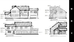
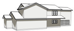
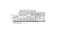
    Is this getting any better? I tried to erase the siding to make the house look simpler, and I got rid of the pop out.

    The "open to below" over the garage is a garage attic.

    I also removed the garage side door from the west to the south.

  • PRO
    5 years ago

    The problems to me are


    Just experimenting


  • 5 years ago

    Your sketch ideas are making progress, but the east elevation is still a mess. And the windows in general need some help with layout/size.


    https://mcmansionhell.com/post/149622740651/mcmansions-101-windows

  • 5 years ago
    last modified: 5 years ago

    The problems with the exterior start with the interior.

    You walk into the house and you are practically on top of the piano which will become a dumping area because there's nowhere else to dump stuff in the front entry.

    Angled walls show that the person designing the house really had no clue because they make for awkward interior spaces. While they may look ok on paper, in reality they suck. Meaning the angled door into the study.

    Corners are not meant for bathrooms. They're meant for bedrooms and public rooms. Corners are also not meant for utility rooms, laundries, pantries, etc. Why is the bathroom on a prime real estate corner?

    Is the buffet going to be hanging in space like that? Have you truly thought about what you want for that long space?

    The storage closet at 38" is too small to be a walk in. You need 3' to walk in and for shelving a bare minimum of 12".

    The kitchen is a mess. You have the stove practically on top of the fridge with barely what looks like 1' of space between them. The bare minimum needs to be 15" and that is too narrow. Then you have the oven across the way so the island is a barrier if you need to move something from the cooktop to the ovens.

    Also the sink is in the middle so anyone needing to wash something or do anything else, has to walk right past the most dangerous part of the kitchen which is the stove. Do you really believe they'll take something out of the fridge and then walk around the other side to bring it to the sink? Plus that now makes cleanup much more difficult with having to shlep dishes to the furthest point in the kitchen to clean them.

    It looks like the kitchen is 16' wide give or take? You can take off 4' for the cabinets on the ends and another 8' for the two aisles. That leaves you with an island that is 4' wide. Pretty skimpy for such a kitchen. (General rule here is never let architects design kitchens. Even residential architects! LOL)

    Never mind you have two corner cabinets which are much less efficient compared to regular cabinets.

    Your mudroom area is way too narrow. If someone sits down to put on boots, or anything else, how does anyone get by?

    How wide is the garage door?

    What are the living room dimensions?

    If I recall you wanted the downstairs room to double as a bedroom for your parents? Wouldn't it be nicer if they didn't have to walk across the hall in full view to use the facilities?

    I think Janni focused on most of what's wrong upstairs. I'd add, why are there only windows on one wall in all the upstairs bedrooms?

    What's with the odd angled wall to the master closet? That doesn't show good design. It shows POOR design and a lack of space planning.

    What's with the awkward hallway ending in a wall to the two kid's bedrooms?

    And if you have kid's bedrooms, why are the closets not acting as noise buffers between the two bedrooms? Especially in the second bedroom where that is an outside wall and should instead have windows!

    Why a linen closet that's unusable with that awkward angled shape?

    What's with the wasted space between bedroom 1 and 2?

    Honestly, I think you could do a lot better than this. This is someone fitting tetris boxes together versus someone designing a home.

    You need someone of residential design talent who can pull your ideas together into a cohesive whole. Sorry to be so blunt. :( I know you put a lot of time into this, but I think if it were all simplified it could be a heck of a lot better.

  • PRO
    5 years ago
    last modified: 5 years ago


  • 5 years ago
    last modified: 5 years ago

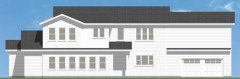
    Maybe your brother can do something like this , where the windows are a bit more pleasing. I did not change anything over the garage.


  • 5 years ago
    last modified: 5 years ago

    No one should be surprised that, to me, all big houses are begging for the Shingle Style treatment.


  • 5 years ago
    last modified: 5 years ago

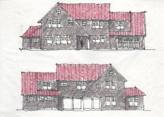
    1 1/2 story twin gables with dormers (aka, modern farmhouse)


    These sketches are not designs; they're rough explorations of ways of integrating forms in some kind of architectural order without seriously modifying the floor plan. Hopefully they will lead to better ideas. The colors are only to bring some life to the forms. Material and color choices should happen much later.

    What these sketches have in common is lowering the second story eaves to the first story (or story and a half) where possible using dormers and longer steeper rakes. The goal is to bring some of the charm of a cottage to a larger house form. I assume that's why the large Shingle Style summer homes of the New England coast are called "cottages".

    As I pointed out the last time this house appeared on the forum, for client presentations your designer should forgo the convenience and dull fill pattens of a CAD program until a design concept has been found. To me, CAD is great for construction documents and existing condition drawings but its where design ideas go to die. I practiced for 30 years without a computer and find the only advantage of it for design is 3D sketch modeling when the design gets complicated.

  • PRO
    5 years ago
    last modified: 5 years ago

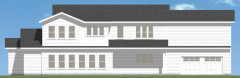
    This dropped the 1st floor ceiling in the rooms across the front of the house, and made the office smaller.


  • 5 years ago

    Wow! You guys just have amazing talent. It is so fun to see your fresh ideas and expertise in both drawing and computer design!