Software
Houzz Logo Print
webuser_835585599

Paint color advice...again!

5 years ago

After sampling dozens of colors and painting the entire room Balboa Mist - total FAIL! I’ve found two colors that I think will work better. SW light French gray and SW Ellie Gray. I like the light French gray but it does get washed out/looks blue. I’m going back today to get a sample of it darkened a bit and a sample of Ellie gray 50% lighter.


I’ve had the hardest time finding a color. My husband has agreed to repaint but only once more so I need to make the best choice. I like color and tend to go darker on walls. Please help!!!!!

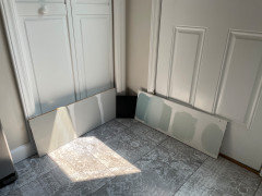
ellie gray, light French gray and light French gray lightened (black is new countertops)


On the wall - light french gray, Ellie gray and Ellie grey lightened (I added some white).


Comments (67)

  • 5 years ago


  • 5 years ago

    I think the balboa mist looks just fine, however, I would stay away from all the colors you are sampling. I would go for a pale, clearer color light blue, or light green, or light blue green. To be honest, the kitchen while nice, just looks a bit boring. And please do not paint the colors on your wall. You cant get an accurate look at how the paint will look. Take some big white piece of poster board, and paint your colors on that, and then you can also move them around the room, at all different times of day and lighting. What works on one wall, may not work on the other walls. What looks good in the morning, may look bad in the afternoon, etc. Look for a color, that doesnt have a muddy grayed down look to it.

  • 5 years ago

    Do you have a blue suggestion? I love blue

  • 5 years ago

    Blue was my first color i wanted and couldn’t find one that doesnt look green

  • 5 years ago

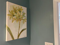
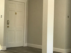
    This is the bathroom at the far end of the dining room. It opens into the kitchen/dining.


  • 5 years ago


  • 5 years ago

    It is boring and I LOVE color!

  • 5 years ago

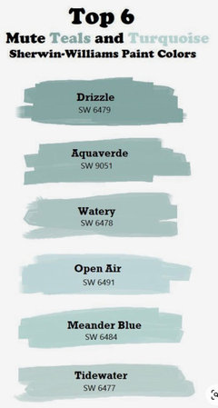
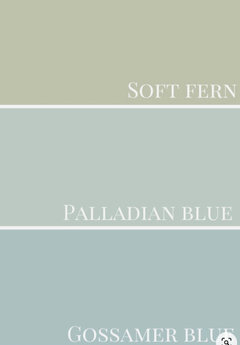
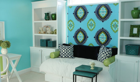
    This type of blue?


  • 5 years ago

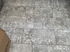
    Your floors are pretty dominant in the space.

    The internet sucks at accurately depicting color

    Your floor looks taupe (Between pink beige and violet gray).


    It is a tough color to work with.


    My guess is that Balboa mist was too yellow and yellow undertones really fight with taupe.

    I think you may be going in the wrong direction with your hue. - more green instead of more orange.


    If you have a piece of your flooring that you can take outside I would recommend getting the free

    color chips or ask the store if they have a fan deck you could borrow.


    Look at your flooring with the different color families and find the color closest to your flooring.

    Then you can go lighter, darker. Looking at colors in afternoon daylight will give you a much more accurate view of the undertones and how they play together than doing it inside.


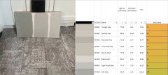
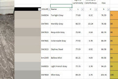
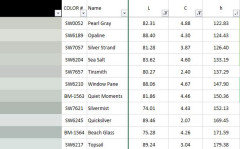
    You could also list all the colors you tried and pull the LCH values from EasyRGB.com (Look up the color name and then click on the color and choose convert The LCH Value is listed as

    CIE-L*Ch(ab)


    Then look at the color compared to your flooring - what is it that you don't like - too blue, too yellow, too green, to purple, too muddy, too light, too gray? Refine your search for the right color using the numbers.


    You will find that lower chroma, (grayer colors) appear more blue or more green as the chroma drops - our brains interpret gray and blue very similarly).


    There are many of us on Houzz that can help you find the color that most closely matches what you want.


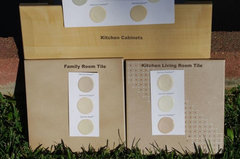
    Example of being able to see the pink in a tile when you are outside. The kitchen tile was way pinker than the family room tile, but in the house you didn't see this - they looked the same, but they didn't play with beige colors the same.


    colors · More Info


  • 5 years ago

    It’s definitely gray. Buy different shades of Gray.

    Bright kitchen afternoon sun.

  • 5 years ago

    is there a blue you would suggest?

  • 5 years ago

    I would love a fresh blue green (more blue than green) that isn’t too dominant

  • 5 years ago

    I went with balboa mist because I thought the floors would be dominant and we would need a subtle color. They just look too purple/pink to me.

  • 5 years ago

    Have you looked at SW SILVER STRAND?
    Any pros that are familiar with that color?. Looks bluish greenish gray.

  • 5 years ago

    what about ocean air or coral gables- ben moore

  • 5 years ago

    Like I said before - The internet sucks for color accuracy - If Balboa Mist when pink/purple your floor is not at all taupe - just looked pink on my computer.


    You love bluer blue greens - have you tested Silver Strand in your home?


    It is a blue/green/gray that leans blue, but doesn't turn baby blue. It is a cleaner color than the ones you are testing.


    The blue you listed above is a beautiful color, but because walls are so large getting too much color can make them overpowering.


    Here are a couple of reviews on Silver Strand

    https://www.remodelaholic.com/sherwin-williams-silver-strand-color-spotlight/


    https://www.kylieminteriors.ca/colour-review-sherwin-williams-silver-strand-sw-7057/


  • 5 years ago

    I will look at silver strand! I think I’ve given up on a Gray that will work.

  • 5 years ago

    I’m really wanting a blue now. It’s too much gray

  • 5 years ago

    What about liquid blue


  • 5 years ago

    Or aviary (would that be too light)


  • 5 years ago

    Or am I totally off. I suck at this. I have no eye for color or design.

  • 5 years ago

    Silver strand looks like RH silver sage. Which we just painted over because we did not like. Is it bluer?

  • 5 years ago

    But in this photo it looks like rhe color Im envisioning


  • 5 years ago

    @ B G

    Don't beat yourself up, this is harder than it looks and I bet you are better than you think you are.


    I want you to take the night off, relax, watch TV, enjoy life. Take a Scarlet moment and think about this tomorrow.


    Before you tackle this again, I want you to think about the colors you love. That Aviary Blue is lovely. I bet you look pretty in blue. So think about laying on the sofa with your Aviary Blue blanket over you. It won't look so special if the sofa and the walls and the carpet are all Aviary Blue. The walls are the backdrop for the colors you love.


    I remember trying to pick a wall color for a home 30 ish years ago. I was going from white to color. Nothing was working. Someone finally recommended a color that worked and I painted my family room and rehung the art I had in the room. The walls perfectly matched the clouds in my favorite painting that always looked beautiful in that room. The painting had all the colors that I love and the color in the background was the perfect color to complement those colors.


    Now I often look at paintings and art for the colors that are staying (All my things that I love) and I find the perfect background for those colors.


    Remember, you somehow get dressed every morning and don't go to work looking like a clown (unless you are a clown). You pick makeup that works with your skin tone and can buy outfits that look good with your coloring. Now you are just dressing your home to look beautiful around you. Don't go too saturated in large rooms. There are a lot of square feet of color, so we have to be a bit more gentle with the color. Bedrooms and bathrooms and laundry rooms are the places to go bolder.


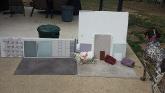
    After 40 years of picking paint colors I still take everything outside to help me see what it will look like together. This method never seems to fail.


    Currently renovating a home I bought a couple of years ago.

    Here's a picture of my colors.


  • 5 years ago

    Thank you ❤️


    that’s exactly what I want for the room. A nice backdrop. It just looks so drab with all the ray

  • 5 years ago

    Hi BG-

    Your floors are very interesting!

    Just a suggestion-

    Do you need to change your light bulbs so you see your colors in your kitchen more accurately?

    Also, you may not want blues at all, but I read an article recently that talked about light blues that was just so very pretty, I wanted to share it here-

    It was in Southern Living, the article was about light blue colors to paint your porch ceiling. Of course, you could paint any room those colors as you will see in the article.

    https://www.southernliving.com/home/colors/porch-ceiling-blue-paint-colors


  • 5 years ago

    I do need to change the bulbs. We have 2700 in there and I bought soft white today.

  • 5 years ago

    Want to share what the flooring is? it looks nice.

  • 5 years ago

    Maybe a little less bright turquoise.....


  • 5 years ago
    last modified: 5 years ago

    If tiles have faded delicate look, maybe a similarly softened color, but I think you're already doing that...

    I love a paint fan, and that I can locate a color, basically, and see what I can find for complementing, etc... even at store's counter borrowing it?

  • 5 years ago

    Idea a bit "far out" - wonder how much initial set-up is with cost and labor - could replace fabrics a long while ahead?

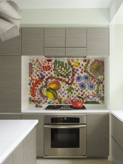
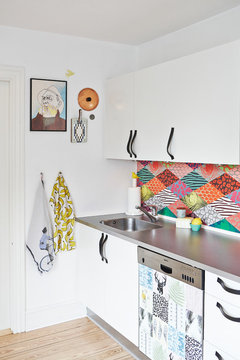
    "fabric behind tempered glass, that is offset from the walls, with metal offsets. As such, you could change the fabric as desired, and it's very easy to clean. Offsets are typically metal, and set the material (in this case glass) off from the back wall.
    The fabric is on cardboard/ change as needed." -- Dallas Renovation Group


    The Oven Wall - Check out the Backsplash · More Info


  • 5 years ago

    Another way I guess -- "The fabric was laminated behind glass."

    Bohemian Apartment Kitchen with Fabric Backsplash · More Info


  • 5 years ago

    Simple wallpaper on a small amount of wall --

    Houzz Tours Anne Rimmer · More Info


  • 5 years ago

    Adds a fully finished look with s.steel appliances / 24 inches high / W 20".

    Uniform greyish metal with tile's pattern for contrast ? If you love this, cause expensive I think.


    Backsplash, Stainless Steel, 20" · More Info


  • 5 years ago
  • 5 years ago

    Prob won’t like my comment but I think the color you have is so nice and neutral. It’s a good pop from the white cabinets. I’m nervous if you paint the kitchen a pale blue hue everything will seem pale? Is there anyway to decide paint after your new countertops are in? I think that will ground the space again. Have you thought about putting art in the kitchen that brings in that blue you like? Might also help! Or blue Knick knacks in your window!

  • 5 years ago

    Another idea, I think I see a pantry in the second photo? What about that bright blue you love in there? Everytime you reach for food you’d see your favorite color without it taking over the entire space.

  • 5 years ago

    thank you! We’ve hit a bit of an issue with floor installation which is giving me time to really think about the paint color. Countertops come Thursday. So I think I will have to wait (which is a good thing). I love the blue pantry idea!!!!


    is there a big difference between collingwood and balboa? I’m liking it more but its still a little too tan. Want something with a bit more body that leans grayer.

  • 5 years ago

    If Balboa went pink Collingwood will go more pink.


  • 5 years ago

    Ok I will live with balboa and see what it looks like with the table and other things back in. Thank you!!

  • 5 years ago

    I used silver mist behr paint. I like your balboa! My house is getting renovated a little at a time we are doing most of the work! There’s not many lights on in this pic.


  • 5 years ago

    Also, 2700 soft white isnt exactly the light bulbs, that you should be trying. Try LED Daylight bulbs, in at least 3000 or even 4000.

  • 5 years ago

    Yes I learned. 😂 i have 2700 and 5000. I think 3000 may be perfect.

  • 5 years ago

    3000 is still pretty warm and sadly there are not a lot of bulbs available in 4000. 5000 is really the closest to natural daylight.


    Someone posted a photo today that I think is a perfect example.


    The larger light is a small skylight next to their 5000k cans


  • 5 years ago

    I am going to share something that I think might help you and others.


    There is a website called EasyRGB where you can look up almost any paint color by most any manufacturer.


    Look up the color using the match tool


    Click on the color and select CONVERT - look for the CIE LCH(ab) values


    Use these numbers to find something a little less blue, light, dark, pink.


    This is a chart of hues in 10 degree increments from 0-360. Light/Luminance stable at 83 and Chroma ranging from 0-18


    These are the corresponding RGB Values for the above chart


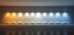
    Here is a visual simulation of what happens when we take these colors and see them under 2700k lighting compared to 5000k lighting


    Lower chroma colors don't stand up to variation in lighting as well as more saturated color - All are impacted, but grays and whites are more noticeably impacted.


    These photos are in my idea book LCH and Lighting and may be more easily enlarged there.


  • 5 years ago

    @B G im so sorry I got the paint color name wrong. It’s silver drop behr from Home Depot. I too got many samples must have had the other one one in my mind.

  • 5 years ago

    Thank you!!

  • 4 years ago

    Hello I know this is an older thread but im replacing my floors and saw this same Waxahachie flooring and I love it. May I ask is it still holding up well? Do u recommend it? I love boho tribal vintage stuff and this looks so chic! I don't want to get it though and regret getting a patterned floor since it will be harder to switch decor up and colors ect? Any advice ty