Software
Houzz Logo Print
101newkitchen101

Backsplash too white?

5 years ago
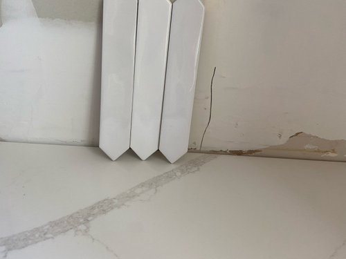
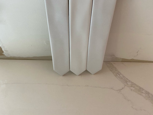
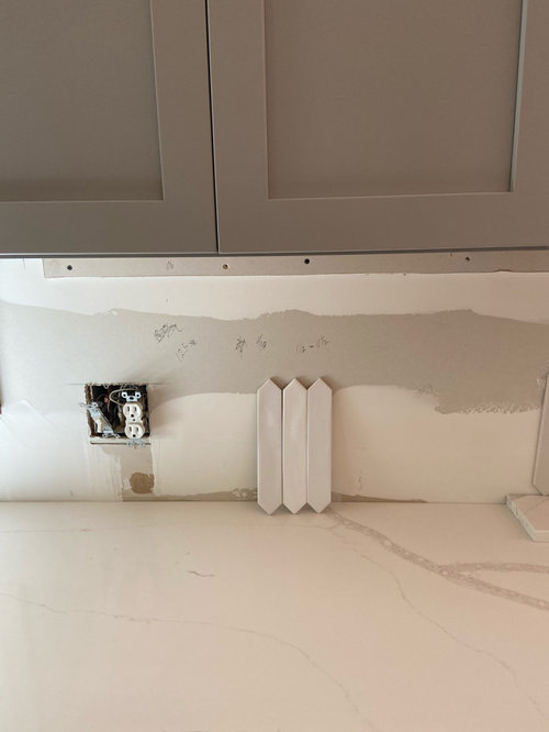
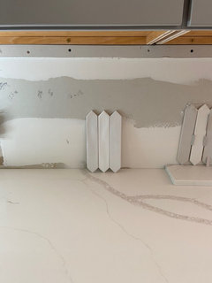
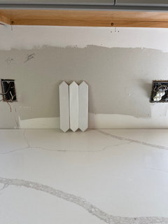
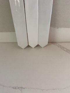
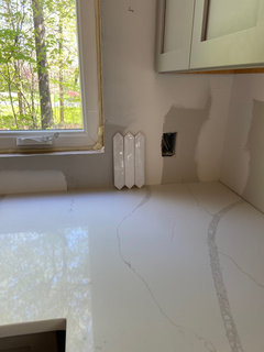
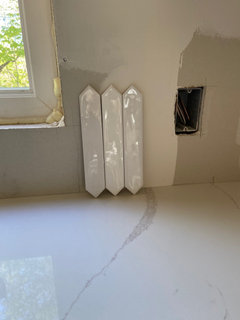
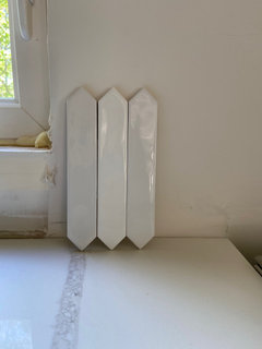
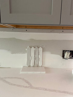
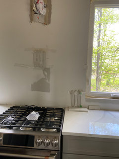
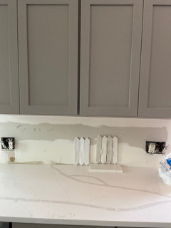
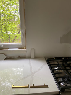
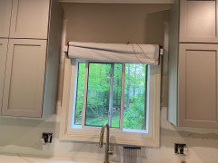
I thought I’d chosen my backsplash but now that the counters are in I’m second guessing. I’d chosen a matte picket tile with shades of white/gray variance. I’m worried it would be too busy as I plan to tile all the way to the ceiling on my range wall.

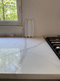
The tile I chose also has a glossy version, which has less variance in tones, so was thinking it would be less busy. But it’s a little whiter and brighter and I’m worried it would make my counters look dull/drab or yellow.

How do you know how much whiter would be too white? M

Comments (37)

  • 5 years ago

    I don’t want it to be too busy overall. Do tall pickets end up being a busier look? I can barely find any examples.

  • 5 years ago

    The gloss version does has less variance in color than the matte, but I’m wondering if it would still look busy on a full wall.

    And of course...I feel like sometimes it looks too white for this counter.

    I’m at a loss for tile guys. I’ve been looking for so long and I’m down to the wire.

  • PRO
    5 years ago
    last modified: 5 years ago

    It won't be too busy. Pick the white that's the closest match to your counters. The contrast against your cabinets will be very pretty! P.S. To keep the tile from being too "graphic", don't use contrasting grout. Pick a grout that's the closest match to your tile color.

  • 5 years ago
    last modified: 5 years ago

    I’m thinking they come as a set, like the Bedrosian Chloe. So you have to use that white?

    I like the idea of pickets, but I like them shorter and wider.

    Using three different tiles is tricky.

    Personally I would do the lightest gray with a white grout, or find a white close to the counter and use a silver grout.


  • 5 years ago

    I L-O-V-E your picket tiles! If you’re worried about the grey can you go with a plain white that is close in color to the white of your countertop? Use a white grout too and the effect will be subtler. I so wanted to use picket tiles for our year delayed kitchen reno (delayed again because we are renovating a bathroom several states away to make it more accessible for 90 yr old in laws) but DH was not a fan. Little does he know that I have it slated for the back wall of our master vanity alcove when we can get to that! Looks like your kitchen is going to be a knockout when finished.

  • 5 years ago

    Yes, I like the pickets vs subway. I can’t find any shorter fatter ones locally. I found these, but they’re so much smaller. And maybe a bit too cool for the counter.

  • 5 years ago

    The problem is that my counter is such a soft white that almost every white tile I put next to it makes it look yellow. I have yet to find a white tile that is the right tone!!!

  • 5 years ago

    Which might mean a light gray is the answer.

    I just did a 3x 12 ceramic gray tile with my Silestone.


  • 5 years ago

    @Eld6161... actually these are called gradient tiles and they have 5-9 shades of white all in one batch. So they look varied. Here’s the matte ones...you can see the variance. The reason I thought these would work is because it’s less obvious that the white isn’t perfect because the shades are varied, but then I started to worry too many different tones would get busy on my full wall.

    Again, these are the same rules but they’re matte so the color tones show more. You can only buy this tile with the varied shades....you can’t pick just one.

  • 5 years ago

    This is the glossy next to the matte.

  • 5 years ago

    Does anyone know of a larger wider picket tile that might match my colors? I would prefer to stay in the white range as opposed to going gray.

  • 5 years ago
    last modified: 5 years ago

    Have you thought of another colour then? Whites can drive us crazy. :) Perhaps a shade or two lighter than your cabinets? Or get closer to the colour in the counter veining? Don't forget you're seeing the differences between these whites because you're looking for them. After a while, in the day-to-day, the eye isn't as easily distracted by the subtle differences. That said, you may want to get a few tiles of each colour you're considering to get a better idea. A lot easier to evaluate the impact of a colour when looking at a half dozen tiles versus one on a wall, especially when the tiles are small.

    ETA: Also, if it helps any, consider that the backsplash isn't "essential" to the functioning of the kitchen. It's a decision that can be postponed with the help of washable paint. I know labour is scarce these days and everyone doing renos is crunched for time but if a decision can be postponed...sometimes it helps alleviate stress. Best of luck with your choice. :)

  • 5 years ago

    @eld6161 That looks great! I do like gray splash with the white cabinets, but don't know if I want gray on gray. The thing is that my cabinets were actually supposed to look more greige. They are definitely more gray when seen in any other light, but in my north window heavily forested lighting they appear much more cool gray. I like warmer tones usually. Oops, haha. So I wasn't sure if I wanted to add more gray to the mix.

  • 5 years ago

    @tartanmeup You are NOT kidding about whites. OMG...before all this I had NOOOO idea how many whites there were and how they are impossible!!!


    I was thinking about delaying, but we need to tile before we install the range hood (which needs to be hung and painted at the same time as the crown), so I feel a little less flexible with it.


    My project was delayed for almost 4months due to cabinet issues, so part of me just wants to be DONE!!! I thought I had it decided, but now seeing it with the counter I'm questioning.

  • 5 years ago

    Either way you need to get a good match. i think a very light gray could work like one of the gray pickets. If one of those match, then find another tile the same gray color.


  • 5 years ago

    Where is your under cabinet lighting....because that will change the appearance of whatever tiles you choose. If it were me, I’d go with a pale gray, as the whites will never be a “match”. There are so many posts here about white counters, white cabinets and white backsplash which just don’t have the same white.

  • 5 years ago

    I don’t have under cabinet lighting, but now I’m wondering if it’s too late to get it. Most of the wiring and drywall is completed. Oops. Maybe regretting that.

  • 5 years ago

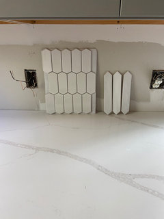
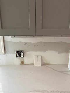
    I think I may have found a white backsplash that works!!! Going to look at it in different lighting. It’s a 3x6 subway, but thinking about doing it herringbone.

    It does come in other shapes, but the cost goes up a lot. I may consider another shape, but also want to keep the costs down.

    It’s the only one I’ve found that doesn’t turn my counter drab/yellow!

    How does the color look to you guys?

  • 5 years ago

    Please don’t do gray tiles. It will look so dreary. The last ones you showed will look great once you get a get items on your counter. A small lamp, a coffee pot, a bowl of fruit - then it will not look so stark as it does now.

  • 5 years ago

    I LOVE that idea, I'm a fan of herringbone. The color looks perfect in your last pic! Personally I like a very subtle gray grout for a little contrast and don't think it would be too busy. Another idea to confuse you even more...What about herringbone set under the range hood/above stove and regular set elsewhere? We did that in our kitchen and I love it! We used a light pewter grout, forgot the brand.

  • 5 years ago

    Talk to your cabinet maker or whoever is installing the cabinets - you should be able to easily add undercab lighting - LED strip. Before choosing your tile though, I highly recommend changing all the kitchen lighting to 4000k (closest to daylight) so you can see the true colour of the "whites". Also aim to match the grout as close as possible to the tile to allow your gorgeous countertops to be the hero.

  • 5 years ago

    @ilesliemy Once I got the counters in and saw the tile I chose it looked so drab!!! (It looks gray at my house but it’s actually varied shades of white). Either way it just looks flat and drab. So I started the hunt for a white that would work. And I think this is the only one that doesn’t yellow my counter...yay!

  • 5 years ago

    @angelatollefson ooohhh, I love how yours looks!!! That could actually be a perfect idea for my space. Only herringbone on the range wall and then regular else where.

    I was worrying about it being busy. Would it be visually busier ALL herringbone or busier to split it up? Hmmm.

    Considering this idea because of extra cost too. I know there’s a lot of waste with herringbone cuts. And unfortunately this subway that matches is 12-17 per sq foot. I think that’s a lot compared to other subway I’ve found. But it’s the only one that matches!!!

  • 5 years ago

    Not a fan of a busy pattern competing with the dramatic veining.

  • 5 years ago

    @andrea morrell

    Would you not use a super light gray grout? I don’t want much contrast at all, actually want it to be subtle. But I was also worried because I don’t want bright white grout since these aren’t bright tiles. But also don’t want cream.

    I’m going to look into the led strips. I don’t even know how they’re installed and my contractor will probably think I’m crazy because I keep changing and adding things!

    Is 4000k the really blue tones light? Right now I gave warm light, and I could go a little cooler but I don’t prefer the ultra cool blue light...it reminds me of an office building!

  • 5 years ago

    Wait...quick question about under cabinet lighting...is it okay that is only have it under one run of cabinets? Does that create a design imbalance of light???! So many things to think about with this process...Omgosh!

  • 5 years ago

    @101newkitchen101 I personally dont think your countertop is too busy from what I can see in the pics. It looks dramatic with the large veining yes simple enough with the gray and white. I don't think it would look too busy with the herringbone under the hood and breaking it up. But totally go with your preference. If you keep the grout color really light its not going to look really busy IMO. I saw lots of designer recs when we did ours to use white but my preference is a bit of contrast to see the pattern. You have to live with it so do what you like!

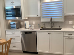
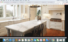
    Heres one example I could find with a google image search. It looks beautiful and classy to me although the picture frame over the stove is a bit more ornate in this one. Sorry for the ugly screenshot

  • 5 years ago

    I'd use the lightest colour - whether that's grey or white - so your eye doesn't focus on the grout lines/pattern of tile (whether herringbone or traditional brick). This way, the backsplash won't compete with your beautiful counters. Also, the darker the grout, the more easy to spot any imperfections in the tile spacing <:-O.

    As for undercab lighting, any big box store should sell the LED strips - they tuck right under the bottom edge of the cabinet. For me, I would want all cabinets to be underlit - I love a bright kitchen. If you can't tie them all into one light switch it may mean you have to manually turn them on - check with your cabinet guy and/or the electrician.

    4000k is the closest to natural daylight. When we redid our kitchen that was the advice we were given and we didn't choose the backsplash until all the lighting was switched to 4000k and the undercab LEDs were installed. This allowed us to see what worked best with the countertop & upper cabs. As well, your eye will read the upper cabinets and backsplash as one surface, the countertops as another. The 4000k will show the true base of your counter - on my screen it reads more taupe than white.

    It is a process for sure and you're almost there!

  • 5 years ago

    I like my white tiles to match any white which abuts them. I don’t mix white with cream, with gray-white, or with blue-white. If my my main white tile has gray veining, I may match the gray vein to a gray tile.

  • 5 years ago

    I love your countertop! Do you mind sharing the name and color?

  • 5 years ago

    We changed our lighting to the 4000 and it changed our lives. I actually like the backsplash you have chosen. Looks very nice.

  • 5 years ago

    Thanks @Kelly c. I got some daylight bulbs and couldn't get used to it! They were so blue for what I'm used to. We have soft yellow light everywhere else, so these were so different. I took those out and put in an in between bulb, and it's much better.


  • 5 years ago

    Thank you @Ginger Chew! It's MSI calacutta Verona.

  • 5 years ago

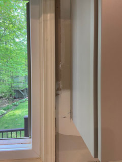
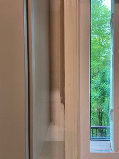
    Guys, the contractor is saying I can’t do herringbone all the way up the window wall because the space on each side of the window is too narrow. He says it’ll look weird. Has anyone ever done it in small spaces like this? He’s saying I should stop at the cabinets and not go to the ceiling. If I do that, I’d probably not want to go to the ceiling on my shelves wall too, wouldn’t you say? Should I stop the tile at the 18” on both walls?

  • 5 years ago

    Oh wait...I think I have a post open regarding tile to the ceiling. I might update that with this info too.

  • 5 years ago

    Home Depot sells under cabinet lighting that can be adjusted from 2700K - 3000K -4000K.

    It is plug in-t you could purchase some, plug in to your wall outlets and tape up under your cabinet to decide what lighting color you prefer. And then buy hard wire fixtures with the color value you prefer. Definitely worth doing the electrical work now to add lights, rather than wishing you had later, IMO.

    https://www.homedepot.com/p/Commercial-Electric-24-in-LED-Under-Cabinet-Light-Bar-Plug-in-Linkable-700-Lumens-Adjustable-Color-Options-2700K-3000K-4000K-54194201/306297935


    101newkitchen101 thanked L.D. Johnson
Sponsored
Wannemacher Interiors
Average rating: 5 out of 5 stars26 Reviews
Customized Award-Winning Interior Design Solutions in Franklin Cnty OH