Software
Houzz Logo Print
lisa_hall4946267

Elevation Style Advice

5 years ago

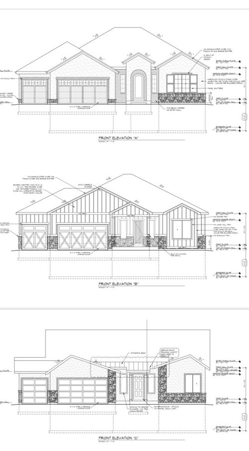
Hi, I’m looking some advice/constructive criticism on these elevations. The goal is to have 4 unique styles that can be built in close proximity to each other without looking too cookie cutter. At the same time, they will be for sale so I want them to appeal to a broad range of people and not just someone with a specific style preference. What would you call each style?

Comments (20)

  • 5 years ago

    Honestly, typical developer attempt at lipstick on a pig. They are all over done.

  • 5 years ago
    last modified: 5 years ago

    Tough love. :D


    Number 3 is the best here, but I'd ditch the waterline stone - take it down to the foundation level or leave it out entirely.

    Number 1 - the brick columns look very contrived and depending what material you go for possibly dated.

    Number 2- This is second best, though the entryway looks weird because of how narrow the space is,. Basically the proportions are off. Same comment about the waterline stone as #3.

    Number 4 - WTF. That the bastard roofs aren't even the worst part of this says something about how weird the stone treatment looks :-)

  • PRO
    5 years ago

    Pay equal amount of attention to all the elevations or your house will look like . . . a train wreck.

    (the hesitation was contemplation of terminology)

  • 5 years ago

    They all need to be simplified. There's too much stuff going on.

  • 5 years ago

    Mark, this was the inspiration for the "drunken sailor". Did we not quite nail it or do you not like that house either?


    Vinmarks, simplified in what way? Roof lines, exterior material... I'm at a loss a little on what we can simplify.

  • 5 years ago

    I wouldn’t do stone. Maybe on elevation b but the rest for sure not. Use as much of the same materials as you can.

  • 5 years ago

    They look like the same house with different materials. I would keep it simple. Get rid of any extra gables and stone - especially stone column. It looks like your inspiration house is a remodel.

  • 5 years ago

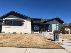
    Maybe I’m not reading the drawings right but I like the photo better (looks like windows, where on the drawing, it’s a triple garage?). I think if these were all constructed in proximity, the simplest change to generate variety would be to mirror image the design. The underlying bones are not terribly handsome, so from there the finishes don’t matter so much. The photo has a horizontal overhang at the front door that is much nicer than the drawings (I don’t know what it’s called, the “hat” over the front door), and the photo roofline looks less high than the drawings. Depends where you are located what the local vernacular looks like.

  • PRO
    5 years ago

    The inspiration seems to carry it off better than elevation "C". The inspiration has better balance, elevation "C" is lopsided.

  • 5 years ago

    One way to improve all four would be to have the garages as "side entry" - right now, they all scream "GARAGE DOOR" - it overwhelms the facade.

    And come on @Mark Bischak, Architect - you have to love those crazy roof lines on the fourth one! It's like they're talking to each other!

  • PRO
    5 years ago

    They're not talking, they're screaming.

  • 5 years ago

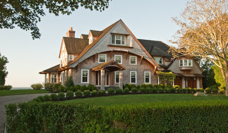
    I agree, elevation C needs some a lot of work to pull it off or maybe it's just a throw away. I would really like to try something different than the Craftman house because I'm tired of it but people like it. I would also love to sideload some of the garages and will when possible but most the lots aren't deep enough. I like the look of several different exterior materials (different stone sizes, stucco, and siding) but all the same color. All one material feels a little blah to me but maybe we overdid the materials here. It could just be a placement issue. Here's the photo inspiration for the first one. I want it to be modern but ours looks a little traditional to me


  • 5 years ago
    last modified: 5 years ago

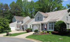
    With those competing roof pitches on Elev-C, this is the first thing I thought of:


    It's really bad because there's no rhyme or reason why it's been done except to be different. No design cues or relationship to anything followed.

  • 5 years ago

    Ok ok ok we will abandon C. The reasoning was to be slightly contemporary while still appealing to the average homeowner and being somewhat cohesive in the neighborhood of traditional homes. Lesson learned, fully commit or don't do it at all.

  • 5 years ago

    I think it depends on what market you're in @Lisa Hall - too many materials screams "new build in Suburban subdivision" - not that there's anything wrong with that. Not an architect, but as a home-buyer, too many things going on are overwhelming. You've already got plans with multiple roof lines competing for visual attention - when you throw in 2-3 building materials on top of that, it can look chaotic. The most appealing exteriors to me are above all intentional - there's a method to the madness.

    Are three car garages a selling point in your market? If you're dealing with lot constraints, I'd rather have an attractive approach and side-loading two-car garage, perhaps with an extra "workshop" bay that doesn't have a door for a separate car vs. a massive three-car garage that dominates the exterior.

    The first elevation is the opposite of my personal taste - I'd only consider that home if it was on a cliff overlooking the ocean with direct beach access, and then I'd be consulting with an architect to see how I could make-over the exterior to make it work. Specifically, the entrance is "called out," but the door itself is puny. It's like one of those dud fireworks - a loud bang followed by nothing.

    I'm not sure what elevation A is trying to accomplish. You have a picture window with multiple grid styles, and an arched front door. I think it would be better served pulling inspiration from Tudor revival styles if possible (although the hip roof is problematic, but still) - brick exterior with the arched door (you could combine the brick with some stucco to break it up) and leaded or diamond lite front picture window. Simplified garage doors in a dark wood.

    One potential improvement to elevation B would be replacing the stone with horizontal lap siding. It looks like an attempt at a traditional exterior - the stone doesn't compliment the board and batten. I'm not a fan of the rooflines on any of these, but the hip roof looks especially weird with these exterior materials - they would look much better on a gable-roof.


  • 5 years ago

    Sorry but they are all a hot mess.

  • 5 years ago
    last modified: 5 years ago

    Eliminate all but 2 materials for each home. Rework— well, everything. Layout, roof, garage,.... What kind of software manipulator home designer produced this? There is no “design” there. Nothing follows an intentional and logical pattern. A 5 year old playing home design games and sticking materials where a 5 year old would, would create more design cohesiveness. Put it all in the trash can and start over with someone with design talent.

    A neighborhood of traditional homes would be up in arms about tacky tract developer central happening. They won’t blend in with that. At all. They will be giant rhinestone bandages on a sore thumb that sticks out way too much.

  • 5 years ago

    What people want to buy is something that looks better than what the neighbors have, but not completely different. Take some photos of nearby houses. What's the style? Is it Craftsman? Contemporary? New Traditional? Farmhouse? Mediterranean? Ranch? and so on. Then start over with a new architect who will work in that style. Build in one true style to your price point.


    You can vary the front elevation by mirroring and coloring.

  • 5 years ago

    I think you need to do a "streetscape" drawing to understand how each house will relate to the others. I don't know the lot widths or the proximity of each house to the others but it might come across looking a little bit like a theme park with each house being so different. Go with a design theme and build that up with the individual houses, not "starting over" with each lot.


    I don't do speculative housing anymore but when I did, how the street looked, not just individual houses, was important.