

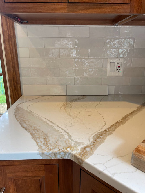
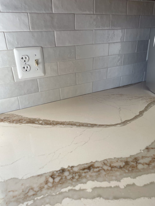
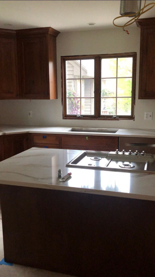
backsplash help please!
5 years ago
Sort by:Oldest
Comments (11)
Related Stories

ORGANIZINGDo It for the Kids! A Few Routines Help a Home Run More Smoothly
Not a Naturally Organized person? These tips can help you tackle the onslaught of papers, meals, laundry — and even help you find your keys
Full Story
BATHROOM MAKEOVERSRoom of the Day: See the Bathroom That Helped a House Sell in a Day
Sophisticated but sensitive bathroom upgrades help a century-old house move fast on the market
Full Story
KITCHEN DESIGNHere's Help for Your Next Appliance Shopping Trip
It may be time to think about your appliances in a new way. These guides can help you set up your kitchen for how you like to cook
Full Story
COLORPaint-Picking Help and Secrets From a Color Expert
Advice for wall and trim colors, what to always do before committing and the one paint feature you should completely ignore
Full Story
COLORPick-a-Paint Help: How to Create a Whole-House Color Palette
Don't be daunted. With these strategies, building a cohesive palette for your entire home is less difficult than it seems
Full Story
ORGANIZINGHelp for Whittling Down the Photo Pile
Consider these 6 points your personal pare-down assistant, making organizing your photo collection easier
Full Story
SELLING YOUR HOUSE10 Tricks to Help Your Bathroom Sell Your House
As with the kitchen, the bathroom is always a high priority for home buyers. Here’s how to showcase your bathroom so it looks its best
Full Story
MOST POPULAR7 Ways to Design Your Kitchen to Help You Lose Weight
In his new book, Slim by Design, eating-behavior expert Brian Wansink shows us how to get our kitchens working better
Full Story
UNIVERSAL DESIGNMy Houzz: Universal Design Helps an 8-Year-Old Feel at Home
An innovative sensory room, wide doors and hallways, and other thoughtful design moves make this Canadian home work for the whole family
Full StorySponsored

Columbus Design-Build, Kitchen & Bath Remodeling, Historic Renovations
Julie Schmooley
Angelou
Related Professionals
Lake City Kitchen & Bathroom Designers · Pensacola Kitchen & Bathroom Designers · Corpus Christi Kitchen & Bathroom Designers · San Bernardino Kitchen & Bathroom Designers · Rapid City Kitchen & Bathroom Designers · Minneapolis Kitchen Remodelers · Stockton Kitchen Remodelers · Provo Kitchen Remodelers · Mountain Home Custom Countertops · Miami Custom Countertops · Savannah Custom Countertops · Hays Custom Countertops · Manhattan Custom Countertops · Petersburg Custom Countertops · Rochester Custom Countertopseld6161
HU-694292508
Boxerpal
HU-187528210
Robin CortazzoOriginal Author
Rachel Lee
mojavemaria
Cynthia Davis
eam44