Software
Houzz Logo Print
a_little_odd

Backsplash sadness

5 years ago
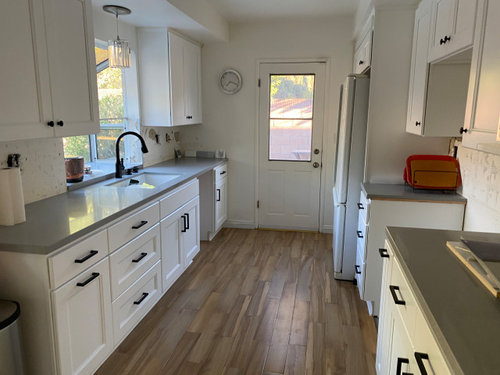

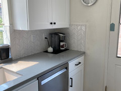
Desperately seeking another opinion. Here's my kitchen. Yes, it's boring, but I'm past that. I'm not a designer or a creative, and this whole process has been filled with my having to make all sorts of decisions that I'm uncomfortable making. My primary concern now is just finishing the darned thing and getting the household back to normal. I think we've narrowed it down to these two backsplash choices. I initially was thinking blue backsplash but I'm finding the countertop a little too difficult to match up with another shade that looks right to me. Installer says avoid glass. The plain white rhombus was my first choice when I thought I was going with two-tone cabinets. The marble looks nice with the countertop, but I'm concerned it's too busy...


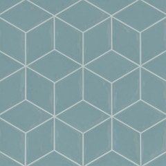
Glossy white rhombus chevron
Honed marble mini chevron
Back to banging my head on the table

Comments (40)

  • 5 years ago

    I like the rhombus, very interesting. The marble is marble- classic, always looks good but I don't find myself gazing at it, if that matters. LOL.

    a_little_odd thanked Anna (6B/7A in MD)
  • 5 years ago

    I like the rhombus but would try to incorporate more color into the room. My theory is drama in a neutral space makes people happy. Kitchens should have some joy.

    a_little_odd thanked Sharon Fullen
  • 5 years ago

    It looks boring because it isn't finished. You have a good base. Love the floor. So much prettier than what most on here are choosing. I would do a 4x12 or 3x12 subway in the same color as the countertop.


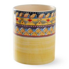
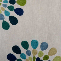
    A roman shade on the window and door in a fun fabric. Then a colorful utensil holder on the counter


    a_little_odd thanked jck910
  • 5 years ago
    last modified: 5 years ago

    Honed marble may be a poor choice because it will be harder to keep clean than a polished or glossy surface. Polished marble sealed would be better if you love marble. It comes in a lot of different mosaics. You can get marble subway tile as well. Marble does tend to crack before installation, so be prepared to accept imperfections.


    The rhombus would be my preference of the choices shown, but you might get tired of it. An interesting subway tile might be a better choice. Not plain subway tile - something with texture and/or interesting edges and/or varying tones.

    a_little_odd thanked kelli_ga
  • 5 years ago

    It is a lovely kitchen. i think you will love it once you are done you have made great choices

    a_little_odd thanked HU-808319745
  • PRO
    5 years ago

    I voted for the marble but either of your choices is fine. It is a pretty space with lots of neutrals- that's fine! I'm not really a color person in fixed elements, I bring in color through art and accessories which can change.

    a_little_odd thanked HALLETT & Co.
  • 5 years ago
    last modified: 5 years ago

    not boring. understated, neutral, and tasteful. I love it.

    I would choose white tile that's in a really interesting shape, interesting texture, and/or laid out in a cool pattern. so my vote is the glossy white chevron. of course make sure the white matches the cabinets, that might be the trickiest part.

    it's ok if everything is neutral, you can bring in color with accessories -- which are so much cheaper / easier to swap out when you need a change!


    a_little_odd thanked User
  • 5 years ago

    Your kitchen isn’t boring at all. It is the perfect backdrop for anything you want to do later on. I think either of the backsplashes are good choices. If you go with something bold it will simply grab all of the attention and keep you from making changes in the future. You have opportunities to add color in the window treatments, throw rugs or runners, countertop decor, etc. You’ve got this! Good job! I love your choices and I love creative design and choices for later on.

    a_little_odd thanked etchick
  • 5 years ago

    I don't find your kitchen to be boring at all! Great job! I honestly like both choices, the rhombus is more interesting and eye catching. The marble is a safer choice. You can't go wrong with either IMO.

    a_little_odd thanked Caroline Hamilton
  • 5 years ago

    I voted for the glossy white but my fav is the dog pic. Can Spoonflower do that on tile?

    a_little_odd thanked tozmo1
  • 5 years ago

    I prefer your so called boring kitchen to the vast majority that are planned on this site :) With a backsplash pattern, plus the chaos of every day, it won't look boring anymore.


    I accidentally clicked on the herringbone, but meant to click on the rhombus .... and it won't let me fix.

    a_little_odd thanked H202
  • 5 years ago

    Nice kitchen! Go with the larger, glossy tile. As others have said, add color with a few accessories. Keep it simple and uncluttered. No sadness necessary.

    a_little_odd thanked flopsycat1
  • PRO
    5 years ago

    Don't be sad...

    The rhombus/chevron is awesome! It will come to life depending on the grout color you use ( please not white ) - the bolder the color , the more it will stand out. That will boost the feeling of the space as well.

    What color will you paint the remaining wall space?? Thats another great area to bring in color. It's also easy to change if your tastes change - that could be a great place for the blue.

    When you get to this stage of a remodel you can get tired.. you only have a little bit more to go!

    Good luck

    a_little_odd thanked Debbi Washburn
  • 5 years ago

    I voted for the dog, but I like the larger Rhomboid tile. Once you accessorize and start living in your kitchen, it will come together and have some “life!” Nice job!

    a_little_odd thanked ptreckel
  • 5 years ago

    I like the glossy rhombus tiles. You mentioned something about blue, but I think a soft celadon glossy green would go better with the countertops, but the white looks good, too. If it were me, I'd probably go with the green to bring in color. Nice job!

    a_little_odd thanked decorpatti
  • 5 years ago

    Thank you for the encouragement, everyone! (Seriously, these comments are so helpful.) My gut says glossy rhombus too, but I was second-guessing myself about it being stark -- and getting comments from my family about the whole thing being too white or too simple were not helping. I now agree the consensus that once I accessorize and it is more lived-in I will feel more confident about defending my choices... I just noticed, however, that Bedrosians has a "new arrival" that is a rhombus in color. We'll see. I think I'm in a better headspace that at this point whatever I decide should be OK.

    https://www.bedrosians.com/en/product/detail/sorrento-tile/?itemNo=DECSORCELRHOG


  • 5 years ago

    not too stark at all! I like the glossy rhombus. or that new one you just posted above, very cool.

    the marble seems too small and busy, but that's just me.

    a_little_odd thanked User
  • 5 years ago

    I love your kitchen! I like the glossy, white rhombus tile best. You can easily add color with a runner and window treatment.

  • 5 years ago

    I don't know how anyone could say that is boring or stark. The flooring is the star and goes well with the choices you've made. Your inspiration photo with the rhombus tile has the same color scheme, so it is easy to imagine how gorgeous it would look! I think the other one is a little common.

  • 5 years ago

    Your bay window/garden windowsill is "on" your countertop -- and I'm surprised but I actually like the look of that -- enough that I'd suggest you consider continuing to "go with it": Instead of investing more of your budget into a backsplash you're not sure you actually want anyway, just add a trim strip of the same material and the same thickness and shape as that windowsill all across / atop your countertops and paint your "backsplash" wall above it any color you want.

    a_little_odd thanked suezbell
  • 5 years ago

    I definitely like the larger tile, but I would not go with a chevron pattern.

    a_little_odd thanked Toronto Veterinarian
  • 5 years ago

    @suezbell, it is quite common to trim out a low window above the sink with the same countertop material. It would be close to impossible to tile that sliver.

    a_little_odd thanked chispa
  • 5 years ago

    "not boring. understated, neutral, and tasteful. I love it." I agree!


    I like the rhombus due to the shape but also think some color would be nice if you have a favorite.

    a_little_odd thanked chicagoans
  • 5 years ago

    @chispa @suezbell Thanks for noticing! Previously our tile counter extended level all the way from edge to window, but that made for a counter that was too tall. I'm so pleased that the counter installer slimmed down the thickness of the quartz on the overhang of that step-up, so that when the tile is placed it should line up fairly close instead of jutting out 2 cm...

  • 5 years ago

    @calidesign I'm so on board with this. A tremendous thank you for sharing these.

  • 5 years ago

    I love @calidesign’s idea of painting the door blue! Adds great color, and easy to repaint if you want a change down the road. Same goes for the runner. I would match the grout color to the tile for a less busy appearance. Your kitchen is great!


    a_little_odd thanked flopsycat1
  • 5 years ago

    I voted Rhombus glossy, but I think either will look great. (I probably should have just pushed the doggy 3rd button 😬 since I’m probably no help.). Anyway, I love your kitchen and it’s not boring. You got this!

    a_little_odd thanked NagyMama
  • 5 years ago

    Your kitchen is not boring! It’s beautiful and classic. Just wait to hear all the oooohs and ahhhhs once your backsplash is in place and your accessories are in place. I love the first tile in white and the beautiful blue. If the blue looks good with your counters i would choose that but either way you did an awesome job doing your kitchen!

    a_little_odd thanked Holly- Kay
  • 5 years ago

    I voted marble - and think your kitchen is perfection!!! You did a great job!

    a_little_odd thanked rdash
  • 5 years ago

    I like your kitchen, not boring, and will look really nice once it is finished. I didn't vote because I think a horizontal tile would elongate the kitchen and make it seem bigger, whereas a vertical tile pattern could make it look a smaller.

    a_little_odd thanked daisiesandbutterflies
  • 5 years ago

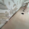
    Thought I'd post a follow-up! Still working a few things out but here's the tile we selected. Installer said there were a few challenges with choosing this tile but I see some of the imperfections simply as freckles. As you can tell by the chip on the right we're going with the blue door to add a bit of color. We chose to extend the tile to the edge of the counter instead of ending at the wall bc it's a galley and I liked seeing the pattern when I walk in. Thanks so much to everyone who commented to help me get past this hurdle!


  • 5 years ago

    I think the blue door will be really cool. I like where you ended the tile and your rationale. I think it turned out great. All in, I think your backsplash is the star. I'm glad you're liking it.

  • 5 years ago

    Looks great, and I like the pencil edge you choose. The blue door will look amazing!

    a_little_odd thanked calidesign
  • 5 years ago

    the backsplash is beautiful! I like the idea of painting that door blue too.

    a_little_odd thanked User
  • PRO
    5 years ago

    looks great!!

  • 5 years ago

    Beautiful kitchen!

  • 5 years ago

    From one galley kitchen owner to another, with the coffeepot and sink locations, you will be happy you tiled that wall. I didn't notice that you had chosen and installed tile before I voted, but I am happy for my choice - that tile looks great! (Ps I also have a pencil edge trim and love that look.)

  • 5 years ago

    Looks great! congrats on a job well done.😊

  • 5 years ago

    Perfect! Enjoy your beautiful kitchen!