Software
Houzz Logo Print
webuser_969784592

Please help with floor tile choice!

5 years ago
last modified: 5 years ago
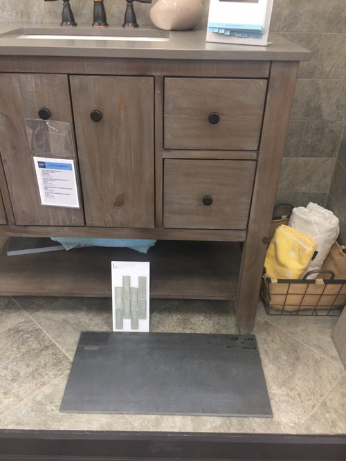
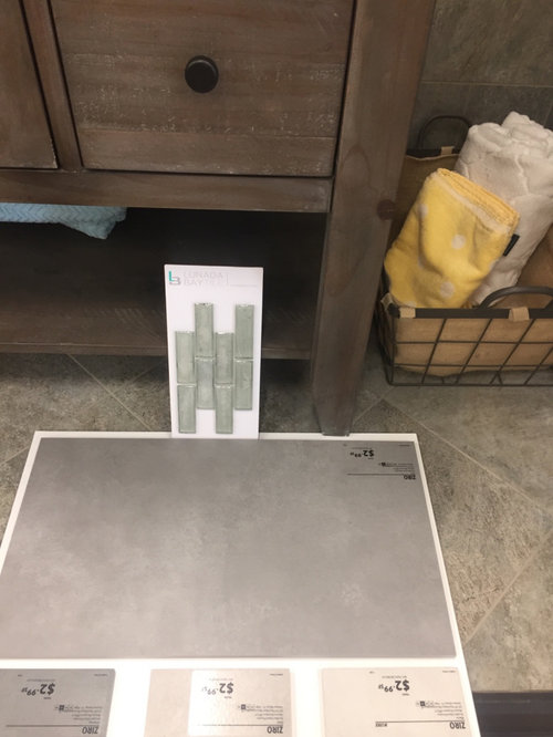
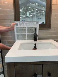
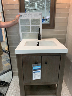
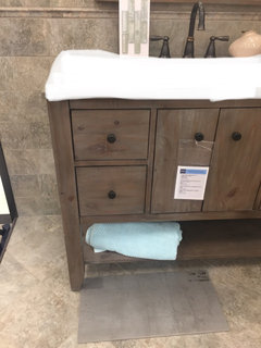
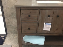
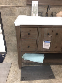
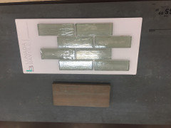
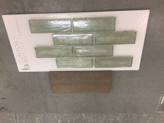
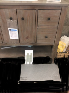
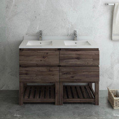
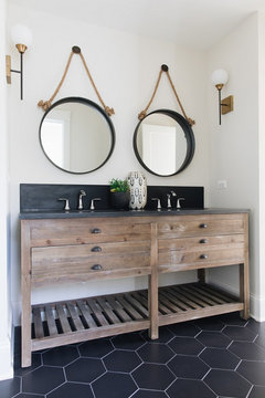
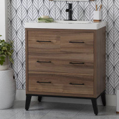
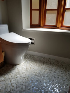
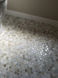
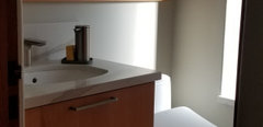
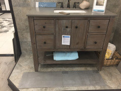
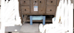
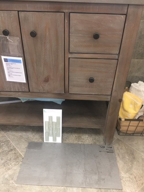
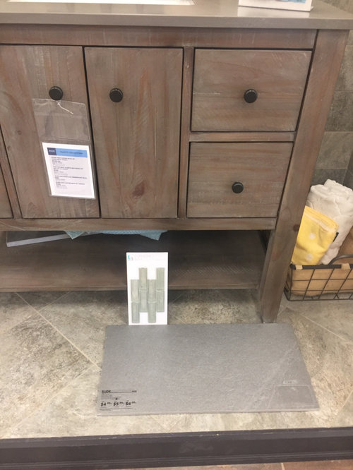
We are completely redoing our powder room and have chosen lunada bay elements quicksilver tile as a floor to ceiling accent wall (vertically placed) behind the toilet the vanity pictured but with a white countertop. Room is windowless and we plan to upgrade to matte black faucet, hardware, and lighting. We’re between a blue-toned slate 12 x 24 porcelain floor tile, a sage-toned porcelain floor tile, a textured-grey floor tile, and a lighter gray smoother floor tile. I’ve posted additional photos in the comments section as houzz only allowed four in the original post. Which do you recommend? Thanks for your input-my indecisive self greatly appreciates it!


Comments (26)

  • PRO
    5 years ago

    I don't think any of those work with the vanity and IMO those wall tiles will be a very busy look for a PR I also think black fixtures would not be my choice .

  • PRO
    5 years ago

    If hard to tell from photos, but your selections a bit flat. How does the accent work against the counter top? that's where it most important. Look at the counter 's color for what works on the floor as well.

  • 5 years ago

    I usually go with medium tones when presented with choices, but I like the dark one or the floor.

  • PRO
    5 years ago

    The glass appears to have a green cast so I would go with the sage.

  • 5 years ago

    Tough choice they are all nice, are you keeping the taupe countertop that's pictured on the vanity?

  • 5 years ago

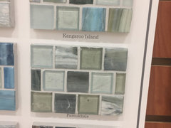
    Thanks everyone for your help! I apologize that I left out that the countertop will be a bright white. Walls are accessory beige but I’m thinking of using a white to balance out thr dark-do you guys think a white would work and if so what undertones should it have? Here are some photos that may help. I think that the tile would work with the wood (see photos) but I’m no expert so curious as to what you thought. We were also looking at Lunada’s pamukkale or a bluish green agate. Thinking vertical accent wall but hoping its not too much-maybe a strip as a chair rail or just to the ceiling where the vanity is.


  • 5 years ago


  • 5 years ago

    I was hoping the countertop was white, from the original photos I think option 3 for the tile.

  • 5 years ago

    I was finally able to download other tiles :


  • 5 years ago

    Thanks, yes im sorry i forgot mention the countertop last night!

  • 5 years ago

    The tiles will be great in a powder room. In the powder room of my previous house I used Sonoma Vihara in the small square mosaic and wrapped every single wall in it. Looked like a jewel box!

    I agree that something still looks a bit flat/off. Have you looked through Houzz photos to see what others have paired the Sonoma tiles with?

  • 5 years ago

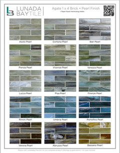
    I don't remember, is the Pearl the iridescent finish? You definitely want shine/shimmer that catches the light. Go with the shiniest finish for a windowless bathroom.

  • 5 years ago

    I LOVE that vanity!!!

    I do think the wall tiles, while beautiful, are so small they tend to look busy and sort of remind me of that linear mosaic shape that is a little dated (IMHO)

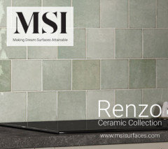
    What about using MSI Renzo Jade shown in photo attached. This also comes in a subway and a picket shape. It doesn't have that iridescent look but it does have a very cool and soft look, slightly varying shades.

    Also, of the floor tiles you posted I do like the last one in your post. I would love to see a pic of the finished room!


  • 5 years ago

    Thanks Cynthia! Those tiles you recommend are beautiful! I was wondering how busy my tile choice may look but wanted to add some color and character which they have :-)!

  • 5 years ago

    Thanks Chisma! The tiles would def be the pearl iridescent finish-i love the shine! I’ve looked at many photos online but will look for more sonoma photos on here to help make a decision. Does anyone think that the dark tile is making things off, and I should go lighter? I was also looking at hexagon tiles but was worried about maintenance and that they may compete with the wall tile.

  • 5 years ago

    Not loving those combos either. (Though I’ll try to me more helpful than negative 😉) I think the conflict might be a few things. First, that all your finishes have a muddy sort of effect. The grey wash on the wood, the blended colors with luster in the glass, and the floor is similar too. When combining different elements, it’s important to offer contrast in textures and colors, or they just become a visual melange. Right now the vanity (love it) already has a lot of texture and that visual muddi-ness I mentioned. So far the floors you’re looking at will end up looking like a concrete garage floor (sorry). I recommend a large format hex in black, or introduce a color like deep green or navy (though admittedly don’t have as much longevity.) and make sure they have a solid uniform color. The black will pair nicely with the black hardware. Next is wall tile. I would look for something glossy, but also not blended colors, and save the glass tiles you’re looking at for a feature, not an all-over tile. I would also choose a color way that has a greater contrast in color and tone than the sage you were looking at. It fights with that grey wash.

  • 5 years ago

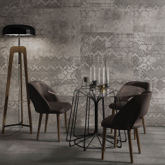
    So I know these probably won’t be perfect examples of your style, but just to illustrate the concepts I was mentioning regarding contrast. The first one has a lot of similar tone and texture, while the other two have higher contrast. I hope these are helpful.

  • 5 years ago

    Theresan, advice like yours what is what i was looking for-I want criticism if it is constructive and offers recrecommdations :-). I def don’t want a muddy-looking powder room and like the ideas you’ve given. I have a lot of work ahead of me! thank you again!

  • 5 years ago
    last modified: 5 years ago
    Hi, on the remote chance this is helpful in any way we have Lunada Bay agate hexagon in our guest bathroom.

    It's the Cortona with 50% silk and 50% natural. The glass is always a bit different from batch to batch because it's made from recycled beer bottles!


  • 5 years ago

    Julie your floor is beautiful, thanks for sharing!

  • 5 years ago
    last modified: 5 years ago
    I hope it was helpful to see the Lunada agate installed in an actual room! Here's a pic with the vanity. It's a quartz with a white background. The baseboard is Corian Glacier White which matches our tub surround.


  • 5 years ago

    > Patricia Colwell Consulting...I like your comments, your give it straight up.


  • 4 years ago

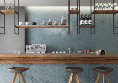
    So I got cold feet about the small tile and am looking at maiolica blue steel 3 x 12 subway for the accent wall to provide more contrast and a modern look and choose a homogenous gray 12 x 24 floor tile, and would paint the wall a very slight off-white (leaning in between warm and cool, maybe BM Calm). We’re wanting to do a double herringbone pattern on walls so wanted to keep a simple floor shape. My inspiration is from the first photo of the blue maiolica tile. Second photo is of floor and last two photos show tile against the vanity. Opinions? Im driving myself, my husband, and likely the tile man store crazy! Now worried that the darker blue may close up the space but my husband like the darker and less teal/aqua version.


  • 4 years ago

    I love it.

  • 4 years ago

    Of your originals, I liked the 3rd tile best, but the danger in all cases is that they may be too close to the tone of the wood -- if there's not enough contrast, the vanity will sort of disappear. So I might look even lighter in the grays.


    for the wall tile, I really liked the pale greens you had early on rather than the blues of your latest photos. I think it will be gorgeous with the white top and wood.