

Need help finding right green for kitchen cabinets!
5 years ago
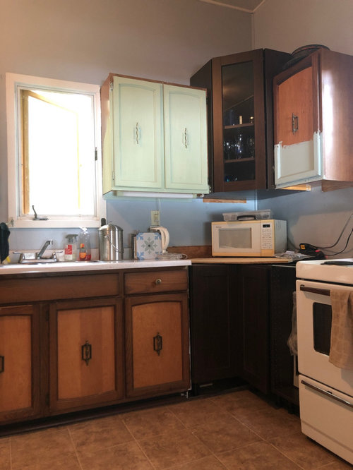
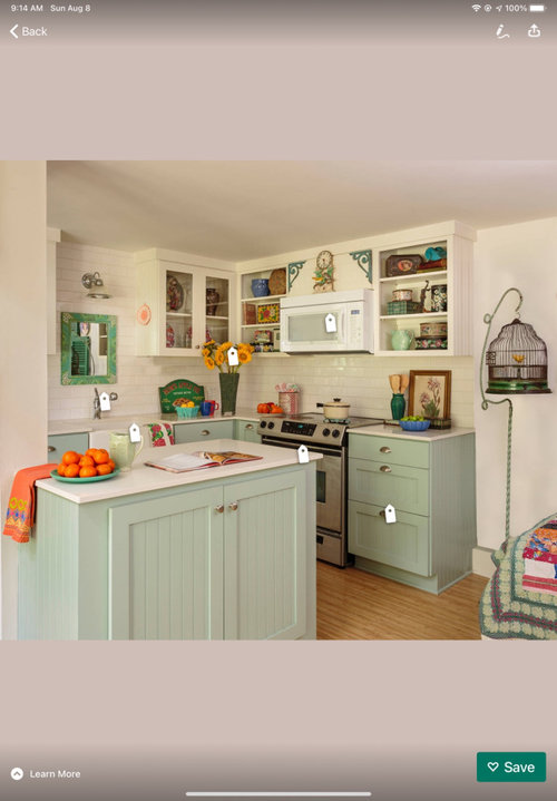
Featured Answer
Sort by:Oldest
Comments (11)
 PRO5 years ago
 5 years ago
Related Professionals
Selma Interior Designers & Decorators · New Haven Interior Designers & Decorators · Altoona Interior Designers & Decorators · Fredericksburg Architects & Building Designers · Parkersburg Architects & Building Designers · Escanaba Architects & Building Designers · Ottumwa Kitchen & Bathroom Designers · Scranton Kitchen & Bathroom Designers · Houma Kitchen & Bathroom Designers · Huntington Kitchen & Bathroom Designers · Bennington Kitchen & Bathroom Designers · Concord Kitchen Remodelers · Provo Kitchen Remodelers · Sheridan Kitchen Remodelers · Daytona Beach Custom Countertops 5 years ago
 5 years ago
- 5 years ago
 5 years ago
 5 years ago
- 5 years ago
- 5 years ago
- 5 years ago
Related Stories
KITCHEN DESIGNHow to Find the Right Range for Your Kitchen
Range style is mostly a matter of personal taste. This full course of possibilities can help you find the right appliance to match yours
Full Story
KITCHEN APPLIANCESFind the Right Oven Arrangement for Your Kitchen
Have all the options for ovens, with or without cooktops and drawers, left you steamed? This guide will help you simmer down
Full Story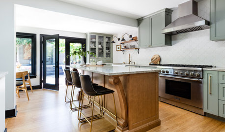
KITCHEN DESIGNKitchen of the Week: Soft Green Cabinets and a Wood Island
A Seattle designer helps a couple rethink their layout and create a fresh palette that honors the home’s Craftsman roots
Full Story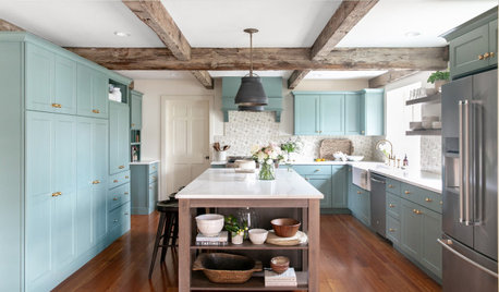
KITCHEN MAKEOVERSKitchen of the Week: Blue-Green Cabinets With Rustic Wood Details
Designers found on Houzz help a couple create a better layout with a large island, more work surface and extra storage
Full Story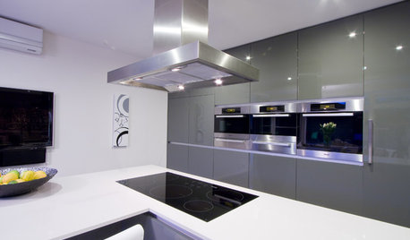
KITCHEN APPLIANCESFind the Right Cooktop for Your Kitchen
For a kitchen setup with sizzle, deciding between gas and electric is only the first hurdle. This guide can help
Full Story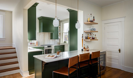
KITCHEN MAKEOVERSKitchen of the Week: Deep Green Cabinets Star in 136 Square Feet
Two designers update a Kentucky kitchen with bold cabinets and a more user-friendly layout fit for entertaining
Full Story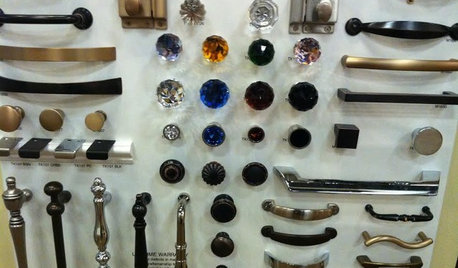
KITCHEN DESIGNGet a Grip on Kitchen Cabinets With the Right Knobs and Pulls
Here's how to pair the right style, type and finish of cabinet hardware with your kitchen style
Full Story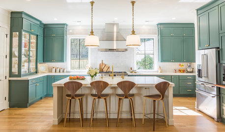
MOST POPULARIs This the Year Blue and Green Kitchen Cabinets Edge Out White?
Neutrals still dominate cabinet color. But some of the most popular recent kitchens on Houzz tell a different story
Full Story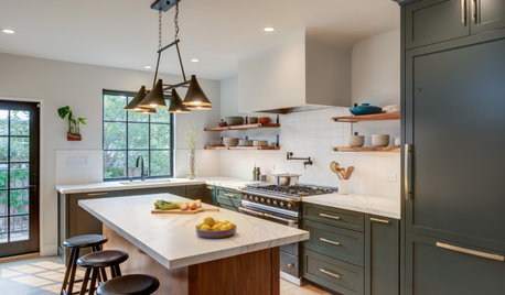
BEFORE AND AFTERSKitchen of the Week: Dark Green Cabinets and Family Function
A design-build firm found on Houzz updates a couple’s kitchen with rich color, a roomy island and a statement range
Full Story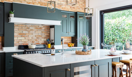
KITCHEN DESIGNDark Green Cabinets Add Elegance to a Welcoming Kitchen
See the clever storage and design ideas in this family hub in Ireland
Full Story


Jennifer Hogan