Software
Houzz Logo Print
azcantada

Which backsplash with great counters, warm white cabinets?

5 years ago
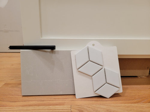
We're at the last decision, and this one's a doozy.
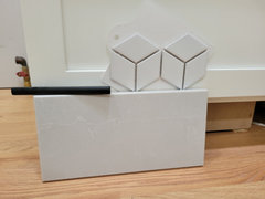
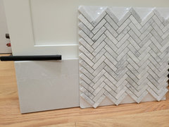
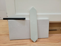
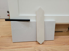
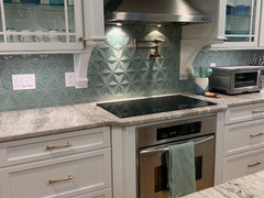
We have warm white shaker cabinets and will have Silestone Desert Silver quartz countertops. We're trying to find a backslash that is not subway tile, but would be good for resale, while still keeping in mind that we don't know when that will be, if ever. So we also want to love it. Gray and white kitchens are everywhere so we thought about doing something a little different in terms of color, or shape, that isn't too out there. I'm afraid to bite the bullet on color.
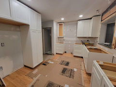
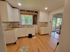
The size of the kitchen is on the small side. L-shaped 9ft x 12ft. We'll have the backsplash go up behind the chimney range hood and around and above the window.
The style in the rest of the house (1962 split level) is also transitional, with some mid century modern decor and furniture.

Comments (15)

  • 5 years ago

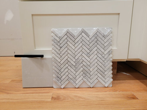
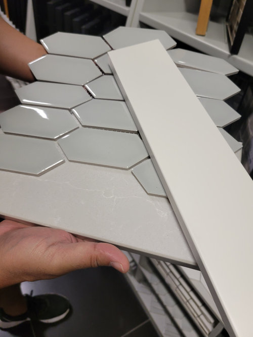
    I'm no pro and they may weigh in, but I think photo 2 herringbone is lovely. Photo 3 I would look for a creamy white version of that tile and use a soft grey grout with it, just to consider. Since the counter is so subtle, the backsplash will be the one to make more of a statement, yet be a classic look. If you have other black accents in the space it will be quite nice. Good luck!

  • 5 years ago

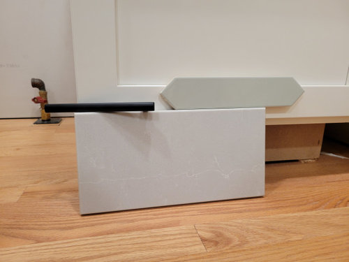
    Photo 2 is nice, but may look dated in the future. have you looked at the handmade subway tiles?

  • 5 years ago

    The mottled herringbone tile will likely match any gray or white color you select for counters and cabinets as long as the whites are not leaning to cream or yellow. Lighting does affect color.

  • 5 years ago

    You won’t go wrong will photo #1 it would add some interest in texture and you can add color in other parts of the kitchen. Personally I prefer a larger tile, it would give a bigger impact. Photo # 2 is all wrong in my eye. It’s a cool grey where as your counter and cabinets are warm in color. Photo #3 would be lovely without being jarring (I would run it vertically to add height visually), but you should add that soft green color in other parts of your kitchen to coordinate - Perhaps paint on wall, accent piece on table, etc..

  • 5 years ago
    last modified: 5 years ago

    I am a fan of the homemade tiles for sure. Even in all the some color they gives you some variation and interest without being too pattern-y. Make sure you ask up front HOW MUCH variation will be in a particular glaze.

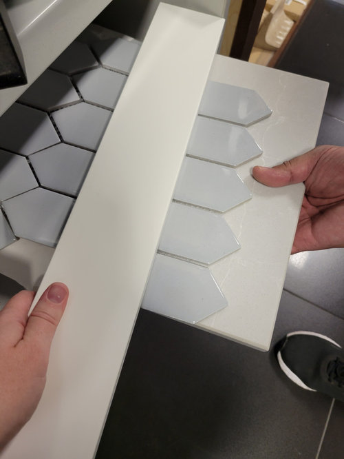
    Try as the other posters have suggested - get your lighting right, get the counters done and put the tile "on the wall" for the best estimate of what it will look like. I feel like all those options are too cool toned (which have a tendency to make warm white look yellow/dingy) but it is just pictures.

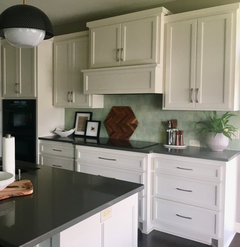
    Our cabinets are probably a bit more true cream than yours and we went with a little color (see below - this was a sunset photo so the uppers and lowers look different)


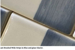
    Have you considered something darker? This is a brushed tile from wizard that I think would compliment everything else and is still somewhat a neutral. I would not get the stripes, instead ask for it all to be the blue color.


  • PRO
    5 years ago

    Wait until all the rest of the space is done that is when you choose backsplash IMO you also make sure all the lighting is LED 4000K to keep the choices you make look good at all times of the day. I need to see your space . IMO the herringbone with be the item to most likely date itself not to mention I never like real stone next to fake plastic quartz.

  • 5 years ago

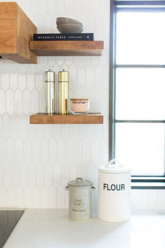
    In stead of the herringbone tile you could try a chevron pattern which has a more linear feel than the business of all the W's in a herringbone pattern. A white picket tile laid vertically in a smaller scale with light grey grout would look nice with your grey counter as well. The marble tones in the herringbone tile you have are nice, maybe in a different pattern?


  • 5 years ago

    Your cabinets are looking like a warm white and all the other elements seem to be cool toned. From the photo the counter makes the cabinets look very yellow and some of those backsplashes also bring out yellow in the cabinets.

  • PRO
    5 years ago

    Thanks all for your comments. We were planning on also taking pictures in daylight (these were taken last night). Should the 4000k be all the time in the kitchen, or only for choosing the finishes? I think we have everything set for 3000k currently.

    The Desert Silver we chose because it's a warmer gray and went well with the cabinets.

    We'll do this again once the counters are in in two weeks.

  • PRO
    5 years ago

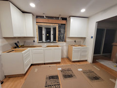
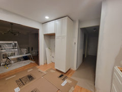
    Here's the space currently

  • 5 years ago

    I changed my recessed lights to 4000K and the light quality was too cool and too blue for my space…..so I went back to 3000K. Try just 1 can first with the 4000….maybe it’ll be ok with all your white and light. Wait to select your backsplash until counters and under cabinet lighting (you are having under cab lights?) is in as that will affect the look of your samples. One thing I have noticed in posts on Houzz is that when there are white cabs and white counters then it’s hard to find a white tile backsplash that blends well. So a tile with a bit of color in it (maybe the veining color from your countertop) might be good to look at. Very pretty kitchen!

  • PRO
    5 years ago

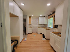
    Here are the same pictures in the day (cloudy) under 4000k plus Cream Gardenia as recommended by @jackowskib

    I thought herringbone is considered classic (as is marble), so why would that one look the most dated in time?

  • PRO
    5 years ago

    And again, here's the kitchen but in cloudy daylight/4000k

  • 5 years ago

    I personally like the tumbling cubes. We did something similar in a kitchen refresh and get nothing but compliments on it.