Software
Houzz Logo Print
crystal_d

Tips and ideas please

13 years ago
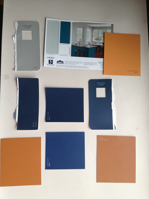
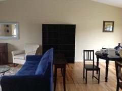
I am a fan of traditional with a modern influence. This will be for my huge open space, living, dining room and kitchen.

Comments (78)

  • 13 years ago
    I love the color scheme you have chosen. Natural wood tones do well with these colors. In the suggestion photo, the blue walls really pop the accessories in the room but the key eye focus is a neutral couch, not navy. I think the blue walls and a navy dark blue sofa would appear overwhelmingly blue and make it more difficult to bring an array of colors that compliment each other. Is there a possibility that you could transform the navy couch with a new cover in a neutral tone to make copying Keitha's style feasible.? OR find a neutral wall color similar to the couch in Keitha's room, use the punch of white trim and bring in shades of orange,and navy from your color wheel.
  • PRO
    13 years ago
    Pure Home showed you probably the most viable solution for having the navy couch and that is the Coastal Living Room. Of everything here, given what you have, I would let the Coastal Living Room be your guide. Make the walls a white color, not white-white, but a lightly tinted color, that allows everything else to sing.
  • 13 years ago
    http://houzz.com/photos/1939898
    What about this wall color?
  • 13 years ago
  • 13 years ago
  • 13 years ago
    Mary has given you some very good practical advice. With a little editing your room can be fabulous!
  • 13 years ago
    Suggestions for lighting?
  • 13 years ago
    sstar93, how do I pull this off? The disjointed pics are confusing me a bit.
  • 13 years ago
    You have a great eye for color that will pick up the navy and give it new life. I think the color in the coastal room you selected is a great choice because it gives you room to expand your color wheel of orange to navy tones. The pictures you selected earlier will work with these tones. Enjoy staging the articles you want the eye to focus on. Trust your instinct of what works. Your personal likes and dreams can live in this room within the wall color you thought would work. The coastal appeal is relaxing and energizing at the same time. Dream On!
  • 13 years ago
    Lighting with your color choices , tall lamps in solid tones that compliment what you like. If a lamp metal base is not what you like, it is an easy fix to go to an auto supply store and buy automobile paint in the color you desire. The spray color change will look like it came from a factory. I think that lightening if you want ceiling fixtures should be simple to draw the eye to your personal choices of design features. Sample rooms often have huge artwork, this is not necessary to pull of the design you want to create. Clean wall space creates a great back drop for your furniture and accessories. Think about what you want to showcase, then have fun finding what you love..
  • PRO
    13 years ago
    Crystal after looking at your Pinterest board I can see what you are trying to achieve. I think you need to start at step one and layout your furniture in a well balanced manner. You have too much put together like a large jam of furniture around your piano. Let your piano set by itself and move the bookcases, perhaps set them together as one library wall, which would be the mostly blank wall across from the dining room table. Perhaps, as I am not there, but am just extrapolating from your pictures, you can treat your dining room table like a dining//library table.

    I would paint the walls a LIGHT silvery gray, like the many pictures you have on your Pinterest. Find a LARGE picture that pulls all of the colors together.

    Remove all of your accessories and then start fresh to place them in a new unit of time. Too many small accessories of a similar size can create a visual clutter. Use the principles of Less is More. Each piece that you add, if it does not add to the look, I don't care how much it cost, or any other significance you add to it, leave it out.

    Be subtle and, looking at the breadth of pictures you have on pinterest, I would not use the orange, but as i think John and others, Ann, Keitha, Dytecture, travisinteriors ( probably everyone here, in your case, looking at your pinterest, go to a more muted form of Orange. Subtlety is the key. Leave the viewer wanting more.

    Resist using blue on blue on blue. Your sofa is blue, perhaps pick it up in the globe you have, a nice piece of art work, and not much more than that. A stack of books, Subtle. Triangulate the color to move the eye around the room and make it feel more cohesive. The Globe, one point on the Triangle. The books with some specifically blue covers, perhaps, subtley emphasised, And then the great picture on the other point of the triangle that incorporates your blue, grays, subtle muted form of orange,

    Everything else neutral, soft white, white white white (not bright white - soft natural white. Pillows etc.

    At that point send us some pictures and we can help you if you are having problems. Everyone here has great suggestions, and I am trying to detail simply what they are trying to tell you If I have miss spoken for any of the viewpoints of the posters on this thread, please forgive me, that just seems to me what they are trying to tell you.
  • PRO
    13 years ago
    You could use a large print of Sunset in Catalina, or you can very contemporary as sstarr93 or you can choose a lot of different directions for your artwork, But just have it make a strong simple statement and keep your framing minimal. No Victorian frames, or Early American, but more contemporary and simple to keep the room fresh. (My feeling)
  • 13 years ago
    I like the Sun Reflection picture that features colors and clean lines that would go with any theme. You can buy oils with light frames that seem to blend across the wall space. . You have large wood furniture that would be complimented by a simpler back to nature picture with the color hues you love because I don't see nautical theme related objects you would need if you decide to create a wall harbor.

    Studying your picture of the massive space, quality furniture pieces look crowded. As Mary suggested, the bookcases should be moved to the bare wall space to frame your dining room set. You could place dishes and objects on shelves that displays your new color theme. I have seen bookcases with different colored paper spread across the backing on the shelves to give color boosts. What is the white cabinet next to the chair by the piano and window? The bare white doesn't go with anything else. You have many art objects that are similar in size and color, it's like a too leafy bush that needs pruning. Pick out a few favorites that are not like each other.
    Pack away the rest for gifts or when you want a change. The shelving looks dark, it needs to have a lighter look with more spaces between objects. The orange piece perched on an end table would look better crowning the top of a bookcase or shelf. The tops of the bookcases need taller objects to balance the size of the unit. I would pick a colorful dining room table top or placemats and spread those colors around the room on the couch, on top of the coffee table to give cohesion. Are you near a thrift store, home décor pieces are less expensive and you can pick up materials to experiment with for just a few dollars.

    The lamps on your end tables are short and I think you need a look with more height.
    What about two toning a wall? Neutral with a muted orange. Tape makes dividing a wall into colors easy. You have the advantage of space and the popular open floor plan. Clear out what you don't use and let your mind imagine the new possible arrangements.
  • 13 years ago
    last modified: 13 years ago
    I like the softer peachy orange in the photo you posted. (I love the intense deep touqoisey blue of second pinterest, but don't think one could live with for very long.0 however, while there are many excellent suggestions above, i think it's actually choosing the specific blues and oranges that gets really difficult, rather than the idea of it. i have had paint samples out for months, and simply can't seem to pick a specific orange that feels right with a blue. Try googling Taos doorways. Looks great outside, but a bit frightening trying to bring in. (i want to use them in a very large rental stairway foyer with a Victorian arched window at least 10 feet tall, but am afraid tenants would kill me.....I have chosen a softer apricot, but haven't moved beyond that yet. if the muted one i chose turned out still too intense I'd think about softening it with a faux plaster affect but i've never tired that and probably don't have the patience.) Also, you have such nice height in the room, use it! emphasize that peek somehow and draw the eye up some too! I totally agree with others about moving those bookshelves. if you can't get rid of most of your smaller objects, you could try putting them on shelves behind some sort of vale/scrim to unify and soften their affect.)
  • 13 years ago
    I can't put the bookshelves there, because I am bringing in a hutch on that wall to serve as a coffee bar. It is a family pie e I am refinishing black.

    I am also painting my dining room table chairs a realism color. I found that inspiration on the latest C and B catalog.
  • 13 years ago
    So...if I don't move the bookshelfs to the dining room, what?
  • PRO
    13 years ago
    last modified: 13 years ago
    If it were my home:

    I would move the bookcases to another place in your home.

    I would not, if it is not too late, add a black cabinet, given all of the pictures I have seen on your Pinterest Board.

    I would stay with the natural wood finishes as in your piano, which I presume is staying.

    I would take a less is more approach.

    If you look at the majority of the pictures in the Crate an Barrel catalogue you refered to, they generally use a color, a wood or a metal color and then they layer in with neutrals. You are not doing that. You are going too many directions trying to find your answers and that is what is fouling your up.

    When I see your pinterest board, I can see you have very good taste in those pictures. You need to study what makes them work, and perhaps pick one that exemplifies what you HAVE TO work with, the NAVY sofa, early american finish piano. Find pictures and pillows that elevate that. I would paint the walls a color, I think it was on page 23 of the C and B Catalogue ( a silvery white). The page with the Black hutch. Perhaps if it is too late and your hutch is already black than make your palette Navy, Black, Neutrals with a LIGHT Silvery Gray walls. And very, very lightly dust with a sprinkling, in a very understated manner, your SOFT MUTED orange, in about three place.

    If you noted in the Crate and Barrel catalogue, particularly on the page of the black hutch, everything was white, off white or clear. In fact they did that a lot, and then, brought in one color. Unless they where showing off the multi- color pillows.

    I would not have the white painted mirror over the piano, that too is not helping you to get to where you are going. That is where you need the large simple picture that brings all of your colors together. Because that piano and that wall is a major focal point in your room. The picture needs to be large to balance with the mass of the sofa, the piano and the size of the wall, among other things.

    Crystal, you need to create a palette, perhaps on a white board, and then you can see what is working and what is not, and then add it too your room. Designers use inspiration boards like this all of the time, because if it looks great on your board it will work in work in your room, but you need to have present on the board, an example of EVERY color and finish. So that you can assess if every color is working, or if something needs to be eliminated to make the palette work.

    I hope this is helpful. This is what I would tell my clients.

    Really enjoyed your Pinterest Board :o)
  • 13 years ago
    I bought the bookcases for is room. Love them, they stay.
  • PRO
    13 years ago
    Hi Crystal, I apologize if I have shared too much of my opinion. It is very hard for those of us that are pros, or at least for me, to leave a poster hanging, once we set in to help them. Helping someone with pictures of their room, and not actually being in their room is very difficult to do, because we really can not see everything, we can not speak to you one on one in the space to get a very good understanding of what you want or don't want, can and can not do. It actually is, more difficult to do, due to the nature of the communication the level of which you can achieve here and perhaps I over stepped my welcome here. I truly wish you the very best with achieving what you want, and I am sorry I do not know your better, so as to be more helpful in my suggestions to you.
  • 13 years ago
    Not at all!!! I highly value what your saying!! Please stay tuned for pics and don't stop. So sorry if I offended.
  • 13 years ago
    I have 2 little boys underfoot, so sometimes I just get a chance to put a brief comment. :)
  • 13 years ago
    Is so hard when ur so confused about what u want! I love the idea of the grey walls and then punches of orange with the navy.....that would look incredible!
  • PRO
    13 years ago
    I undertand, I had two little boys under foot at one time :o)
  • PRO
    13 years ago
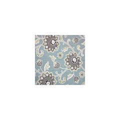
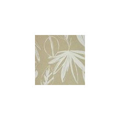
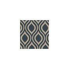
    I would love to see the drapery go! I would replace with a larger geometric or updated large scale traditional print fabric!!
  • PRO
    13 years ago
    Here are a few more examples...use the pillow on your small chair as inspiration!
  • PRO
    13 years ago
    You really need pattern in this room to make it come alive. I love a lot of the pictures suggested above...especially the Hampton home and the one to the right of it. Your colors are in reverse of those pictures. You may want to add the blue accents at the window but I would play down the royal blue of the sofa...add some tan/taupe to the sofa in a pattern.
  • PRO
    13 years ago
    The book cases are fine...did you think about adding some crown molding to them and have them connect over the mirror to resemble more of a built in appearance? I wish they were one shelf taller!
  • 13 years ago
    Ahhhh, help! 911
  • 13 years ago
    Frustrated!!!!
  • 13 years ago
    Please help, waiting to do anything until I get help, so frustrated!!!!!
  • 13 years ago
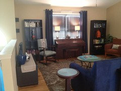
    Couple of things.....I like the chair by the window and piano has no other place to go but this room.
  • PRO
    13 years ago
    last modified: 13 years ago
    Hi Crystal! I'm jumping into the fray here and offering my layout suggestions. :)

    What is really causing you frustration at this point?

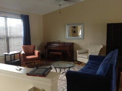
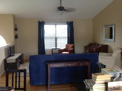
    I would recommend moving the white chair to sit on the left side of the window and angle it towards the piano. Also, soften the angle that the orange chair is at, have it focus to the sofa. This frees up the wall so you can center the piano under the mirror. On the piano you can add a small grouping on one side (towards the window wall) of a lamp and a picture and maybe a small flower or other natural element.

    The room is starting to really come together though with all the changes you are making. I do like Stacey's suggestion of drapery with a pattern.

    Modern living · More Info
  • 13 years ago
    Thanks, just moved it from that arrangement and didn't like it. But thanks so much!!! :)
  • PRO
    13 years ago
    No worries!

    Can you describe what it is about the current setup that is bothering you? Is it the layout, the coffee table, decor ideas?
  • 13 years ago
    C q x SS
  • PRO
    13 years ago
    I like the combinations of the colors, finishes and shapes that you have in the picture under which you say "frustrated" My problem is I am viewing your walls as a pale tan/ peach color, on my monitor, and in this picture it looks more silvery gray. So I am not certain of your wall color, but I like the color as I see it in "frustrated" I love the book cases together and so can see why you like them.

    I am not in agreement with the patterned drapes, but we can't agree on everything.ONe thing, I am on the west coast, so that can also flavor my view point to a degree.

    I like the sophisticated, to me, strength of the uncluttered lines that allows me to enjoy each piece more. However, I have viewed your pinterest, which I always go to, because, to me, you actually are drawn to that too.

    You have surprised me, as I now appreciate the black as well, in your home when it is allowed it's own space.. (To me, when against the piano I could not appreciate either the piano or the book shelf) When I first graduated as an interior designer I had a job of creating furniture vignettes, and accessorizing them for a large local furniture company. I had seven stores that I had to tend to. After a while you get an idea what people liked by how your settings motivated the sales of the items displayed.

    As you show more of your entire space, I can better see some of the difficulty in your decisions. In fitting everything in.

    I agree with Amber Bay, that I would put both chairs one on each side of the window and then angle them toward the sofa.

    Crystal there are always going to be differing viewpoints, I can only give you mine, this does not mean that others are wrong.
  • PRO
    13 years ago
    I think there are so many different colors of furniture and woods in this room. If you choose a pattern fabric for drapery, you could bring the color elements together with a blue/cream pattern. Are you able to put the tv where the piano is and the bookshelves back where they were, so that it looks like a wall unit? Move the couch and sofa table (if you need it) to where the tv is now and move the 2 chairs where the sofa is. The sofa table could have 2 lamps on it and you need a 3rd source of light to make a triangle of light in your space to balance the light and give a cozy feeling.
    You also have a ton of room in the dining room along the wall for the piano.
  • 13 years ago
    last modified: 13 years ago
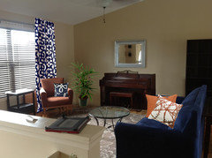
    I think you're almost there. Moving the bookcases out makes the room look much more spacious. Center the piano under the mirror, add patterned drapes, move the white chair to the left of the table in front of the window, stick a plant in the corner, some coordinating pillows...
  • 13 years ago
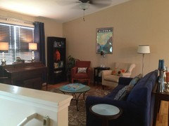
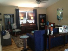
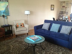
    I have worked hard on this all day. I hope this is better. My walls are a cream and I will be painting them silver gray color. But for now, this is what I have.
    I can't really go and buy anything new right now, but I set out to I fuse orange into my dull navy and neutral pallets.
    Oh, and I am a cases freak and would love to display my collection somewhere all together... Thought????

    I'm also working on a small redo on my dining room table chairs.....will post pics here when I'm done. Oh and.......
    What about my large high wall navy and everywhere else gray?
  • 13 years ago
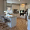
    The view from my kitchen.
  • 13 years ago
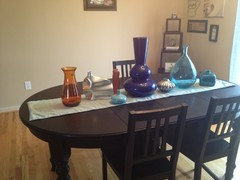
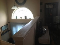
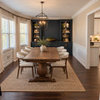
    Another view. A buffet will be going across from the table and do you think I should put anything on this ledge as you walk up my steps?
  • PRO
    13 years ago
    LOVE THE NEW PICTURES! Move your Alaska picture down to your eye level...its too high. Nice job! Your hard work pays off!!! So much cozier..it says, "come on in!"
  • PRO
    13 years ago
    Groveraxle did a nice job with the drapery and pillows.
  • PRO
    13 years ago
    Nothing on the ledge...you have enough going on...no need to clutter.
  • 13 years ago
    That looks great, groveraxle! My personal favorite so far..
  • PRO
    13 years ago
    I love the new layout! You did a lot of hard work today. The space looks very inviting and stylish.

    I second Stacey Hudson, keep the stair ledge clean.

    I suggest keeping all of the walls gray, you could do a darker tone on your large wall, but let navy be an exciting color on your accessories and furniture.
  • 13 years ago
    Somwehere above u asked about doing a navy wall with th e onther grey......GO FOR IT!! Im a bit biased though i love the navy colour, t looks spectaular in my opinion. All u can do is play around with colour until u find one u love so much u have to do it! To give u a bit more help go to ur colour swatches, close ur eyes and when u open them what is the first colour u r drawn to? This is ur primary colour. Whats the second? This is ur accent colour! Have fun and keep posting pics!
  • 13 years ago
    Crystal, I hate to throw a wrench into all your hard work, but you really shouldn't put your piano on the window wall: http://piano.about.com/od/pianomaintenancerepairs/tp/piano_room_conditions.htm
  • 13 years ago
    Thanks to all!!!!
  • 13 years ago
    Crystal, Amazing improvements, really opens the area up. You have furniture that makes a statement appearance so you can see the character of each piece, you definitely are discovering your style. The windows frame the piano.
    The curtains and window treatments accent the piano well and really make use of the other wall for furniture to be near the couch. Windows traditionally were not supposed to have furniture in front of them but designs today can ignore the old school approach.
    Very eye appealing with less clutter on the bookcases. The large collection of color on the dining room table could be reduced to one favorite while the rest might look good on the ledge with the bursts of sunlight playing with the bright glass colors.
    What do you think about navy on the bottom 1/3 of a wall with light gray above to add light and height to the wall space. If you have small boys, navy hides dirt too.