Software
Houzz Logo Print
jkcat

Backsplash for soft cream cabinets

4 years ago
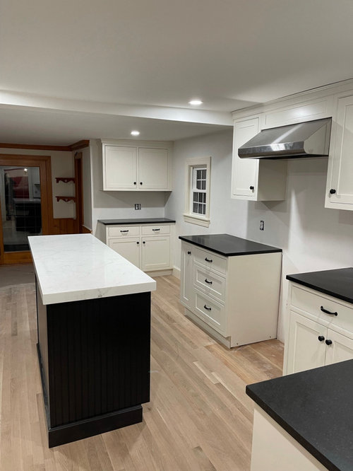
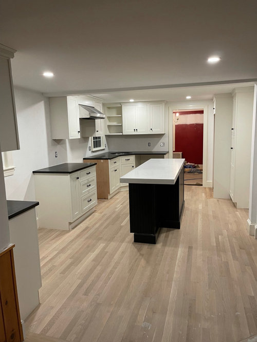
All--I am trying to find the right backsplash for my soft cream cabinets with honed absolute black counters, and also tie in the more white tone of the stratus white counter on the black island.

I thought i wanted simple white subway but all the ones I've brought back look too white next to the cream cabinets. I've tried several white and white-ish subway samples--some with with texture, a wave, matte finish--all look not quite right--usually just too white against the cream. I'm thinking I need something else that's not just a white subway but I don't want anything modern or trendy (and my husband doesn't like a lot of pattern).

Also wondering where to stop the tile where the counter extends beyond the upper cabinet. I thought about tiling the whole wall where the small window is (there will be a small radiator going back under the window) but my husband thinks that's too much tile. Any suggestions for what to try for backsplash and where to stop it?

Thanks for your input!

Comments (27)

  • 4 years ago

    its hard to tell because its such a transitional feel and your furnishings and adjacent decor is not known. You can do a shape hex or other / you can do mother of pearl to blend the shades/ try a real color.../ or herringbone or chevron for some visuals / maybe a bevel tile. Best thing is bring a variety ... not just subway and start narrowing it down. Go back to the tile store and look at the wider possibilities and bring some of these back. You'll get feedback as the kitchen is done except for this part.

  • PRO
    4 years ago
    last modified: 4 years ago

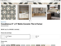
    The island top was a mistake. Why the icy white? It is VERY difficult to be in two palettes, warm and cool, simultaneously. Possible "fixes"? a tile that allows a mix of both warm and col tones. Feeling newer than subway, a five by five ceramic, Bedrosians below IIN OTHER WORDS, MAKE THE LITTLE GOOF, LOOK VERY INTENTIONAL. : )


    https://www.bedrosians.com/en/product/detail/cloe-tile/?itemNo=DECCLOWHI55G


    OR..........


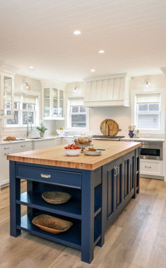
    Do the island top over. Consider a light butcher block, a quartz in a pale gray or softer white. I wouldn't tile any splash, until resolved. : ) Or paint the island to a perimeter cabinet match, and repeat your perimeter counter top. Or paint it a color and add a wood top....

    The top was a goof, ( it happens) and best is to free yourself for a soft white tile, toned to the soft white of the perimeter cabinets.


  • 4 years ago

    Jan, obviously the island top was a decent chunk of change out of the budget. Its mitered and very intentional. I think you give good middle of the road advice, so my question is, is there anyway to bring that white into the backsplash as part of a larger pattern? Maybe something a bit eyecatching to draw the eye and to add anther element of the white? Not everyone can just toss it and start over. You seem to have a good imagination with these sort of problems.

  • PRO
    4 years ago
    last modified: 4 years ago

    I I edited, ADDED to the post. With a tile you can mix......: ) Either way...samples ON site are the only way to resolve. You need samples on site for any back splash, there's no other good/guaranteed way.

  • 4 years ago

    I actually think color of island is biger problem. Maybe use dark green of dark blue? Backsplash in warm white, kind of middle ground between cabinets and island top?

  • 4 years ago
    last modified: 4 years ago

    For me, I dont think that any plain or simple tile will solve the issue. I think that something with a bit of pattern is where to head to with the backsplash. i feel like that kitchen is screaming for something whether its texture or pattern. But thats just my 2c . Id like to read others ideas. Good luck with your kitchen.

  • PRO
    4 years ago

    IMO yu have to many finishes going on and what color of cream are the cabinets, cream can be one of hundreds . IMO you either have all the same counters and a different color cabinet for the island or all the same color cabinets and a different island counter but not both.So now I would go very simple for backsplash . Then add some color with accessories

  • 4 years ago

    one other thing to keep in mind is the wall color. If you chose a more cooler lighter white....not quite stark or clinical but closer to that ...you'd have a better play w the island top. I see the wall color as not flattering ...too gray/ dull.... and its not crisp as the island top is......if you cleaned up the walls I think the cabinets would look fresher and probably appear more like a color so the island would sit better, overall . Paint can help . Get the stove in....maybe window treatments....repaint the walls and I think the splash choice will be easier. and probably whiter tile ...... if you dont want a pattern . Is your lighting done? Questions arise about the adequacy and ? possibility of a pendant .... as the various things w glass shades and use of metals on fixtures might help you over the finish line, too. Its all going to work out I think , but a little bit tricky as commenters describe .

  • 4 years ago

    I think a soft patterned tile will add some interest. Your room is mono-chromatic - all neutrals - and needs some color to pull together the three elements. Unfortunately, a warm cream and a stark White Island top will make this harder, but it can be done. Your husband may need to be more open-minded so the room gets pulled together.

  • 4 years ago

    The island is whiter than I hoped--brought the sample of cabinet to the shop and checked it as I was concerned about it being white but it looked ok against the sample in the shop...and then much brighter once in the kitchen. Everything changes once it's in the kitchen, which is even more clear when I brought my samples in. Jan, it's done -- there is no do-over happening for this chunk of quartz. And I don't hate it but I want to try to incorporate it with the backsplash. As far as lighting, there were two 3" lights added over the island--the electrician wanted to wait until we placed the island before putting them in. The low ceilings, tall owners, and narrowish island ruled out pendant lights. The walls are now BM marscapone. This pic was taken when just primed.

  • 4 years ago

    Something with a creamy beige and black might pull it together.

  • 4 years ago

    The cabinets are showplace soft cream

  • 4 years ago

    Search for porcelain tiles and patterned ones

  • 4 years ago

    maybe a picture with the actual wall color / not just primer would help people figure out some really good options then. .......so you are saying there is more lighting that is in place over the island?

  • 4 years ago

    Yes there are two lights over the island now.

  • 4 years ago

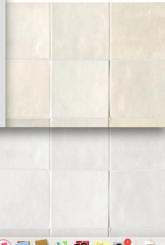
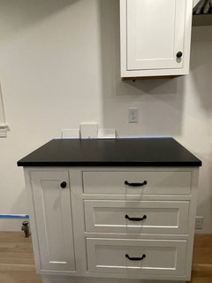
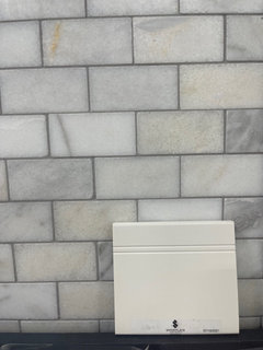
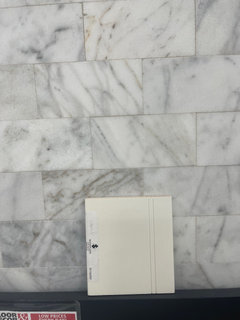
    I only have this pic if a piece of the counter and cabinet with the color on the walls. I had placed two tile samples on the counter w cab sample in bw (we had the tile samples placed at various locations, this is just the only pic). I also went and got some samples last night if a marble that had creams and whites and grays. I have to bring the to the house to test in the kitchen this weekend but here are pics of other options I was hoping might work.

  • 4 years ago

    Cabinet with BM marscapone while testing tile samples (too white against cabinet)

  • 4 years ago

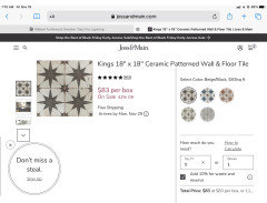
    Other tile samples I thought might work to tie in the white, cream and black--will test at house against cabinets and counter tomorrow.

  • 4 years ago

    @j_yamnitz that's along the lines of what I was thinking too.

  • 4 years ago
    last modified: 4 years ago

    love that chevron from ymnatiz [2nd one] it has a really light beautiful feel for your space. I'd lean to that.... or the shading, anyway. A tad element of gray is okay...dont go predominantly gray.

  • 4 years ago

    Be careful ... some of those gray tiles are going to end up looking blue and making your cabinets look very yellow.

  • 4 years ago

    Id try to get something to match the cabinets as close as you can.so far every surface is a different color. would not continue that with a different color backsplash. Definitely would not tile the window wall.

  • 4 years ago

    What tile did you end up using?

  • 4 years ago

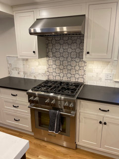
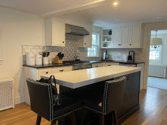
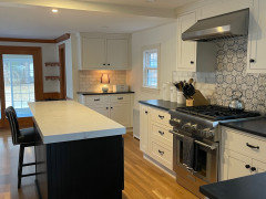
    I went with Calacatta Gold 3x6 honed marble for most of the backsplash to tie in creams and whites and a bit of gray, and then to bring some more interest I used a really pretty Artisan Oasis tile with a print on Carrera marble behind the range. This tile was a 4x4 and had creams, white, gray, and black (link to the Artisan Oasis tiles. https://stoneimpressions.com/project/oasis-tile-artisan-stone-tile/). I spent a lot more than I had intended but I truly love it.

  • 4 years ago

    I also used a tile company that let me select the slab of the Calcutta marble that was cut into the 3x6 subway so I had more control over the colors/tones in the marble.

  • PRO
    3 years ago

    It looks gorgeous! Breaking the rules (like mixing undertones) is sometimes what makes a space interesting. Harmony is easy on the eye and the mind, but sometimes doing the rare and unexpected creates a problem that can only be solved by genius and creativity. Nice job creating a unique and beautiful kitchen!

Sponsored
Whisler Home Improvement
Average rating: 5 out of 5 stars9 Reviews
Franklin County's Committed Home Improvement Professionals