Software
Houzz Logo Print
cxg2

Hall bath dilemma

4 years ago
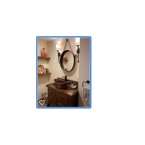
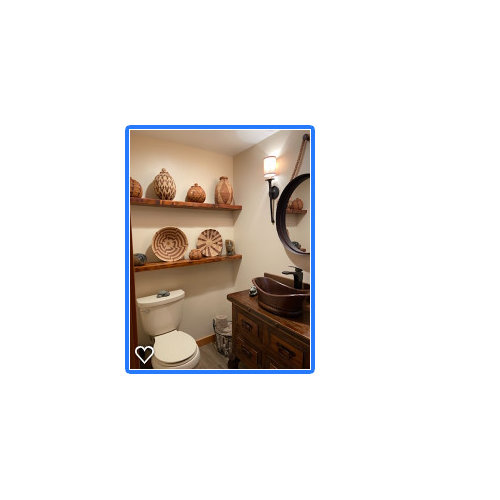
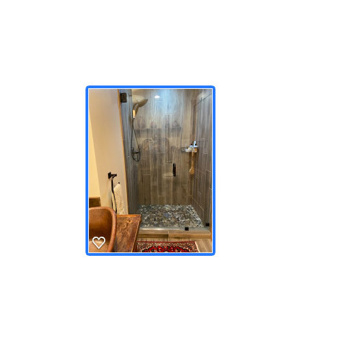
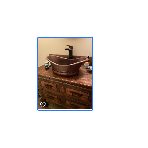
Hi everyone, we ended up buying a house in Seattle afterall... It was completely and newly remodeled so I've been reluctant to make changes, but have yet to fall in love with this hall bathroom (the main one used by guests). I don't know what style it is (I'm also not wild about the other bathroom, but will save that for another day.). It's small but includes a shower, and this large antique-ish vanity with a hammered copper sink and the rope rustic metal mirror and oil rubbed bronze/iron fixtures. I hate the little shades on the lights, the rope, the sink I can't decide if hate or not...everything just feels too heavy and i don't know what it is trying to convey. The baskets are mine and I think they look good on those reclaimed shelves, so I'm thinking...a new sink, mirror and lights? do i need to replace the vanity too or will the other fixes help tone it down? I like that this is a "statement" kind of bathroom, so I don't mind being bold, but I just don't like feeling like I'm in a ship or something. Guests seem to love it, says it feels like a spa, but... I think it's just because it's so 'bold'. Wall paper? Would really love your thoughts! Thank you!


Comments (78)

  • 4 years ago
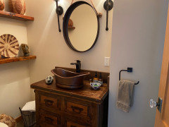
    Love your vanity and mirror! I would change the toilet. A toilet that is a different color from the sink looks like an unplanned, piecemeal reno. All white will look polished.

  • 4 years ago

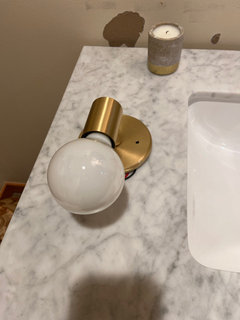
    Thank you… yes I think you’re right! My sconces came!

  • 4 years ago

    Not too white. Go for a bone color, that can blend in the cabinet, and not be too harsh a contrast. I actually LOVE that little bathroom!!!

  • 4 years ago

    Thank you!

  • 4 years ago

    looking good.


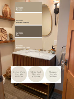
    because the real wood is next to the tile floor, I'd be tempted to paint those baseboards.

    if you like to stay w/the monotone colors, you could do these. (you don't have to do a white baseboard or trim. do a darker color and a lighter wall


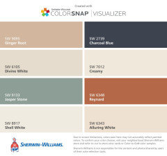
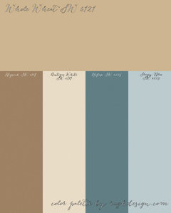
    or try some of these


  • 4 years ago

    Thank you Beth! I was hoping you would weigh in on colors! Did you see the vanity I got was one of your suggestions, with the gold brass faucet and sconces…I love it. How about baseboards that Pier brown and the walls one of the whites below…oyster white looks like it has some gray which would pick up the gray in the marble?

  • 4 years ago

    I love that vanity!

    grab a few samples and see how they look in the room. I used BM Calm in my house. It's a white w/a gray undertone. you may like that one.

    (you can go to HD and use the Behr samples. they will color match. it's not going to be exact, but should get you close enough. if you like how it looks, just use their paint. I actually prefer Behr)

  • 4 years ago

    Will do! A friend just showed me a photo of a similar vanity/counter/gold faucet with a deep navy on the wall… looked amazing but not sure I’m that brave, what do you think?

  • 4 years ago

    I think it's only paint! easily redone if you don't like it. go out on a limb.

  • 4 years ago

    I think navy would be much better than white for making your shelf decor pop. (Vases? Baskets?)

  • 4 years ago

    Ok! Thanks! Will send more pictures when all done!

  • 4 years ago

    Screenshot 2022-05-16 at 2.45.09 PM.png

  • 4 years ago

    Go for the navy. As @Beth H said, it’s only paint. I think it will make a huge impact on the whole room.

  • 4 years ago

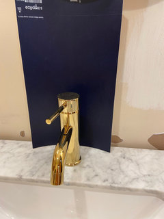
    Hi again, so the tiler came to look at the job and asked me if I wanted a gold/brass schluter trim on the top of the marble backsplash... I had never even heard of this. It sounds kind of nice but i don't want to take away from my beautiful polished brass faucet .... on the other hand, it might be a pretty accent vs just a rough tile edge with caulk/grout. I have a mix of metals--the faucet, hook, and sconces are polished brass (although the sconces are more brushed), the mirror is wood painted gold, and the drawer handle and legs of the vanity are a brushed gold... i'm thinking brushed gold to match the vanity rather than polished brass to match the faucet??....so many decisions! Any thoughts most welcome! Thanks! I'm definitely going for the navy paint...I got a sample of SW Anchors Aweigh and I'm going to go get a sample of BM Hale Navy and see which i like best. but I need the contractor to come and finish installing the sconces so i can see the paint in the light!

  • 4 years ago

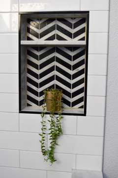
    I did both a black and a gold schluter trim in my shower. (you want the Jolly, small profile edge trim, not the other type)


    see the smaller gold edge on the inside? larger black trim on the outer rim


  • 4 years ago

    Ah pretty.

  • 4 years ago

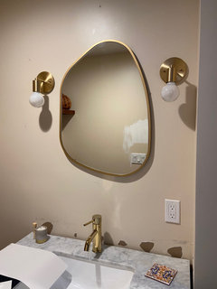
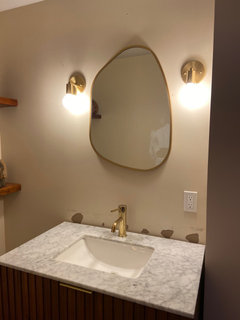
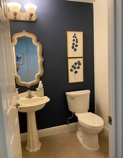
    Sconces up…

  • 4 years ago

    Love it!

  • 4 years ago

    love those!

  • 4 years ago

    The!

  • 4 years ago

    Thanks!

  • PRO
    4 years ago

    Love the asymmetrical mirror and sconce offset. Very cool!

  • 4 years ago

    The sconces and mirror look great.

  • 4 years ago

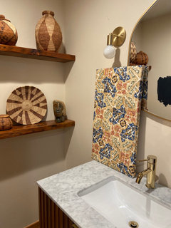
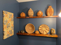
    Thank you! I’m having fun. I just made a wall hanging with fabric and some styrofoam that I think will look nice with my baskets but also break up the navy wall. It will go on the wall on the other side.

  • 4 years ago
    last modified: 4 years ago

    cute! love the colors w/the cool marble tones. can't wait to see that wall painted!

    which blue did you choose?


  • 4 years ago

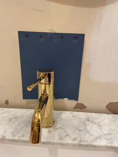
    Well, I thought Hale Navy, but I painted some swatches on the wall and in the light (no windows) it looks black… so as much as I love it I’m thinking I might need a lighter navy.

  • 4 years ago

    I might get samples of evening dove and van deusen blue….

  • 4 years ago

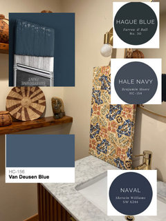
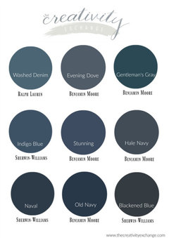
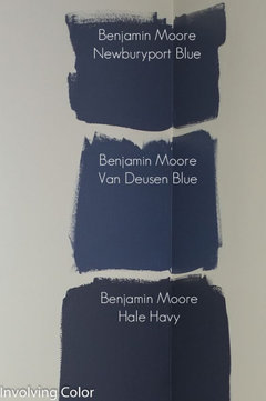
    Aaahhh… this is so hard… Van Deusen blue is very nice but not true navy, Anchors Aweigh, very rich but like Hale Navy super dark… these photos capture the difference well. So this is where there is more light than other walls…

  • 4 years ago

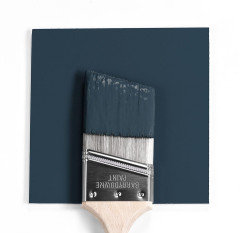
    What color is in the top left of your first picture Beth, with the paintbrush just above Van Deusen? That looks like the perfect color…

  • 4 years ago

    I have anchors aweigh on my kitchen island and it is very dark - looks almost black at night. You definitely need a bit of light for it to work.

  • 4 years ago

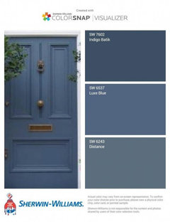
    My bathroom vanity is SW Distance and it has a distinct purple feel in a not-well-lit-bathroom. It’s not a true blue. Just thought I’d help with some of the colors Beth posted.

  • 4 years ago

    Thank you… such a hard decision but given the light it probably does make sense to go with the lighter blue…

  • PRO
    4 years ago

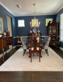
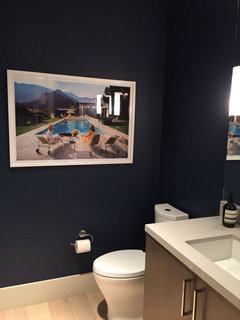
    Here is my powder room with Van Deusen Blue wall. Love it. Put it in dining room too!

  • 4 years ago

    Stunning in both rooms!

  • 4 years ago

    That is beautiful! Thanks! I see you did an accent wall in bathroom…

  • 4 years ago

    What white did you use for the trim?

  • 4 years ago
    last modified: 4 years ago

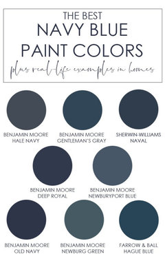
    That one is Gentlemans Gray. has a smidge of green to it. it is a pretty color


    it a small room w/no natural light, these navy colors are going to look quite a bit darker, so keep that in mind. VanDeusen isn't a navy, but it will look darker in a room w/no window.


    Hague Blue from F&B It would be similar to Hale Navy. see how the Gentlemans Gray looks a touch 'greener' ?


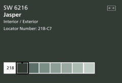
    This Jasper color is also very pretty and would look killer w/your gold and warmer elements.


    why not pick up some samples and try out your faves?

    cxg2 thanked Beth H. :
  • 4 years ago

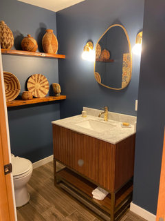
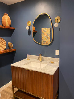
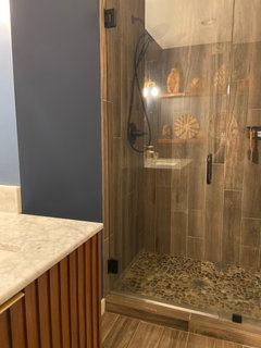
    Ok Houzzers!! I love it, thank you for all your great ideas!

  • 4 years ago

    Nice use of blue and wood/ natural. I like it.

    cxg2 thanked everdebz
  • 4 years ago

    Thanks, this was the “Before”

  • 4 years ago

    It looks great! Love the blue and the new vanity. Your baskets look better against this wall color. I’m so glad you love it.

    cxg2 thanked RedRyder
  • 4 years ago

    Wow! Looks terrific.

  • 4 years ago

    Thank you!

  • 4 years ago

    @cxg2 What shade of blue did you end up with? It is lovely!

  • 4 years ago

    Your bathroom looks really great!

  • 4 years ago

    The blue is BM Van Deusen.

  • 4 years ago

    oh my. that looks so good. van deusen is a great color.

  • 4 years ago

    Thank you Beth!

  • PRO
    4 years ago

    Looks amazing. Perfect color for your woods too. Well done! So awesome. Wait til your family and friends see this!! Oh yeah!

  • 4 years ago

    Thanks Flo! The photos you shared were very helpful!