Software
Houzz Logo Print
chcarvin

Paint problem- please help!!

4 years ago
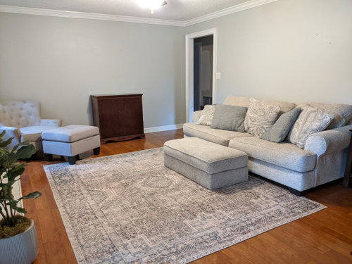
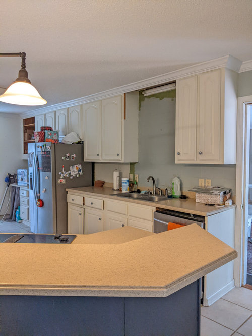
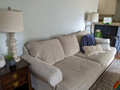
After months trying to find the right paint color for our keeping room, I finally settled on Silver Strand -- even though most of those months I spent looking at a sample that covered almost an entire wall.... and of course, now that it's fully painted... I really don't like it. *sigh* I've sat with it for a few weeks hoping I would adjust but I just don't think I can. It feels way too gray in most lights and other times of the day it's a baby blue. The trouble with finding the perfect color was that it was open to the kitchen that has off white cabinets (that we were not planning on painting) and beige countertop. I wanted more of a white look but decided I needed some color next to rhe creamy cabinets but nothing seemed right. I'm replacing the rug in the picture with the one that shows more contrast, but what if I repainted the room in the color Swiss Coffee and that way the living room all the way into the kitchen was an off-white. I think they'd match pretty well without repainting cabinets. We are putting a brick backsplash in the kitchen and with the darker rug, I am hoping it will contrast the light color throughout both rooms nicely. The island separating them is painted Hale Navy. Does that sound nice or will I regret that as well? Please help before my husband puts me in the looney bin!!

Comments (16)

  • 4 years ago

    Thank you!! Do you think a whiter white would look okay next to the off white cabinets?

  • 4 years ago

    Yes, if it’s similar to the trim color, it will all go together.

  • 4 years ago

    I'm generally not a fan of gray, but I think it looks fine, as a wall color. What I do think is that you need COLOR... somewhere. *Everything* looks grey in your photo - the sofa, the cushions, the rug... Add some colorful art to the walls, some red pillows, lamps with color. I'd choose one or two colors - I like red, but could be green and yellow... just have fun with color.

  • 4 years ago

    Yes, I agree about the color. I'm hoping the new rug will do that and I was hoping to add most color with the decor,but I can't get past the gray-- especially when it often looks baby blue. ὡE

  • 4 years ago

    Chelsie, I once painted a room three times until I found the right color. How do you want the room to feel? I am assuming warmer and not cooler given your thoughts on the paint color.


    I think everything in room is reading on the cool side except your plant and wood piece of furniture.


    I think whatever you decide to do in regards to wall color you just want to bring in some warm tones. You can do that with your rug, throw pillows, lamps (lamps make everything feel warmer) and maybe throw in some more wood furniture and nice art.

  • 4 years ago

    Happy to hear I'm not the only one!! ὡC Yes, I think I'd like warmer. I'm trying to get the colors right before I add any art, but maybe that would help inspire me. If I did the Swiss Coffee would it make the off white couch blend into the wall too much? I'm hoping to put a big mirror over the couch and put a vintage gallery wall over the antique piece. I've got cream and navy pillows I'm adding, the island has been painted Hale Navy and I will look for dark wood bar stools. The new rug will definitely add color. I'm itching to use the Swiss Coffee but worry if regret that too. ὡE

  • 4 years ago
    last modified: 4 years ago

    What paint line/company are you using? A lot of paint lines carry the color Swiss Coffee. I am feeling your pain on not liking your paint. I just had my living room/dining room area pained Sherwin Williams Creamy and I'm not liking it. I wanted a warm creamy white like the name but it's too cool for me and leans a bit yellow.

    Now back to the Swiss Coffee. I also had me ceiling scraped/textured and painted. It is a nice white color. Maybe I should have gone with the same on the walls. I contacted the drywall guy who did the ceilings and he said the ceiling paint color is Swiss Coffee by Dunn Edwards.

  • 4 years ago

    I was thinking of the Benjamin Moore paint, but I will have to check out Dunn Edwards. I would LOVE to have the ceiling scraped. We are doing renovations in the kitchen so that may have to wait, but it would definitely be nice!

  • 4 years ago

    I was thinking of the Benjamin Moore paint, but I will have to check out Dunn Edwards. I would LOVE to have the ceiling scraped. We are doing renovations in the kitchen so that may have to wait, but it would definitely be nice!

  • 4 years ago

    Does it need to have color so there's not too much white or off white now with the light couch? I covered one pillow to show what more navy on there would look like. Haha when there is something on the wall will it look okay if everything else is kind of the same? Remember the new rug I've ordered will add some contrast.

  • 4 years ago

    I would not add a mirror over the sofa. I think that is one place that needs color as in art.


    I would consider painting your lamp bases in a darker color or just use a wax to add some darker wood tones.


    I have a beige sofa with beige walls as I live in an apartment. Excuse the messy sofa... I have several cats. However, it the beiges are ok bc I have loads of color to make the space not feel just beige.


    It is not my dream set up... but I rent so I make do. Again, my couch and pillows do not look the best as I need to do a good cleaning in there.


  • 4 years ago

    Any interest in doing a cool hale navy accent wall?


    In my former kitchen we did something similar.


    Same color as island on accent wall


    Kitchen


    We used the same paint on the cabs as we did on the trim and baseboards. I it was SW Dove w

    white.

  • 4 years ago

    If you're up to trying to stick with a grey, what about Benjamin Moore Edgecomb grey?

  • 4 years ago

    Check this out. Colors that go with BM Hale Navy


    Colors that go with Hale Navy

  • 4 years ago

    I know that we go through trend after trend, beige walls, gray walls, greige and now white. The problem with just picking the new neutral fad color is that it doesn't take into account what works well with the colors you love.


    My favorite colors have always been wine reds and purples and teals. My sister loves fall colors, the deep oranges, golds and greens. My sister in law loves pastel colors, cornflower blue and peach.


    When we buy art, we are drawn to the colors we love. When we pick a bedspread or throw pillows we are drawn to the colors we love. When we look for area rugs or bathroom towels we are attracted to the colors we love.


    Walls shouldn't be the main attraction, but should act as the foundation for your art and décor. It is kind of like picking the right foundation makeup. Just because an ivory foundation makeup looks great on your best friend or is a top seller doesn't mean it works with your skin tone, hair and eye color.