Software
Houzz Logo Print
palimpsest

Better, or different.

4 years ago
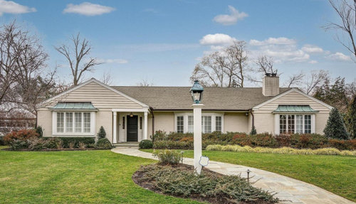
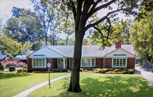
In real estate today: I often look at the Streetview and I found this today. The Streetview of the location is not recent. So, one of my favorite questions.

Listing:


Streetview:


Is the newer better, or just different?


Comments (47)

  • 4 years ago
    last modified: 4 years ago

    Better. I like the new curved sidewalk more, the lightpost moved (not under tree), added and changed shape of front columns and the front steps moved to the front of porch. The painted brick also makes the house look better as a whole.

  • 4 years ago

    I like the newer better, too. They did a nice job with the colors, it actually looks like it could have started that way.

  • 4 years ago

    Much much better. I like everything about the newer version.

  • 4 years ago

    Better. It added a little French Country to the pic.

  • 4 years ago

    I agree, better!

  • 4 years ago

    Different, or worse. I thought the first photo was the old and the second the new, till I realized I had them switched. The foundation plants look better in the older. I do prefer the curved walkway and lamp position in the newer, but I think the beige house is unappealing.

  • 4 years ago
    last modified: 4 years ago

    I like the looks of the new better but I would never paint brick.

  • 4 years ago
    last modified: 4 years ago

    As much as I think ”no, don’t” when a brick house in my neighborhood is painted, sometimes it is for the better. Only thing is, look at the chimney already.

    I like the new porch, the lamppost, the walkway, but I like the old foundation plantings. In either case, I hope there is a walkway across to the driveway, as well as to the street.

    Oh, can can we tuck the security sign down a bit more into the plants, and straighten it? Please? Those signs don’t look very welcoming, but I guess that’s the point..

  • 4 years ago

    Since it appears that a mature tree was lost between the before and after, I have to say that the new version is worse.

  • 4 years ago

    I wondered about the mature tree as well. The pictures were taken in different seasons and in the top photo upper right there is a tree branch which I hope belongs to that mature tree that is so beautiful in the bottom photo.

  • 4 years ago

    Better.


    Many mature trees have a life span. We’ve lost 2 magnificent oaks within the last few years. Both Laurel Oaks that died of old age.

  • 4 years ago

    The first thing that caught my eye was the lack of trees in the listing photo. Looks as if a tornado wiped them out.


    I don't mind the painted brick as it lightens up the house. Landscaping looks nice as well, except for the lack of mature trees.

  • 4 years ago

    The walkway is only better because the entry was changed from side-of-porch to dead-on. Which was a mistake.


    The painted brick, the weird extra porch post (what is it supposed to be? a metal detector?), the cheesy Home Depot landscaping...not better.


    If you were gonna fix up that house, you'd do something to play down the siding and the weird off-center bay window. You wouldn't do...whatever that was.

  • 4 years ago

    Different, but I have mixed feelings.


    1. They did a good job on the after. Looks like it has always been that way. I like how the front porch is opened up.

    2. Love the improvement on the layout of sidewalk and the lamp post/landscaping.

    3. I love red brick on older ranch homes...would never paint brick.

    4. Would NEVER remove a good shade tree. They may not have had a choice. i have cried over losing my maple trees.....but trees dont last forever.


    In summary, I thinks improvements could have been made without painting the brick and without removing the tree.


  • 4 years ago
    last modified: 4 years ago

    I like the old version; more colorful and more interesting. The new version is bland and boring.

  • 4 years ago

    They might have lost only the one tree in front. The photos are taken from different angles, and I’m always surprised that a shot a little lower can make the house completely block anything tall in the back yard.

  • 4 years ago

    And who knows how many years between pictures. Our current street’s Google view is from 2012.

  • 4 years ago
    last modified: 4 years ago

    I think the tree is still there. Enlarge photo and you can see bare limbs on the right side towards the top.


    ETA Photo: TREE is still there.


  • 4 years ago

    Way, way worse. The re-done appears to be one of those 1970's houses, that the lady of the house would have filled with cheaply made "french provincial" furnishings and thought she was oh so chic.


  • 4 years ago

    Well my vote is not "better". The house did need some freshening up, it was 60 years old in the "before" picture. But the first thing I saw in the new picture was the shabby looking chimney and I feel like the house looks flatter now. I do like the new walk.

    Something weird happened to the back, probably prior to the latest owners. There is a little bit something "Upson Downs, Mountebank, CT" (Auntie Mame) about the current back yard.


  • 4 years ago

    Geez, that backyard is just a cluster eff.

  • 4 years ago
    last modified: 4 years ago

    Two thoughts. The new landscaping looks a little unkempt or wild to me and does not fit the what I perceive to be a more formal exterior look,

    I also don't care that the after photo appears to be head on and the lamppost is smack in front of the window. That's just like when people plant trees right in the middle of their house. I'm hoping the big tree is still there or died an unfortunate death and wasn't electively removed.

    I liked the red brick.

  • 4 years ago

    Adding on to an existing house in a city isn't going to get you something perfect most times. I bet it's nice inside and serves their purposes outside.


    The pizza oven is pretty weird though, especially with their aversion to nekkid brick. :P

  • 4 years ago
    last modified: 4 years ago

    Different. Maybe worse. I think a really good quality roof with architectural shingles in the same color as in the before photo, keeping the landscaping and widening the walkway if in good shape with brick would have made a significant improvement. All the $$$ spent didn't correct the real problem of the asymmetry of that left wing. I can't help thinking it did not look that way when first built...but yes, it's probably lovely on the inside. I prefer the after rather than tearing down and building a McMansion.

  • 4 years ago

    I am sure the asymmetry was original to 1952. They were not nearly as hung up on forcing symmetry onto everything as house designers are now. They were probably more concerned about putting that bay in the middle of whatever room it was in, which of course would be to the right side because of the entry hall.

  • 4 years ago

    Different. There's something about the way the siding plays off the painted brick that doesn't quite cut it for me. I think the original could've done with some updating, but I'm not sure this was the best solution.

  • 4 years ago
    last modified: 4 years ago

    Worse. I like brick.

    Allison, i think the post light is actually in the same place, but since the walkway has been changed to undulating curves the same post is now on the other side of the new walkway.

    If they wanted to give a new look to the house there are many other ways to have improved it.

  • 4 years ago

    I'm voting for better.

    Although I agree w/the lack of the trees.

  • 4 years ago

    I think it's the same sidewalk lantern, I think it's gas. I think they just built a bigger post around it.

  • 4 years ago

    I like the old house much better.

  • 4 years ago

    I like the paint colors on the new much better as it looks fresher and more up to date and it makes the house look larger without being so cut up by the brick vs the gables.

  • 4 years ago

    It's just different. 'up to date' isn't always a compliment. What's wrong with history showing in our architecture? Keeping things in good repair and improving are good things but making everything look like TODAY--pass. Painting brick is always a bad idea for longevity and it leaves future homeowners with horrible issues, the chimney as pointed out is already showing one issue. Sure it looks fresh but when dealing with things like a house one has to think of the long game. Loss of the tree is note worthy. I doubt it was all that old. It wasn't that large. They sacrificed it for the walk way, which if they had put a new tree in I could see. The curved wider path and larger light pole are much better. The porch is an improvement. The new plantings are already too tall, too much, looks over grown. Security SIGNS deter the actual product not so much!!!

  • 4 years ago

    I think it may be possible that the new photo is from a different angle and closer to the house and the tree is actually still there. You can see a tall limb up in the top right corner of the photo that I think belongs to that tree. I do hope they didn't cut it down...I do hate that when people cut trees down!

  • 4 years ago

    Exactly, @arkansas girl I said this earlier, and just ETA this photo clip. Looks like the tree is still there.


  • 4 years ago
    last modified: 4 years ago

    There is something texturally about painted brick that makes me vomit a litlle in my mouth so for me it is much worse.

  • 4 years ago

    I notice they added a column and a lintel on the front porch and beefed up the lamp post. But what makes no sense is why did they paint the leaders brown? They were white before and would've blended into the paint much better that way....

  • 4 years ago

    I think it looks pretty handsome in the before and after.


    I agree adding the second column wasn't totally necessary but it is pleasing to have a porch with two symmetrical columns, if not totally correct from a functionality perspective. I like the front entry with the wide steps. Better than average (not to say award winning) landscaping in both pictures. I think the awnings look better (more like they belong) in the more Mediterranean-looking after. I really love a brick rancher and I personally would almost never paint brick unless it was truly hideous, but I can understand the urge to go for a unified look.

  • 4 years ago

    I want to hate the after because I usually hate painted brick, but I don't. I kind of like both before and after equally. I like how the bay windows and lovely copper roofs stand out against the beige.

  • 4 years ago

    I think the new gutters might be copper and they will stay brown for years before they verdigris.

  • 4 years ago

    Different. I like the new walk. I dislike painted brick. The extra post on the entry is neither functional nor attractive. The new landscaping is already covering the lower part of the windows, so that means plants were not selected with mature size in mind.

  • 4 years ago

    Different. I rarely like painted brick, while I don’t hate this it will become dated before too long.

  • 4 years ago

    Our copper gutters etc were shiny when installed. They turned brown, but not that brown, the first year. Also, most that put in copper gutters do round downspouts and these are not. I think they are painted, maybe trying to mimic copper. I pulled the photo and enlarged when Pal posted to see them.

  • 4 years ago

    Why did the have to cut down the tree. That bothers me.

  • 4 years ago

    The old tree is still there. See Allison’s pic.

  • 4 years ago

    Actually it's just a different camera, angle, and time of year. I think it's still there.

  • 4 years ago

    I spoke too soon!