Software
Houzz Logo Print

Comments (44)

  • 4 years ago

    Love the bedding and the bed! Original and fun. The paint color looks to me a bit dull and deep but impossible to know on line. I'd try a few different peel-able samples to see how that shade will react with the light (day and night time) in the room.

    Sunshine Anderson thanked hollybar
  • 4 years ago

    I love the wall color and the bedding!


    Make sure that the lighting is adequate. Nice and bright. Window treatment, light and airy with blinds.


    But, yes, as @hollybar recommended, get samples and see the wall color shade in the room.

    Sunshine Anderson thanked njmomma
  • 4 years ago
    last modified: 4 years ago

    @hollybar Thank you. The color is muted and the LVR is 17.61. I have had it swatch on the wall for about a month. The color feels very nostalgic and whimiscal. It looks nice against all of the different elements in the room (although I am not 100% sure that the current grey rug is idea). With that said, I am afraid of how saturated the color is.


    The other color I was looking at was Sherwin Williams Woven Wicker which has a slightly higher LVR. The muted orange/brown is also sampled on our wall and looks good with my daughter's bedding and furniture. But, who paints a little girls room golden brown?

  • 4 years ago
    last modified: 4 years ago

    @njmomma Thank you. You're giving me confidence! There is only one window in my daughter's room and she has newer white blinds. The ceiling are vaulted with no ceiling lights. Most of what we have planned for (to date) are lamps. Does this change your opinion?


    Could you give me an example of window treatments you are thinking of? I do want to add curtains.

  • 4 years ago

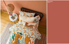
    On my monitor it looks like the bedding is more orange than the Rosy Peach, but what's important is how it looks in real life. Rosy Peach is a very intense color. Does the room lend itself to an accent wall in the dark color and the rest of the walls in something lighter (moving up the paint chip to its lighter version) or even possibly the Shoji White? I would certainly paint one wall first and see how it looks to you before doing the whole room in it all in one day. Dark colors are harder to cover if you decided to repaint.

    Sunshine Anderson thanked kandrewspa
  • 4 years ago

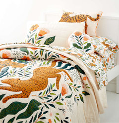
    @kandrewspa. The Peachy Rose color is sprinkled in the bedding. I’ve attached a photo. The bedding is mostly orange brown which is why I was considering SW Woven Wicker but I dont think anyone else likes it. My husband and painters are pressuring me to decide for tomorrow :(


  • 4 years ago

    @Sunshine Anderson

    For drapes I would do the background of the bedding, cream or white sheers on a black wrought iron rod. Matching the black headboard.

    Sunshine Anderson thanked njmomma
  • 4 years ago

    We have a small powder room painted an orangey colour that is about that dark and intense. I would not paint a bedroom that colour. Too much colour. I do not think you will be happy with the result.

    Sunshine Anderson thanked partim
  • 4 years ago

    That color looks too dark. how does Shoji White look in her bedroom?

    Sunshine Anderson thanked Suki Mom
  • 4 years ago

    I like BM Rosy Peach with the bedding- it’s a fun color for a young child’s bedroom. Does your daughter like it? I think SW Woven Wicker is a rather dreary color for a child’s bedroom. I’d follow the suggestion given by njmomma for curtains.

    Sunshine Anderson thanked Carolae
  • 4 years ago
    Sunshine Anderson thanked Carolae
  • 4 years ago

    @njmomma. That sounds pretty!

  • 4 years ago

    @partim Thank you. it’s a pretty color

    but I want to make sure the energy is perfect for her frowing mind/body. I am afraid it will be too much.

  • 4 years ago

    @Suki Mom. It would look good but my husband wants to do something special for our daughter’s bedroom. He likes color and most of our interior is painted Shoji White (which is white to him). He said he didnt want to come home to another white wall LOL. I will ask him to reconsider.

  • 4 years ago

    Everyone! I have an idea! What about painting BM Rosey Peach on her ceiling only? It is vaulted.

  • 4 years ago

    Have you thought about doing an accent wall? The wall the headboard would be on? In the BM Rosey Peach?


    Honestly, we really need to see the room. Can you post pictures?

  • 4 years ago
    last modified: 4 years ago

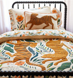
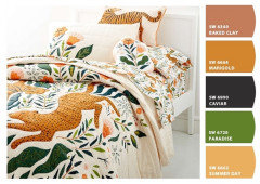
    Unless your daughter loves, I’d head in a different direction. Lighter, fresher, and more complementary to black bed and bedding - they willl pop. The bedding website actually incorporates the color I was going to suggest.


    Peachy Rose room


    Something like this


    https://www.etsy.com/listing/549798644/tiger-print-large-wall-art-tiger-art?epik=dj0yJnU9M24xSEdQV3BET1VWWmtfY0FlSGhWTlhpY3RIckZ3RU8mcD0wJm49bmxaYUctcVJ3bkhJRVFWdVRoM1IxZyZ0PUFBQUFBR0lPZnRj


    Sunshine Anderson thanked Maureen
  • 4 years ago

    @Maureen The second photo does not make

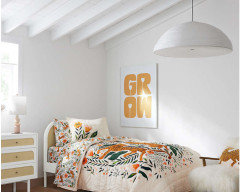
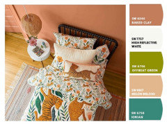
    me happy. I don’t have BM Marigold in my deck. I will try to find it. Do you know how it compairs to SW Bakelite Gold? I love the wall color of the last photo. Is it different than BM Marigold? Seeing how everything pops against the light grey walls in the etsy photo and how the bed and bedding is stage in some photos makes me want to go very light although I love photo with the colored walls on the bedding website (as you pointed out).


  • 4 years ago

    @njmomma


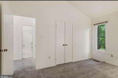
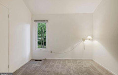
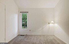
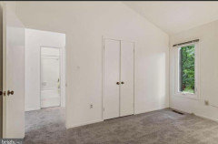
    Here is her room before we moved in. The ceiling is vaulted which you cannot see. The wall light is gone and the only lighting in the room will be lamps unless we do electral work (I’m open to this but supply is an issue and I’d need to decide on and have a fixture in hand by the middle of next week). The other wall (not shown) is uninterrupted.


  • 4 years ago

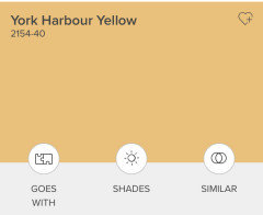
    The color in last photo is more of a mustard.

    Could go a bit lighter, but your best bet is to test in her room.


  • 4 years ago

    Carpet seems to be on the cooler side. I see blue in it. All the other fixed elements are warm.

  • 4 years ago

    Hold a piece of bright white paper next to the carpet to assess the color. On my phone it looks like a pink beige.

  • PRO
    4 years ago

    A swing and a miss ....... on this color.


    It's sometimes a good idea to let the Sherwin Williams ColorSnap computer find colors for you. You don't have to use the exact color, but it points you in the right direction for finding the right color.


  • 4 years ago

    I like the colors and the bedding. It looks like a fun childs room. The most important thing is, does she love it all? She is the one that has to really love her room and have it a place she wants to be.

  • 4 years ago

    @Beverly

    Beverly gave you some great SW paint colors to consider.

    I would check them out

  • 4 years ago

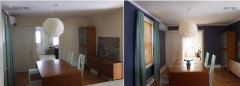
    My reservation about a dark colour in the room is that it only has one relatively small window.

    In the 2 pictures above, the piano room has a very large window.

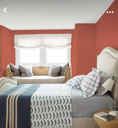
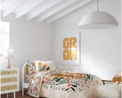
    And in the bedroom shown above, the colour looks but but in my opinion that's only because the light from the window is shining directly onto the wall with the poster. If it were lit by lamps only, or at a different time of day, I think it would be dark and somewhat dreary.

    Your room has only one relatively small window, and I don't see how it would cast much light on any of the walls because it is in the corner and seems to be lighting only the short wall beside the closet, which will probably stay white. So you won't ever be getting a wash of light on any of the longer painted walls.

    I think that because you (or your husband) are sick of all-white walls, you are going to the opposite extreme, which is not necessary to feel like the room has some colour.

    How big is your swatch compared to the area of the wall that you are painting? If your room is 12 ft x 12 ft and 8 feet tall, you're painting 384 square feet of wall, compared to maybe a one foot square of swatch. You're multiplying the amount of colour by hundreds.

    When I was a young teen my parents let me pick my room colour, and I matched the wall colour to one of the colours in my bedspread. It was way too dark and intense, and I hated it for years. And before you ask, no, it wasn't an option to "just" repaint. So don't make my newbee mistake.

  • 4 years ago

    I think dark wall colors look best in rooms that are north facing or have little natural light, and can help make a room cozy.

  • 4 years ago

    @Carolae the OP may want that look, but the point of my post above was to point out that the room will not look like the picture in @Jennifer Hogan's post above, with light streaming onto the wall. No-one wants surprises after the room is painted!

  • 4 years ago

    A common mistake is to think that light colors in rooms without much natural daylight are the right answer.

    You need richer, bolder colors to offset the shadows cast in rooms without much natural daylight.

    The Piano Room has a large window, but the day was completely overcast (raining) and it is a north facing room.

    This is one of the few real life examples, but it is a good one (From Little Victorian)


  • 4 years ago

    OP, please let us know what you decided to do and post a picture. I am very interested in seeing how it looks when completed.

    Sunshine Anderson thanked kandrewspa
  • 4 years ago
    last modified: 4 years ago

    @kandrewspa I will. I am confused as ever and open to taking a totally new direction. I just dont know. I am going to try to rest my mind and regroup.

  • 4 years ago

    @Jennifer Hogan. Thank you. I do want to consider the psychology of color. My daughter had Down Syndrome and we need to do everything we can to encourage commincation. She is confident and social but we need to do all that we can to keep that up as we enter grade school. Please let me know if you have any other paychology of color recommendations.

  • 4 years ago

    @BeverlyFLADeziner. Thank you for sharing that tool. I did not know about it and will try it out.

  • 4 years ago

    I am not expert on color psychology, just absolutely fascinated by color and the perception of color and the emotional responses to color, how color trends change with the economy and how our mood impacts how we see color and how color impacts our mood. Why did we change from rich Tuscan colors to builders beige and white after 911 and then switch to gray when the housing market failed in 2008. After 10 years the housing market had rebounded and things were looking better - we were seeing white on white as the newest design trend (White is the color of hope, where gray symbolizes security, beige is more comforting). Covid has mixed things up a bit, white and hope are still high, but I am seeing more and more people yearning for color.


    This is a website about child development and color. http://renketkisi.com/en/index.html. It touches on children with disabilities. You may want to ask your child's developmental therapists if they have any information on color choices that may help with your child's developmental progress.


  • 4 years ago

    @Jennifer Hogan. Thank you so much. I will look into everything!

  • 4 years ago

    I just used Rosy Peach in the hutch in my dining room and as the background to built-in shelves in my den. I think it is a great color for your daughter's room.

  • 4 years ago

    @houssaon You don't think it will be too dark? Can you share a photo?

  • 4 years ago
    last modified: 4 years ago

    @hollybar

    @njmomma

    @kandrewspa

    @partim

    @Suki Mom

    @houssaon

    @Jennifer Hogan

    @Carolae

    @Maureen

    @BeverlyFLADeziner

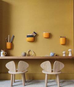
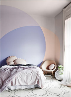
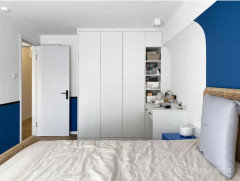
    Any thoughts on trying to achieve the look below with SW Woven Wicker, BM Muslin, or SW Evergreen Fog? I cant make sense of how the walls and ceiling are painted but it’s an interesting take on accent walls.


  • 4 years ago

    Sounds like you want to use two of these three colors? Getting a better sense of entire room in one photo would help and then if someone has the ability to do mock ups for you that would be your best bet. Room will be darker than your inspiration picture if not using a lighter shade on walls?

    Did you want a white ceiling or a color?

    What wall will be bed be on?

    Good luck.

    Sunshine Anderson thanked Maureen
  • 4 years ago

    @Maureen. I am thinking one of the three colors alongside a white.

  • 4 years ago

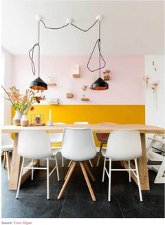
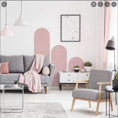
    Accent walls are the simplest form of color blocking, but there are many ways to add color to walls without painting the whole wall. This is often done in conjunction with one or more matching pieces of furniture.


    I have some additional examples in 2 ideabooks.


    Mostly Color Blocked Walls

    https://www.houzz.com/plans/color-blocked-walls-pp~3447796?stepId=saved


    Some that got mixed into my color ideabook.


    https://www.houzz.com/plans/colors-pp~194085?stepId=saved


    most of my saved images will be stronger colors than you are looking at because I like strong colors, but you should be able to get ideas for ways to add color without adding color to an entire wall.

  • 4 years ago

    Are you going to be keeping the carpeting? You mentioned earlier that it is a cool gray. In that case I am concerned about pairing a warm wall color with it. Do you have the bedding already? Does it look good with the carpet? I love Evergreen Fog but I am not feeling it for a little girl's room. I have seen it used in a boy's room. Which wall were you going to place the bed on?

  • 4 years ago

    @kandrewspa Yes, I definately have to keep the carpet and it does look fine with it.


    Here is her bedding:


    https://www.crateandbarrel.com/marrakech-tiger-kids-twin-quilt/s568616?localedetail=US&a=1552&campaignid=12237167245&adgroupid=119984803089&targetid=pla-979968487601&pla_sku=568616&pcat=HSW&ag=kids&scid=scplp568616&sc_intid=568616&gclid=Cj0KCQiA3rKQBhCNARIsACUEW_ZIfOSNI9E8uebI37MeQnl5IRNVmffxNz5pw82-t-Nmptqthropc2IaAiu8EALw_wcB


    Here is her bed:


    https://www.crateandbarrel.com/jenny-lind-kids-black-twin-bed/s327007?localedetail=US&storeid=609&a=1552&campaignid=9986587418&adgroupid=101670670275&targetid=pla-557249027004&pla_sku=327007&pcat=HSW&ag=kids&gclid=Cj0KCQiA3rKQBhCNARIsACUEW_ZFUzo_UTYMwI9M89UBxhwyJ1zGpHLLkDwj_wjud64oc9aReFy8Z7YaAhioEALw_wcB


    If you look at the photos of her room shared a little while back, we had the bed opposite the wall that has the lamp (with the foot of her bed facing the lamp). Here are photos of her room:


    We could also arrange it so that the head of the bed is where the lamp is (same wall as the only window) to look more like this:


    Another option would be to place it similar to the inspiration photo where her bed is directly in front of you when you open the door. But, I read that it‘s best not to have the foot of your bed facing a door.


    The way the wall color shows up on my screen in the inspiration photo is almost identical to the SW Woven Wicker color in person and I know it will match the rest of my home since this is our whole house pallet. I would want to also incorporate the black and white wall paper in the inspiration photo. You may have to look closely to notice it.