Software
Houzz Logo Print
mc2543

Window Feedback on elevation

4 years ago
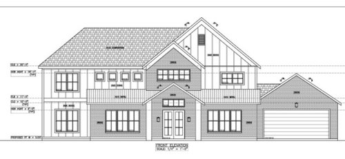
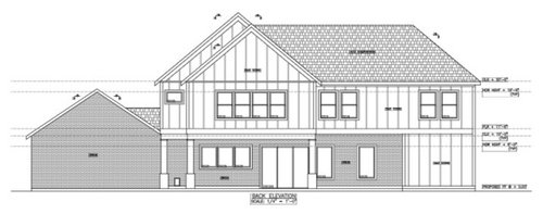
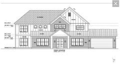
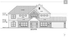
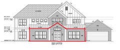
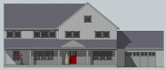
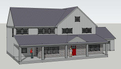
Any glaring feedback on this house with respect to the windows?

Only thing I can think of is spacing out the triples on either side of the front door and maybe spacing out the 4 pack in the back on the 2nd floor.

Would a 4x4 pattern look better on the larger front windows?

Comments (39)

  • PRO
    4 years ago

    The windows are not of a consistent style--some have muntins and some don't. Also some look to be double hung and others awning? or sliders? The 4 little ones in the front don't go with anything.

    Also you have too many cladding materials--horizontal and vertical siding--plus two different roof materials. The whole house needs to be simplified and streamlined, it's very busy looking.

  • 4 years ago

    Diana thanks for the feedback.

    I’m under the impression muntins on the rear of the house weren’t as important and can be cut down to allow for better views. Aesthetics on the front and functionality on the back.

    Most are single hung and picture.

    The 4 small ones are where the stairs travel to the 2nd floor.

    The house has to be mostly brick on the first floor so we have that and then we used board and batten for the rest.

    Figured the metal accent roof on the first floor would make it stand out and look a little nicer than shingles.

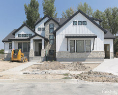
    Modern farmhouse was the style we were trying take.

    Any pointers on how to simplify and help the elevation flow better?

  • PRO
    4 years ago

    Was this created by an architect? If so, he or she should be the one to ask. But as I stated, cutting down on the number of materials would be a good first step. Why do you need brick and board and batten? Brick doesn't say "farmhouse" to me, modern or otherwise. And I don't agree with the idea that the front and back of the house should be different. Farmhouses are simple structures, they don't have extraneous items just to make them "stand out."

  • 4 years ago

    Majority brick or stone for first floor is a requirement for the neighborhood.

    I’ve seen some modern farmhouse unpainted brick that didn’t look bad so we were trying to emulate that in some fashion. https://www.architecturaldesigns.com/house-plans/modern-farmhouse-plan-rich-with-features-14662rk/client_photo_albums/1192

    Just trying to pull it all together into something that looks good. Figured the windows needed some TLC but you bring up some thoughtful suggestions.

  • PRO
    4 years ago

    Good houses are designed with all exterior elevations considered, not just the front and back.

  • 4 years ago

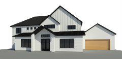
    We reviewed a design similar to the 3rd rev you have but we agreed (me and builder) it looked too much like a schoolhouse. The extra gable seemed to break up the long ridge. You don’t care for it?

  • 4 years ago

    Shouldn't the back and sides match, coordinate with, or complement the front? They should certainly be as attractive.

  • 4 years ago

    Any one element of a design must be coordinated with all the other elements but two elevation drawings is not enough information.

    For us to understand the massing of the house you need to provide either the side elevations or the floor pllans or a 3d perspective.

  • PRO
    4 years ago

    What if you have one vertical grill on the front, cross hairs on the right side, nine divisions on the left side , and none in the rear?

  • 4 years ago

    I'd prefer to lose the nested gable and the gable over the front door - losing both the double door and the transom. I think you are complicating the idea of a modern farmhouse with McMansion features and it's taking away from the simple lines of the structure that a farmhouse should have.

  • 4 years ago

    Something doesn't look right with the double front doors and the transom above.

    I would also want to see how that gable ties into the gable behind it and exactly what distance that ridge will be below the windows in the back gable.

    Would also want to see how that metal roof is going to tie into the garage on the right side.

    I would want a better looking garage door. Maybe 2 single doors would look better?

    Add a window to the back garage wall to break up that large expanse of brick.

  • 4 years ago

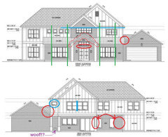
    A couple comments on the front:

    - In GREEN lining up windows, affects plan

    - In BLUE, "loft" window head is higher than adjacents? Width not successfully proportioned with the porch gable, but see other commenters' sketches about the gables and use of brick.

    - In RED porch gable framing, there is none shown. Brick between the door and transom. Garage gable problematic shedding water to the wall.

    A couple on the back:

    - In RED same garage roof problem, and the distance between slider and window, and other window and wall doesn't seem to match a typical family/dining room proportion. Plan specific, but review all fenestration locations with respect to upstairs massing and columns.

    - In BLUE the 4-unit window is shown mulled, as opposed to the other (2) unit windows. Probably would be beneficial to have a post there. Also the transom might be pretty tall if over a shower.

    - In PURPLE doggie door doesn't have to line up with anything.


    M C thanked 3onthetree
  • 4 years ago

    RES nailed it with his drawing.

  • PRO
    4 years ago

    Yes RES2 so much better!!

  • 4 years ago

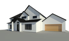
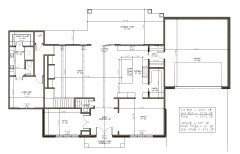
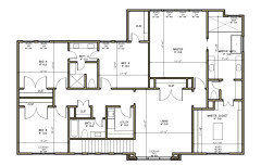
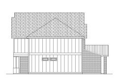
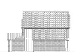
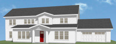
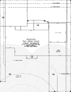
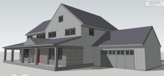
    Thanks for all the comments and suggestions. As indicated the documents I have sent are lacking so here is a file dump of everything I have. 3D renders, floor plans, left and right elevations.


  • 4 years ago
    last modified: 4 years ago
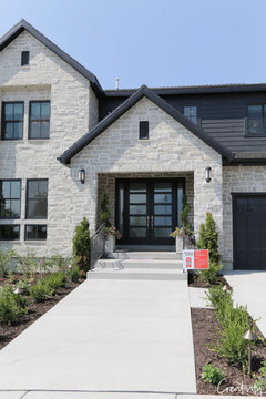
    PPF cleared up my one cavil: correcting the asymmetric 2nd floor window.

  • 4 years ago

    Unpacking some very helpful comments

    • I've seen both double and single doors for farmhouse but most comments here are reflecting going with single doors. Is single the original farmhouse?
    • The left and right elevation lack windows (except for guest bathroom and master bathroom) because the house will be right on the property line. Most houses around the area look similar.
    • Lots of comments saying unpainted brick will clash. Was hoping a subtle non painted brick would still look good.

    https://www.houzz.com/hznb/photos/2018-home-a-rama-people-choice-farmhouse-exterior-indianapolis-phvw-vp~132754316

    https://www.houzz.com/photos/southern-farmhouse-in-maple-grove-farmhouse-exterior-richmond-phvw-vp~171897509

    https://www.houzz.com/hznb/photos/custom-built-residence-2020-farmhouse-exterior-phvw-vp~165848663

    • I do agree RES2 sketch looks better than mine and as others have indicated it does make it look less busy. I do think the 2nd floor gable looks better than not having one. I feel like the ridge needs to be broken up somehow but yes the nested gable might be overboard.
    • I appreciate 3onthetrees symmetrical considerations and window continuity for the doubles and triples.


    will work to get this cleaned up. Any other feedback/advice on the info I submitted today is much appreciated too!


  • 4 years ago

    I will say that the plan is not god-awful, but there are some improvements to be made and surely you will get hammered by somebody. Fenestration emanates from the plan, and the plan and massing should be right. So if all goes well as you simultaneously design in plan/elevation/section, your fenestration will naturally evolve nicely.

    - I might start by addressing 2 things on the 2nd floor: the huge massing of the Master and it's unnecessary wings (Bed#5 closet and shower leftover) towering over the patio, and the loft ("Living") location. These seem to be forcing you into gables and it's associated fenestration that isn't working with the lower levels or proportionally on the upper. It would annihilate the current plan, but I would do schemes of moving Bed#5 to the loft, putting the loft behind the stair, relocate/remove the J&J, and move the Bath#2 to the back. There may be opportunity to move around the Master ensuite to not have such a long travel from Master to the Master Closet as well.

    - The 1st floor flipping the Guest bath/closet to get fenestration of the blank back wall, doing furniture layouts of the Living and Dining and larger windows, and working with the upstairs overhang and its columns relating to these downstairs spaces and fenestration. I would eliminate the symmetry of the Study and Dining, it is messing up the front elevation.

    - The garage gable's orientation has to go. It doesn't work and is bad news all around.

  • 4 years ago

    3onthetree I will say I believe we are pretty much tied into these floor plans unless we make some small changes here and there that don't blow them up but I do appreciate the feedback. I will attempt to explain some things that your comments are touching on.


    I like the function of the covered patio so I envisioned the overhang in the back could naturally be the ceiling for the patio and it would give us a little more SF overall.


    We wanted some form of a game room upstairs and the area at the top of the stairs allowed this to happen while also letting it flow into the secondary bedrooms and master. The number of bedrooms that we wanted plus the game room upstairs kind of forced our hand on this without adding a lot more square footage which in turn is more money we would have to put into the house.


    We always imagined the flow to be the master, bathroom and WIC all in a line but with the shape of the lot and the house the 90 degree from the master bedroom into the bathroom wasn't a deal breaker. The house is long and doesn't have much depth to it so we could maximize the back yard space so we had to get creative about how some things flowed.


    "I would eliminate the symmetry of the Study and Dining, it is messing up the front elevation."


    What's your reasoning on why this messes up the front elevation?


    Is the garage orientation an aesthetic thing to you or moreso function of roof function? The 3D render didn't seem to pop out to me as "bad news".


    Again appreciate all the help.

  • 4 years ago
    last modified: 4 years ago
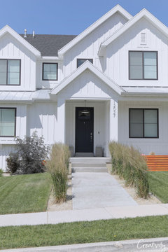
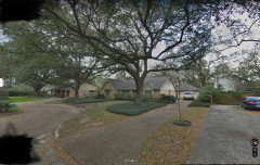
    PPF we are offsetting the 2nd story because there are some 65+ year old live oaks in the front that would have to get aggressively cut if the 2nd floor was directly above the first. I take it thought you prefer the small gable on 2nd floor vs a larger on that is offset as RES2 has drawn?


    Just want to make a note about how amazing this community is. I'm so grateful something like this exists and how much design work and time has gone into these posts. Y'all truly are gifted at what you do.

  • PRO
    4 years ago

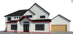
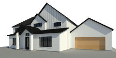
    Here's my recommendation for the front. Not many adjustments.


    OPTION 1

    OPTION 2


  • PRO
    4 years ago
    last modified: 4 years ago
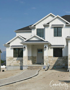
    Where are you building? Do you have picture of the lot you could show us?

    And yes, I prefer the smaller gable. The large one seems to overwhelm the house.

    Spend the money you will save by not doing the extra gable on shakes for the 2nd floor :)


  • 4 years ago

    PPF Here's some more lot info.


  • PRO
    4 years ago

    Don't let this group shame you into getting rid of the large gables. They'll minimize the house until it has no personality.


  • 4 years ago
    last modified: 4 years ago
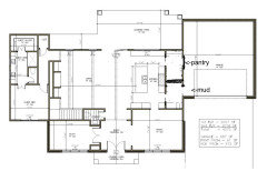
    I know, I know, you don’t want plan changes, but this changes nothing on the elevations or windows.

    If you switch the mudroom and pantry, you create a natural path from garage to stairs, so the family and kids’ friends don’t walk through the working part of the kitchen. Instead, they can walk past the cookie jar, much preferable! And, you can load and unload luggage, groceries, right at the trunk of the car, and without carrying those, especially luggage, through the kitchen. Well, groceries still have to go through the kitchen, but if you’re like me, half my groceries aren’t destined for the pantry. And it makes the LR less of a passageway, especially when you don’t have guests, which means the furniture won’t get bumped and shifted.

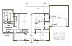
    (and, I wonder if the guest suite door can also be moved to near the stairs? That gives you a living room that is not a passageway, and a corner in it for cozy seating. and, you wouldn’t need the little hallway. The guest suite might even flip, with the bedroom to the back, and a hall like Mark shows downthread from the stairs area, past the now-hall-accessed bath and closet, to the front?)


    Oh, and how do you plan to use the 5’ x 3’ closet at the entrance to the guest suite? It will be hard to use, to keeo from cluttering. Trust me, I have one. A window would be nicer there! or pretty artwork.

    And this one is just fantasy, but would you consider a door from the study to the stairs? I think it looks like you’d add one or two steps inside the study, but it would be 1) interesting and 2) add circulation.

  • 4 years ago


    The more gables, the more memorable your home will be.

  • PRO
    4 years ago

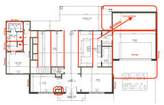
    While you are trying to fix the exterior, I will offer a few interior conceptual possible improvements:


    Move the guest bath to the corner of the house and locate the closet (does it have to be walk-in?) between the guest bath and the guest bed. Access both from the hall within the guest bedroom.

    Locate ceiling beams as if they were real, with visible support such as a wall, and not windows and doors. Relocate windows and doors to achieve this.

    Move the garage closer to the street and move the covered patio over so it does not restrict the view or shade the living and kitchen windows. Create an access to the covered porch from the kitchen possibly through the Mud room.

    Make the powder room more secluded.

    If a habitable room has an exterior wall, put a window in it to let more natural light in. Size and provide window treatment to restrict unwanted views.

    Eliminate void spaces.

  • 4 years ago
    last modified: 4 years ago
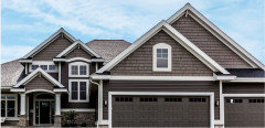
    Flip Mark’s guest suite so bedroom is at the back, and move the suite hall door to by the stairs. Front elevation windows? can be high windows in the bathroom or closet. The bath can also be used as guest bath for first floor. I like Mark’s idea of everything opening from the hall, makes it more flexible.


    You know, a 17’ dining room is huge. Wonderful for company! Will you use it day-to-day?

    I agree with Mark. Consider adding a side window to the study and the dining room, and the bedrooms. You won’t regret it. Is this a teardown and replacement house? You have neighbors? even if you keep a blind drqwn, it’s nice to have that bit of light. And imagine how nice to be able to pop your head around the corner of the kitchen and see if a car is in the driveway through a dining room window on the side?

  • PRO
    4 years ago

    First time someone agreed with me so early in the year.

  • 4 years ago

    Well, I just got my annual directory of Michigan Residential Architects, so I’m feeling magnanimous.

  • 4 years ago

    Is this in Texas, by any chance?

    Is there enough storage, for seasonal items, gear, etc?

  • 4 years ago

    RES really did well in his drawing. That is what a farmhouse in my area would look like.

  • 4 years ago

    I think the whole house could use improvements.

    For example, your downstairs is over 2000 square feet but your powder room looks like one put into a 1000 square foot house that's over 100 years old and 2 floors, where there's no powder room on the first floor and they have to squeeze one in somewhere. In a house where the first floor is over 2000 square feet, one shouldn't have to practically sit down on the toilet to close the bathroom door!

    Your kitchen has lots of counter space but very little will be used. In fact all that counter space in front of the windows will wind up a dumping space for books, mail, and kids stuff if you have kids. It's certainly not space that will be used to prep food because food prep normally takes place next to a water source.

    Why do the master closet, guest bath and guest closet need double doors? Since when are bathrooms and closets features?

    And below is what I constantly post about best houses. Those in bold are things that could use improvement in your house.

    The best houses orient the public rooms towards the south for the best passive solar heating and cooling

    The best houses are L, U, T, H, or I shaped.

    The best houses are only one to two rooms deep. And covered lanai, porches, garages, etc count as rooms in this case.

    The best houses make sure kitchens have natural light, meaning windows so one doesn't have to have lighting 24/7 to use the kitchen. (And no, dining areas with windows 10' or more from the kitchen will not allow for natural light.)

    The best houses make sure all public rooms and bedrooms have windows on at least two walls.

    The best houses do not if possible put mechanical rooms, pantries or closets on outside walls

    The best houses do not have diagonal interior walls making for odd spaces.

    The best houses keep public and private spaces separate.

    The best houses do not have you walk through the work zone of the kitchen to bring laundry to the laundry room.

    The best houses do not have the mudroom go through any of the work zones of the kitchen.

    The best houses do not use the kitchen as a hallway to any other rooms.

    The best houses do not put toilets or toilet rooms up against bedroom walls or dining areas.

    The best houses do not have walk in closets too small to stand inside.

    The best houses do not have roofs that are overly large, and dominate the exterior of the house.

    The best houses do not have stick on exterior materials only on the front façade.

    The best houses have an organizing “spine” so it’s easy to determine how to get from room to room in the house and what makes sense. Meaning they don’t have meandering circulation paths.

  • 4 years ago

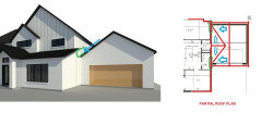
    This is the problem with any gable directing water towards a vertical wall. Roof plan shown as drawn from provided elevations (and if the cricket keeps the same roof pitch it would be higher than the garage gable, but is shown way lower on the provided elevations):


    This is the symmetry that @PPF. had but deleted the comment, of the Study and Dining Room which is competing with the 2nd floor and garage which doesn't have symmetry, and is pushing the balance of the elevation off. This is from a "front-on" visual of a line drawing; but when standing in real life, seeing the 2nd floor set back and even the garage set back farther will accentuate even more the symmetry of this Study/Dining massing. It almost looks like an existing 1950's ranch house that had an out-of-scale 2nd floor addition put on it:


    Also, the comment about setting the 2nd floor back from the 1st floor footprint to clear the mature oak trees perks my attention. AFAIK, if you disturb too much of the critical roots within the drip line of a tree, that may cause some dieback or accelerate the death of that tree depending on how severe the disturbance is. Your comment sounds like the 1st floor will be tucked under the canopy of some mature oaks, thus the foundation dig will cut much of the root system.


  • 4 years ago

    Whatever "tuning" is done to imporve this house, it will still be a large traditional 2 story light wood-framed structure with a 1 story brick shed on the front as if a front porch had been enclosed with brick. I don't need to tell you what I think of that. This is what can happen when a committee tries to guarantee good design with arbitrary rules.

    If you have the time, the cost savings from a simpler more rational design would offset the additional design cost. Of course, that assumes you find a better designer.

    Good luck.

  • 4 years ago
    last modified: 4 years ago
    "This is what can happen when a committee tries to guarantee good design with arbitrary rules."

    Well said RES. That's the reason why I seldom offer design advise in the form of a drawing. Or post my own designs anymore for that matter.

    One of the best attributes of this forum is that everyone has an equal voice. But that is also its worst attribute. In this case, everyone having an equal voice is a curse to the OP because he/she will have a difficult time separating the wheat from the chaff. It is very difficult to determine the best advice when all advice is presented equally.

  • PRO
    4 years ago
    last modified: 4 years ago
    The worster attribute is that these commenters are never equipped with all the information needed to offer adequate advice. When the initial question is asked, uninformed opinions are the only thing that can be received. How can good advice be given on the location of the dishwasher when it is not know that the OP only has one arm.

    (poor grammar intentional)

  • 4 years ago
    last modified: 4 years ago
    Maybe a shallow porch would tie the parts together and allow the farmhouse theme to dominate.

    Are you allowed to paint the brick?