

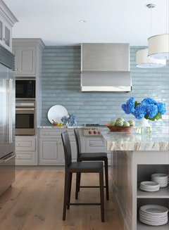
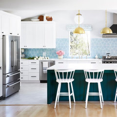
Analysis paralysis! Help choose a small galley kitchen backsplash.
4 years ago


Featured Answer
Sort by:Oldest
Comments (6)
Related Professionals
Vancouver Home Remodeling · Elizabethtown Kitchen Remodelers · Columbia Kitchen Remodelers · Corpus Christi Kitchen Remodelers · Asheville Bathroom Remodelers · Miami Interior Designers & Decorators · Crestview Architects & Building Designers · Chambersburg Architects & Building Designers · Santa Maria Architects & Building Designers · London Architects & Building Designers · Springfield Kitchen & Bathroom Designers · Saint Joseph Kitchen & Bathroom Designers · Hattiesburg Kitchen & Bathroom Designers · McAlester Kitchen & Bathroom Designers · Pocatello Kitchen Remodelers 4 years agolast modified: 4 years ago
 4 years ago



Related Stories
SMALL KITCHENSKitchen of the Week: A Small Galley With Maximum Style and Efficiency
An architect makes the most of her family’s modest kitchen, creating a continuous flow with the rest of the living space
Full Story
KITCHEN DESIGNKitchen of the Week: An Austin Galley Kitchen Opens Up
Pear-green cabinetry, unusual-size subway tile and a more open layout bring a 1950s Texas kitchen into the present
Full Story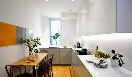
SMALL KITCHENSKitchen of the Week: Space-Saving Tricks Open Up a New York Galley
A raised ceiling, smaller appliances and white paint help bring airiness to a once-cramped Manhattan space
Full Story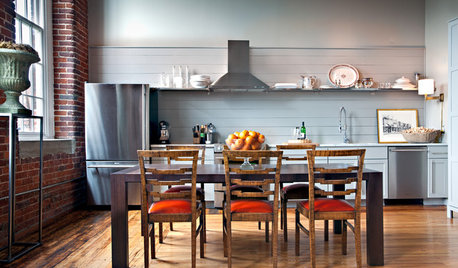
KITCHEN DESIGNSingle-Wall Galley Kitchens Catch the 'I'
I-shape kitchen layouts take a streamlined, flexible approach and can be easy on the wallet too
Full Story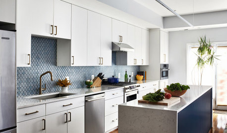
KITCHEN DESIGNKitchen of the Week: A Galley With White-and-Blue Style
A designer helps a D.C. couple create a bigger and brighter family kitchen with a new island and a fresh palette
Full Story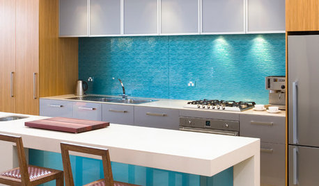
KITCHEN DESIGNHouzz Quiz: Which Kitchen Backsplash Material Is Right for You?
With so many options available, see if we can help you narrow down the selection
Full Story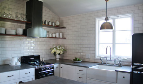
KITCHEN DESIGN10 Big Space-Saving Ideas for Small Kitchens
Feeling burned over a small cooking space? These features and strategies can help prevent kitchen meltdowns
Full Story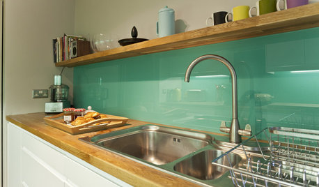
KITCHEN DESIGNHow to Pick a Kitchen Backsplash That Wows
Design your ideal backsplash with help from these Houzz guides and inspiring ideas for every kitchen style
Full Story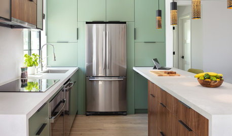
SMALL KITCHENS10 Simple Ways to Bring Order to a Small Kitchen
It can be tricky keeping a compact cooking space tidy, but these ideas can help
Full Story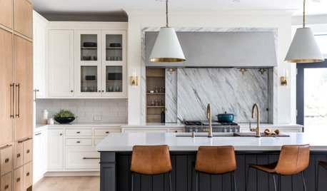
KITCHEN MAKEOVERSKitchen of the Week: White, Wood, Gray and a Backsplash Surprise
A Maine couple with three young daughters ask a designer to help them create a clean space with custom style
Full Story
darbuka