Software
Houzz Logo Print
baileyrules

Backsplash indecision

4 years ago

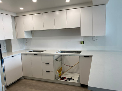
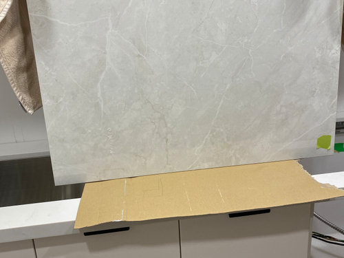
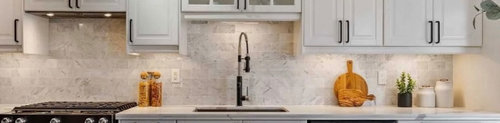
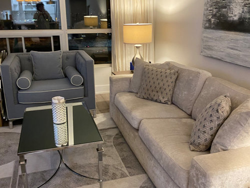
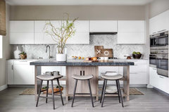
Looking for modern backsplash to compliment the subtly veined quartz counters and white kitchen but battling indecision. I'm trying to stay away from all white as it may seem institutional. We did bring home a large format tile, but I'm not sure if it carries enough oomph, taupe or grey veining to pick up the counters, floors and black hardware. The other is a photo of subway tiles that might work but is this too transitional? I'm a fan of being moody but not loud patterns. I've attached pics of the current state of our renovated condo kitchen, the two possible backsplash options, and our Living Rm (contemplating area carpet purchase and size?) I'm truly open to any suggestions and appreciate your input in advance.


Many thanks,


.

Comments (10)

  • 4 years ago

    There are so many colors that would look good. Check out Complete Tile.


    baileyrules thanked houssaon
  • PRO
    4 years ago
    last modified: 4 years ago

    Go to a dedicated tile store, and bring home samples. It's not an online project.

    The rug is nice.....could be bigger. How much ? No clue. We can't see the whole space and have no DIMENSIONS.

    baileyrules thanked JAN MOYER
  • 4 years ago
    last modified: 4 years ago

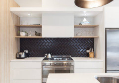
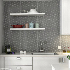
    i'd place a herringbone tile configuration. with the rise above sink and cooktop that gives a nice area to have a pattern like that. it can be subtle or more dramatic./ colored or neutral tiles. Tile store visits are in order.

    Keeping The View At Bay · More Info


    baileyrules thanked herbflavor
  • PRO
    4 years ago

    I would never mix real stone and fake but I do love large format glass tile in a color from the counter and with matching grout and in a stacked ptteren then I would add a bit of color maybe a nice vase of yellow flowers or a big robins egg blue bowl . As for the rug its okay I like a little color in my spaces but monotones can be very restful . Please with all those grays and white change all the light bulbs to LED 4000K to keep that yellow hue from ruining the color choices .

    baileyrules thanked Patricia Colwell Consulting
  • 4 years ago

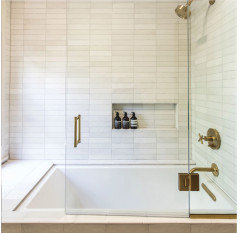
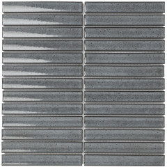
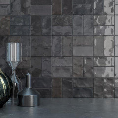
    What about something like this? It adds subtle color and texture, and looks modern in a straight stack. It comes in lots of colors.


    baileyrules thanked stiley
  • 4 years ago

    Honestly, you don’t have a good place to stop the tile- you’re going to be asking whether it stops with the uppers or the countertop next. Also, there’s a bulkhead/ chase in the corner that is going to cause headaches with tile too. I would opt for painting the drywall with a good scrubbable paint.

  • 4 years ago

    There is a lot you could do here - prob overwhelming in that there are a million directions you go!


    ^^ just wanted to say that we had a similar situation where our backsplash stopped a bit abruptly bc of our peninsula - I was a little worried about it but ended up putting enamelware pitchers there and haven't noticed it since (it's been 12 years lol) so I think you can stop your BS in line with your upper on the far right and put something you like against that wall to ease any BS-to-wall transition awkwardness


    my home · More Info


    baileyrules thanked la_la Girl
  • 4 years ago
    last modified: 4 years ago

    man that's a lot of white.

    NO to large format tiles! number 1, it's too big, and 2, it's wasteful because you end up cutting them to fit!

    just pick a color you like in a simple design.

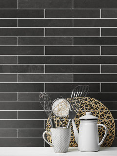
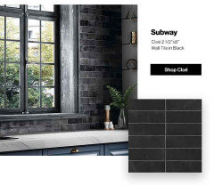
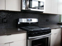
    how about black? a nice modern matte black 2x10 tile


    bedrosians Makoto tile


    or, how about these ? they come in all colors


    look up Finger Tiles. they're a bit larger. Houzz has these . Sevilla KitKat tiles


    gray chevron?


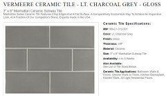
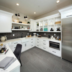
    charcoal tile in a diff layout?


    baileyrules thanked Beth H. :
  • 4 years ago

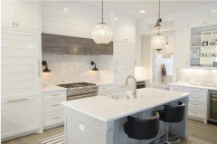
    Thank you all for your comments and suggestions. Though the tile store is now my second home, I'll pay another visit with art and samples in hand. I'm more in the neutral family to softly bridge the gray (Museum Piece currently on the peninsula living rm side), the flooring, and white. White being pronounced so I didn't have strips of different colours, wanted a transition but I hear what you're saying @Patricia Colwell Consulting about mixing stone/porcelain, i just thought the colour difference would be enough - this photo below was my inspiration. There would be very little waste as the tile is 36" (shave 2 1/2 tiles from top and 1 or 2 tiles in half for the rest). Can you provide an example of a large format glass tile you mentioned - sounds interesting. Thanks for the lighting tip, yes, I have to change them.


    @JAN MOYER - the rug was purchased at Homesense in Toronto (=HomeGoods in the States) for $ 280 but I'm returning it as i think the 5 x 7.5 is too small. It's very soft underfoot.

    Where to stop the tile on the peninsula is another issue we're discussing so yes @Rachel Lee and @la_la Girl - thanks for the tip! Hoping to add more colour (counter stools, different rug, pillows, table linens, kitchen rug. The condo is small (720 sq ft) so my intention was to keep the expensive stuff neutral and play with the rest.