Software
Houzz Logo Print
mxk3

How bad is this kitchen paint?

4 years ago
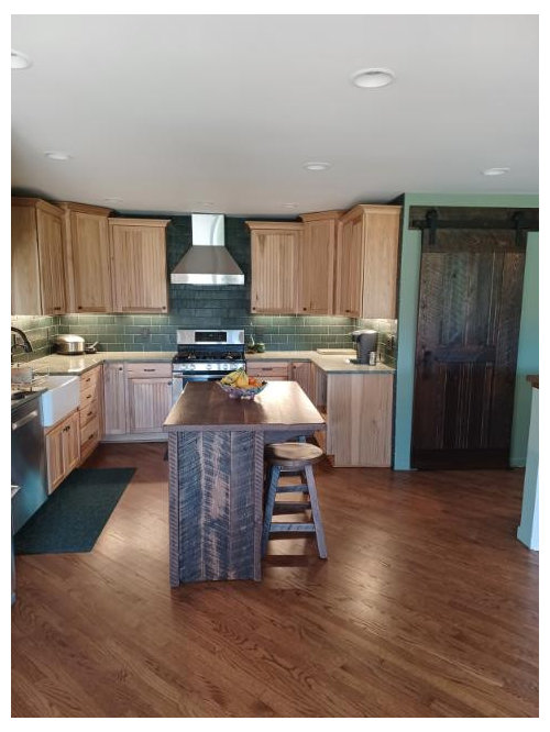
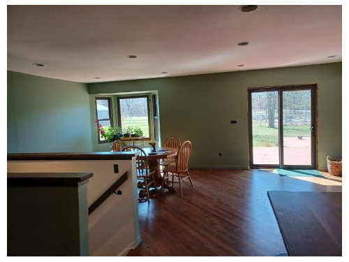
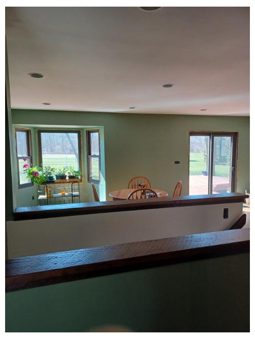
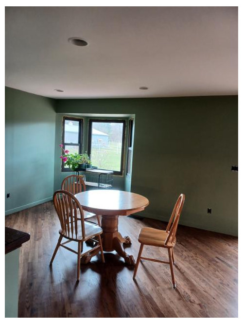
This is a spin-off of my post yesterday about feeling let down after a project. I really don't know if (a) I hate the paint I chose, it feels drab, (b) I'm having trouble adjusting to the change, and/or (c) I'm feeling a massive let down after 1.5 years of plotting and planning and dreaming and now poof! it's all over. So looking to get some opinions on the paint color I chose for the eating area, which is BM High Park 467.


Couple of notes:

* I rarely turn lights on during the day, so this is as bright as is going to get in there, these pics are on sunny day except the one at the bottom (noted)

* Window trim isn't in yet. Debating whether to do regular trim painted either frame color or wall color vs custom trim to match the barn door and island (which were both custom)

* My new kitchen table and chairs hasn't arrived yet, this is not the table that will be there. The new table is 42" x 60" rectangular with 6 ladder-back chairs in reclaimed barnwood -- same as the island and the barn door.

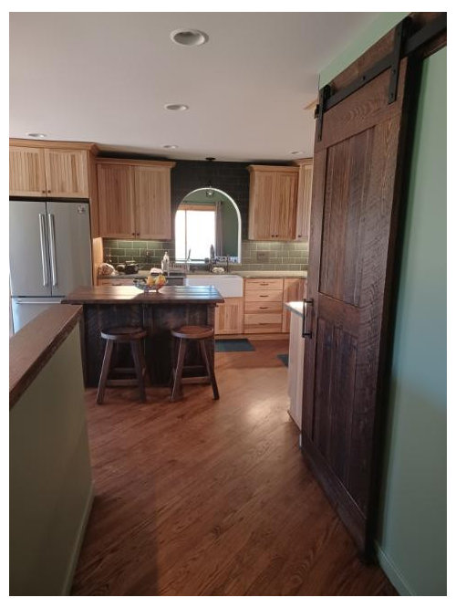
* I *LOVE* my kitchen proper, absolutely love it, it makes me happy walking down the hall into the kitchen every morning and seeing all that beautiful wood and rich green tile. It's the green PAINT I'm struggling with here.


--> If you think the paint color isn't right, what can I do to help the situation? DH will not let me repaint, at least not for now, so I'm stuck with it for the foreseeable future.


Here goes...


My favorite morning view:


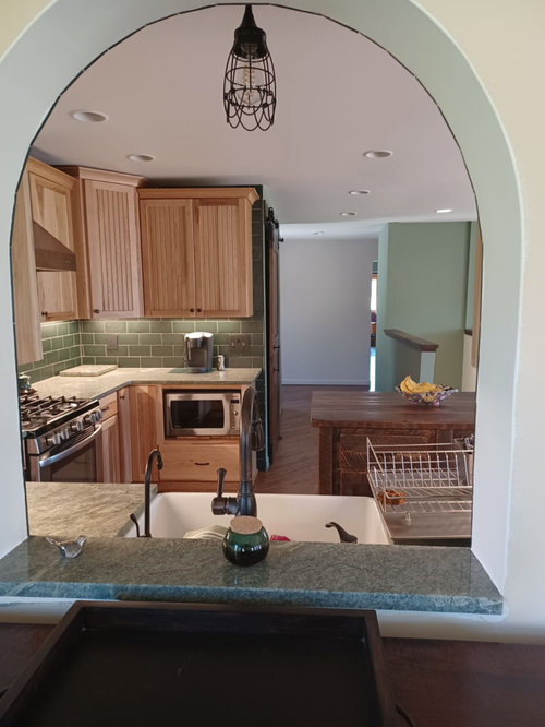
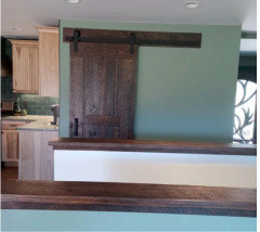
View from opposite side of pass-thru:


Eating area on a cloudy day:


Comments (37)

  • 4 years ago
    last modified: 4 years ago

    I like the color a lot. What was it before? If it was a lot lighter, then yes, it’s probably a bit jarring to you right now. But I think it looks great, and is very ”in” … colors are coming back in a big way after years of gray and white and everything whitewashed. But this is a classic look, regardless of trends.

    Play around. Maybe a new rug, maybe art. And you have your new furniture still to come, which sounds very nice for in there.

    What window treatments will you have? It’s still not all completely finished, so probably feeling a bit off to you at the moment. It’ll come together and I bet you’re going to love it.

    Are you on Instagram? Look up some English accounts — I see greens like this often, and they look fantastic. Farrow & Ball IG, Edward Bulmer, House Beautiful UK, kitchen accounts. Look up ”green kichens” in tags, so many gorgeous ones. Seeing others might inspire you. (I’m sure you’ve already done web searches of BM High Park kitchens.) In general, Americans are way more uptight, rigid, nitpicky, and ”follow the crowd” about decor than Europeans, is the reason I suggest getting inspiration from those sources.

    I like that this color in your kitchen has a bit of a moody feel, but still cheery. Organic, cozy, rich. I like the subtle changes of it in different lighting. And it’s nice with your wood.

    It’s just very new to you, be patient with yourself. :)

    porkchop_z5b_MI thanked Jilly
  • 4 years ago
    last modified: 4 years ago

    Did you paint the baseboards green? If so, that looks wrong to me.

    Also, the backsplash green and the wall green don’t work well together. The green paint is a bit muddy.

    porkchop_z5b_MI thanked taliaferro
  • 4 years ago
    last modified: 4 years ago

    Sorry, but I don't like the color. It's off with backsplash. There us a disconnect there.

    I live it for a while, but research alternatives that will make YOU happy.

    Also, post here asking for paint advise.

    Like Jinx, many people WILL like the color. But, how you feel about it, is all that matters.

    porkchop_z5b_MI thanked eld6161
  • 4 years ago

    It might be the paint. When we bought our current home, the living room was a similar color. It was beautiful, and it coordinated perfectly with the flooring and chimney. But with low ceilings and gray weather, it was just too dark. The room felt much better when we painted the walls a soft cream. But before you do that, you might try white window trim, to bring a bit of lightness and highlight your views. Put some art on the walls to break up the big expanse of green. And maybe "mock up" some white window treatments--you could tack or tape up some white bedsheets to just gauge the effect.


    You do have a wonderful kitchen. And your green is a gorgeous color that highlights the wood perfectly. But it might not be the right tone for your particular room.

    porkchop_z5b_MI thanked mcarroll16
  • 4 years ago
    last modified: 4 years ago

    I like it with the kitchen area, it's a soothing, cool color. The dining area does seem dark, but it looks like there aren't any lights on...?

    porkchop_z5b_MI thanked carolb_w_fl_coastal_9/10
  • 4 years ago
    last modified: 4 years ago

    Like Jinx, I like the paint and think it looks good. I do think the space looks unfinished yet. I think the new window trim, should match the windows. Right now, those windows jump out to me as unfinished, and needing a bit of something on them. Maybe the trim, will help that feeling, but, I think, even a valance would add a lot to them. I also do not like your baseboards painted like they are. Paint them dark, like the window trim, and they will also match the trim, on the stairway. They look unfinished to me too. Its a beautiful kitchen, just doesnt look finished yet. A few accessories with some color, would help a lot too. A rug in the dining area, would also add something. Once its all done, and is totally finished, I think you will like it a lot better. Its gorgeous. Makes me happy to see a room, thats not all white. So tired of looking at white kitchens.

    porkchop_z5b_MI thanked cat_ky
  • 4 years ago

    I have that color in a few places in my home but I have to agree it's a miss match with your back splash.

    porkchop_z5b_MI thanked arcy_gw
  • 4 years ago

    Colors are hard to discern on a monitor, and may look different on each. With that caveat, the tile green looks warm and the paint green looks cool, to me, and that causes a bit of a mismatch. If your husband is opposed to repainting now (and I truly hope it's not a "won't let me" scenario as much as "we had a discussion and agreed not to spend that money/do that work right now") you can try changing out a few light bulbs. See if using a warmer tone makes the paint read warmer. I wouldn't change all the bulbs at once; just try a few and see if it makes any difference to your eyes.

    BTW: Your cabinets and tile are gorgeous! I hope you can focus on that!

    porkchop_z5b_MI thanked chicagoans
  • 4 years ago

    “Like Jinx, many people WILL like the color. But, how you feel about it, is all that matters.”

    Exactly. That goes both ways.

    From my understanding, it’s not going to be changed. And I think it can definitely be worked with and look great.

    porkchop_z5b_MI thanked Jilly
  • 4 years ago
    last modified: 4 years ago

    It is hard to see the real color of the green paint on the walls by looking on the computer. What paint color was used? I love the cabinets, counters and backsplash. White trim would brighten up the space if that green is as dark as it looks in the picture. Light color accessories would also help. Once you finish the space with drapes, pictures, new table/chairs the walls will fade into the background. Finish everything first and I think you will love it. BTW my husband would not want to repaint either. (I would do it when he wasn't looking LOL)!

    porkchop_z5b_MI thanked vjs12
  • 4 years ago

    I just looked up BM High Line, In one of the photos it looks like this but in quite a few others it looks more teal or turquoise- definitely a lot more vibrant looking.

    What color is the backsplash? Because it looks kind of gray and I think the paint works nicely with it...but in your photosI do see a disconnect. ((Do your walls look like this color below? I think that works..))


  • 4 years ago
    last modified: 4 years ago

    I've never understood the "DH won't let me" thing, but that's for another day.

    Hoping you can at least paint the trim white. Paint the stools, too.


    porkchop_z5b_MI thanked elcieg
  • 4 years ago

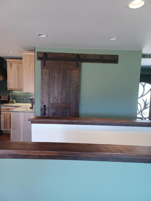
    I agree that the color is just a little off from the backsplash. Without repainting the whole space, I might start with painting this wall. Look how nice the lighter color pony wall looks with the wood trim and your barn door. It looks like the biggest area that is close to your backsplash and could have the biggest impact in changing the look if it were the cream color here.

    Maybe also the wall across from this one, but start with this. It won't be a big job and might have a big impact.

    porkchop_z5b_MI thanked olychick
  • 4 years ago

    "DH will not let me repaint" would not work for me, specially when I could do it myself and it would only cost a couple of gallons of paint.

    porkchop_z5b_MI thanked chispa
  • 4 years ago

    I also see a mismatch with the wall and tile (on my computer - IRL it may be fine).

    I am probably an outlier here, but I think that the high contrast with the white ceiling and white stairwell against the wall color is jarring. (True confession - I hate ceiling white anyway.) So you need to find some ways to bring whiter elements into the room - in the artwork, in a rug, random bits of decor once your furniture is in, window treatment if you use one...

    My ideal solution would be to repaint the stairwell and ceiling a softer shade either of white or a pale color to play off the green. However, I hear you that that is off the table. (Me, I would be telling my hubs that this my dream kitchen and it needs to be fixed LOL! )

    porkchop_z5b_MI thanked raee_gw zone 5b-6a Ohio
  • 4 years ago
    last modified: 4 years ago

    I wish to respect DH's wishes in the name of marital harmony --> he rarely tells me no, so when he does I know he's not kidding. Sure I could go ahead and paint, he's not doing to divorce me over it, but causing bad feelings in the other half of the team just isn't worth it to me. He might change his mind with some time and when we're onto the next project, we'll see..

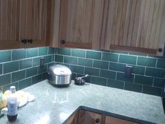
    The High Park does look like pretty much like Salvona's BM pic on my walls. Some lights the blue comes out more, others the green. I agree it doesn't pair terrifically with the backsplash. The backsplash is not a grey-green; you're probably seeing the light reflection from the undercabinet lights. Here's a close-up:


    The counter is green (is Costa Esmeralda), but it's a blue-green and can sometimes look bluish-grey, depending on the light, which is why I thought the High Park would work.

    What I'm gathering from the comments thus far is:

    * The baseboard needs to be re-painted

    * The window trim should be the same color as the window frames (that is SW Black Fox, BTW)

    * I need some artwork on the walls

    * It will look better once the window trim is up and the room is styled

    I will not paint the baseboard white, but painting the same as the windows is an option. I'm not a fan of contrasting baseboard, but I may have to concede here. I have some spare pieces I can paint myself and set up against the wall to see how that looks.

    The green on the barn door wall wraps around the corner and into the foyer -- I'd have to have all that repainted, but maybe I can talk DH into conceding to re-painting just that wall and the foyer; the areas touch each other, so it wouldn't look disjointed. But that's a lot of white....I dunno....but is a possibility, and at least then the green paint wouldn't be so close to the tile so the mis-match not so obvious. (that white is BM Moonlight White, BTW).

    I really appreciate the thoughtful comments (and kind words) -- they are so helpful! Keep those ideas coming, please!


    ETA: I know the ceiling could be better, but I went with white because what you don't see in the pic is the way the back side of the stairwell connects to the rest of the house, and that hallway is painted white. I can tune the ceiling out, though -- not it's not the best, but that's not what I'm not happy with.

  • 4 years ago

    Moonlight White, when I look at BM's website, seems to be the kind of soft white I was thinking of. Perhaps it is just the photo that make it look so stark to me.

    porkchop_z5b_MI thanked raee_gw zone 5b-6a Ohio
  • 4 years ago

    So the window frames are dark? Yes, I wouldn't paint the trim white like I mentioned before. I think you have the right idea painting the window trim the same color (SW Black Fox) as the window frame. Get it done and I think, like I said before, you will love it! Can't wait to see the finished project. Those cabinets are beautiful and go so well with the green backsplash and counters. Good Job.

    porkchop_z5b_MI thanked vjs12
  • 4 years ago
    last modified: 4 years ago

    The pony wall down the stairs is the Moonlight White. In certain lights, it is a soft, creamy white; in others, it looks white-white. It is one down from Simply White (2143-60, 2143-70, respectively). The ceiling is Simply White - so yea, the ceiling is white-white....


    ETA: If I can talk my husband into letting me paint the barn door wall, I can have painter paint the ceiling Moonlight White to soften it just a bit -- DH will never know the difference.

  • 4 years ago

    I hope that works for you...it would seem like a compromise just to at least see if you (and maybe he) likes it better with just less of the dark color.

    porkchop_z5b_MI thanked olychick
  • 4 years ago

    Jinx -- no need to bow out, I value the input, as I do everyone else's!


    Like I originally said, IDK if maybe I just haven't adjusted, am feeling a sense of disappointment because the planning and anticipation are over (I thoroughly enjoy the process...), or whether it really is the color itself. It might be all three wrapped into one feeling. I did really like the color when I sampled, I thought it was a home run, and I've posted many times before that I love me some dark rooms, I enjoy being enveloped by color.


    You do raise a good point about finishing what needs to be finished before making more changes. I have to have the conversation with DH about what to do about the window trim, the quote came back for the custom wood trim and I've got to get back with the guy yes or no. If we do painted window trim, DH will do that himself, it won't take him long and he probably wants to get it done and over with. What will also help pull things together is getting the new furniture -- I can't make it get here any sooner, I'm looking at May best case scenario but reality what it is, it's probably not going to be until mid-summer. Anyway, since I have to have the conversation with DH about the windows, it's a good time to raise some of the suggestions brought up in this post and see what he says and go from there.


    Anyone want to weigh in on doing the window trim wood vs painted Black Fox? (would be the same dark reclaimed wood as the barn door, island, and pony wall caps).

  • 4 years ago

    In no way do I consider the wall color "drab." A bit dark for the space and the amount of light you get, maybe. But not drab, and not BAD.


    I agree with Jinx that window treatments, rugs, and art will make a world of difference. Right now you have a lot of blank wall area, and its a big color change, so that's all you see. Give yourself a chance to like it.

    porkchop_z5b_MI thanked cawaps
  • 4 years ago
    last modified: 4 years ago

    I think it needs to match the window frame. The windows will look larger. If you do the trim wood, I would do the baseboards the same otherwise leave them the color of the wall paint.

    porkchop_z5b_MI thanked vjs12
  • 4 years ago

    I would not paint the baseboards white, and I am not sure I would paint them black either. I don't think you want a white stripe or a black stripe at the floor because there is nothing white in any of the finishes except the ceiling, and generally ceilings don't count as part of the scheme, they are white by default.

    I think I would probably go full monochromatic and paint the window casings the green first rather than matching the black sash. There will still be some accent of the window with just the dark sashes.

    So even if this ends up being the wrong green (it doesn't look quite right on my monitor, I agree), not introducing the contrast of white (or too much black) will give you a better idea of what it will look like with a shade adjustment.

    As for the room appearing "too" dark, I feel like cameras do this, and this is probably not quite how it feels in real life.

    porkchop_z5b_MI thanked palimpsest
  • 4 years ago

    I've done contrasting baseboards in the past, but I decided I like allover color better now. It's a cleaner look, IMO. I could see it if one was going for a cottage-y feel, tho.

    porkchop_z5b_MI thanked carolb_w_fl_coastal_9/10
  • 4 years ago
    last modified: 4 years ago

    I agree that you can't really judge colors well on a computer monitor. Photos in general don't always capture what you see in person.

    FWIW, every photo up there shows a different shade of green on my display.

    porkchop_z5b_MI thanked carolb_w_fl_coastal_9/10
  • 4 years ago

    First, your kitchen is fantastic - congratulations. That last photo showing cabinets, backsplash and counter is just yummy.


    I'm not quite understanding why the barn door wall can't be a stand alone white, even if the wall around the corner stays green? Of course, from the kitchen, repainting it might not have much impact, although it's right up against your cabinets. I'm definitely not trusting that the photos I'm seeing reflect what you're seeing!

    porkchop_z5b_MI thanked barncatz
  • 4 years ago
    last modified: 4 years ago

    Update: Well, it's been a little over a week with the paint. I went back to work and because I haven't been stuck in the house all day like I had been last week, I came home every day with a fresh pair of eyes. I like it better than I did when it was first done and i've adjusted to it more but I still don't like it, and I think I finally put my finger on specifically why. It feels gloomy in here. The sun is streaming in through the south-facing windows, and still it's just...depressing. It's not that the color is dark, it's the amount of grey in it. My other house had a very large dining-living room combo that I painted a rich, dark eggplant color -- that room faced north and it made me happy every time I walked in there, it was luxurious and beautiful and never looked drab or brought down my mood. This High Park is very greyed and gloomy. Hindsight being what it is, I should've gone with a cleaner green or an off-white. Sigh...

    DH is happy as a clam, he says he loves the color, but truthfully I don't think it's so much that he loves the color; rather, I think he's just glad after 5 years we don't have a house that looked like a circus inside with blue, green, cream, white, and flamin' yellow walls with holes in the drywall and falling-off baseboard. Seriously -- I had day-glo yellow walls in some parts of the house... :0/

    I'm hoping maybe in a year or so in when we move onto the next project I can talk my husband into letting me change the High Park, but for now I'm going to have to make the best of it. Will go shopping for some art and see what I can come up with. He did want the custom wood trim around the windows and doorwall, so I went ahead and ok'd the quote on that, should be installed sometime within the next month or so, that will make it look finished. He put up all the switchplates, too. Those small details do make a difference to pull things together, but it's not going to be enough to take away that feeling of gloominess -- only changing the paint will do that.

  • 4 years ago

    Your space is lovely. But I agree that it feels gloomy - it is a very cool and minty green. I love your wall color, but I would not want to live with that color at home, and I agree with the comments about it not working well with the warmer green of your backsplash and the wood tones in your space.

    If you decide you really don't like the wall color (which I can understand), I'd suggest looking for a green with more yellow/warmth in it. If you want to be really certain about the color, consider hiring a consultant. You should be able to get a paint color recommendation for about two hours' of a consultant's time, and the cost is easily justifiable when you think about the cost of paint + time if/when you get it wrong. (And maybe hubby will be more receptive to the idea if a pro says, "yes, this is the color your walls should be"?)

    FYI, in my last house, I painted the kitchen a similar color green and decided within a week or two that it was wrong. I repainted with a warmer green and loved it. In my current house, I painted my front living/dining space THREE TIMES before I admitted that I could not figure out the right hues for my new space. So I hired a consultant - and I am very happy with the final color that she recommended. (Color consultation was ~$100; paint that I didn't like cost >$300, plus my time!)

    porkchop_z5b_MI thanked salex
  • 4 years ago

    What about hanging some mirrors to reflect light from the windows?

    porkchop_z5b_MI thanked carolb_w_fl_coastal_9/10
  • 4 years ago
    last modified: 4 years ago

    I know you mentioned you don’t turn the lights on during the day, but perhaps now would be a good time to start a new habit. What does the space look like when its well lit?

    porkchop_z5b_MI thanked fraker
  • 4 years ago

    "What does the space look like when its well lit?"


    I'm not sure, turning the lights on with the natural light coming in is something I just don't do. Unless I need the light for reading or something, but that's atypical here. The kitchen proper has good task lighting with the undercabinet lights, and I do put those on when I'm working in there.

  • 4 years ago

    Backsplash looks to be olive/sage/brownish warmer green, while the wall color is more cool bluish/turquoise. Each a fine color on it's own, but they fight each other.

    porkchop_z5b_MI thanked Carrie B
  • 4 years ago
    last modified: 4 years ago

    My long-awaited table and chairs arrived today -- and the stain was wrong! So back it goes, going to have to wait about another 6 months, maybe longer. AARGH!!! The table would've helped pull things together and taken my eye off the paint. :0(


    But the window trim should be done soon, DH really wanted the custom wood trim so at least the windows and door will look finished.

  • 4 years ago

    So frustrating!! Hope it comes sooner than you expect it to!

    porkchop_z5b_MI thanked olychick
  • 4 years ago

    I'm back with an updated comment. I beat myself up all summer over this paint color, I really don't like it, it's just drags me down -- I like to think I have a pretty good eye for color, how could I have screwed this up? I believe I figured it out.

    A family member mentioned earlier this year she didn't like the color either, its too drab. She recently came over and said oh wow your paint color looks really green, it looks different than before. Bingo! This room faces south = indirect light in spring/summer, direct sunlight in fall/winter because of the low angle of the sun. I chose it mid-winter, which explains why it looked fine --> the sunlight was hitting 3 of the 4 walls directly at various times of the day and warming up the color.

    It still doesn't make me like the color, but it at least explains my error in judgement, and I learned something to take into consideration next time around.

    BTW: Got an estimate on re-painting, labor and materials cost for painting went up (along with pretty much everything thing else nowadays), will have to keep working on DH while saving my Ps & Qs to have it done.