Software
Houzz Logo Print
lisacb95

Muted green backsplash?

4 years ago
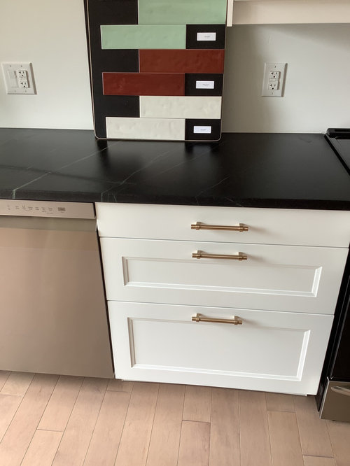
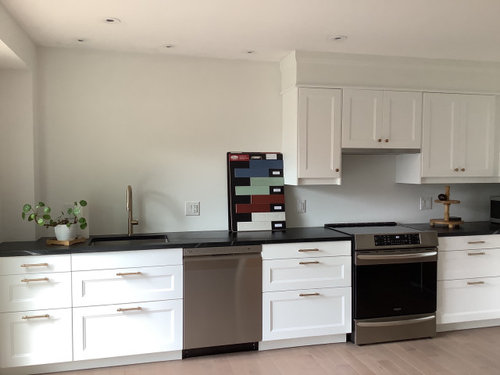
Our kitchen renovation is almost complete with the backsplash/wall paint being the only decision left. Cabinets are Ikea Axstad in matte white, black soapstone (stormy black) that has greenish and white veining, and our floors are matte maple hardwood that was supposed to be a light brown but instead we received a shade that is much lighter and pulls pink depending on the time of day/sun/shade. I originally was thinking I’d do a glossy neutral light putty colour backsplash which I really like and think it can work with the cool white tone of cabinets (the one on the bottom) but I really love the mint green. The area to be done is about 15ft long, about 7ft of which I was thinking of either taking up all the way to the ceiling and adding wooden shelf or only halfway up to a wooden shelf then paint the rest of wall. I’m wondering if it’s too much green, or if its going to pull even more pink from the floors? The rest of our living area and style is very neutral, maybe the green is so appealing because it’s giving some colour?

Comments (15)

  • 4 years ago

    Adding that the photo is really making the floor look pink but it’s more muted in real life with brown hues

  • 4 years ago

    Green and red are complementary colors, so using anything green will make the floors appear even more pink (which is light red).

  • 4 years ago
    last modified: 4 years ago

    I like the shelf idea. the warm wood tones will look nice w/the black/white

    maybe something like these oak shelves w/the black sconces?


    BTW, this tile is Bedrosians, Makoto-soft gray.

    another white oak shelf w/the black. this is Cle' Tile-White zellige


    soapstone w/lunada bay tile (Picket is water colors and the mosaic is Agate)


    Walnut w/the black, zellige tile


    Bring in a nice rug w/a pattern to place in front of that sink area


    as for the tile, I don't like that particular green. it's too pastel-ish, and too large of a size.

    this green might be better. Fireclay tile in Salton Sea. (comes in diff shapes too)


    I like this one from Winchester Tiles. Tundra is the color.


    love this look. a smaller zellige tile in a herringbone


    I like this tile too. Renaissance Oasis 3x8 Drift Renaoa38


    Cloe tile. comes in a green or a black


    I just saw this tile the other day. Renzo Jade 3x12.

    It looks like this in ithe Picket design.


    Similar to soapstone. Statement tile.


    https://www.statementstile.com/maiolica

    This burgundy tile is stunning against the black. it's under Flow on the above link


    they also have this dark gray zellige tile. what do you think about this layout?


  • 4 years ago
    last modified: 4 years ago

    What catbuilder said....if you want to see it in action, go get some mint green wrapping paper and tape it up. It will enhance the pink rather than deter from it. Put a bright red bowl on the floor or countertop, it should make the floors look less pink. (no, I am not recommending a red backsplash; just demonstrating color theory). Will there be a rug? If so, have you picked it out yet?

  • 4 years ago

    How about wallpaper instead? not so hard to replace later.

  • 4 years ago

    @Beth H. Thank you for all those photos, was hoping to only have to decide between 2 choices, looks like I’m taking another look - i really like your choices especially that smaller zellige look tile in the greens and the cream you shopped. That burgundy tile is beautiful, not a shade I would have thought to use and I think would be too dark in our north facing kitchen but one that I would love to see someone use in their kitchen. I don’t mind herringbone pattern and I like the stacked tile but I think it might be too modern of a look for our room.

    @Jean I haven’t thought about a rug for that space specifically until you and Beth asked, I do have to add one in front of the patio door thats next to the smaller cabinets though. I also have to add a dining table in the space, its a small narrow table thats maple but I will be stripping it and staining to go with the shelving. Thinking of this now but maybe the flooring colour wont be much of an issue when rug and table are placed, hmm.

    @everdebz I did think of removable wallpaper initially but I think the cost might be about the same as the tile depending on the paper.

  • 4 years ago

    I'm a sucker for green (we have a limey green kitchen and are doing a mint green bathroom now) but I wouldn't use it here with your flooring. We have a bathroom with 90s-era tile floors that read pink in some light, and tried a lot of colors on the wall to mute it. A taupey gray saved the day in the end. I'd so something similarly neutral here--putty could work, but more pronounced than the tile in your photo. I'd skip the red and the green. Some of the gray-greens that Beth suggests could potentially work if you want to try for a green, though.

  • 4 years ago
    last modified: 4 years ago

    I think thherringbone layout would be beautiful w/the wood and the black sconces. I'd take the tile all the way up since you don't have a large backsplash area (see last photos for photoshop)


    here's one done in a black 3x6 tile. I like it better in a larger tile, 2x8, 2x10, 3x9,,, but it's still nice


    sage green color


    this would be a cool idea on that large wall. diff ways to do it. I do like these colors w/your soapstone


    back to the green:

    Fireclay tile again. they have many shades of green (you can order a sample pack)

    https://www.fireclaytile.com/fireclay-favorites-green-handmade-tile


    a friend of mine did soapston and fireclay tile in their green glass. looks like this


    If you like a bit more traditional looking, this is a sage green tile from Winchester. Mere field tile, 4x4


    Bedrosians also has many tiles. here's a darker green

    https://www.bedrosians.com/en/product/list


    still love the Zellige w/the wood shelves. take it all the way up. and if you can swing some sconces, even better

    great look, hate the white subway tile!


    love these shelves


    But these shelves w/the copper? wow. this is stunning


    what do you think about doing the shelves like this^, and using a marble chevron tile like this one?


    Then I'd bring in copper accents,,


    bring in the green accents w/a few plants, cutting boards, trays, etc.


    Style your shelves like this:


    And, you end up w/something like this


    and this runner. (Ruggable)


  • 4 years ago

    Using the mint green. See how it enhances the pink?


  • 4 years ago

    Ah, I am a lover of color, but in your kitchen, I think your original design was spot on with the neutral tile, and letting the green be understated but elegant and in the soapstone's veining. With the shelf you're thinking of, you can always bring a bit of it in later. I also believe it will bring pink tones out of the wood, but even without that, I far prefer the understated feel to your original track.

  • 4 years ago

    The green will not work with your floors but @Beth H showed you some stunning white tiles. Or use marble tiles if the maintenance won’t be a problem. You need to be mindful of the floor in any kitchen and yours definitely throws off a touch of pink. So far, the kitchen is lovely.

  • 4 years ago

    I personally prefer the green.

  • 4 years ago

    @artemis78 @Jean @function_first @RedRyder @felizlady , I love the green but yes I can definitely see from the photoshopped photo from Jean how much more the pink is pulled, I’m crossing this particular green tile off the list, @Beth H. : thank you so much for posting all these photos, I love the colours I agree I have to go more neutral - but definitely not white! That photoshop with the shelf’s/sconces confirms that I definitely want to take tile up to ceiling with those two elements. In my lighting plan the electrician moved 3 of the pot lights out further so that if I decided to put up a shelf it would still provide enough light for the counters/sink. Would it be weird to not have the sconces hardwired? I’d rather not have the electrician go back into the wall and I keep seeing on Instagram users buying Magic Bulb and using that instead- the sconce is installed as normal but instead of running any wires this bulb is battery operated. I have plenty of light, the sconces would be more for aesthetics as I really like that look. The copper shelves are a beauty, I’m not sure if it’s something that would be too much in the space visually along with chevron marble/herringbone marble but I appreciate how good it looks! I did look at marble tile, I think it and soapstone look so good together but i am concerned about maintenance with the marble as we cook a lot of sauces that could stain. I really do like the photoshop tile you added, I’m going to get out to the tile shop again later this week and pick up some more samples in zellige and marble.

  • 4 years ago

    I suspect the photo below has too much going on for your taste, but with the pink and green discussion going on, you may find it helpful.


    Our Creative Director's Victorian Villa by deVOL · More Info


  • 4 years ago
    last modified: 4 years ago

    These 4” sage green tiles Beth H. posted are my personal favorites, but so much depends on the colors in your connecting room.