Software
Houzz Logo Print
hzdeleted_72899892

No concern for "wall art" ...

4 years ago
last modified: 4 years ago

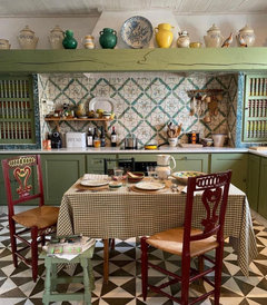
Or whether it all matches or if the pattern play is "too much" ... It seems to simply BE, and it is incredibly charming. Or at least I think so. Oh, and there is stuff atop the beam too, which would probably make some cringe. Again ... pure charm.

Comments (30)

  • 4 years ago


  • 4 years ago

    Agree. A lot of patterns but the play together nicely.

    User thanked jill302
  • 4 years ago

    I tried to edit my OP but Houzz won't let me. Anyway, I'm just pondering why it is that we cannot seem to come anywhere close to this effortlessness in our modern homes. Clearly most of us lack the architectural features that lend that old world charm, but beyond that, is it simply impossible to pull off such a vibe in most US homes ... or do we lack the vision required?

  • 4 years ago

    It works because there's actually a lot of repeating patterns.

    The squares in the tile echo the floor and the tablecloth, the harp on the chair echoes the canisters and jugs on the top shelf.

    The little round circles in the chairs pick up the bigger whole picture of the top shelf canisters and the the tall spindles on the cabinet doors echo the chair lines. the colors all are repeated throughout with the blue platter being a focal singular point.

    User thanked Bumblebeez SC Zone 7
  • 4 years ago

    Ida, I wonder if we overthink it?

    User thanked bpath
  • 4 years ago

    I think, in general, Americans are much more uptight about decorating. It becomes a math problem.

    There are so many Houzz threads with people posting actual charts for making sure your rugs, lamps, curtains, art, etc are the exact number of inches they ’should be’. And even more threads telling OPs not to do something because it breaks ’rules’. I see here daily, someone talked out of doing something creative, erasing all character and personality from a room, for a bland room that looks like every other. Everyone freaks out if more than one pattern is being considered. Or lots of color. Or mixing styles. Or using a rug, mirror, lamp, whatever … *there*. No, you can’t do that!

    Of course this board isn’t representative of the entire design world, just using it as an example. Herd mentality.

    Americans are too afraid of getting it wrong. Social media, HGTV, etc are also big factors in influencing this mindset.

    User thanked Jilly
  • 4 years ago

    I wonder how much of that old world charm is old and how much is fake old. Reclaimed beam or structure? Cabinetry and counters are certainly recent.


    I don't mind the patterns at all but it feels a tad contrived to me. Taking a trashy old kitchen and making it charming? I enjoy those. Building a new one to make it look that way? Tricky.


    It's still very cute and they did a good job with the patterns and colors but it's a wee bit too disneyland for me.

    User thanked Fori
  • 4 years ago

    Yeah, I think we tend to overthink it on the whole. While it's true that there are repeating patterns in play in this particular room, it tends to feel like it was arrived at in a haphazard fashion, and I think that lends tremendous character. Like it just happened "somehow", over time. We really do fear "getting it wrong", as though there are rules and decor police who enforce them. Or maybe we remain too affected by an ingrained sense of "omg, what will others think?" and we never really learn to trust the development of our own creative instincts.


    If this kitchen were mine, I'd have spent countless hours tweaking the items on the beam to ensure they were exactly in the spots they needed to be. And I don't want to be that way.

  • 4 years ago

    Old world charm is so comforting. On the other hand....Shabby Chic is Shabby. It's not upscale. Most people DO NOT strive to live low-end...in a tiny space. Most homes have multiple bedrooms...multiple bathrooms. Lots of space.....room to entertain.


    I think we admire photos like THIS....but in real life ....DO NOT want this look for our homes.

    User thanked User
  • 4 years ago

    I do.

  • 4 years ago
    last modified: 4 years ago

    MAGNAVERDE shared some great and insightful thoughts on this exact topic over the years, and Pal has, too.

    I should have clarified in my post that of course there are certain styles that should lend themselves to a certain rigidity. Certain modern looks, for example, which I also like very much. But I was speaking of people who seek something like the room above or similar styles, but are too afraid they’ll get it wrong … so they take an easier/trendy route to get the room done now. The result being impersonal and lacking their true vision.

    User thanked Jilly
  • 4 years ago

    Shabby Chic is Shabby. It's not upscale. Most people DO NOT strive to live low-end...in a tiny space.


    I still like Shabby Chic, and it certainly can be upscale. Also, equating square footage with luxury is a very American view. In most European cities for example, even some of the most luxurious spaces are quite compact. I have learned that i like smaller, cozy spaces. My fave room in my CT house is the smallest, about 8x10 iirc? And there is definitely such a thing as a "too big" room IME.


    we cannot seem to come anywhere close to this effortlessness in our modern homes. Clearly most of us lack the architectural features that lend that old world charm, but beyond that, is it simply impossible to pull off such a vibe in most US homes ... or do we lack the vision required?


    I don't think you can get "beyond that." The starting point is an historic home and what appear to be pre-existing vintage elements; that is the most important part of the room IMHO. So many US homes are white boxes with perfectly smooth drywall and clamshell molding. It is very hard to imbue any soul. Imagine everything you see here in a new construction space, and I think it is a fail


    As for the pattern mix, the color and mood are a definite match, and the variation in scale makes it work. But I would venture to say this room was either professionally done or done by someone with an artistic background. That's why "most of us" can't create it; it is an achievement and reflects true talent.

    User thanked mtnrdredux_gw
  • 4 years ago
    last modified: 4 years ago

    I think for a lot of people this look, or any look, is hard to pull off because people are afraid to take a leap. They do a halfway attempt because painting the cabinets is too scary or the tile is too ott and bad for resale. After all, they might decide to put their home on the market in 30 years.... 30 YEARS! The final result becomes completely muted and ends up looking like most everyone else's space. Boring mistakes.

    I really hate half attempts.

    I do think this look can be achieved in modern homes without the appropriate architectural features but only if the homeowner is creative and can think outside the box.

    User thanked ilikefriday
  • 4 years ago

    Because those beams look silly with sheetrock…


    User thanked Springroz
  • 4 years ago

    I do think this look can be achieved in modern homes without the appropriate architectural features but only if the home owner is creative and can think outside the box.


    I think homeowners are very much bound by the vernacular of their home, otherwise they end up having rooms that feel like theme parks. See: farmhouse, Tuscan, coastal. None of those really work if the home has no relation to those environments.

    User thanked mtnrdredux_gw
  • 4 years ago
    last modified: 4 years ago

    I think homeowners are very much bound by the vernacular of their home, otherwise they end up having rooms that feel like theme parks. See: farmhouse, Tuscan, coastal. None of those really work if the home has no relation to those environments.

    Very insightful! "Theme parks"...I'm going to use that one...

    That's true! None of the properties I've purchased have any farmhouse qualities.

    User thanked User
  • 4 years ago

    Not long ago I came across a photo on IG showing a windowsill in a kitchen with that same old world charm as depicted above. On the sill were some seemingly random kitchen pieces - earthen canisters and jugs and such -- all put there as though not necessarily to display them artfully, but like they were just there to have them out in plain sight, in case they were needed. I kept looking at that photo, determined to do something similar on the odd-ish windowsill in my dining room. I have fought that thing for the past 8 years, feeling like it needed "something", but always coming up with solutions that felt contrived. And then there are the voices in my head that whisper, "you can't put things there ... things don't GO there..." and it's just been one of those things that kept bugging me.

    I did go ahead and place some of my special pieces there and have finally achieved something that I quite like. But man, just the mental gymnastics it took to arrive at a livable solution when it looks so totally effortless when others do it ... eeek.

  • 4 years ago

    I think the scope and scale makes a difference, along with achitectural features.

    Many American homes are boxes, whether large or small. Lacking these details Ida's example photo shows.

    Our house, a 1955 lackluster box had some nice points of interest in it, such as tongue and groove pine paneling, the classic 1940s and 1950s scallop trim, but other than that, it was a box with safe antique white paint where the T&G paneling was not on the wall.

    The comment most often heard from visitors was that it looked and felt like a rental. I agreed. No matter what I did to make it homey, it still had rental feel to it. Did not feel homey.

    Then we decided to get new couch and loveseat and paint the LR and K/dining area. I choose a creamy white for the dining area, a soft yellow for the K and same soft yellow for LM. I gave the living room almost school bus yellow trim after soft white made the LM look like an ice cream parlor. (I'm not afraid of color)

    The new paint added a European flair to my tiny K/dining area enhancing the few points of interest this house had. Success!

    All my nick nacks picked up through my life finally had a homey resting place instead of looking I was a teenager trying to decorate her first apt with her childhood treasures.

    The furniture I chose was purple. People freaked out that I did that, but I love it and it goes nicely with the yellows on the walls. The brick hearth was finally grounded with these changes, whereas before it just sat there adding the rental feel.

    Our general decorating style is more or less good quality 2nd hand store stuff, garage sale finds and discards found on the side of the road. In our house before the color changes, the style looked just like as I described. But with the color changes, it all works well and even though it's been 20 years now since I made the changes, people still say wow, this is a wonderful home and I just love it.

    Perhaps the lack of space and perhaps even lack of wall space here makes each meaningful item feel nestled with the color changes whereas before it did not. It just seemed cluttered with stuff that should be sent off to another life somewhere else.

    So, while not a showcase home featured in a magazine, it has the charm and huggy feel I like in a home, now. Took a few years and a few changes, but even our rental style house became a home that makes you feel surrounded with positive energy and overall support and warm shelter.

    User thanked SEA SEA
  • 4 years ago

    Sea Sea, it sounds absolutely perfect! I love how you've made it your own warm and embracing space!

  • 4 years ago

    They do a halfway attempt because painting the cabinets is too scary or the tile is too ott and bad for resale.


    This is the problem in a nutshell, to me. Any deviation from standard HGTV is jarring and surely wrong.

    And that kitchen in the OP is anything but standard, or haphazard. The effortless pull together everything just works look requires follow through on a vision and editing, even if that is not obvious to the observer.

    User thanked Zalco/bring back Sophie!
  • 4 years ago
    last modified: 4 years ago

    Part of the problem in America compared to Europe is that "old" for a house means from before WWII in much of the country.

    Another part of the problem is that most people don't have taste. They don't have bad taste, they just don't really have Any, and rely on whatever they are being told is currently in good taste to be their good taste as well. and whatever that is changes every few years.

    People are fickle: something they loved a few years ago is now "ugly".

    People have been convinced if something is old, maybe a little worn, but not necessarily, not the current color etc. and so on, it must be replaced.

    People don't know what "appropriate" means anymore, and so you have a marble kitchen with pendants the size of a beachball tacked onto the back of a cape cod.

    Subtlety and simplicity is "boring": people need 5 different kinds of cladding material on the outsides of their houses to make them "Interesting".

    People have learned on TV that good design is as neutral and non committal as a hotel room or restaurant dining room.

    Marie Kondo is telling everybody to get rid of perfectly nice and interesting stuff as if it's a stack of old newspapers. Guess what Marie. I don't smoke, but I am not getting rid of the boxed set of Cartier ashtrays my parents got as a wedding present.

    You can't really do anything artistic with these types of constraints.


    User thanked palimpsest
  • 4 years ago

    Obviously it's okay to do with your house, whatever you want and decorate however you want and some people will never realize that it doesn't look good.

    User thanked Bumblebeez SC Zone 7
  • 4 years ago
    last modified: 4 years ago

    I feel like the "idea" of this fits in here somewhere.

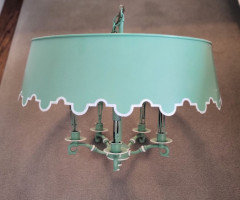
    When I was little, this was black with white pinstriping and hung over our kitchen table.

    When I was in college, it got repainted like so. Obviously it's missing the candle sleeves.

    This is one of the random objects that was focused on when I posted pictures of my parents' house once, when there was some talk of selling--even though this wasn't one of the questions. I was told this needed to go, and that Home Depot had some nice fixtures to replace this ugly old thing. I was told that if they, as a buyer walked into a house and saw decor from 1987, they would assume that since my parents couldn't be bothered to even get new furniture since then, the roof probably leaked the electrical was probably faulty and so forth. My dad replaced the roof at age 90. But my parents taste was the same their entire adult lives, they weren't going to redecorate to keep up with a trend at that point.

    Anyway, we took a lot of the light fixtures out, not because we wanted to impress some potential buyer, (The house had an offer on it before the listing was official), but because we wanted them.

    It's at a place now being repainted to black and white and it's being hung in my house. It's weird it's dated, it's a little too big for the spot that it's going in, but so what, it's mine and it's not going to be the same fixture seen in every interior between 2015 and 2025.


    User thanked palimpsest
  • 4 years ago

    I LOVE that fixture, Pal … so glad you saved it. Please show afters!

    User thanked Jilly
  • 4 years ago

    It reminds me of the 1970s.

    It also reminds me of an exhibit that Andy Warhol did at Rice University in 1969 called "Raid the Icebox."

    User thanked Lars
  • 4 years ago

    Pal...I do remember that light fixture...in black....it was pretty common....not considered posh or over-the-top. It was tasteful. The shade is metal? I'll bet there are not many left...and you will have a one-of-a-kind.

    User thanked User
  • 4 years ago

    I think we admire photos like THIS....but in real life ....DO NOT want this look for our homes.

    I do.


    But, but, but, Ida, your darling old house was much the same feel as this, don't you think? I loved that house of yours!

    User thanked cyn427 (z. 7, N. VA)
  • 4 years ago

    Actually the matte black and white was a custom finish. The original was that metallic copper paint. The restoration guy said shiny black and gold was another standard.

    User thanked palimpsest
  • 4 years ago
    last modified: 4 years ago

    Cyn, you're so sweet! The woman who bought our old house made a few cosmetic changes that really gave it a 1950s look. Even though the house was built in 1940, her changes were great and seemed to fit nicely. Of course, I tried to make it something like a Mexican hacienda initially, and that never quite felt right. Eventually I embraced the pure cottage charm, but still wanted to display my beloved Native American art ... my problem is that my style is such a mishmash, and a house such as that one seems to want a pure period look.