Software
Houzz Logo Print
jason_sperling31

Kitchen Design Issue

4 years ago
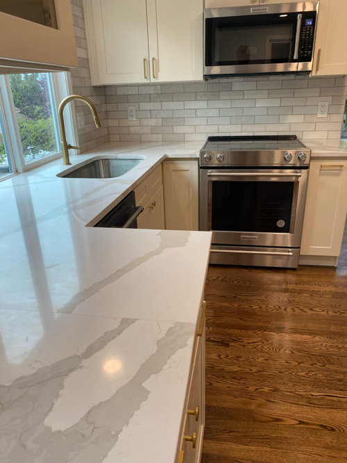
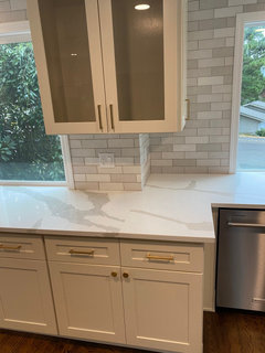
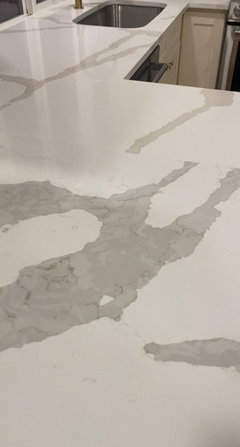
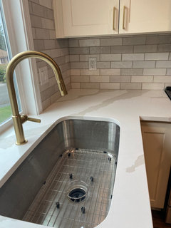
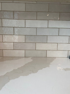
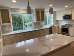
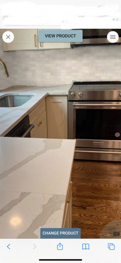
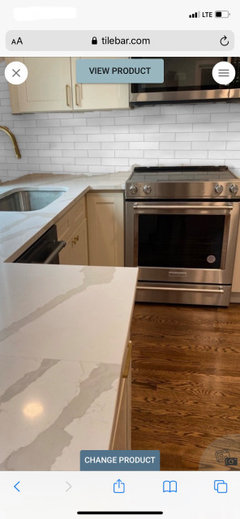
We had a new kitchen installed and the counter top slabs are different types of Calcutta. We chose Dorado which has a cream base with warmer beige and gold tones. This was installed by the sink. Also installed was Venetian Calcutta which looks to have a whiter base and prominent grey and slate color tones. It’s a slight difference in colors (warm vs cold) but you can definitely see it. Our cabinets are linen color, but they have a yellow tint when placed next to the white/grey Venetian Calcutta. Just as disturbing, the backsplash matches the Venetian Calcutta and the grout matches the Dorado.

We need to find a solution. Have it removed? Live with it? Change the lighting? Any ideas would be appreciated. We are beyond disappointed.

Comments (29)

  • 4 years ago

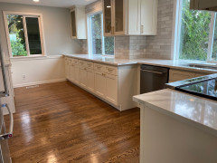
    Additional photos

  • PRO
    4 years ago

    You need to explain why the 2 different counters at all. I need to see the whole space to even begin to understand 2 different counter tops .

  • 4 years ago

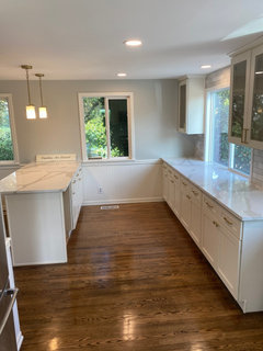
    Here’s the entire space

  • 4 years ago

    Another angle

  • 4 years ago

    We ordered three slabs of Dorado due to cut outs needed by flushed windows. This would have needed three seams. Our contractor returned two smaller slabs for a larger one which allowed one seam. The issue is the replacement slab was Venetian vs Dorado. We aren’t sure yet if the supplier provided the wrong slab or the contractor ordered the wrong replacement slab.

  • 4 years ago

    Yes, a huge miss by someone when the replacement slab was picked up. No one saw the difference until the final clean up and walk through. I also think we have a tile/grout issue. As I’m told grout dries lighter. Right now it looks taupe vs medium grey. The grout color is Oyster grey. I’m not sure it matches either slab or complements the cabinets. Probably should have gone with a lighter grout. Thoughts welcome.

  • 4 years ago

    Grout is not your problem. Tile is not your problem. You need matching slabs.

  • 4 years ago

    To add more detail: the only countertop that is Dorado is near the sink. The long slab under the window is Venetian as is the entire island and small slab to right of stove. We ended up with very little of the countertop we selected.

  • 4 years ago

    The different color in the slabs is not coming through in the photos.

    What I am seeing in the photos is that your cabinet color would have been better as a purer white, something like BM Chantilly Lace. The current color comes across as yellow compared to the blue-gray tones of the counters and backsplash.

  • 4 years ago

    Color variation is difficult to see on screens, but in person the countertops are clearly different in both background and veining.

    I agree the cabinets looks more yellow due to the contrast with the cooler whites and grays of the counters and backsplash.

    The Venetian countertops have a white background with grey veins. The Dorado is a creamier background with gold/beige veining which matches the cabinets better.

    I think the grey and white backsplash color is what really makes the cabinets look yellow. Unfortunately, we chose the backsplash after the cabinet and countertops purchases and matched them to the wrong slab. That’s why the backsplash has more grey than beige/gold.

    We didn’t want the stark white cabinets or countertops, but in hindsight white cabinets would have matched the counters we ended up with better.

  • PRO
    4 years ago

    To me the bigger issue is the linen cabinets vs. the very white/gray counters and tile. Did you not have samples of all the materials prior to purchasing? That yellow undertone on the cabinets should have driven your counter selections, since the cabinetry is the most expensive element of this kitchen. (Or any kitchen, for that matter.)


    I don't think there's much to be done short of replacing all the counters and tile, and I'm assuming that will be cost prohibitive.

  • 4 years ago

    You selected Dorodo. You have very little of it in your kitchen. You have lots of Venetian, which you don’t want. I would go back to the contractor or whoever acquired and installed all the WRONG countertop that you do not want. Do you have your preferences written down? Agreed to? Did you approve these slabs? These are important questions. If he did this without your approval or consent, tell him that you want the Venetian REMOVED and replaced with Dorodo. Even if it means one more seam than you would like.

  • 4 years ago

    We’re you involved in selecting materials? If not, don’t make that mistake again. If you selected one material and the contractor selected different material, the contractor is in error and should be required to correct things. The entire counter should be from the same slab if possible, and the seam on the big counter to the left of the sink is unacceptable in my opinion.
    A quality installer would have had a discussion with you regarding location of seams.

  • 4 years ago

    @ Sabrina : yes the cabinets vs countertops/backsplash are a stand out design issue. The cabinets and countertops were purchased at the same store with samples that matched (or seemed to at the time!). The cabinets actually do match the creamier Dorado with veins enough for our liking. It’s probably not a perfect match, but best available without waiting six months for materials and living without a kitchen.

    We purchased all the materials and had samples. Each was delivered at different times due to delays. The backsplash unfortunately was purchased to match the Venetian slab. It doesn’t complement the cabinets as well as the Dorado.

    Since it is cost prohibited to replace all we were looking at any options to blend this all together as it really isn’t ideal.

  • 4 years ago

    @ ptreckel : the slabs were returned without our input or approval. The return was good natured in an effort to go to 1 seam vs 3. It also saved us $$ on slabs… they just didn’t match in the end which is unfortunate.

    I just had the supplier send me the invoice on purchase of the larger slab. I wasn’t part of this return and didn’t have the invoice. The invoice says Dorado, but it’s clearly not the same material. I am wondering if the supplier had it labeled incorrectly? The contractor stated he picked up Dorado and the invoice verifies that. However, the variation on color is too great to just be a different slab/version of Dorado. It looks exactly like the Venetian as we remember ruling that Calcutta out with our cabinets from the start.

  • 4 years ago

    The lighting is also interesting and effects the color of the countertops. Our pendent lights are a soft yellow while the rest of the ceiling lights are a bright white (daylight?) You can se the difference in this photo. The Venetian island actually looks less stark white under the pendant lights.

  • 4 years ago

    I will comment on the lighting. Cooler “temperature” LED lighting will make everything look less yellow, warmer lighting will make everything a bit yellower. It’s not going to fix the counter mismatch.

    So, you are not yelling at your contractor. You’re obviously unhappy. How do you see this being resolved? Because I can hear you trying to find a way to not be bothered by this. What would be your perfect resolution?

  • 4 years ago

    Good guess eam44. All the ceiling lights are bright white LEDs. The counters in front of the windows are also much brighter white than the island with the the lights turned off. Now I’m wondering what the lighting was like at supplier for the cabinets and countertops. It all matched fairly well with the samples provided upfront.

    My resolution starts with a conversation with my contractor. He’s coming out tomorrow to look at the countertops. If they are in fact Venetian we’ll discuss replacement. There’s nothing we can do about the cabinets.

    My best case scenario would be to have the Venetian removed and Dorado installed free of charge Then replace grey/white backsplash with a warmer tone that matched the linen cabinets. This will likely be an additional expense to us as homeowners since we selected the backsplash (to match the wrong slab). We could also consider replacing the LEDs with warmer temperature lighting.

    Best I can come up with!

  • PRO
    4 years ago

    Cahnge the bulbs so they are all the same LED 4000K which usually is called daylight then see if this all works together lighting has a huge effect on color. I agree you eith live with what you have or fight for what you want no fix for 2 different counters that I can see . You will learn from this mistake and never again let someone else choose slabs . I have no clue as to w the size of the slapb or wht thre is a seam in such a conspicuous spot not matched not even trie dto be matched . Maybe post a pic of the template and layout you signed off on .

  • 4 years ago

    Could also paint the ceiling and far wall a neutral tone to match the cabinets better..

  • 4 years ago

    @ Patricia : we chose the initial slabs. Two were just returned without our approval or sign off. We will learn from that.

  • 4 years ago
    last modified: 4 years ago

    You’re handling this pretty well, and what you are asking for is completely reasonable. I will just say in my experience, being nice occasionally means you dont get what you want, so be sure about what you want before you start. He may try to come up with a less expensive fix.

    Your cabinets are yellow, and you wish they weren’t. Now you want to minimize the yellowness with warmer tiles. I just dont want you to end up with yellow tiles you also dont like. There is a long, storied tradition of mixing different whites, and cream and white, in kitchens. Consider your options in your space with your light once you’ve taken care of the counters. I hope you end up with the kitchen you want. I think youve made some beautiful choices.


  • 4 years ago

    If the walls were not quite as gray i think a lot of the color pressure would be relieved…the floors are golden..the hardware is golden….the backsplash has some warmer hues…the wall color may be the detractor here…

  • 4 years ago
    last modified: 4 years ago

    I agree with @btydrvn, above. I think all the grey on the backsplash is really the issue. The rest is really fine.

    You have mostly warmer elements in the space, and the grey backsplash is not complementary. And since greys are over - especially for walls - no reason to hang onto it, unless you really love it. Grey and warmer tones, like sands, etc. can work well together - it’s all part of the shore nature color palette. But in this case the grey on the walls is not working with all the elements - particularly not w/ the cabinets.

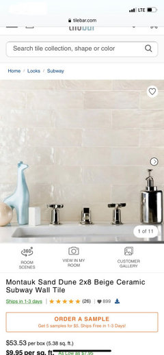
    So I would suggest either removing the backsplash and painting the walls, or just painting the backsplash, or changing the spash to somethng that would be more complementary to the cabinets.

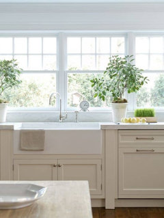
    https://www.tilebar.com/montauk-sand-dune-2x8-ceramic-wall-subway-tile.html


    ETA: Below, with a whiter backsplash:


  • 4 years ago

    Not pro. I think from here it looks beautiful. The softly contrasting mix of backsplash tiles is more interesting than all white.

  • 4 years ago

    Thank you Freedomplace1. Agree on the backsplash and like the warmer colors. Ceiling may also get painted another complimentary color vs ceiling white. Another suggestion was to paint the cabinets. Lots to consider..

  • 4 years ago

    Hmmm, recovery wise… I’m thinking that maybe applying a grey wash to your cabinets may help to make the surfaces more friendly and appear less yellow. Worst case you might need to change out the backsplash. Recommend getting the slabs you contracted for straightened out first. Best of luck to you!!

  • 4 years ago

    My first impression of your kitchen was that it looked beautiful … I don’t think mixing the whites is much of an issue. But what jumped out at me was the glaring seam in the counter.