Software
Houzz Logo Print
palimpsest

Practically perfect in every way.

4 years ago
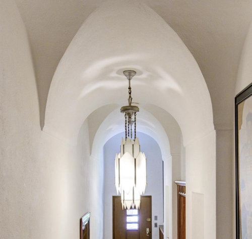
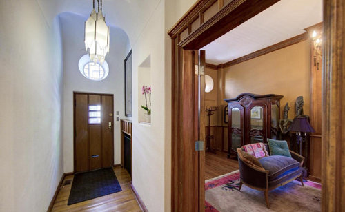
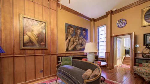
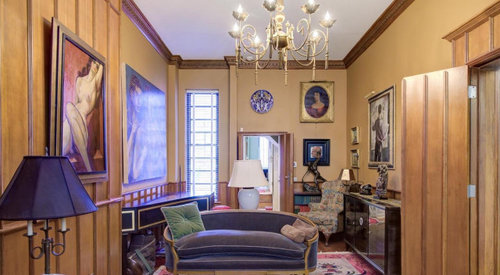
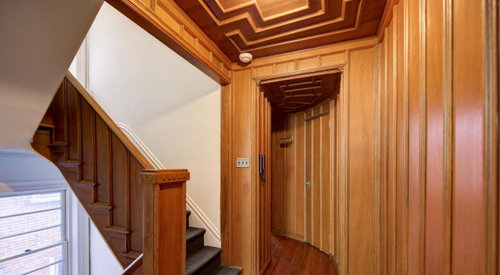
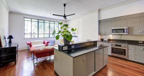
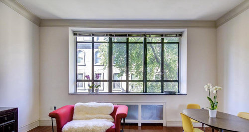
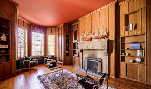
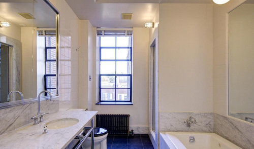
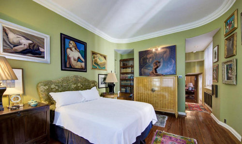
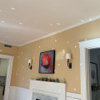
I didn't even want to share it with anybody. 1870s updated with a Deco-Moderne renovation in the 1930s. It's a duplex, technically. Well done 1990s main kitchen - metal lab cabinets and chem tops. Light update to bathrooms. One 60s bath, not shown. Upper bedrooms are still 1870-ish.


Comments (19)

  • 4 years ago

    I think I may know this building. Is it in Brooklyn, NY?

  • 4 years ago
    last modified: 4 years ago

    It certainly is perfect. Wow, love everything about it.

    Can we get a law passed that none of the paneling is allowed to be painted? The craftsmanship!


    Thanks for sharing, this is a treasure. I’m saving lots of these rooms for inspo and eye candy reasons. :)

  • 4 years ago

    This is actually in Philadelphia.


  • 4 years ago

    It is a wonderful place!

  • 4 years ago

    I'm not sure I've ever seen a ceiling-mounted radiator. I've known houses with radiant heat in the ceiling, but they were not exposed.

    I do like when modern and vintage combine well. It's not often done well.

  • 4 years ago

    The ceiling mounted radiator is in the garden unit, so technically part of the basement, even though it is walk-out. I have seen this sort of thing in various old houses here.

    The original house underneath is 1870s. This just possibly could have been the kitchen in the original layout.

    The layout on the upper floors, three and four I guess, is still essentially 1870s. Had I thought of it I should have taken pictures of the metal machine-age style railings on the 1870s staircase

  • 4 years ago
    last modified: 4 years ago

    The woodwork is amazing - very nice! And I dig the molded ceiling too.

    I would've liked to see that 60s bath 😀

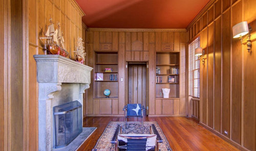
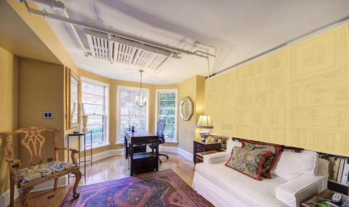
    What is the yellow expanse in that last photo - a screen or a photo mask?

  • 4 years ago
    last modified: 4 years ago

    I love this style of combining old with new. Love all the wood. Looks like a comfortable fun place to live, as long as you can manage stairs . . . I also love home decorating where the folks are confident enough to leave well enough alone and not abandon perfectly good home features just for some trend of the day. If it ain't broke don't fix it . . . One can overdo paneling, but the real wood stuff can give off a cozy natural vibe if done right. I wouldn't have it in every room but that paneled den room with the fireplace just looks fun to me. A call back to what was once considered sophisticated and now just looks like a step back in time. Why not do that in some room in your house if you have the room and dough. I love well done time travel decorating.

  • 4 years ago

    Beautiful. There are several old churches in Brooklyn that have been repurposed into coops or condos. One is very quirky and includes the attached rectory. I was inside once 45 years ago and I thought it was the same place.

  • 4 years ago
    last modified: 4 years ago

    I covered the books in the photo.

    You have to be able to manage stairs here, everything is vertical.

    The stairs in this house(despite its size), like many others here are too narrow to be currently code compliant and a chair lift would make for a tight fit.

    Here is the 1960s bathroom. This is a greyish green IRL, I think it predates avocado. There is a matching tub. Maybe American Standard Bayberry.


  • 4 years ago

    Those curved walls, so lovely and the essence of moderne. That’s a find!

  • 4 years ago

    it is beautiful - I'm glad yu changed your mind about sharing it. I love how the different elements blend together. The entry is very church like with the light fixture, circular window and gentle curve of the arches. At first the kitchen seemed a little stark compared to the warmth of the wood floors and paneling but then I decided it was a refreshing change. I didn't realize that you covered the books until I read your reply - here I thought how unusual to have blinds like that!

    Does it have a roof deck too?

  • 4 years ago

    The 1930s kitchen may well have had metal cabinets too, hard to say. But another Art Deco house a couple blocks away has a kitchen much like this, and that kitchen is metal and original, so this may have been a choice for appropriateness rather than contrast

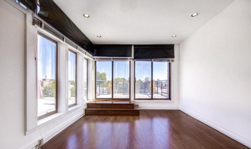
    The house does have a roof deck off the sunroom (which has heavy blackout shades).

  • 4 years ago

    I love the entry lighting and the metal cabinets are perfect in that they make me think of the St. Charles white house line of free standing cabinets.

  • 4 years ago

    I think this is one of the best homes you’ve shared!

  • 4 years ago

    It's wonderful! I'd love to see more of the kitchen. St. Charles cabinets originated in St. Charles, IL, a suburb of Chicago, so I see them periodically around here. They are beautiful and just so--I don't know--kitchen-y. They did a fantastic job here with the remodel.

    If that's the walkout to the rooftop deck in the 3rd to last photo, what a stunning room and view that must be. Updated bath is right on target, imo, and good for them for not painting all the woodwork white.

    Thanks, Pal, for explaining that you covered the books. I initially thought perhaps it was a screen they used to protect their book collection from the sun.

  • 4 years ago

    This house has been owned for 30+ years by the same person. So it survived from the 1930s renovation to about 1990 almost unscathed. And then it has survived since 1990 with only the most thoughtful of updates. Every time something like this comes onto the market I am afraid something terrible is going to happen to under the new owners--and it usually does--not always, but usually.

    -------------

    The kitchen below is from the Emlen Etting house, another Art Deco house that has survived pretty well.

    I believe this kitchen is older than the house above, but it's had a number of small changes. The stainless countertop with integral sink is relatively recent, I think, because of the shape of the sink. The other counters are formica with metal edge banding.

    The spot for the refrigerator is obviously for an older, narrower fridge, and the spot for the range is for a wider style of range. The existing range is meant to be a slide in so it has an exposed side. I wonder if they bought it because it is shallow and doesn't project beyond the counters.


  • 4 years ago

    That's a great kitchen--thanks for sharing it. I can see how it could be divided into different stations... coffee bar along the curved set in the back, baking/prep on the right... and open shelving storage. It would be fun to stock and decorate.

  • 4 years ago
    last modified: 4 years ago

    Thanks for clarifying. Those green fixtures remind me of the 1970s - they seem wider, and styled a bit differently than typical 1960s era, IMO.

    And I'm curious - why mask the bookshelves?