


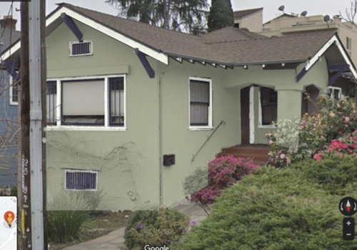
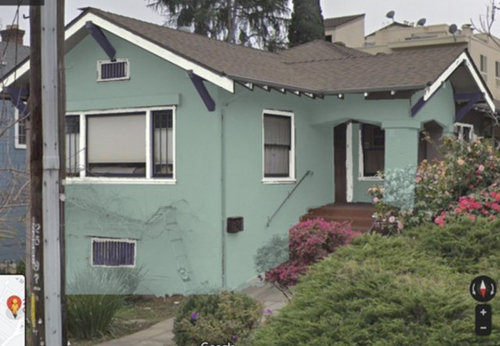
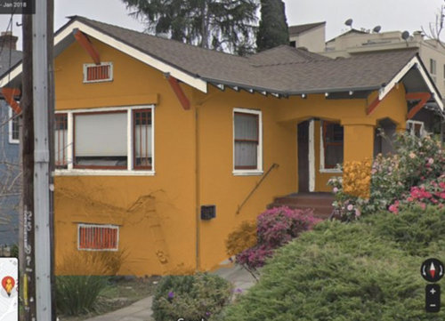
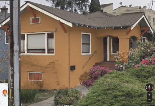
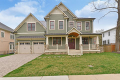
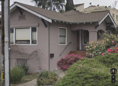
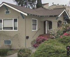
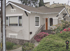
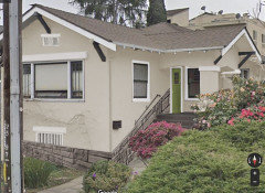
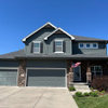
What color trim for exterior?
artemis78
last year
last modified: last year
Featured Answer
Sort by:Oldest
Comments (15)

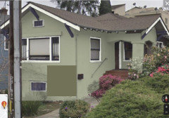
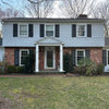
apple_pie_order
last year
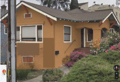
kandrewspa
last yearRelated Professionals
Huntington Painters · Sterling Painters · Tamarac Painters · Vashon Painters · Murray Cabinets & Cabinetry · National City Cabinets & Cabinetry · Alpine Flooring Contractors · Ossining Flooring Contractors · Summerville Flooring Contractors · Sweetwater Interior Designers & Decorators · Ballenger Creek Kitchen & Bathroom Designers · El Dorado Hills Kitchen & Bathroom Designers · Farmington Furniture & Accessories · Lake Magdalene Furniture & Accessories · Redding General Contractors
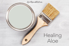
littlebug zone 5 Missouri
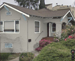
last yearpalimpsest
last yearpalimpsest
last yearpalimpsest
last year- PRO
Patricia Colwell Consulting
last year palimpsest
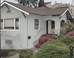
last yearartemis78
last yearartemis78
last yearartemis78
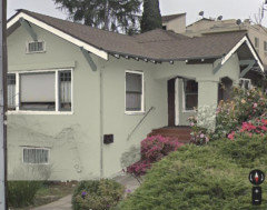
last year PRO
PROCelery. Visualization, Rendering images
last yearlast modified: last year- PRO

Related Stories
TRIMTrim Color Tips: Get Your White Trim Right
Set off wood tones, highlight architectural features, go minimalist ... white trim is anything but standard when you know how to use it
Full Story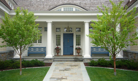
EXTERIORSCurb Appeal Feeling a Little Off? Some Questions to Consider
Color, scale, proportion, trim ... 14 things to think about if your exterior is bugging you
Full Story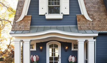
TRIMExterior Panel Shutters Cover All the Bases
Take care of privacy, security and decoration in one fell swoop with panel shutters to dress your home's windows
Full Story
TRIMShutter Cutouts: A Window to One's Soul?
To settle on the perfect shape for this simple detail, follow your heart — or diamond, or maple leaf
Full Story
REMODELING GUIDES7 Details for the Well-Dressed House
Jewelry for your home: trim, awnings, shutters, lights, cupolas and more
Full Story
ENTRYWAYSHelp! What Color Should I Paint My Front Door?
We come to the rescue of three Houzzers, offering color palette options for the front door, trim and siding
Full Story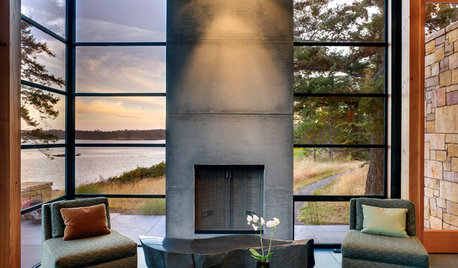
MODERN ARCHITECTUREDesign Workshop: 10 Surprising Twists on Window Trim
These modern approaches to window trim include no trim at all. Can you wrap your head around them?
Full Story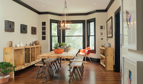
TRIMWhat Color Should You Paint Your Trim?
Learn the benefits of painting your trim white, black, neutral, a bold color and more
Full Story
TRIMInterior Trim: 8 Must-Know Elements
Softening transitions and creating a finished look, interior trim for walls, windows and doors comes in many more options than you may know
Full Story
REMODELING GUIDESHow to Size Interior Trim for a Finished Look
There's an art to striking an appealing balance of sizes for baseboards, crown moldings and other millwork. An architect shares his secrets
Full StoryMore Discussions


Jennifer Hogan