


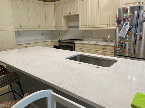
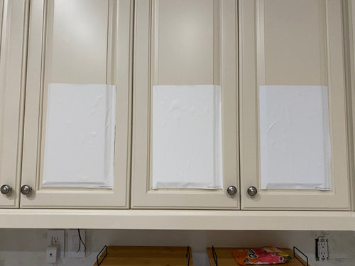
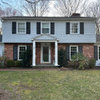
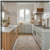
Cabinet Color Help!
Cara Simon
last year


Sort by:Oldest
Comments (21)
Related Stories
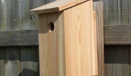
DIY PROJECTSHelpful Hangers: French Cleats Support Projects Big and Small
From cabinets to birdhouses, French cleats hold projects securely in place
Full Story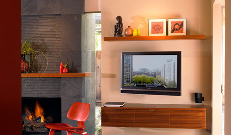
DECORATING GUIDESDecorate With Intention: Helping Your TV Blend In
Somewhere between hiding the tube in a cabinet and letting it rule the room are these 11 creative solutions
Full Story
Storage Help for Small Bedrooms: Beautiful Built-ins
Squeezed for space? Consider built-in cabinets, shelves and niches that hold all you need and look great too
Full Story
REMODELING GUIDESKey Measurements to Help You Design the Perfect Home Office
Fit all your work surfaces, equipment and storage with comfortable clearances by keeping these dimensions in mind
Full Story
MOST POPULAR7 Ways to Design Your Kitchen to Help You Lose Weight
In his new book, Slim by Design, eating-behavior expert Brian Wansink shows us how to get our kitchens working better
Full Story
HOUZZ TOURSHouzz Tour: A Modern Loft Gets a Little Help From Some Friends
With DIY spirit and a talented network of designers and craftsmen, a family transforms their loft to prepare for a new arrival
Full Story
KITCHEN DESIGNKey Measurements to Help You Design Your Kitchen
Get the ideal kitchen setup by understanding spatial relationships, building dimensions and work zones
Full Story
BATHROOM MAKEOVERSRoom of the Day: See the Bathroom That Helped a House Sell in a Day
Sophisticated but sensitive bathroom upgrades help a century-old house move fast on the market
Full Story
LIFEDecluttering — How to Get the Help You Need
Don't worry if you can't shed stuff and organize alone; help is at your disposal
Full Story
KITCHEN DESIGNDesign Dilemma: My Kitchen Needs Help!
See how you can update a kitchen with new countertops, light fixtures, paint and hardware
Full StoryMore Discussions

Norwood Architects
Cara SimonOriginal Author
Related Professionals
Crestview Interior Designers & Decorators · Champaign General Contractors · North Smithfield General Contractors · Troy General Contractors · Waterville General Contractors · Beaverton Kitchen & Bathroom Remodelers · Holt Cabinets & Cabinetry · Wildomar Cabinets & Cabinetry · Brentwood Tile and Stone Contractors · Mill Valley Tile and Stone Contractors · Omaha Painters · Carson Painters · Goodlettsville Painters · San Juan Capistrano Painters · Ossining Flooring Contractorskandrewspa
herbflavor
Cara SimonOriginal Author
Cara SimonOriginal Author
Cara SimonOriginal Author
Floored You: TileDesigners
User
User
Cara SimonOriginal Author
blueskysunnyday
ffpalms
Cara SimonOriginal Author
kimdee24
mxk3 z5b_MI
Missi (4b IA)
Cara SimonOriginal Author
Cara SimonOriginal Author
ffpalms
Cara SimonOriginal Author