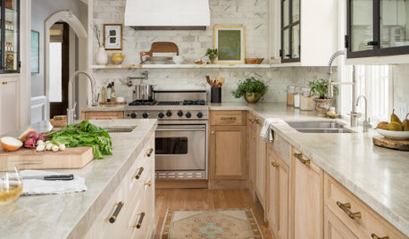
Software
Houzz Logo Print
ocean547

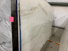
Aria polished quartzite v Taj Majal

3 years ago
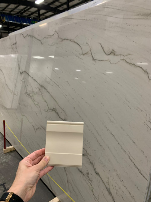
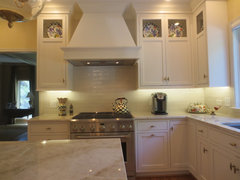
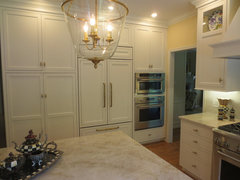
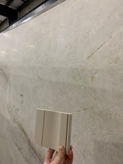
I haven’t been able to find much on Aria quartzite. Has anyone installed and been happy/unhappy with the result and durability? I have a polished slab on hold as well as honed Taj Majal and they do not give out samples to test…here is the Aria.


Comments (37)

  • 3 years ago

    It might be my computer monitor playing tricks, but your cabinet paint looks very warm, and the countertop very cool. Doesn't look like it will look good together...


    ocean547 thanked Sammie J
  • PRO
    3 years ago
    last modified: 3 years ago

    No............ cabinet seems too warm a white for that.

  • 3 years ago

    Oh…..here is Taj Majal. Better?


  • PRO
    3 years ago
    last modified: 3 years ago

    Lighting and judgement. We are not there. You are : ) Seems better, but you need to have them take the slab OUTSIDE and you go out with your cabinet sample. In natural light, not the hideous florescent of the stone shop.

    And what is your FLOORING to be??

  • 3 years ago

    Flooring is just late 90s oak (we have a toddler and floors are absolutely not being redone!)

  • 3 years ago

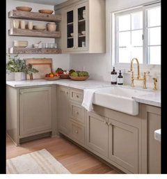
    Also curious why the strong no for taupe cabinets and white toned counters? I've seen lots of inspo with this combination! My concern with the taj is an overall too beigy look reminiscint of overdone

    travertine of the 90s! Here are a few…


  • PRO
    3 years ago
    last modified: 3 years ago

    Taj has white/cream/gray/beige DEPENDING slab. It is darn worry free. Slabs ? You must shop. They will vary greatly, courtesy Mother Earth.

    Just as below....which is Taj.


    Interior Design Work · More Info


    Interior Design Work · More Info


    Interior Design Work · More Info


  • PRO
    3 years ago

    The cold gray veins in the first choice is what isn't working. If you choose a white stone, it needs to have a warmer base. BTW, beige, brown, rose, burgundy, greens, and wood, are all back in style. The color forecasters are predicting even warmer tones like autumnal leaves golds and reds to return in about a 5 year cycle.

  • 3 years ago

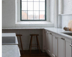
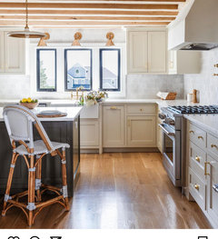
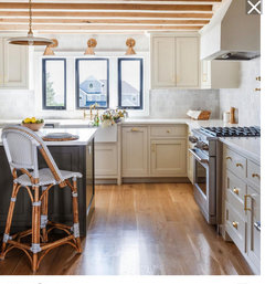
    I hear that. For fun, this just popped up in my feed! Somehow the grey and beige and white is working. But could be marble (or quartz), which isnt in the cards. I guess there is also black window framing… lots of finishes and different tones. We have Schaub brass hardware which is less gold than in this photo.


  • 3 years ago

    Your doors are creamier than that slab. You need to keep shopping with a door from your cabinets.

  • PRO
    3 years ago

    You don’t want to test a sample, you want to test the slab in person.

  • PRO
    3 years ago

    Also curious why the strong no for taupe cabinets and white toned counters?

    Because based on the photo you posted, that cabinet sample is not taupe and that slab is not white.

    ocean547 thanked Kristin Petro Interiors, Inc.
  • PRO
    3 years ago

    @ Ocean

    The photography in your feed isn't really "working".

    Look at the lower right. The cabinetry is WHITER than yours and a match to her marble. Look again......


    Now here

    Lighting and angle........can fool as can exposure to daylight beyond


    ocean547 thanked JAN MOYER
  • 3 years ago

    I don't know anything about Aria, but I have installed polished Taj Mahal in 2 large kitchens, around one fireplace and one outdoor BBQ area. No issues with any of the 9 slabs. TM is also the type of quartzite with the least problems/complaints on these forums. I think I have read of only 2 problems over the last 12 years. Compare that to the many threads with staining problems with "white" quartzites like the Aria.

    ocean547 thanked chispa
  • PRO
    3 years ago

    Cool and warm CAN work together, but it needs careful planning. The colors should be different enough to be pleasing, and not look like you made a mistake.

    Here's a great article that discusses the do's and don'ts of pairing cream and white:

    https://www.homeglowdesign.com/2016/08/27/cream-white-kitchens-stroke-genius/

    ocean547 thanked Diana Bier Interiors, LLC
  • PRO
    3 years ago

    Agree with Diana, and it is BEST left to a pro.

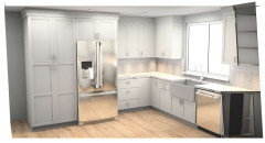
    Also, you should post the kitchen you're doing. The plan.......layout and all. Sometime we are too close to a forest to see a single tree.

    ocean547 thanked JAN MOYER
  • 3 years ago

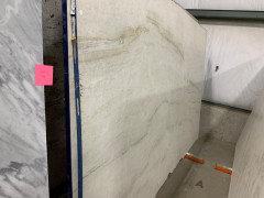
    Thanks for this article! Super helpful and also everyone responding too. So perhaps not enough contrast with Aria. Since this post has become less about durability and more about design, do people think the Taj is better, or keep shopping? Here’s the specific honed Taj Majal slab on hold….


  • PRO
    3 years ago
    last modified: 3 years ago

    It is about BOTH. As with any kitchen it is a sum of a whole. Layout is FIRST. Appliances.....and then the finishes with harmony to tops, cabinets and floor.

    No picture is going to help in isolation. At the very least? Tell them to drive that slab out to the daylight. Get out of the building!!

  • 3 years ago

    I appreciate this so much. Hiring a designer isn't in our budget so it's very much DIY design. I value this feedback a ton for that reason. And you're right, our feeds can lie. Instagram pretty has a lot to do with lighting and editing. I absolutely see the value in hiring a pro.


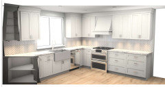
    Here's the layout (none of the finishes are exact, it's simply the layout). Our trim is off-white and very close to the cabinet color. Our appliances are stainless.

    We have chosen the below also:


    White fireclay apron sink

    Brizo polished nickel faucet

    Schaub brass cabinet hardware (pulls on lower and knobs upper)


  • 3 years ago

    I would switch the range and that first drawer cabinet, so you aren't crammed into the corner and hitting doors if both appliances are used at the same time.

    ocean547 thanked chispa
  • 3 years ago

    Sadly this layout can't change. It's just a reno and cabinets are ordered. The fridge is currently next to the stove so we are moving that across which created more continuous counter space. It's small and no island!

  • PRO
    3 years ago
    last modified: 3 years ago

    That's why you ask before you get to the details of a cabinet order via any salesman who could care less what you put where.......

    Might think of a color change on the sink to an ivory.....and go darker on counter and a creamy tile splash. Change the faucet to stainless which will match appliances. You don't need three metals. Polished nickel is a high maintenance in a kitchen and you have nothing else in there in polished nickel.

    Oh well. : ) : )

    ocean547 thanked JAN MOYER
  • 3 years ago

    I shouldn't have said sadly- We like the layout and wanted that double drawer section. Thanks to all!

  • 3 years ago

    Two comments about yourl layout which I think you still can do once the cabinets are there.

    1. Flip the stove and hood with the cabinets to their right so you have a longer prep space between sink and stove. It would mean just getting one more panel for the upper cabinet to make it work.

    2. If you can put the dishwasher to the left of the sink so it's no longer in your prep area.

    Otherwise the layout will work well for your U shaped kitchen.

    ocean547 thanked cpartist
  • 3 years ago
    last modified: 3 years ago

    I like the TAj w/gold hardware and your cabs. but you're inside an industrial warehouse w/florescent lights. see if they can pick up the slab and move it towards natural light. (they have machines for that) take another look.

    if you have warm oak floors, then that taj with gold or soft brass should work. only you can say for sure

    from your floorplan picture, I see a silver gray and nickel. those elements won't work as well w/that Taj slab.


    can you get two door samples? (or are you doing one color? sorry, i'm confused by the pictures)

    the hardware should be last, along w/your backsplash tile.


    if you have a piece of your flooring avail, bring that too. or at least a really good photograph.

    ocean547 thanked Beth H. :
  • 3 years ago

    Which one did you end up choosing?

  • 3 years ago

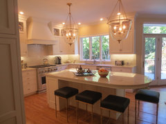
    Turned out beautiful!

  • PRO
    3 years ago

    Wow, it looks great! Love the contrast between the cabinets and the backsplash. And the Taj is just gorgeous.

  • 3 years ago

    @ocean547 so many people post frustrations with matching white or near-white backsplash to white or near-white counter. Seeing what you did makes me realize that part of a solution could be a contrast of reflectiveness! I love your honed countertops! It helps them blend better with the cabinets too, and that looks better than if the backsplash was honed and the counters polished. You've shown me a second thing! I should match the reflectiveness of the counter and cabinet and use a different reflectiveness for the backsplash! I'm so glad you posted this!

  • 3 years ago

    thanks for this comment! I really wanted matte counters, and our cabinets are standard sheen for the manufacturer, but read matte also. We only have windows on each end, so it's not incredibly bright, and the polished backsplash helps the light bounce around. I think it works!

  • 3 years ago

    @ocean547 - this is a STUNNING combo and you really nailed it. Do you have a photo of your sink wall? Thanks!

    ocean547 thanked Sally T
  • 3 years ago

    Beautiful! you will enjoy for years to come. We did Taj Mahal countertops in 2015 and it is still the highlight of my mornings, every morning. IMHO Taj Mahal goes with anything and speaks beautiful love words to you everyday. I would love to see more pictures of your finished kitchen. Kudos to you for a great job. You may not be a 'pro' as you said in an earlier post, but you nailed it like a pro.

    ocean547 thanked perky_2
  • 3 years ago
    last modified: 3 years ago

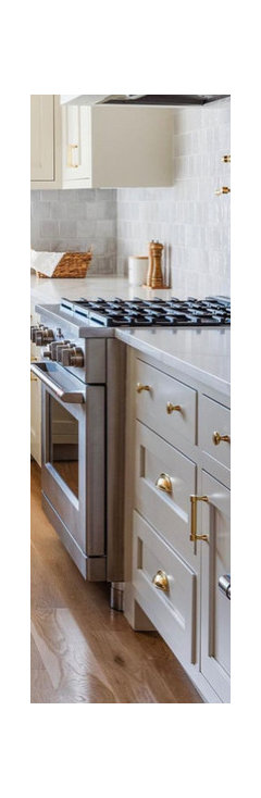
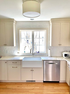
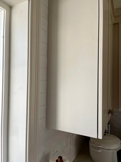
    Thank you so much. We love it, and that is what counts! When you are limited to the manufacturer's paint colors for cabinets, it's tricky. Here is the sink area. In bright midday sun, the cabinets read creamier with more yellow undertones than they do in the morning/evening (esp. with an iphone), when the grey comes out more. You can see that our trim is off-white/creamy, but there is slightly more grey in the cabinet paint, which reads as more of a taupe color at other times. A true chameleon. You can see that tone in my photo with the stove above and the photo taken of the cabinet below next to the trim (this is how it looks a majority of the time with our lighting).


  • 3 years ago

    Your kitchen is stunning, but now I have discovered a Staub InstantPot! Be still my heart - this is going on my must-have list ASAP!!

  • 2 years ago

    Late to this thread in researching Aria (which I purchased and debated against TM). You have an approach similar to mine with colors/contrast. I wanted to chime in that your kitchen turned out beautifully!

    ocean547 thanked HU-689318719
  • 2 years ago

    All this talk about warm wood and cool counters dalso depends on the lighting in your kitchen. Usually lighting in stores skus to grren (fluorescent bulbs). This affects the undertones we see. Don't make decisions without seeing samples at home.