Software
Houzz Logo Print
mo_kotes

Update 2- Kitchen ‘lightening’ up ideas

3 years ago
last modified: 3 years ago
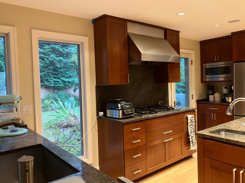
Hi folks!

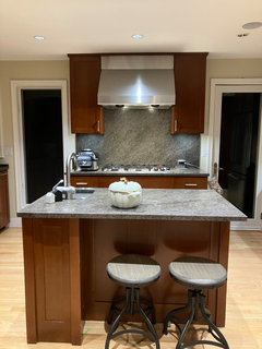
I debate (with myself!) on updating our cherry wood and black granite kitchen. DH would rather I didnt mess with it; we did a kitchen remodel in the previous house 😀

I would love to get the cabinets painted and replace the dark counter with a white one. Then I think ofthw disruptions and cost and give up!

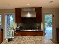
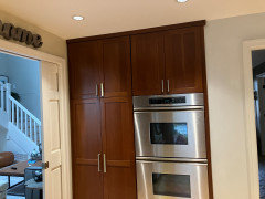
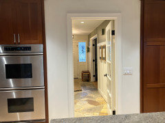
What can I do to lighten up this kitchen? I am planning on changing the backsplash first… or is it just a useless exercise? The backsplash wall is the wall one sees as they enter the house. All the counters are the same - the lighting makes it look different.


Comments (67)

  • 3 years ago

    If you look on Houzz for cherry colored kitchens with whit countertops, you will get a good idea of what your kitchen can look like.

    You might want to try new LED bulbs for increased light - whatever you do with the other elements. Your kitchen looks in great shape - and keeping your spouse from getting super angry is also important.

  • 3 years ago

    I really think you need to change the wall color. It appears yellowy on my screen. It makes the room look drab.

    I would do that before tearing out the counters.


    Jane

  • 3 years ago

    Thanks @jane__ny- good point amd easy to do!!

  • 3 years ago

    Your kitchen cabinets are gorgeous! It's obviously your kitchen and you can do whatever you want, but I'd keep the cabinets and consider replacing the countertop and backsplash to something white or another light neutral color.

  • 3 years ago
    last modified: 3 years ago
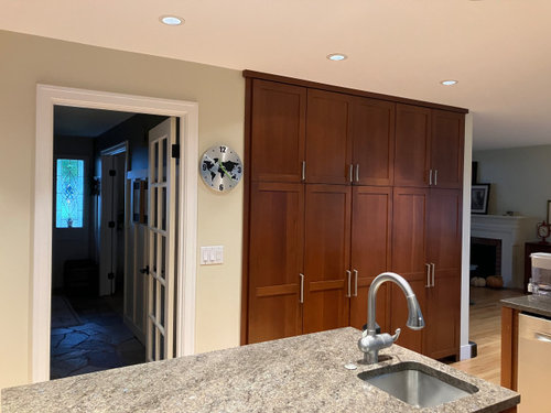
    If you want to "lighten up" the kitchen, consider 3500-4000K LEDs instead.

  • PRO
    3 years ago

    Change all the bulbs to LED 4000K then see whay you need to lighten up the space

    Mo Kotes thanked Patricia Colwell Consulting
  • PRO
    3 years ago

    This is a kitchen where a light creamy slab of Taj Mahal would be perfect! Avoid the ones that are too gray. Then do a zellige inspired simple backsplash. Something in a light ivory to cream, that has some character of size and color variation. Daltile’s Farrier line in Cremello really is not that white. It’s a warm light cream. https://www.daltile.com/products/wall/farrier/cremello


    Mo Kotes thanked User
  • 3 years ago

    Gosh that’s a great space with all those windows - if it were me, i would change the backsplash and get nice simple ivory tile in there + paint the walls a warm white like maybe SW Greek White and then add a few fabulous vintage rugs -our eyes have gotten used to kitchens that resemble white operating rooms but there are so many other styles to embrace!


    Mo Kotes thanked la_la Girl
  • 3 years ago

    Taj as the counters and as a slab for the backsplash. Nuage is another quartzite variety to look at. Nuage Quartzite? like it? (houzz.com) 3500k leds are less blue than 4000k. Test what works for you.

  • 3 years ago

    Such pretty cherry wood, and while whiter counters are nice your counters are pleasant enough. Low cost action I would take: (1) change to the bright light bulbs and (2) get some white or light colored paper and cover up your backsplash. Step back and see if that "lightens" up your kitchen.

    Then, you'll have a better idea how to proceed, and (hopefully) get your husband on board with the project.

    Mo Kotes thanked User
  • 3 years ago

    I think @nickel_kg has a terrific idea. Using paper to help you envision just a new white backsplash will definitely help.

  • 3 years ago
    last modified: 3 years ago

    Does the hood have lighting? It seems like if the backsplash were lit, it would appear as light as the countertop with the second sink.


    I love the glass door and window on either side of range!

  • 3 years ago

    Thanks for all the ’high end’ and ’low cost’ options you all!!

    The paper on the backsplash is def a great idea.


    Thanks @la_la Girl for some paint colors! I do believe I will paint the room in the next few.


    Thanks for the light bulb specification @dan1888 and @Patricia Colwell Consulting! Ordering some of both to try our!

  • 3 years ago

    Your cabinets are beautiful, definitely don’t paint them! That would be such a travesty! But I would do a new backsplash, the dark backsplash looks like a black hole. I would paint the walls a creamy (not yellowish) white. Maybe add some more lighting. I don’t think the counters are really the problem, but a lighter counter does look nice with cherry.

  • 3 years ago

    I do think your hood is fine, you don’t need a new one. Do you have pendants over your island?

    Mo Kotes thanked Alicia
  • 3 years ago

    Hi @Alicia- yes, the lighter counters make the cabinets so much ’less heavy’!

    There are pendants over one of the aides, a peninsula, I guess.

  • PRO
    3 years ago

    Beautiful cabinets change out backsplash and countertops paint walls a white maybe even the trim white…if you have an island that would be nice painted white…add lighting over island.

    Mo Kotes thanked Home Interiors with Ease
  • 3 years ago
    last modified: 3 years ago

    Beautiful kitchen. Paint the walls if you are looking for a change. You say you have under-cabinet lighting, but that was not turned on when you took your photos, correct?

    Mo Kotes thanked partim
  • PRO
    3 years ago

    🤗

    Mo Kotes thanked Home Interiors with Ease
  • 3 years ago

    Just to update… I changed the can lights to 3500 and the under caninets to 4K. Also did dond cleaning and polishing of the granite.


    wdyt? Too cool now with the lighting? I may change the under cabinets to 3000 or 3500, I think.!


    I have some white paint to try out on the walls too 🤞🏽🤞🏽


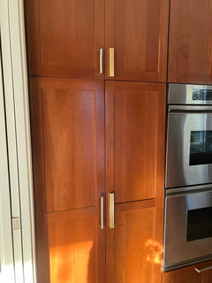
    Question - will gold handles work on the cabinets even though everything else is brushed nickel/ stainless steel?


  • 3 years ago

    I like the hardware better!! Looking good.

    Do you want to try more of an antique finish on the hardware. More brassy than gold…

    Mo Kotes thanked HU-187528210
  • PRO
    3 years ago

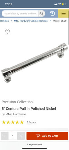
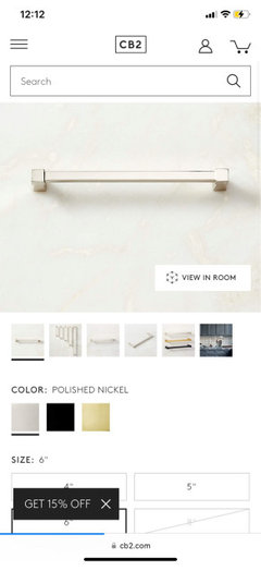
    I think a polished nickel would look beautiful..add a bit of shine/sparkle to the space.

  • 3 years ago

    I hadnt thought if polished nickel st all; everything else is more like brushed nickel, stainless steel. I will habe to bringsome sanples and check it out. Thanks @Home Interiors with Ease

  • 3 years ago

    I like your countertops. If budget is an issue You could find a tile to match the lightest shade in those counters for your backsplash. Then paint the walls white.

  • PRO
    3 years ago

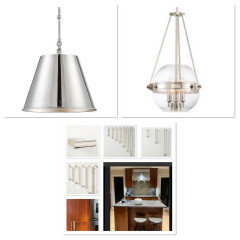
    Here are a couple pendant ideas in polished nickel if you change out your peninsula lighting.

  • PRO
    3 years ago

    Make sure you look at Polished nickel not Chrome…polished nickel has a warmer tone Chrome has a cool sometimes bluish tone.

  • 3 years ago

    @Hellogardener- Isnt budget always a constraint lol? I could change the counters (willnot be for another 6 months atleast if I choose to go that way)


    I definitely want to do the backsplash - but doing that now and counters a year from now would be stupid, right?

  • 3 years ago

    Thanks @HU-187528210- another direction that hadnt crossed my mind. i will pick something up to try. i would like it to be a bit more ’modern’ than antique.

  • 3 years ago

    Okay- one kore update. I got some sample white paint to try on a couple of walls. I need to watch and see if I like this or go a shade warmer.

    wdyt?


  • PRO
    3 years ago

    I really like it..has just a slight hint of grey from what I see..looks great with the stainless and wood cabinets…what is your white trim color?

  • 3 years ago

    I think I would prefer matching the walls to the trim color. On my screen the second picture is pulling way too blue next to the trim and warm cabinets.

  • 3 years ago

    Agree with Jennifer Hogan. On my monitor, the second picture is a cold blue-gray white, which won't compliment your cabinets or your countertops.

  • 3 years ago

    @Home Interiors with Ease- the trim is currently something I dont know. My usual trim color is SW marshmallow which I intend to paint the base molding (unpainted now) and the trim etc.


  • 3 years ago

    Thanks @mcarroll16 and @Jennifer Hogan- Yes, it seems a bit cool to me too. I think this is Alabaster. I may try my marshmallow on the walls too on my next free day 😂

  • 3 years ago
    last modified: 3 years ago

    I realised i had my can of marshmallow from last time so I just haphazardly put it one side.

    Pop quiz - can you tell which side? 🤣

    Any


    votes? or go even warmer?

  • 3 years ago

    Ha! No, on my monitor I really can't tell. The left side looks a touch brighter and cooler, but it also looks like it's just receiving more light on the surface. Looking at the less shadowed parts of the right side, that color seems pretty good.

  • 3 years ago

    Its really bizarre - usually marshmallow doesnt read blue at all. it could be that there is snow on the ground and its a very cloudy day… or the lights at 3500 are too cool.

  • 3 years ago

    Well, all of picture 2 looks warmer than picture 1. No part of your last picture looks blue or gray on my monitor. Left side just looks a bit brighter and cooler than the right side.

    Mo Kotes thanked mcarroll16
  • 3 years ago

    I can't, nor would I expect to be able to see a difference. The colors have a .8 delta and the human eye generally doesn't see a difference of less than 1 delta.

    The thing that may be more noticeable in person is that Alabaster's undertone/hue is more green than Marshmallow, so where sometimes Alabaster can pick up a green tone Marshmallow is less likely to pick up green.

    Luminosity, Chroma and Hue of each:

    Luminosity: Marshmallow 92.6 / Alabaster 93 - virtually the same

    Chroma: Marhsmallow 5.7 / Alabaster 5.6 - virtually the same

    Hue: Marshmallow 93.47 / Alabaster 99.95 90 is yellow


    The focal center of yellow is 87 and yellow green is 116. Low chroma yellows appear more green, so this is where Marshmallow may be a bit safer than Alabaster.


    Mo Kotes thanked Jennifer Hogan
  • PRO
    3 years ago

    😳

  • 3 years ago

    Wow @Jennifer Hogan- thats some impressive technical info!! The right side as seen directly on the screen is alabaster. The marshmallow reads just a bit warmer IRL. I have it on the molding seen in the entry between the cabinets too.


    Thanks you all for weighing in and the suggestions! Totally appreciate it. I have some new hardware coming next week and will hopefully finish painting by then to give an update!

  • 3 years ago

    If you’re ambivalent about “maybe changing” the countertops, you can remove the backsplash now and just paint the (repaired) wall in whatever white you choose for the walls. Just use a paint finish that can be wiped. Then you can choose a new backsplash and countertop at the same time.

    (BTW - the two whites look the same on my monitor.)

    Or you may like the painted backsplash enough to leave the countertops as they are. The goal is to ”lighten up the room”.

  • 3 years ago

    Thanks @RedRyder- yes, I have come to the conclusion that doing the backsplash while not loving the counters will be a bad idea.


    Just to add data for anyone contemplating whites - IRL, the marahmallow has a mild creaminess compared to Alabaster which does have a tiny blue tint in this light.

  • 3 years ago

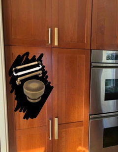
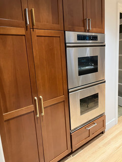
    Okay - more updates. the new hardware arrived. The gold by itself is nice but I am not sure if its too ’shiny’ relative to the appliances..?

    The top also has ine new handle which is too dull for me lol.


  • 3 years ago

    You could take a scotch brite pad to one of the shiny ones, see if you can make it look a little less shiny.

    Mo Kotes thanked Alicia
  • 3 years ago

    I think it looks nice though

  • PRO
    3 years ago

    You really should try polished nickel..looks great mixed with stainless appliances.

    Mo Kotes thanked Home Interiors with Ease
  • 3 years ago

    @Home Interiors with Ease- ugh, it gas not been an easy hunt for polished nickel pulls with 5” and 7.5” spacing, leave alone the styles I want!

    Oh, and a readonable price point ☹️

  • 3 years ago

    All monitors are different, but on mine the brass handles in the large pantry doors look the best. I like the softer corners and the finish.