Software
Houzz Logo Print
littlebird2024

Help me accessorize my family room

3 years ago
last modified: 2 years ago

ideas would be appreciated

Comments (86)

  • 3 years ago

    Wowwww that library is insanity!!!! Gorgeous gorgeous!! 🤎🤍😃

  • 3 years ago
    last modified: 3 years ago

    Little Bird - yes, a big floor vase - not sure about ’body size’ - but how tall is chair? Maybe at least taller than seat of chair & the height of filler of vase TBD. Also have to factor the curve of staircase. But now, seeing your rug art idea, what about doing that as companion piece to chair? That art would be so striking it seems would need a place of its own to stand out & not have a room full of furniture to compete with. Move the chair towards staircase & art on outside where chair is now. And, use the leaves over the lake. My imagination says Wow! The foyer would be filled with artful pieces - lotus lamp, chair & rug art.

    That Voodoo chandelier - a sexy bedroom? I just saw your wooden reindeer on fireplace hearth - I have one! She lives on my covered front porch..

  • 3 years ago

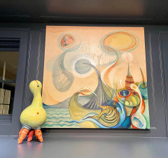
    Thanks, HU! I love your insanity description - because I do love kooky crazy stuff. Check out this funny little creature I just got - I think he looks like he jumped out of the painting. I would love to live in a swirly world like that!

  • 3 years ago

    Amazing! You’re so super talented!! Love your style 🤍🤍

  • 3 years ago

    I like the vase and greenery for your foyer. I like the space location it takes on the wall. It needs a simple thin steel stand.

  • 3 years ago

    On your art question, I like the abstract. I think that style just works a bit better with the crisp lines of your furniture. On size, roughly 2/3 the width of your sofa, and definitely cropped to hang above the sofa. Having it extend behind the sofa will feel odd and unsettling. If you want a floor-to ceiling art work, rotate the sofa 90 degrees and put it where the chairs are, with chairs facing it on the piano side of the room.

  • 3 years ago
    last modified: 3 years ago

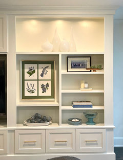
    Lovely home. I think you need to add softeness to the shelves with wicker/woven items. Low light plants on the top shelves, and one on a lower shelf. If you don't want live plants, look for large wicker baskets or boxes with lids. Don't line things vertically from one shelf to another, stagger. All the books are horizontal, so add some vertical. Find objects to use as a bookend (don't necessarily need two). The two framed pieces relate, so both are good. Hang the larger.

    Items need to relate to each other, not just buy category or color, but by overlapping or touching.

    Do you have interesting items from traveling, or vintage/antique items you've collected? While the things currently displayed look nice, it doesn't feel personal.

    FWIW, backless stools are not comfortable for very long, if at all.

  • 3 years ago

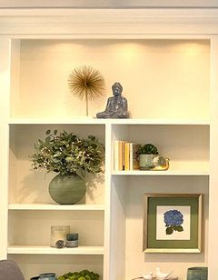
    Thanks for all the valuable tips. I’m still working in the shelves - but what do you think of this spiky object next to Buddha? Yea or nay? I have until tomorrow to return it

  • 3 years ago

    Love it! Buddha now has his bodhi tree! Would like it better on one of the smaller shelves, and a larger piece on top. But that grouping is perfect.

  • 3 years ago

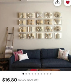
    Thanks, mcarroll16. So you like the starburst/Buddha, but on a lower shelf only? I’m having such a hard time finding something for the top on both sides! What do you think about these book sculptures?

  • 3 years ago

    Well, maybe the Buddha would work up top if there was also something larger up there? The book sculptures are cool. If you're asking about using them on the upper shelf, I think they might also be too small. Your green vase with the floral arrangement seems like the right scale (but I don't like the idea of flowers up that high, for a reason I can't articulate).

  • 3 years ago

    @Little Bird Shapes - strong shapes is what I still think is best for the top shelf on both sides. Remember the pottery? Just try some of your white pitchers just for mock up even if something in a color is better. I think I get what @mcarroll16 can’t articulate about the flowers up that high - flowers in a vase are meant to be viewed with eyes looking down or across to the top of flowers rather than up at bottom of vase. So, too high for vase of flowers.

  • 3 years ago

    KW, I think you’re right. So, I just plopped every vase I own up there. I’m sure you were thinking something more artful, but is this the direction to go? Various sizes of the same item? Or should it be different items?

  • 3 years ago

    Dumb question: how do you get someone’s name to show up green in a comment?

  • 3 years ago

    @Little Bird - Wow - those vases & pitchers make a pretty interesting arrangement! That shelf space is pretty tall - taller than it looks in pics assuming some of the pieces are @ 12”. I think a couple of taller pieces mixed in & maybe a couple with colors taken from objects on shelves below - green /tea/ lavender? But, I do think those pieces make an eyecatching top for the entire set of shelves & would be cool if the other side could be a duplicate with diifferent pieces, heights & colors. That whole side shelf is looking great - so much more interesting. LIke the small horizontal photo - that’s new - looks like a big family wedding party in a field of lavender!


    Not a dumb question - It’s how you tag someone & if their profile set for it, when tagged it generates an emali notification.. key in @ sign & the list of posters in the thread should display. select the name you’re tagging. Sometimes the person’s name doesn’t appear in list - don’t know if that’s a profile setting or what.. And, sometimes you have to attempt the @sign & selecting from the list a couple times to grab it for display. I think it depends on the device being used. Houzz is quirky.

  • 3 years ago

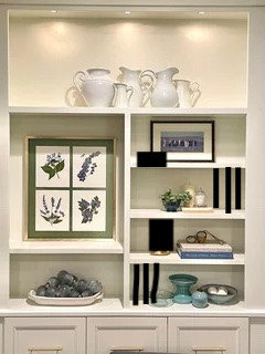
    Crude mock ups, but hope this helps you understand.


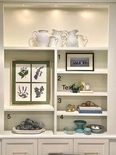
    I numbered the shelves to point out that 1, 2, 3, 4 and 5 all feature items or clusters of items that visually read horizontal. The top shelf does too, but I left it off since the pitchers vary in height and the eyes "dance" across them.


    Most of the shelves feature items horizontally (visually, maybe not physically). Heights need to vary. The verical lines could be books added, which also visually soften. The black squares are items to add interest and connect to the other object(s) on those shelves or add height to a shelf where needed. You could move the clear low glass bowl (shelf 4) to shelf 1.


  • 3 years ago

    Thanks, @KW and @Allison0704. I will look for ways to add different the heights. One thing that makes it difficult to put bigger items on the top is that the shelves are only 10” deep, and my taller things are too wide. I’ll have to look for skinnier tall things. I appreciate your guidance!

  • 3 years ago

    Huh. No green names. Oh well

  • 3 years ago

    @Little Bird Hmm - after I keyed in @ sign, the list of posters popped up but your name not included so I started keying your name & it popped up. As I said, quirkiness abounds on this site! BTW, I’m on new iPad device & from user comments, the functionality available seems to depend on device used & OS device is running on.


    On more important note - the height of those pitchers looks ’better’ on second look at entire shelf display. If it looks good to you, there IRL, it’s likely good. Perspective counts for a lot! 10” wide shelving is good as that ensures items don’t get lost at back - perfect for displays.

  • 3 years ago

    Haha, too bad they look good - I have to return them to their original shelves elsewhere in the house!

  • 3 years ago

    Well, on the other hand, you might now have a specific decor shopping list - what fun!

  • 3 years ago

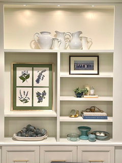
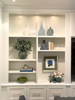
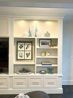
    Still working on the lower shelves, but I just got these glass vases for the top shelves. What do you guys think? Too many vases? Is the sleek style incongruent with the homier stuff below?

  • 3 years ago

    Or maybe it’s better to keep all one color instead of mixing? Or…should I go back to the ceramic pitchers idea?

  • 3 years ago

    I love it! I think you need the mix though, or all one color in blue or green. I love the clean lines of the small white group, but the vases are almost invisible against the white cabinet.

  • 3 years ago

    Thanks, mcarroll16. I think you’re right about it being kind of invisible. It’s actually even more invisible in person. It could work if I collected enough of the blue and green ones, but I just picked up this whole bundle at Pottery Barn, so they look a little too matchy-matchy

  • 3 years ago

    Well the scale for that shelf is perfect! I actually like the all-white shelf the best, in terms of the overall composition. But the large group is also great.

  • 3 years ago
    last modified: 3 years ago

    Hello @Little Bird ! Just seeing your new arrangements. You do have quite the knack for grouping items nicely. I love the shapes of the vases & they look great on the top shelves. My first impressions & thoughts - picture 1 - I looked at left side of arrangement & thought ”hmm - needs one vase with color on that side - wishing the last vase was also the darker color” -I think it needs the weight of the color on end to ’anchor’ it to everything below. otherwise, I love it. Picture 2 - I’d try swapping the places of the last 2 on right - the tall white one & short gray one. There’s something about the repeat pattern of white / color left to right that makes the gray piece on the right end feel detached from group. Picture 3 - I agree with @mcarroll16 that the scale is perfect - those vases with the shelf height & I do like the all white too. But in terms of overall effect on those shelves, the all white is too ethereal to balance with the lower shelves. And, it’s too much like your beautiful kitchen cabinet filled with white. But, these vases with touches of color mixed in, for me, look to be a perfect counterpoint to that white filled cabinet in the adjoining space. I think you found the cherry for the sundae with the vases!


    ETA: What a fun thread this has been Little Bird! Thanks for being so accepting of suggestions and coming back to share your progress!

  • 3 years ago

    Thanks for all your help, mcarroll16 and KW! And everyone else too! I’ll keep arranging, but I really have a better sense of what to do now after getting everyone’s suggestions.

  • 3 years ago

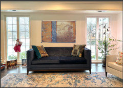
    So…what do you think of this art behind the living room sofa? I just photoshopped that in. The large vertical painting is already in the living room. Is it too similar to that one? What about the size?

  • 3 years ago
    last modified: 3 years ago

    First, I love your house! The library is gorgeous and there are only a small handful of things I would change (I'm extremely picky) and I love your restraint in not putting anything on the fireplace mantle. (One piece is the white pitcher, it's too white and doesn't relate to the other items, the other pitcher looks more like an artifact so looks ok, even though it's high contrast. The other is the vase with flowers to me looks very grandma ish. I don't object to the flowers, but maybe a rectangle shorter vase with interesting green and white flowers. Or orchids, I don't really love orchids, but I think they would fit and give you the height needed for that area. You could try that vase in place of the one on the lower shelf. Looking at it again, your eye goes to the two white objects, everything else is muted, textures and low contrast. Sorry, I know you didn't ask for that. So, regarding your family room, not sure if anyone has suggested this, I think the back of the shelving needs something. Paint, wallpaper, something with texture. Your entire space is smooth and there is a lot of smooth white. I would try grass cloth or something similar. It doesn't have to be a color, white or grayish white. Also I would introduce another color in the deco, right now everything is white and blue/gray. A very light muted mustard? Some light muted fall color that would go with the other items. A browinsh light orange to work with the coffee table? Get a paint color fan to find a color. Is there a rug in this room? If so, pull off that and get some pillows for the sofa to blend with the new colors in the deco. I think I see a white rug, Something with a white/light background with a bit of pattern and color would look good. Just at a glance, odd man out is the larger art work because it covers most of the space. There are two items with contrast and pattern, both artwork. You might want to balance those with some other pieces with patterns/contrast. Last thought, I do think that you need some pattern in the room. The two pictures are interesting because they activate your mind, just like the items in the library. Find things that make you think and feel. But balance them with things that just sooth, be it with color or shape or texture. And really, you don't need patterns to make a room interesting, but you seem to be searching for something to make the bookcases interesting. Personally, I don't like candles anyplace that they would not be lit. Or things that look incomplete (cake plate with no cake) etc. (the light blue object on the second shelf on the right) Sometimes your brain thinks something doesn't look right but you dont' know what it is. Sometimes that is because you are used to seeing it in its proper useful place. Which can still be interesting, but needs some company or context. And those moss thingys, I really love on a coffee table, but not on a shelf. Why? I have no idea. Keep working on it! Make it as perfect as your library. You have spectacular taste and a beautiful home to work with.

  • 3 years ago

    Thanks for the many things to think about, Gigi W! To clarify:

    • the white pitchers- do you mean that I should remove the ones in the blue library?
    • the grandma vase of flowers- on the white family room shelves? Do you mean the big green vase, or the blue pot w the white wood/paper flowers?
  • 3 years ago

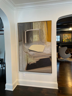
    @Little Bird The living room art - size of both pieces seems right for each of their spaces. The one over sofa makes me think of a tapestry rather than ’art’ though a tapestry is certainly art. It’s very peaceful so if that’s the tone you’re wanting, it’s good & seems compatible with both throw pillows and rug. I prefer art with a ’topic’ or specific image but art is a very personal thing. The large vertical piece - I’m trying to see what the image is - I think there is one & it’s not an abstract as piece over sofa. It looks like paper on a desk in front of a window with curtains billowing in breeze? I like the colors in it. Side note - I see your whimsical art & critter creature over fireplace in adjacent room - Love them!

  • 3 years ago

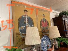
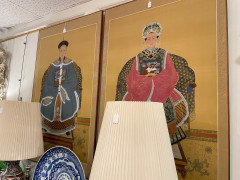
    Haha, KW - those funny little critters make me smile every time I see them. They’re like me: a little kooky, don’t quite fit in, but always looking for the next fun adventure. What do you think of these Chinese people for behind the sofa? I like the colors, but is it weird to have portraits of random people?

  • 3 years ago

    Not weird but the two pieces have a definite theme and IMO would dominate most rooms they’re hung in unless the room had Chinese inspired items around it. They have Chinese pottery lamps and a plate sitting in front of them now which creates a little vignette and ties them to something in the space. I definitely see the connection between their colors and the colors in the first piece you showed us & you said that’s what caught your eye - the colors. Looking at your sofa sitting between what looks like French doors and the view outside, I can visualize something with a nature theme to connect to what must be a pretty view in spring with all the trees in leaf. I think nature themed art would connect to the other piece hung by the room’s archway entry too. . Art with depth would draw the eyes to that side of room and out the windows and would be easy to find the colors you’re looking at. It would be lovely to find something that ’makes you smile’ or feel an emotion when looking at it. You have that with your funny critters & the art with them. I cruised through Art.com and found this piece for color - it’s a strong image too but the dark color and straight lines of sofa balance it. Hope the link works

    Van Gogh Irises

  • 3 years ago

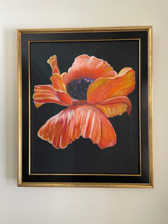
    KW, thanks for the art idea! You’re right, as usual. I feel like I can trust you to stop me from making bad decisions, and also inspire me to find the right things. The irises have the colors I’m looking for, but are a better subject for that location. IN FACT, I might even be able to get my daughter to make that painting for me. She did this one that we have in the front doorway.

  • 3 years ago

    That is stunning, beautiful and gorgeous, so dramatic! I’m out of adjectives! Even better, the frame presentation is just so perfect for the poppy image. With talent such as your daughter’s I have to ask why you are shopping for art! Your daughter might just use the van Gogh Irises for inspiration and customize the colors to the palette you’re looking for. An original piece of art created just for you would certainly have meaning for you - just as this beautiful poppy must have.

    Little Bird - thank you for your kind words to me. You do know that it’s much easier for us to critique another’s ideas than it is to come up with one’s own - even if we do have a creative eye. My view of this forum is that it’s one big brainstorming session and that it allows us to exercise our mutually creative minds 😊

  • 3 years ago

    KW, I would love to have my daughter sit at home all day and paint for me, but alas, she is a child and must go to school. Maybe in the summer!

  • 3 years ago

    A child? Even more amazing! Even the Poppy as the subject of the art seems rather sophisticated. Maybe she’s a budding Georgia O’Keeffe.

  • 3 years ago

    Little Bird, your daughter is incredibly talented. Maybe she would take commissions, during school breaks?

  • 3 years ago

    @mcarroll16 Thank you for being the first to mention @Little Bird ’s daughter taking commissions! That thought crossed my mind too. Does this young artist also play the grand piano in the music room or is that another family member’s talent?

  • 3 years ago

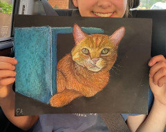
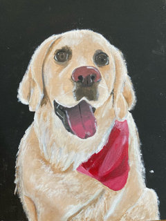
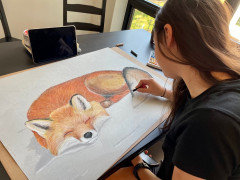
    Haha, she actually does take commissions! She makes very cute animal portraits

  • 3 years ago

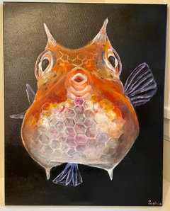
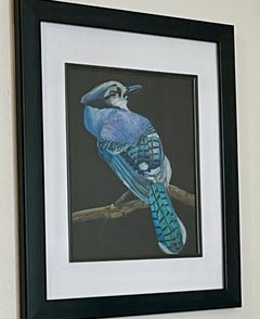
    She does the fluffy animals. Her sister does the fish and birds. Good team!

  • 3 years ago

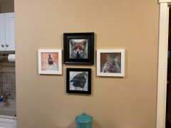
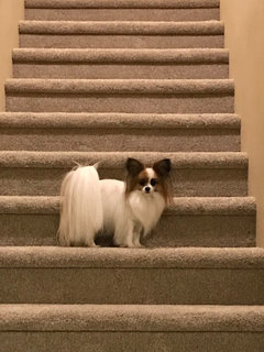
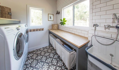
    Words fail me @Little Bird ! All that talent in those young little hands and minds. You can see by my Houzz icon that I have a weakness for ”fluffy animals”. I live with that one - a Papillon. She’d be an excellent subject for your daughter! My sister has an Amazon parrot that your other daughter would love! Her fish is simply amazing! Is their art done with chalk pastels or colored pencils? I have these prints in my laundry room that make me smile while fussing with laundry - found them in a cute store while on a road trip - sort of whimsical I thought. The already framed fox caught my attention so I had to get more prints to make an arrangement! They seem your one daughter’s style.


  • 3 years ago

    KW, those are SO cute!

  • 3 years ago

    Here’s my long hair chihuahua. A lot of people ask if she’s a papillon!

  • 3 years ago

    She’s so pretty & I see why people ask that - her ears are very fringed & she has a perfect little apple shaped head. Many who aren’t familiar with Papillon breed ask if my dog is a long haired Chihuahua! ”Papillon” is French for Butterfly & they are called the Butterfly dogs because of the markings on the head with white down center & the huge fringed ears for the wings. They’re actually a spaniel so no relative of Chihuahua. Bit of trivia - Marie Antoinette had one which accompanied her to the guillotine - dog was left to live long! Here’s a pic of Ginger - she’s a red sable in coloring - many are white with black markings.


  • 3 years ago

    KW, she DOES look like a butterfly! That tail…her “scarf”…so pretty!

  • 3 years ago

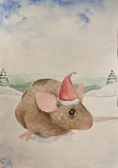
    I just found my child in her room making a series of these rat Christmas cards to GIVE AWAY! I want to keep them for myself!

  • 3 years ago

    That rat is adorable!

  • 3 years ago

    Yes, agree it is absolutely adorable! Your daughter is so generous - giving her friends the gift of a smile with her talent. The card is frameworthy so maybe she’ll give you one to frame and add to your holiday decor. A keepsake!

Sponsored
Hope Restoration & General Contracting
Average rating: 4.7 out of 5 stars35 Reviews
Columbus Design-Build, Kitchen & Bath Remodeling, Historic Renovations