Software
Houzz Logo Print
webuser_975144171

what color to paint new island

3 years ago
last modified: 3 years ago
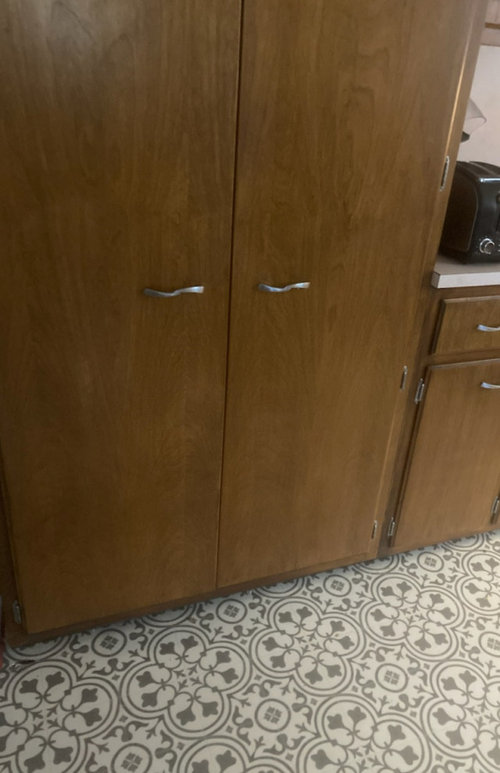


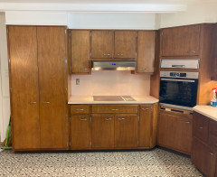
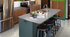
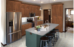
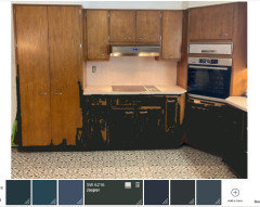
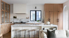
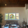
new 6x3 island, with drawers no seating, is going in my kitchen. existing cabinets (sample pic above) are staying and probably wont be ever changed (thats what i'm assuming for this project as id be more likely repaint the island before painting the cabinets. i am not worried per se about trying to match/coexist the new island with the old cabinets but more about what looks good with the countertop and floor.

new floor is https://www.mannington.com/residential/products/luxury-vinyl-sheet/platinum/platinum-revive-collection/Deco/130390

new counters on existing counters AND new island are

https://www.igscountertops.com/lg-viatera-nimbus-quartz/

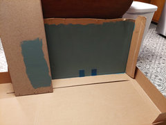
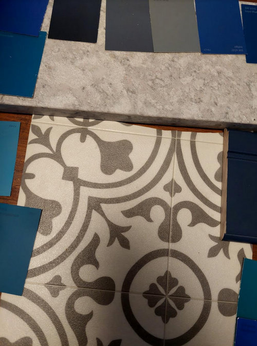
brought home some colors as you see in the pic.

i do like how cobalt blue (the wood sample on the right side of the pic ) looks in my new bathroom with a similar countertop. but i cant seem to reconcile blue with this new floor. all color is subjective and while im scanning thru houzz pictures online i figured id get your opinions.

Comments (27)

  • 3 years ago

    what is the entire kitchen like?

  • 3 years ago

    I would stick to a white, not a bright white, though

  • 3 years ago

    My kitchen is similar.

  • 3 years ago

    here's a greige I like ....and then creamy light is a nice option as in 2nd.....probably go less stark white though .... your swatches look too dark.

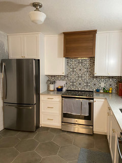
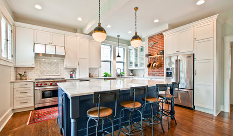
    Foresthill · More Info


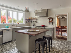
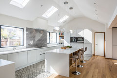
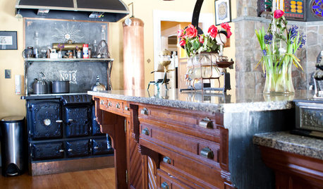
    Transformation of Detached Family Home · More Info


  • 3 years ago

    where the pic is being taken from will be where the island starts. it will end 42 inches from the cooktop. the 3 ft section will face the cooktop and the 6ft section will face the sink out of view. 42 inches away from the sink.


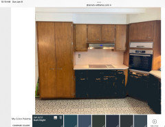
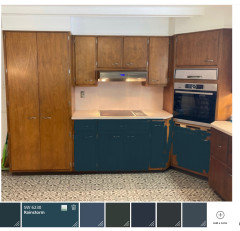
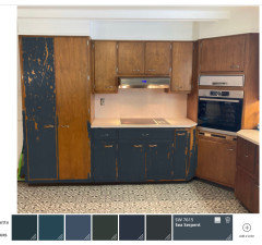
    anyone know of software i can use to insert an island in the pic in various colors


  • 3 years ago

    Your woodwork is beautiful. Just lovely.

    lucky driver thanked Gloria H.
  • 3 years ago

    You can go with a lot of colors. blue or green would be colors I’d explore, or white or grey/griege as suggested. What other colors are in your home?

  • 3 years ago

    thanks about the woodwork. i have too much blue already so probably shying away from it. living room is denim type blue..dark..and bathroom cabinet is dark like cobalt. and blue is my fav color but actually i cannot find a blue swatch i like to go with floor/countertop. i did find a visualizer and started playing. but it's difficult lol


  • PRO
    3 years ago
    last modified: 3 years ago
    IMO a good clean for the existing cabinets and a nice wood island to match but if that is not possible I agree the floor is the star so the darker color from the floor paint matched make sure all your lighting is LED 4000K before doing anything else. I will say the existing caniets are in good shape but the layout is not good so a trip here before the wasted money on counters and an island that IMO barely fits and the floors which IMO are now driving the bus. If painting an isalnd was the plan then you should have chosen a different color for the floors thta could have been used. Now you have floors in a color that looks like you tried to match the cabinets .

  • 3 years ago

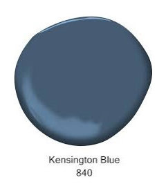
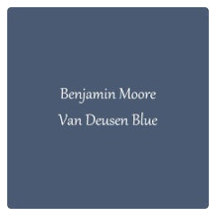
    The blues you’re looking at are way too saturated. I agree that you probably want to go with something that works better with the tile anyway. SW Keystone Gray is a good place to start. If you do want blue go grayer. BM Kensington Blue or Van Deusen Blue are good ones to start with.

  • 3 years ago

    The blues you’re looking at are way too saturated. I agree that you probably want to go with something that works better with the tile anyway. SW Keystone Gray is a good place to start. If you do want blue go grayer. BM Kensington Blue or Van Deusen Blue are good ones to start with.

  • 3 years ago
  • 3 years ago

    I am in the same boat leaning towards teal, but just a warning...When we painted out salvaged cabinets the dar Moody teal from the switch ended up more Crayola bright than we anticipated. I don't know the right visual/color term, but wondering if a pro can point you in the right direction of how to make that rich teal blue color you like the right tone to go with the other materials.

  • 3 years ago
    last modified: 3 years ago

    im thinking of doing a test on a spare piece of larger wood to see how things will look in the lighting etc. when you put riverway next to the ocean color , the riverway is def a safer more muted color. we werent sure if the ocean color was too bright but when you put them side by side it really is


    and we def prefer river way to rosemary so at least we narrowed that down :)

  • 3 years ago
  • 3 years ago

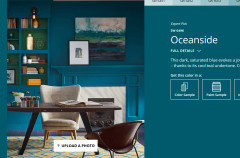
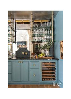
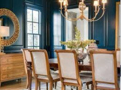
    Riverway will be a lot more livable than a more saturated color. We have had it in our powder room (on the walls) for more than five years. I still love it. What looks good on a little swatch can be painfully bright on a much larger sample. Example of Riverway below on cabinets. Teal looks great with wood tones like you have. If you want more saturation than Riverway, Moscow Midnight is very pretty. More saturated and darker, without going as far as Oceanside, also very pretty with wood.

  • 3 years ago

    Definitely no to 4000K bulbs…much too blue and sterile. 3500 K max .

  • 3 years ago

    I think a dark blue or green that is closer to black would look better. Here are some crude attempts to mock up. Jasper and Dark Night are my favorite.

  • 3 years ago
    last modified: 3 years ago

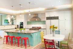
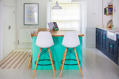
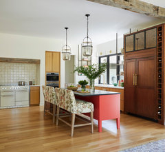
    if you dont want a light neutral then I'd certainly not go into all those dark colors......take the cue from MCM and use real color with a bit of pop. a lot more interesting and the space would be good for it. the dark does nothing for your cabinets and they can look really good with a strong accent color adjacent.....its not that huge of an island so go for it !!!

    Madison Park Residence · More Info


    The Colourful Fun Shaker Kitchen · More Info


    Lookout Farm Eclectic Farmhouse Kitchen · More Info


    are you certain about no stools even w small overhang?


    A "Naples Blue" Island in a Bright White Kitchen Update · More Info


  • 3 years ago

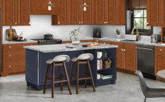
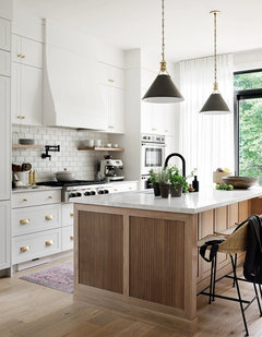
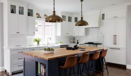
    In the first photo the countertop (similar to your choice) looks good on both the white and wood cabinets which is something to think about. In the second photo the white Island is a nice balance to the wall of wood cabinets and does not have the visual weight that a color would bring into the space and could help your whole space have a lighter feel overall.


  • 3 years ago

    She thinks it's too much like sage and she does not like sage so she will look at more colors tomorrow at the store

  • 3 years ago

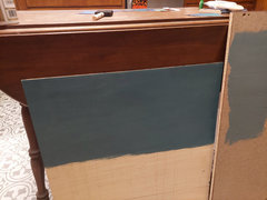
    Samples painted on white foam core or poster board from the dollar tree will offer a more accurate read. Color is relative, so anything painted on brown cardboard is going to throw it off from how it will look on the actual island.

  • 3 years ago

    ^ correct. You can cut the cardboard so it’s only showing paint, then look at it next to the tiles, not more cardboard. If the green is throwing her off, then maybe go more blue and less gray.

  • 3 years ago
    last modified: 3 years ago

    She likes deep sea dive sw7618 which is painted on new wood on the left. right is the old color from the weekend


  • 3 years ago

    Do yourself a favor and buy the large samples from Sherwin Williams online…..they are about 12” square with an adhesive backing and you can move them around to see in different light. Well worth the approximately $4 for each sample.

  • 3 years ago

    I second that ^^^ suggestion. Samplize colors can be stuck onto the wood and let you get a better sense of the colors.

Sponsored
Kuhns Contracting, Inc.
Average rating: 5 out of 5 stars26 Reviews
Central Ohio's Trusted Home Remodeler Specializing in Kitchens & Baths