Software
Houzz Logo Print
s_arnos

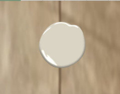
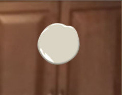
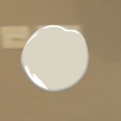
Wind's Breath or Edgecomb Gray, by Benjamin Moore???

3 years ago
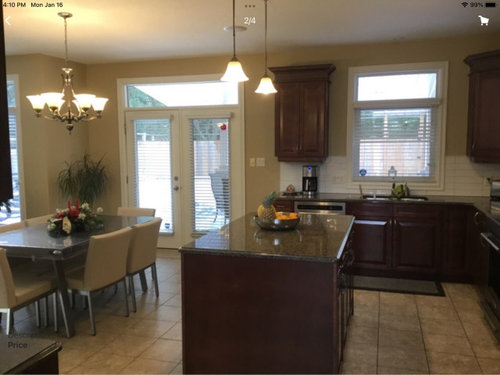
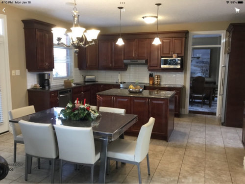
We need to decide on a paint colour for our open-concept main floor asap. Our house is currently a dated yellow-beige and I'm tired of it! I want a warm greige to update and brighten up our space. I'm looking for a timeless colour. I've narrowed it down to the colours mentioned above. Our kitchen faces west so I'm nervous that Wind's Breath might look too washed out and blend in with our trim. On the other hand, Edgecomb Grey is slightly darker but I'm worried it has a slight pink undertone. To complicate matters, my cabinets are cherry-coloured and my granite counters are Tropical Brown. Which colour do you think works better in this room? Thanks so much!

Also, do you have any suggestions on a chandelier and island pendant lights to modernize the room?

Comments (18)

  • 3 years ago

    I used Edgecomb Gray in my family room/kitchen and loved it. It faces S/SW and gets a lot of light. I liked it so much that I used in N/NE facing bedroom and it looks lilac. Definitely sample in every room. Good luck!

  • 3 years ago

    Thanks, Ann. I don's want lilac but my kitchen faces West so it should look good there.

  • 3 years ago

    I have used Edgecomb Gray in almost my entire house. We have lots of windows in every direction, and I never see it read "pink". I did try Revere Pewter, but that pulled "green" for me.

    I have also painted my daughter's house in Wind's Breath.

    If I were you, I would get large pieces (at least 2' x 4') of foam core board and paint them (minimum of 2 coats). Then see which one works best with your flooring.

  • 3 years ago

    That's a very good idea!

  • 3 years ago

    I have EG in a room with two windows facing north and one facing west. It doesn't have any discernable undertones in that light. I sampled Winds Breath in a south facing room and it looked a little green. So Mary Elizabeth has a good point - you have to look at it in all of your rooms. It doesn't really matter what other people think about how it looks. Your lighting and other surfaces in the room are going to be different than everyone else's. I think Winds Breath is dark enough to contrast with trim, but you didn't say what your trim color is. In my experience, 10 points difference in LRV is enough for contrast.


    I will say I just don't use the same color in north facing rooms as I use in south facing rooms because the light is so different the same color doesn't work under both conditions. As long as you have cased openings between rooms you can use different colors. My kitchen has only northern light. I had to use something with more yellow because every other color looked dead there. So if you start going crazy trying to find the right color for every room, just try something different. If they have close to the same LRV I don't think people even notice it's a different color.

  • 3 years ago

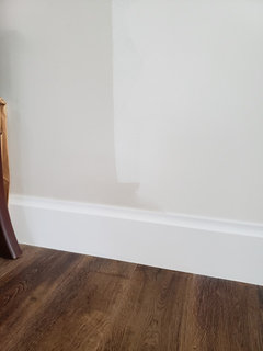
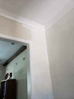
    You brought up some good points. My trim is Garlic Clove with a LRV of 82. Wind's Breath has a LRV of 70 and Edgecomb Grey is 60. I will paint sections of my walls tonight to see how different rooms look throughout the day.

  • 3 years ago
    last modified: 3 years ago

    FWIW Edgecomb Gray looked fleshy-orange in my south-facing room; if you face west, you reaalllly better make sure you it doesn't turn orange-y on you when the low, strong evening sun streams through the windows.


    ETA: I painted a bathroom vanity in a south-facing bathroom Wind's Breath. It looks good but has a very slight lilac cast. Just something to be aware of -- if it pulls lilac on you, it's not going to look good with your cherry cabs.

  • 3 years ago

    Did you post before? Someone had asked about BM Winds Breath recently.

    I used WB when we built last year and wasn't happy with it. Too beige-yellow in my house. I had picked it because it looked perfect in my parents house!

    I repainted with BM White Dove on right side. WB on left. Trim BM Chantilly Lace.


  • 3 years ago

    I will look at the samples again tomorrow throughout the day. I definitely hope it doesn't look lilac! If Edgecomb Grey looks lilac and Wind's Breath looks yellow, then what will choose?! This is stressful!

  • 3 years ago

    It isn't easy, but it is just paint!

    In my previous house I had cabinets (and wood floors) that were similar color to yours and I painted the rooms BM Grant Beige. A bit darker, warmer and has some green/khaki when compared to Edgecomb Gray.

  • 3 years ago

    Edgecomb Gray will look lilac next to your walls - but probably won't once your wall color is covered.


    This is why I stressed looking at the colors next to the cabinets and flooring without looking at the wall,


  • 3 years ago
    last modified: 3 years ago

    I'm sure you've come across the paint expert, Kylie M, but incase you haven't, here is her take on edgecomb gray : https://www.kylieminteriors.ca/colour-review-edgecomb-gray-benjamin-moore/ 

    I don't know much about it, but I have watched her videos and read her blog enough to know that she is a HUGE fan. She constantly refers to this color as "grounded."

    She also writes about Winds Breath here: https://www.kylieminteriors.ca/paint-colour-review-benjamin-moore-winds-breath-oc-24/

  • 3 years ago

    In my previous house I tried Edgecomb Gray in a few areas and it looked dull/flat in my house, so I repainted with BM Grant Beige which was warmer and a tiny bit darker.

  • PRO
    3 years ago

    Edgecomb Gray looks greenish with luck of light.

  • 3 years ago

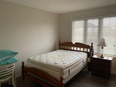
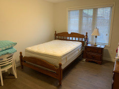
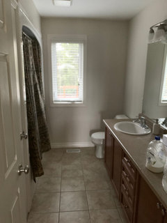
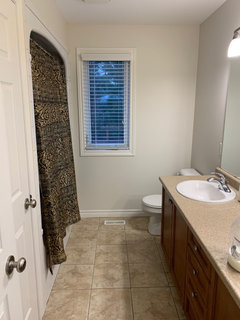
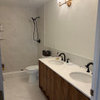
    These are all very valid points. Thank you, everyone! We went with Wind's Breath and so far I like it. It's quite a chameleon colour that fluctuates between warm beige and cool grey. Look at these pictures of the same room at the same time - with and without lights.

  • 3 years ago

    Your bathroom color has whiter bulbs, and that makes the paint look nicer in there with the lights on. Your bedroom, has yellow color bulbs. I would change them for daylight type led bulbs, at least 3500k The color is very pretty.

  • 3 years ago

    These are all very valid points. Thank you, everyone! We went with Wind's Breath and so far I like it. It's quite a chameleon colour that fluctuates between warm beige and cool grey. Look at these pictures of the same room at the same time - with and without lights.

    I didn't even think of that. Thank you!