

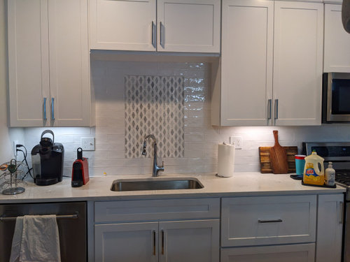
Was this feature tile a mistake?
3 years ago
Featured Answer
Sort by:Oldest
Comments (20)
 3 years ago
Related Professionals
New Bedford Kitchen & Bathroom Designers · Altoona Kitchen & Bathroom Designers · Chula Vista Kitchen & Bathroom Designers · Bismarck Kitchen & Bathroom Designers · Eugene Kitchen & Bathroom Designers · Brunswick Kitchen Remodelers · Louisville Kitchen Remodelers · Middlesboro Kitchen Remodelers · North Adams Kitchen Remodelers · Decatur Custom Countertops · Sebring Custom Countertops · Morgantown Custom Countertops · Greenfield Custom Countertops · Newport Custom Countertops · Everett Custom Countertops- 3 years ago
 3 years ago
- 3 years ago
- 3 years ago
 3 years ago
- 3 years ago
 3 years ago
 3 years ago
 3 years ago
- 3 years agolast modified: 3 years ago
- 3 years ago
 3 years ago
- 3 years ago
- 3 years agolast modified: 3 years ago
- 3 years ago
- 3 years ago
 3 years ago
- 3 years ago
Related Stories
BATHROOM DESIGNBathroom of the Week: Pamper-Me Features and Marble-Like Tile
An Orlando, Florida, couple’s former cramped, dated master bathroom gets an elegant, contemporary update
Full Story
REMODELING GUIDESTile Rugs: Decorative Features for Your Floor
Clever Floor Accents Bring Color and Style to Entry, Courtyard and Bath
Full Story
TILELet’s Talk Tile: An Alphabetical Guide to Tile Terminology
Get set for a tile project with this handy glossary of shapes, materials, finishes and more
Full Story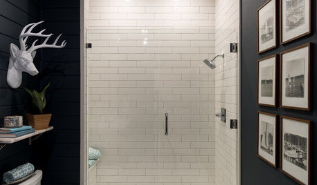
BATHROOM DESIGNA Rustic Setting and a Paint Mistake Create Drama in the Bathroom
Near-black walls, wood features and elegant surfaces personalize this lake house bathroom
Full Story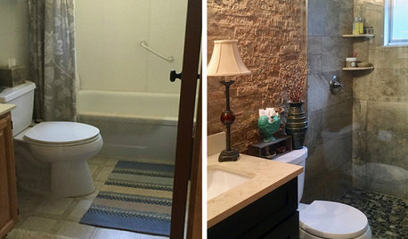
BATHROOM MAKEOVERSReader Bathroom: They Ditch the Tub and Add a Feature Wall
A trip to Sedona, Arizona, inspires the textured stone tile in this Michigan bathroom
Full Story
TILE10 Fresh Tile Ideas You Might Have Missed This Week
See a roundup of new tile styles, patterns, materials and more featured in this week’s articles
Full Story
MIDCENTURY STYLE10 Midcentury Features to Treasure
Before you trash that geometric tile or kitschy wallpaper, find out whether your home's blasts from the past are gems in disguise
Full Story
BEDROOMSNew This Week: 3 Dramatic Features to Wake Up Your Bedroom
These striking sleep spaces cast a new light on wood, tile and built-ins
Full Story
BEFORE AND AFTERSGreen Mermaid Tile and a New Layout Boost a Dated Pink Bathroom
This now-airy Whidbey Island bathroom features a soaking tub, a walk-in shower, heated floors and an expanded water view
Full Story
KITCHEN DESIGNPaisley Tile Backsplash Takes This Kitchen to a Whole New Level
The remodeled Toronto kitchen features a soapstone-topped island and a bold backsplash that makes an impression
Full Story

sheloveslayouts