Software
Houzz Logo Print
course411

Input on counter material

3 years ago
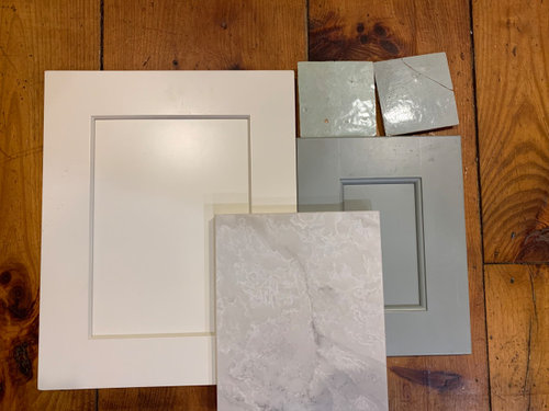
It's time to purchase our countertop, and I wanted to do a gut check before we proceed with our current choice.


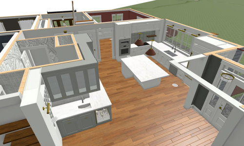
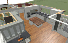
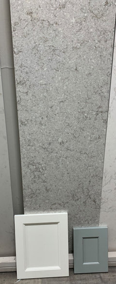
Below you can see the main elements: main cabs in Shiloh Soft White, wet bar & pantry cabs in SW Unusual Gray. The background flooring is the existing (bossy) kitchen floor, which is staying. Hardware metals will include polished chrome, burnished bronze, and copper.


Also shown in the foreground is our front runner countertop choice: Vadara Cascada Perla. It looks cool in this picture but in person it has a warmer look.


We've (reluctantly) ruled out natural stone for lifestyle reasons. As for stone pattern/color, I don't like a lot of motion but I also hate no motion; and most white quartz slabs are too white/cool. So when we saw the Vadara it seemed to tick lots of boxes.


Nonetheless, are there other similar QUARTZ slabs we should consider before pulling the trigger?

MSI Calacatta Valentin looks to have the exact same veining pattern (?!) but a browner hue. Any others?


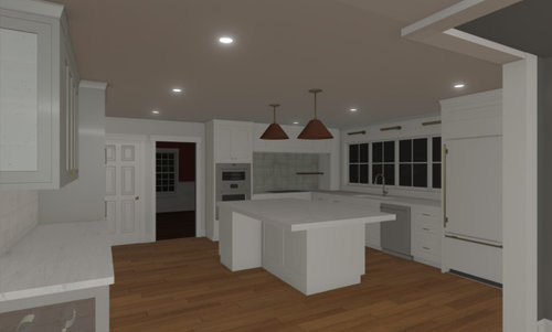
For reference here are a couple of renderings of the kitchen plan:


Comments (11)

  • 3 years ago

    The way the colors are rendering on my monitor, I don't like your choices together. The gray cabinet color you chose doesn't pair well with the warm-white cabinets, nor does the counter material. It's best to decide if you want to go warm or cool and stay in that lane. I'd personally stay in the warm lane -- your gray cabinet choice doesn't look that great with the floors, either, while the warm white cabinet does.


    I don't consider your flooring bossy, based on what you've shown -- it looks like lovely warm-toned wood. Pics of your existing kitchen with the floor in would be helpful.

  • 3 years ago

    By bossy I mean the floors are a strong design element so the goal is to avoid too many competing materials.


    Too bad about how the colors render on computer. Depending on lighting, the cabs skew gray or green and look lovely in person. At any rate, the ship has sailed on cab colors (they're being delivered next week) so we need to work with what we have.

  • 3 years ago

    when I look at the space I think the lighter cabinets should go on the non window wall -is that the pantry and bar??? and the "main" area should have the gray-green...is that the island and window side??? the elements are fine..I would have picked more wood cabinetry but the painted is okay if you want it.

  • 3 years ago

    when I look at the space I think the lighter cabinets should go on the non window wall -is that the pantry and bar??? and the "main" area should have the gray-green...is that the island and window side??? the elements are fine..I would have picked more wood cabinetry but the painted is okay if you want it.


    @herbflavor Yes, pantry and bar are the non-window side and are the gray-green cabs. Again, cabs are already ordered so we're not in a position to change them, but out of sheer curiosity I wonder why you would have flipped the colors? Our current kitchen is all cherry wood and with the floors it's just too.much.wood. So painted it is :)


    @The Kitchen Place thank you!! I hadn't come across Viatera or Corianquartz before so great options to look at.


  • PRO
    3 years ago


    J&K White Shaker - Dayton OH · More Info


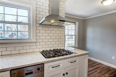
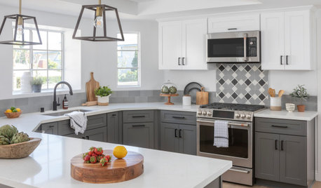
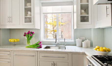
    Here is ARIA by LG Viatera on a stark white cabinet. This was a flip job by a friend of mine. It wouldn't have been my choice for the tops...but after it was installed, it actually looked really good! I've come to realize that Aria pretty much goes with anything. LOL. The gray walls here remind me of your Agreeable Gray color.

    course411 thanked The Kitchen Place
  • 3 years ago
    last modified: 3 years ago

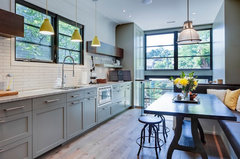
    the reason I would have flipped is the gray green seems a little military like and along a pretty long wall w all cabinets I thought I would prefer a lighter look than the darker tone..... over at the window side the UV keeps it bright and light so darker color there wouldnt be any issue . Just my personal feeling about it. It'll be fine anyway. here's the color..if you can do a lighter backsplash on that side..any warmer metal for variety [handles/pendant??] even a light counter there....I see you have some glass fronts..thats good......little things can keep it fresh and invigorating. Its a nice solid color...details can play well with it.

    Contemporary Kitchen · More Info


    course411 thanked herbflavor
  • 3 years ago
    last modified: 3 years ago

    I see what you're saying.

    Hardware will be brushed bronze, likely this pull or similar. Glass-front cabs will have a latch, glass shelves, and internal lighting. Bar sink may be copper (still deciding). BS will be white or cream 4x4 zellige. The "military" word is apt, as I'm trending toward industrial-ish fixtures & pulls with living finishes.

  • 3 years ago

    Ok now I'm completely second guessing myself. Would soapstone on perimeter with wood butcher block on island, be worth exploring? Something like this image


  • 3 years ago

    Update: we've chosen a counter: MSI Gray Lagoon. The photo gives the impression that the counter is darker than it is in person. It picks up the green-gray tone of the Unusual Gray, with areas of white that don't compete with the Soft White.


  • 3 years ago
    last modified: 3 years ago

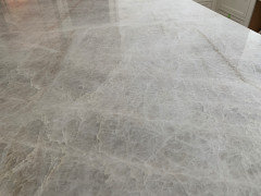
    Well, what do you know. The day I went to MSI to confirm the Gray Lagoon slab, there was a gorgeous Taj quartzite that had more gray than I usually see, and that looked beautiful with our samples.


    I posted more pictures on this thread.