Software
Houzz Logo Print
michael_moser23

bathroom wallpaper

3 years ago

Hi! We are finishing up a new addition and we have a new powder room under the stairs. It’s small (7’ x 4’). The flooring is white oak with a natural finish and we already have a green vanity. The trim is a white. We are looking to find a wall paper that can really work with these existing elements and make the room come to life. Any thoughts on what would go with the green?

Comments (32)

  • 3 years ago
    last modified: 3 years ago

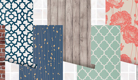
    That is a great color! Since there are a gazillion choices for wallpaper and people here are working in a vacuum of not knowing your style or preferences, what the rest of your home looks like, it's kind of hard to narrow down recommendations enough to hit on what might appeal to you. I would start by thinking of colors you like that will complement the green (unless you want to do just green and white) and fit in with the rest of your house. Say you're a blue loving person; I would google blue and dark green wallpaper. You could add flowered, or geometric and see what you get that appeals to you.

    See what I mean? I love all of these but maybe none will appeal to YOU!


  • 3 years ago
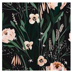
    I did the same search with pink and green:


    And just green and white:


  • PRO
    3 years ago

    Small powder rooms are the place I suggest that people go kind of wild. You have a very good start with your colorful vanity. Many of the wallpapers that have been suggested here would work well. An internet search for green powder room wallpapers this morning yielded many more. You should be able to search also until you find something that particularly appeals to you. Good luck!

  • 3 years ago

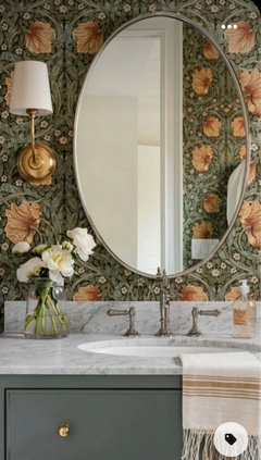
    ^^So many lovely choices! Small and tucked under the stairs would make me want to do something magical (morris & co) but totally a personal choice


  • 3 years ago
    last modified: 3 years ago
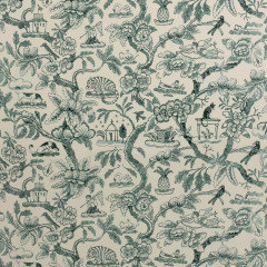
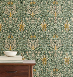
    I love the whimsical idea and also inclusion of a few colors for depth, contrast and especially personality. I’d also paint molding green and use brass accents and lighting.


  • 3 years ago

    Interesting, so y’all think more green in the wallpaper as well vs some other color on the paper that the compliments the green? I left it open to see where people would go with it and it’s still under construction so hard to get a picture of what the rest of the room will look like, but here is also a pic of the kitchen. And Here are a couple were considering.

  • 3 years ago

    Sorry missed some photos

  • 3 years ago

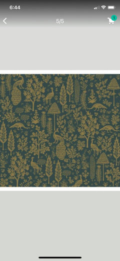
    I like this one with the dark green and gold, and organic patterns. Do you have a link @olychick?

  • 3 years ago

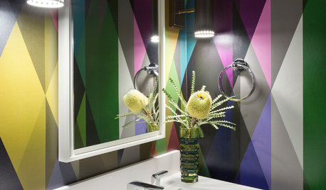
    I went more modern:


    Or this one that the color can also be changed to a custom color...ie green & white, then added a quirky painting just for fun.:


    Mnm 01 thanked Kelly Jones
  • 3 years ago

    Another idea:


  • 3 years ago

    Sorry I don’t have a link. Try an image search. I’m on my phone now and can’t figure it out. If you don’t find it, I’ll search when I get back to my laptop.

  • 3 years ago

    I really like that one, too, Oly … I’ll try to find it. :)

  • 3 years ago
    last modified: 3 years ago

    Here it is — I’m posting the first link that came up, other places sell it, too:

    https://www.burkedecor.com/products/menagerie-toile-wallpaper-in-emerald-gold-from-the-rifle-paper-co-2nd-edition-by-york-wallcoverings?utm_source=google&utm_medium=cse&utm_term=40149473132580&variant=40149473132580


    Oh my gosh, it’s gorgeous. I saw it in someone’s dining room (on IG) a while back and fell in love.

    This gets my vote, great choice, Oly! I wish I had a room in it. :D


    Mnm 01 thanked Jilly
  • 3 years ago

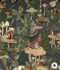
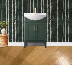
    Misty forest:


  • 3 years ago


  • 3 years ago

    Thanks, Jilly, I just got back to my computer and was going to search. When I post random photos just as suggestions like that, I never can figure out how to link the source without having to do a few more steps and so I don't.

  • 3 years ago

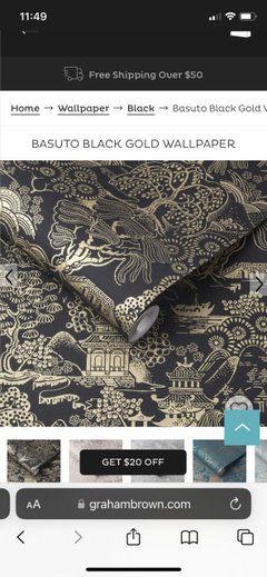
    We are thinking about this one, what does everyone think?

    https://www.grahambrown.com/us/basuto-black-gold-wallpaper/105929-master.html

  • 3 years ago

    Construction is not done but may this picture helps, put it in context more, and yes you can see it from the kitchen and that family room.

  • 3 years ago

    That wallper is beautiful, but I’m not sure it works with your vanity. I don’t care for it with the green of the sofa shown. Does it complement the vanity in person? Monitors can be so tricky with colors.

  • 3 years ago

    We ordered a sample so we can check that, but in general you don’t think black and gold, work with green? Seems like it would. I still like this one, but we don’t like the actual pattern subject as much.

    https://www.burkedecor.com/products/menagerie-toile-wallpaper-in-emerald-gold-from-the-rifle-paper-co-2nd-edition-by-york-wallcoverings?utm_source=google&utm_medium=cse&utm_term=40149473132580&variant=40149473132580

  • 3 years ago
    last modified: 3 years ago

    Well, it's personal preference, of course, but I would not put those 3 colors together, in those shades at least and with large swaths of all 3. Maybe that wallpaper with a black vanity and gold faucets could work. I think the one I posted that you just reposted has a green background in the same family as your vanity.

    However, it's your home and if you like the mix, do it!

  • 3 years ago

    If you prefer more of a chinoiserie style, maybe search for green chinoiserie and see if something appeals to you. I just did and this came up, not chinoiserie but the colors look fabulous.

    or maybe some of the green toile papers?


  • 3 years ago
    last modified: 3 years ago

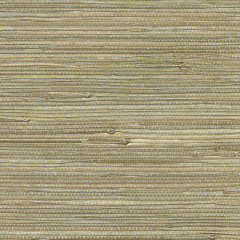
    You want a small repeat for a small space. Make sure that the pattern you choose won't be chopped off. Small prints, stripes, faux grasscloth will work. And don't be afraid of a dark paper. Under the stairs means no natural light. Do sconces on either side of mirror, and a ceiling light over the toilet, all on dimmers.

    York Wildwood Wallpaper Hunter Green RI5156 Rifle Paper Co. · More Info


    This is a faux grasscloth, Philip Jeffries, and I love the blue with the green vanity.


    I like both papers with the floor.

  • 3 years ago

    @Mnm 01 Will you be doing gold or brass faucet, too?

  • 3 years ago


  • 3 years ago


    You can‘t go wrong with Versace 🤩

  • 3 years ago

    It’s interesting, this thread is all about green with green, I was always thinking you want something that the green vanity has contrast with vs more green behind it.

    Or if you do green, then you’d probably want to do wainscot so the vanity has contrast off the white trim color and then you can have more green in a wallpaper above the wainscot.

    Do y’all agree about the contrast on the vanity and not having green on green? If so, maybe we should go with a non green wallpaper to give contrast. If it does have green it would be smaller amounts?

    For example this has subtle green with a gold tone that the green vanity could contrast on. (Although this was is not as much fun but using it as example of colors).

  • 3 years ago

    Because it's a small room, people (me at least) are thinking it would be fun to go dramatic with that gorgeous vanity. Thus the dramatic style wallpaper that includes some of the green in the vanity. Contrast will work, but either way, the vanity is going to stand out. Your last grasscloth looks like it would work, but as you say, not as much fun.

    Assuming you'll have a light countertop like in your photo, the vanity will be provided some contrast with that. Almost all of the pics I could find of green vanities are ads designed to sell the vanity, so they do have light walls or wainscotting behind them to really set the vanity off, but you don't need to do that unless you love the look. The green in your vanity is a fresh look, so there aren't a lot of pics of actual powder rooms using it. I'll search a bit more.

  • 3 years ago

    Yeah I see what you mean about how they display it for featuring the vanity vs the overall room.

    This could be an interesting middle ground, a bit more conservative (you can see this room from family room and kitchen so want to to work with the rest of the house as well (warm neutrals)) but still has some depth and interest?

    I also still like the other one, except the peacocks don’t really speak to us, but the colors seem nice (we ordered a sample.

    https://studiohabita.com/collections/terrae/products/mayfield-moss

  • 3 years ago
    last modified: 3 years ago

    You're smart to get samples and see what you think. I really like the new one you just posted, too. And you realize that people are just posting what WE like, so if you want to go a different direction, maybe not so bold or with more contrast, that's what you should do. It's fun to get different perspectives and maybe consider something different than what you might think of yourselves, but we don't know you, your tastes, your home, etc.

  • 3 years ago

    For sure, it's great to see what everyone would do and very helpful. So really appreciate all the posts.