

Does this look like three distinct colors?
3 years ago

Sort by:Oldest
Comments (15)
Related Stories
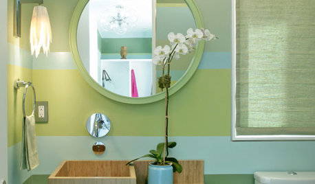
COLORLoving Color: More Ways to Like Stripes
Wake up a room with multiple types of stripes — or just one dramatic band of color
Full Story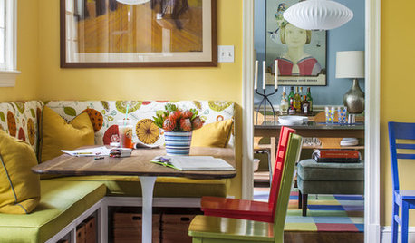
COLORColor Feast: 6 Deliciously Uncommon Dining Room Color Combos
Give your mealtime space a generous helping of hues paired in a most refreshing way
Full Story
BOLD COLORColor Guide: How to Work With Primary Colors
Go beyond the ABCs with Mondrian-style renderings and eclectic takes using these notice-me color foundations
Full Story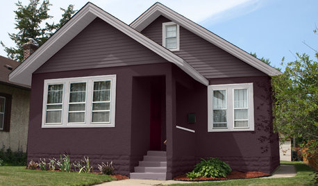
EXTERIOR COLORChoosing Color: 1 Home Has Fun With 5 Different Color Schemes
See a home’s potential for transformation with several new hues. Do you have a favorite?
Full Story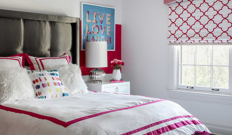
BEDROOMS3 Girls’ Bedrooms in 3 Bold Color Palettes
A New Jersey couple, their daughters and their designer work together to create distinctive bedrooms for the girls
Full Story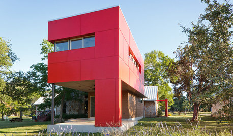
EXTERIORSColor Makes Its Mark on Modern House Exteriors
Consider borrowing from the rainbow to give a modern home depth, distinction or even just a mood boost
Full Story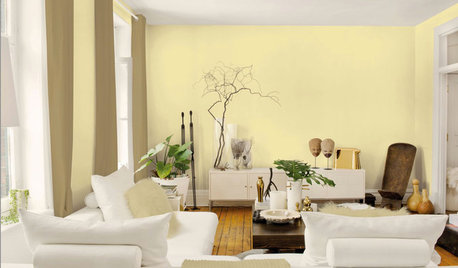
COLORBest Ways to Use the Soft Yellow Color of 2014
You may fall for PPG Pittsburgh Paints’ Turning Oakleaf if you like your hues warm, mellow and cheery
Full Story
HEALTHY HOMEBath Design: Renew Body and Mind With Colorful Light
Take one tired, stressed-out self. Rinse in a shower bathed in blue light (or any color you like). Repeat
Full Story
DECORATING GUIDESHow to Confidently Choose Colors for Your Home
Learn 10 ways to identify the shades you like and the ones that will work well in your rooms
Full Story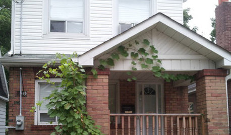
ENTRYWAYSHelp! What Color Should I Paint My Front Door?
We come to the rescue of three Houzzers, offering color palette options for the front door, trim and siding
Full Story
dedtired
mtnrdredux_gw
Related Professionals
Saginaw Furniture & Accessories · Sioux Falls Furniture & Accessories · Jonesboro Interior Designers & Decorators · Indianapolis Interior Designers & Decorators · Richmond Interior Designers & Decorators · Austin Interior Designers & Decorators · Beckley Interior Designers & Decorators · New Haven Interior Designers & Decorators · Winona Interior Designers & Decorators · Durango Interior Designers & Decorators · Calgary Interior Designers & Decorators · Bowling Green Architects & Building Designers · Louisville Architects & Building Designers · Enid Architects & Building Designers · Plainfield Architects & Building DesignersJilly
palimpsestOriginal Author
mtnrdredux_gw
daisychain Zn3b
bpath
palimpsestOriginal Author
tuesday_2008
Kswl
blfenton
Allison0704
Jilly
Lars
chinacatpeekin