Software
Houzz Logo Print
josh_hamilton44

Help! Do my white tiles clash?

3 years ago
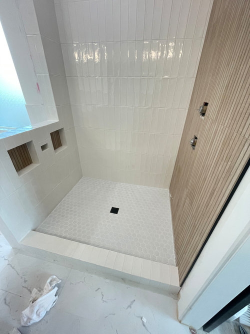

i am the homeowner of a new build home and in an effort to save money the builder allowed me to do all of the tile work.. what a task! all the other tile in the house looks great, but im afraid the shower floor looks TOO white! my wife says it looks fine, but im not sure i can get over it.. how bad is it?? (context) we had super white cabinets and i made them repaint to a more subtle white to maintain my sanity.

Comments (18)

  • PRO
    3 years ago

    Make sure the lighting is LE 4000K . Next time come here before choosing tile I like the bathroom floor and the shower walls to be the same 12 x24 tile but it is in now I sure hope you understaood water proofing before doing the tile work, I would now add some color with towels accessories some pretty bottles in the niches filled with body wash and shampoo anything to just get your eye to move around . It will be fine a nice teal bench in there that folds when not used I will sya that threshold should have been all one piece not tile but now I would leave it just be sure to not let water sit there .

  • 3 years ago

    Thank you for the comment. i did EXTENSIVE waterproofing! probably too much. we probably wont do a teal bench. were trying to stick to white, natural wood, and black accents.


  • 3 years ago

    Maybe she meant teak, not teal.

  • PRO
    3 years ago
    last modified: 3 years ago

    Please skip 400Ok which will just make the white bluer, colder, ICIER.

    3500 is more than enough, unless you are bringing a knife and surgical gloves.

  • PRO
    3 years ago

    Yes, the whites clash ever so slightly, but only on the back wall. The tiles on the side and on the threshold look fine. I'd leave it, since it looks like you did a very nice job!


    Josh Hamilton thanked Diana Bier Interiors, LLC
  • 3 years ago

    I am impressed with the quality of your tile work. It looks beautiful. Kudos to you to put in the sweat equity to get the look you wanted in your new home.

    Josh Hamilton thanked J from Lakes Country
  • 3 years ago


  • 3 years ago
    last modified: 3 years ago

    Perhaps the floor grout should have been warm white to make it look intentionally woven in?

    Just say no to 4000k! "The blue light in LED lighting that is increasingly used in our homes can damage the eye’s retina while disturbing our biological and sleep rhythms, a French health authority warned in a new report."

  • 3 years ago

    I think it looks great - i would not worry about it at all. A narrow teak bench could distract the eye from where the wall and floor meet

    Josh Hamilton thanked la_la Girl
  • 3 years ago

    I would love to see the style of bench youre talking about!

  • 3 years ago

    there are tons out there - i am sure you can find the right size so it doesn’t feel too bulky - just search ”teak shower bench” after you’ve taken some measurements :)


  • 3 years ago

    Stop being so hard on yourself. It looks fine. Nothing wrong with mixing whites.

  • 3 years ago

    Agree with cpartist. whites do not need to match exactly and sometimes it’s better if they don’t.

  • 3 years ago

    I think it looks great

  • PRO
    3 years ago

    4000K is daylight and no blue that comes when you go 5000K I use 4000K lighting everywhere in my home no blue just a light like a bright sunny day. Anything loer will cast yellow .

  • 3 years ago

    There is always going to be a difference between the way glossy and matte finish tiles look even if they are the same color (I'm assuming the shower floor at least is matte). I agree with you that the shower glass will obscure this difference and it isn't bad enough to justify ripping out and replacing what you did. Believe me, if it were you would have already had five people telling you that's why you should do. :-) Just remember this for the next time - use tiles from the same manufacturer in the same color in different sizes to get a good match, and if that isn't an option, use entirely different colors so it doesn't look like a hit and a miss. I remodeled my master bath about a year ago (this was also the fifth bathroom we remodeled) and I used some gray so I didn't kill myself trying to get the whites to match. It is also more interesting IMO, but some people really like the white on white look. You still have an opportunity to paint the walls something other than white to break up the white on white look. And finally, when you do the work yourself you are always painfully aware of whatever mistakes you feel you've made and 99.5% of people will not notice any of them. There are plenty of people who post here who have had "professionals" do their tiling and they got a much worse result than you did, so congratulations. :-)

  • 3 years ago

    4000K is daylight and no blue that comes when you go 5000K I use 4000K lighting everywhere in my home no blue just a light like a bright sunny day. Anything loer will cast yellow .

    Sorry but Kelvin isn't the most important and in reality anything above 3500 does have a blue cast.

    More important is CRI: Color Rendering Index (CRI) is a measure of how good a light is at showing an objects "true" color. The CRI does not measure the color of the light itself, (that is measured by degrees Kelvin) but the color of items being revealed by that light source. The Index measures from 0 to 100.

    What is the difference between Kelvin and CRI? A: The CRI or R9 is very different than Kelvin. Kelvin is the temperature or color of the light itself, but CRI or R9 will tell us how well that light will reproduce colors when using it. They are independent metrics and are not correlated in anyway.

    The general rule is: The higher the CRI, the better the color rendering capacity. CRI is independent of color temperature. These are two different things. For example, a 5000K (daylight color temperature) fluorescent light source could have a CRI of 75, but another 5000K fluorescent light source can have a CRI of 90.

    The higher the numerical value of CRI, the better the light fixture or bulb's color rendition. Generally, a CRI of 80 or above is considered good, while a CRI of 90 or better is thought of as excellent.

    You might want to actually do some research before you spout off about color.