

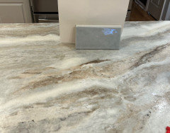
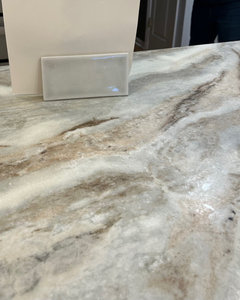
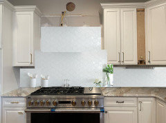
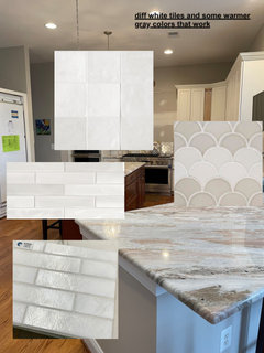
Fantasy Brown Backsplash decision
3 years ago


Featured Answer
Sort by:Oldest
Comments (8)
Related Professionals
Mountain Home Interior Designers & Decorators · Emporia Interior Designers & Decorators · Lynchburg Interior Designers & Decorators · Portland Interior Designers & Decorators · Morgan City Furniture & Accessories · Little Rock Architects & Building Designers · Greenville Architects & Building Designers · Fort Wayne Architects & Building Designers · Lewiston Architects & Building Designers · Bozeman Architects & Building Designers · Bronx Architects & Building Designers · Manhattan Kitchen & Bathroom Designers · Memphis Kitchen Remodelers · Baltimore Custom Countertops · Southaven Custom Countertops



Related Stories

KITCHEN DESIGNThe Best Backsplashes to Pair With Wood Counters
Simplify your decision-making with these ideas for materials that work well with wood counters
Full Story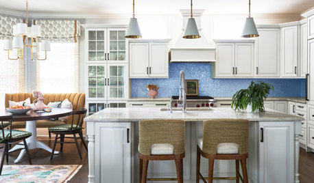
NEW THIS WEEK7 Stylish New Kitchens With Spectacular Backsplashes
Designers, including one found on Houzz, share details on tile colors, shapes and patterns that elevate these kitchens
Full Story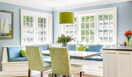
DECORATING GUIDESThe Dumbest Decorating Decisions I’ve Ever Made
Caution: Do not try these at home
Full Story
KITCHEN BACKSPLASHESWhere to Start and Stop Your Backsplash
Consider these designer tricks to work around cabinets, windows and other features for a finished look in your kitchen
Full Story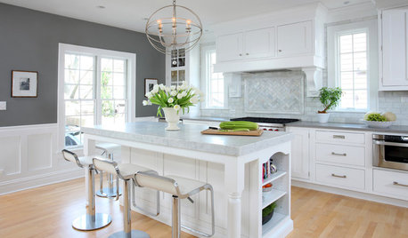
KITCHEN DESIGNHow to Add a Kitchen Backsplash
Great project: Install glass, tile or another decorative material for a gorgeous and protective backsplash
Full Story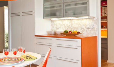
KITCHEN DESIGNCountertop and Backsplash: Making the Perfect Match
Zero in on a kitchen combo you'll love with these strategies and great countertop-backsplash mixes for inspiration
Full Story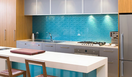
KITCHEN DESIGNHouzz Quiz: Which Kitchen Backsplash Material Is Right for You?
With so many options available, see if we can help you narrow down the selection
Full Story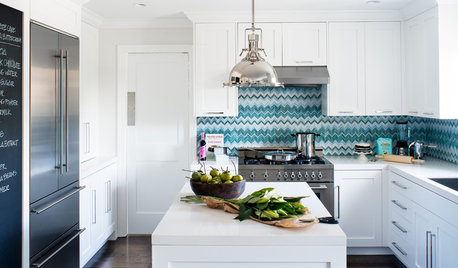
KITCHEN BACKSPLASHESDesigners Share Their Hottest Picks for Kitchen Backsplashes
Make a splash in the kitchen with these design pros’ selections for backsplash materials, colors and layouts
Full Story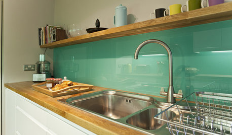
KITCHEN DESIGNHow to Pick a Kitchen Backsplash That Wows
Design your ideal backsplash with help from these Houzz guides and inspiring ideas for every kitchen style
Full Story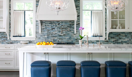
MOST POPULARBattle of the Backsplashes: Glass Mosaics vs. Natural Stone
Read about the pros and cons — and see great examples — of these two popular kitchen backsplash materials
Full Story
ShadyWillowFarm